As you might know by now, I rarely step foot in a kitchen. I really don’t have much to do there. Cook? As if! But I LOVE all things kitchen design. The hardware, the cabinetry, the accessories, oh my! In my dreams I’m designing a line of kitchenware–items I’ll never use but gaze at for their beauty. I love adding beautiful tea towels, an adorable butter dish, potted plants (see above). I figure if it’s beautiful I might somehow trick myself into wanting to spend more time there. So far, no dice.
Additionally, aside from my lack of culinary skills, the kitchen isn’t my favorite room in my house. It’s tucked around the side of my house and doesn’t receive much light. It’s always felt a bit stale in color and energy in comparison to the rest of the more lived-in spaces. Though we rent our walk-out basement apartment, our landlords are the best and they have always said we can do whatever we want to the space, but, it IS a rental after all, and we always thought it would be a more temporary housing solution so we haven’t invested much into it.
You can imagine how thrilled I was to partner with BEHR®Paint once again (remember Baby’s nursery or our studio mural?) and participate in their upcoming Color Clinic event, the same event we participated in last year, by adding some color love to our kitchen. YES PLEASE, I said. This kitchen of mine could certainly use some help so I might as well experience first it to help you know what to do for your own kitchen makeover. As I’ve come to learn, paint makes such a world of difference!
As a refresher, BEHR® Color Clinic is your chance to ask some design experts questions on how to color your own problem spaces through a series of events from April 30th to May 4th on BEHR’s social platforms PLUS I’ll be hopping on to answer your questions on April 30th and May 3rd on Instagram. By asking questions using #BEHRColorClinicSweepstakes, you’ll have a chance to win gift cards to The Home Depot®, and design consultations. Get some free design advice? Sounds pretty awesome to me!
I’m excited to take you on a tour of the first stage of our kitchen renovation and the mistakes we’ve made so far and how we’ve fixed them.
BEFORE
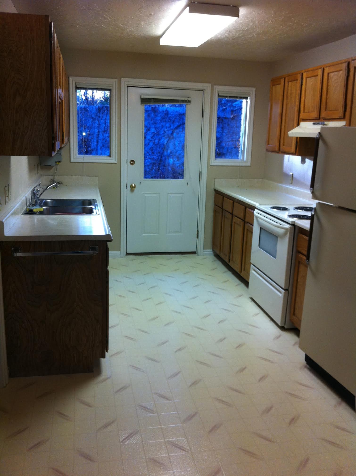
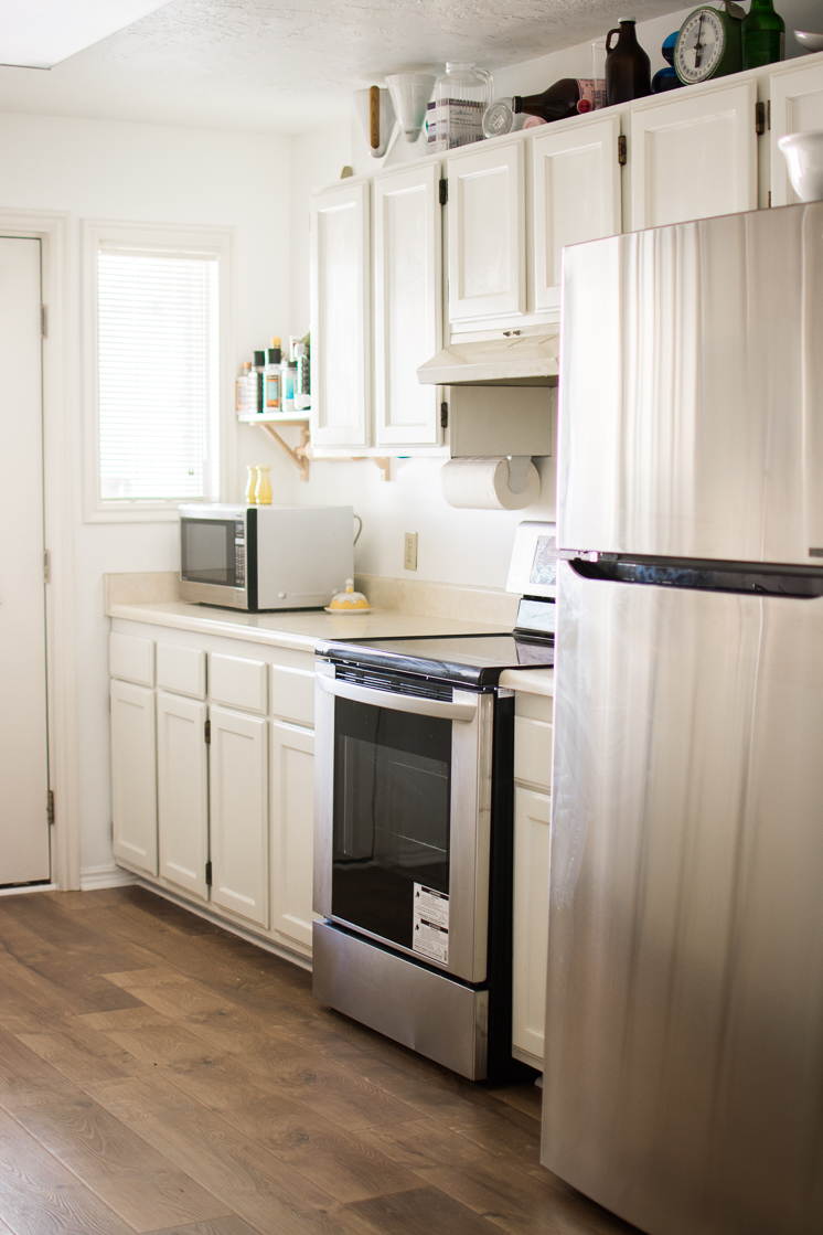
When we first moved into our apartment 5 years ago, the kitchen had a major case of the early 90s. This is a photo that my landlord sent us while we were still living in Denmark. We took the apartment without ever setting foot in it.
Wood cabinets, linoleum flooring, laminate countertops. Gorgeous, right?! 😉 One time, while Paul and I were on vacation, we came back to find that our sweet landlord, Debby, had painted all our cabinets a slightly off white. It was the kindest thing anyone had ever done for us! It instantly made such a huge difference in our space. Behold:
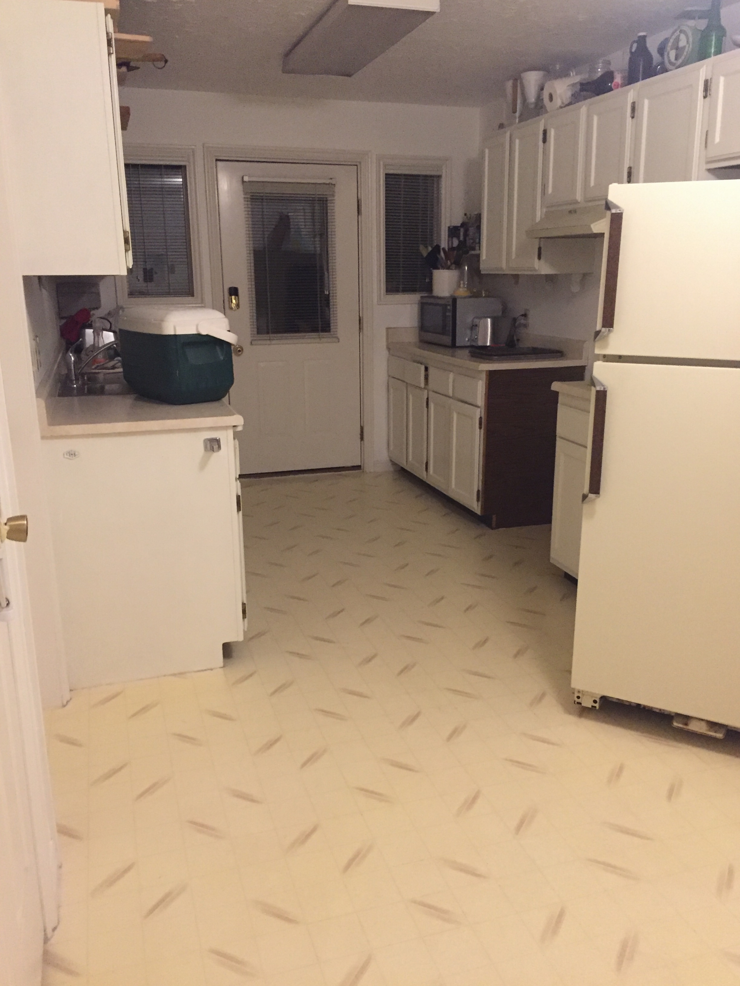
Ok, it’s a terrible photo, but it’s all I got! As you can see, white is MUCH better than the 90s wood, though it’s begging for a new floor, which we eventually got once this happened:
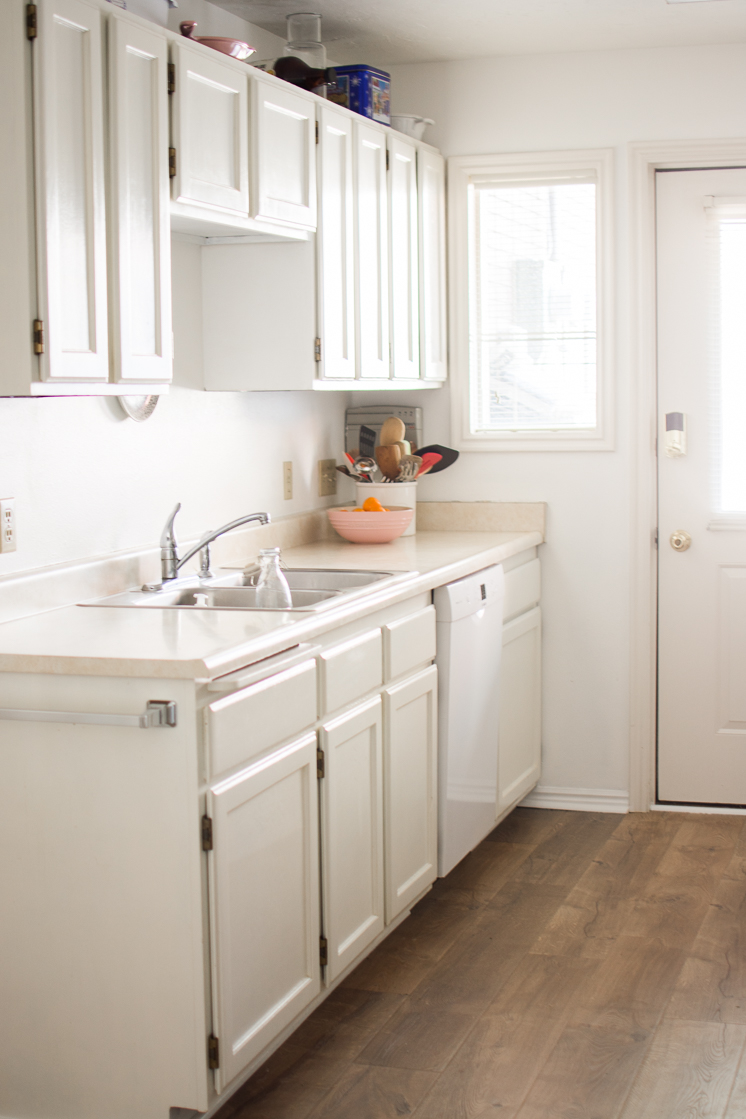
Better, huh?! We got our new flooring in November (read about it here!) and once again, it made a huge difference. We were slowly getting on track, but there are obviously a number of things in the way still.
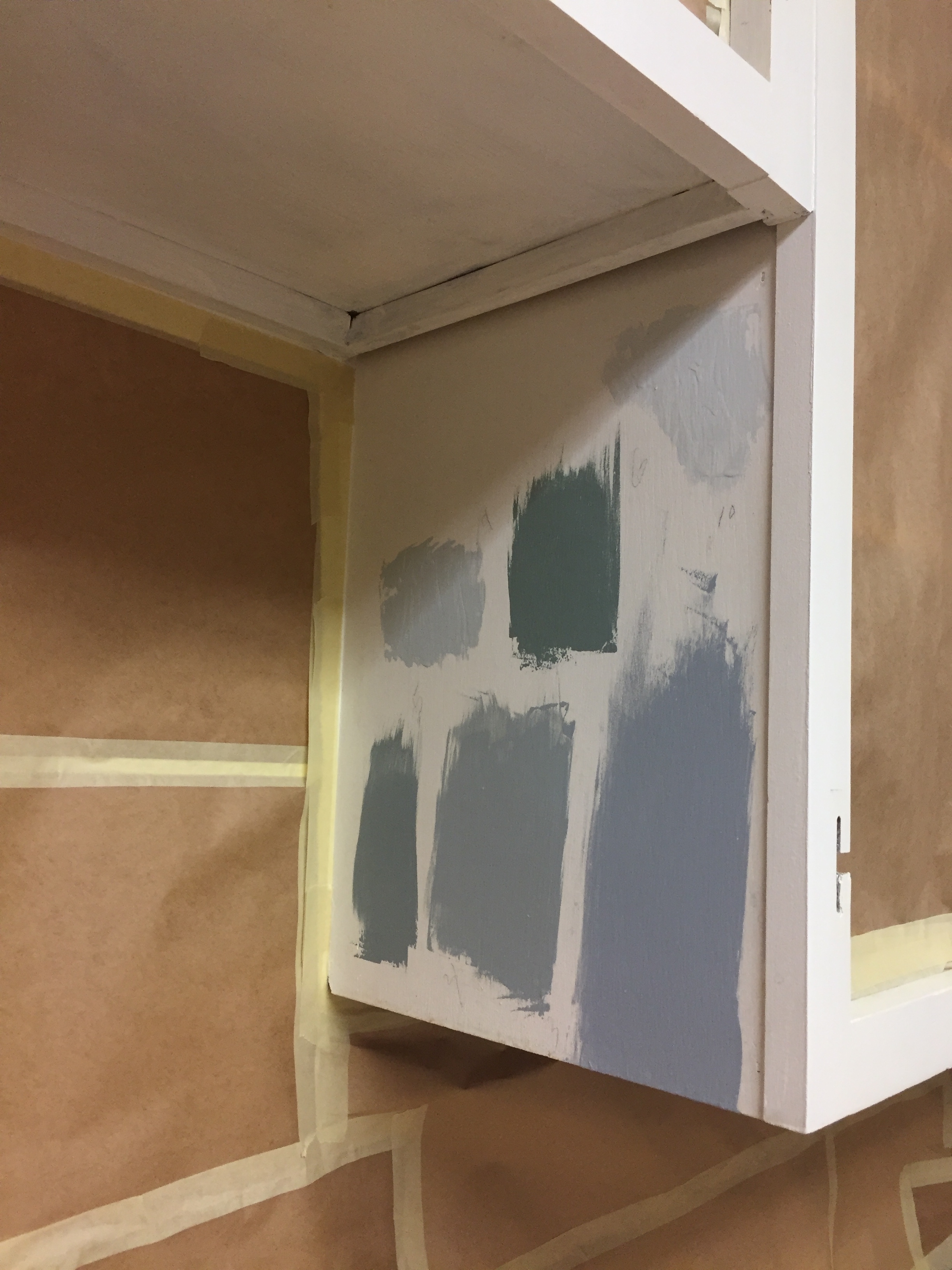
After a bit of research, I had been spotting the two-toned kitchen cabinet trend, where the top cabinets are a different color than the bottom and I thought it would super fun to try for this space. I had only seen it done with a white on top and a color on bottom, but for some reason, I got it in my head that it would be cool to try two different shades of blues, one lighter up top and one darker down below.
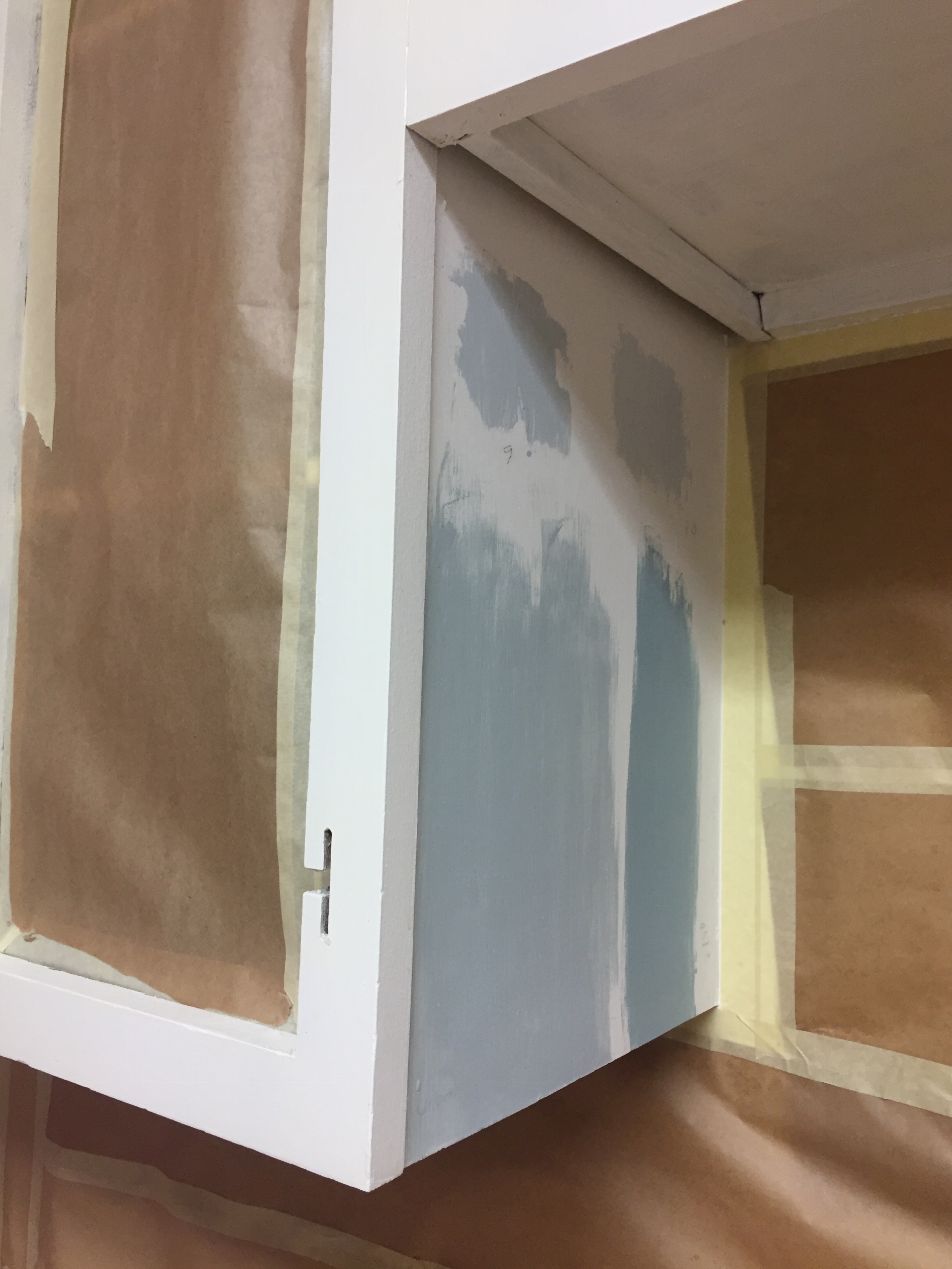
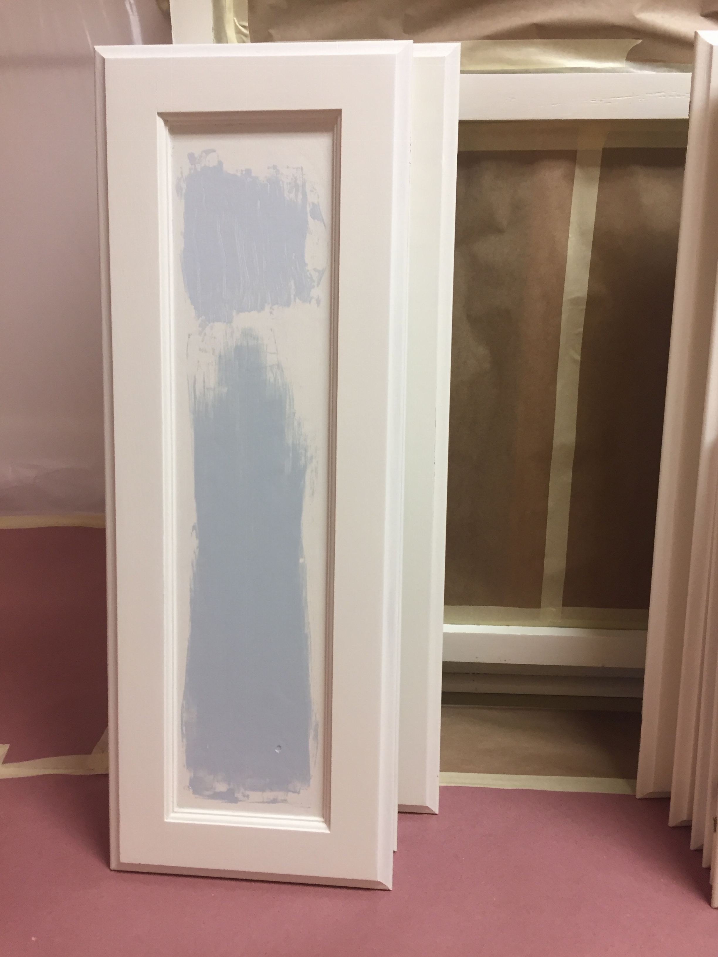
I experimented with testing out various samples of BEHR paint on different sides of the cabinets. The fluorescent lighting drastically changed the way it appeared on each side so it was rather hard to tell how it would really show up. Each side looked so different!
Now, I don’t own this space, I admit, so, on one hand, I don’t feel totally connected to it nor do I feel like I’m designing the kitchen of my dreams, BUT, I also don’t want to put my landlords in a tight spot when we move out. So, it’s part safe/part experiment.
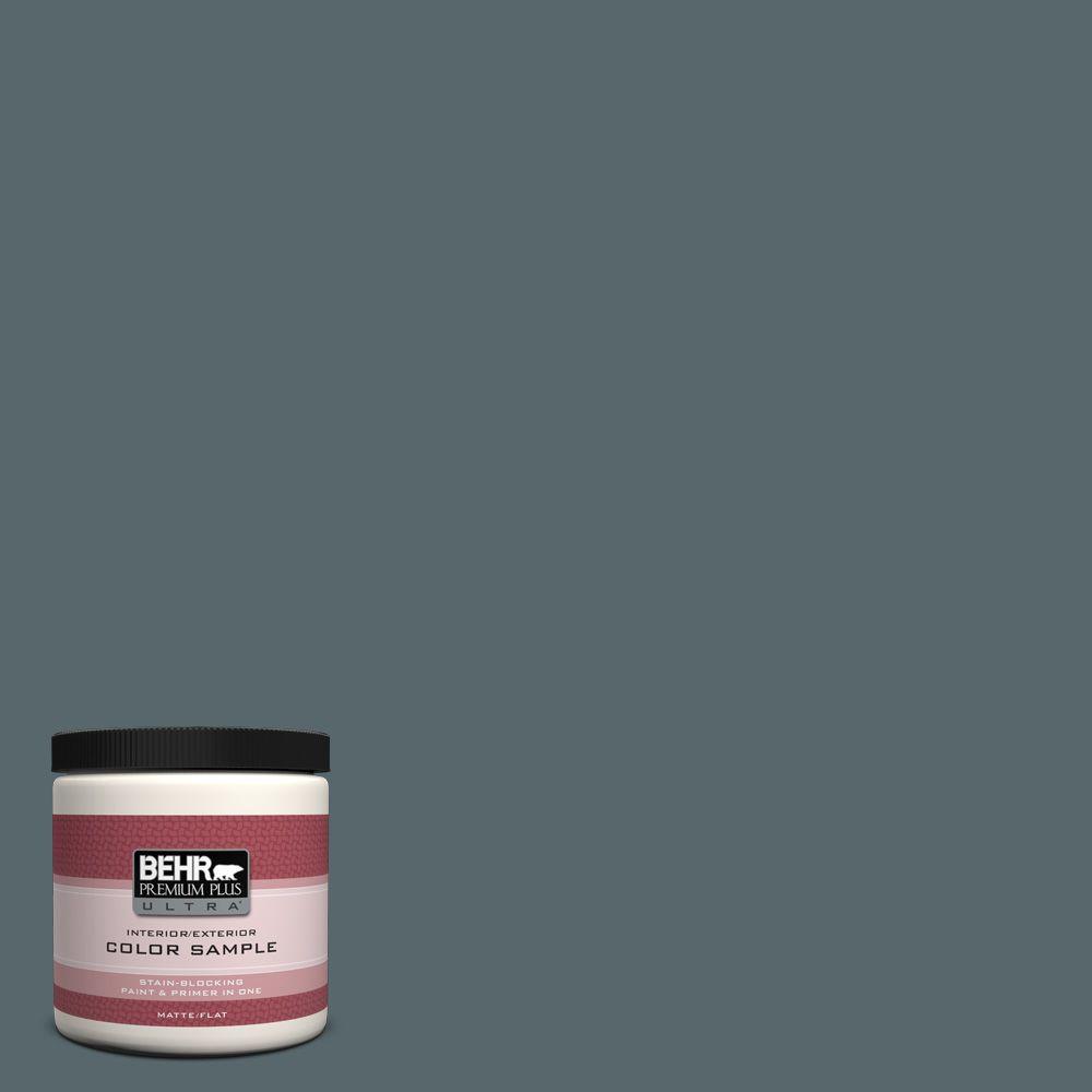
It was a no-go. What I came to find is that you can’t do a mid-value (how dark and light a color is) color with a dark-value color. It doesn’t work! Please note this! The top mid-value color had to go but I LOVED the bottom, the BEHR Whale Gray. It’s the perfect dark color that’s part blue with a dash of green. I love it.
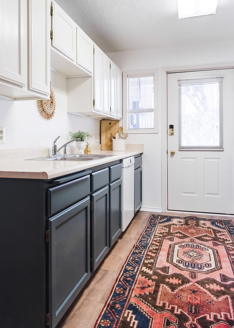
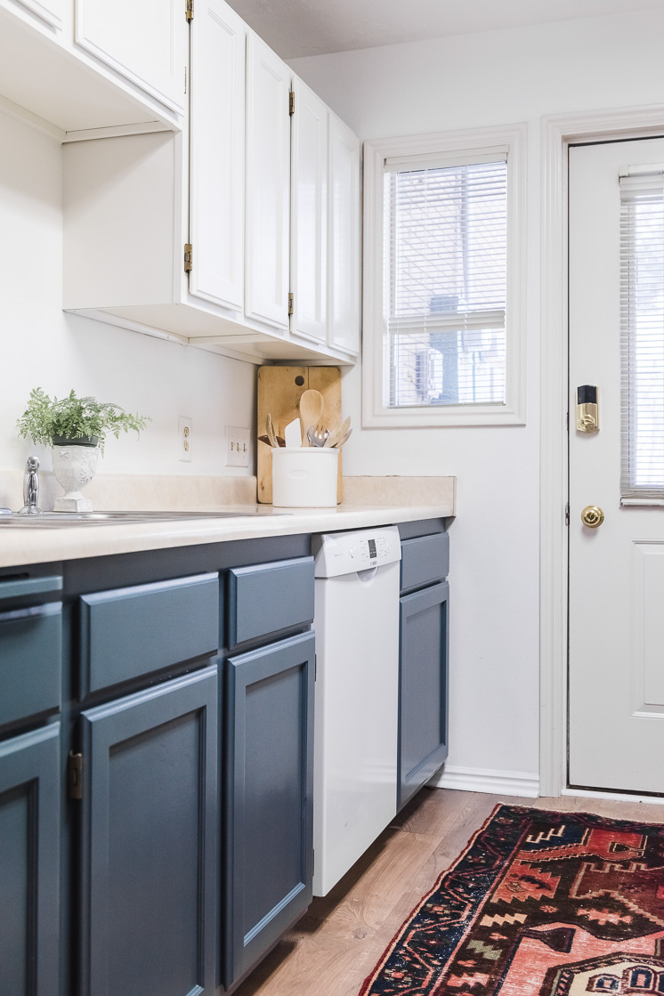
We re-painted the top cabinets and now I could choose the classic BEHR Swiss Coffee up top keeping the Whale Gray bottom and I LOVE it! I used BEHR’s Premium Plus Ultra High-Gloss. A semi-gloss or high-gloss is better for cabinets where hands will be touching so it’s easy to wash off. Here’s how it turned out:
And I LOVE IT! So much. It feels updated, fresh, not trying to hard. It’s current without feeling like every other kitchen. Count me a fan!
Here are three things I learned:
- When I was selecting colors, I had to remind myself that muted colors are more liveable. It’s easy to want to choose a bright color because it’s your favorite color, but by choosing a more muted version of a color you can use accessories in brighter tones and it will bring out the color even better. Think small appliances, dishtowels, dinnerware, etc..
- Make sure to sample the colors on various surfaces to see what it does in various lighting. Kitchens have lots of different surfaces which can also produce different colors. Try them all out!
- When painting, use good brushes, especially on cabinets! Otherwise, it will show every brush stroke.
To complete a full color palette, I’d building on the Whale Gray (N470-60) and Swiss Coffee with Sulfur yellow (P320-6), Carnation coral (M170-3), Indian Summer (M170-5)
Now, this is just the beginning of a bigger renovation project. In the works are new countertops, backsplash, hardware, etc. and by the end, you won’t recognize it. And it may just may, convince me to spend more time in there! Who even knows!
The paint change has already made such a difference in our mentality and well-being and I can’t wait for the rest of our planned changes. Stay tuned!
Mark your calendars for April 30th and come with questions! I hope to see you there!
Beautiful rug from Loom and Field
This post is sponsored by BEHR® Paint. Thank you to the brands that allow us to create original content.


