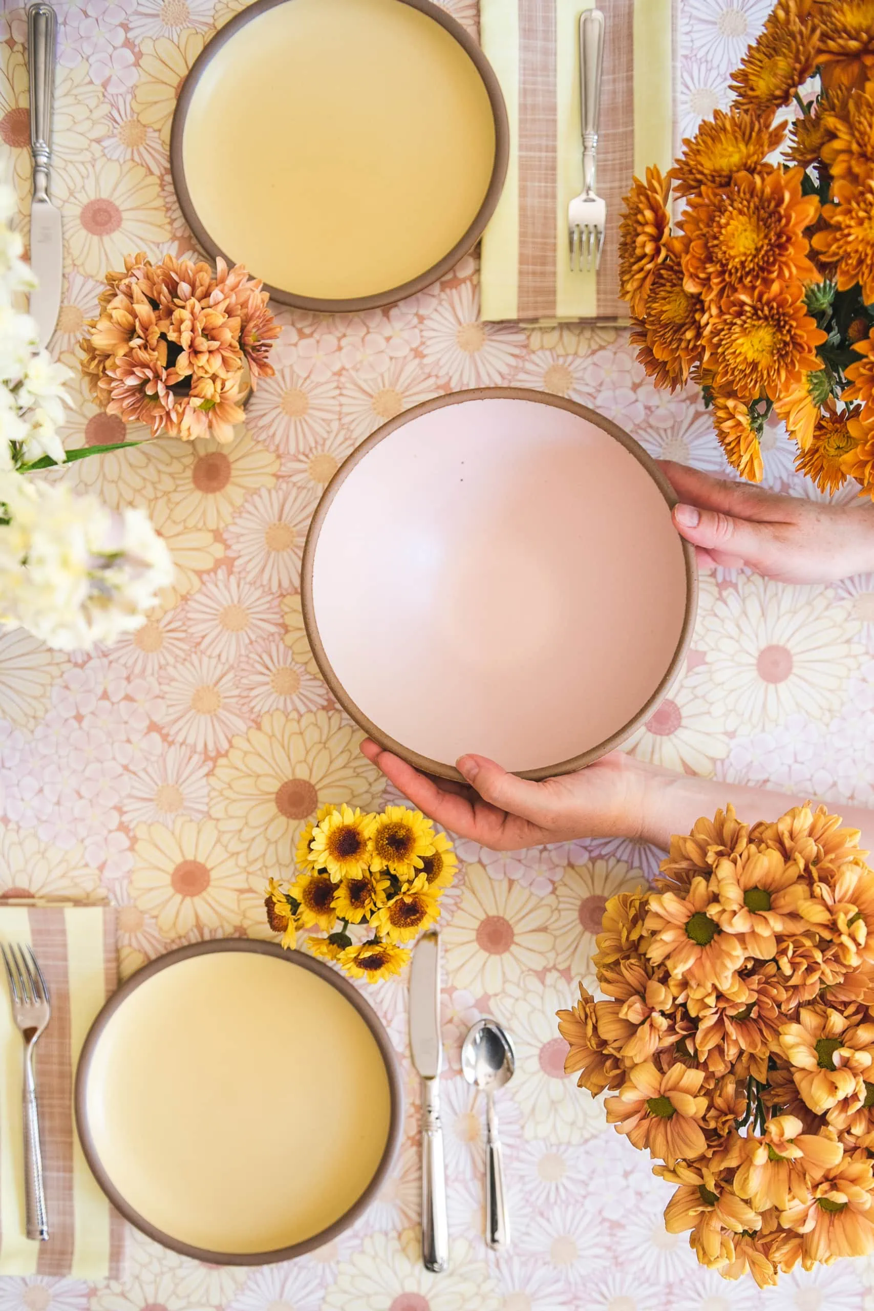
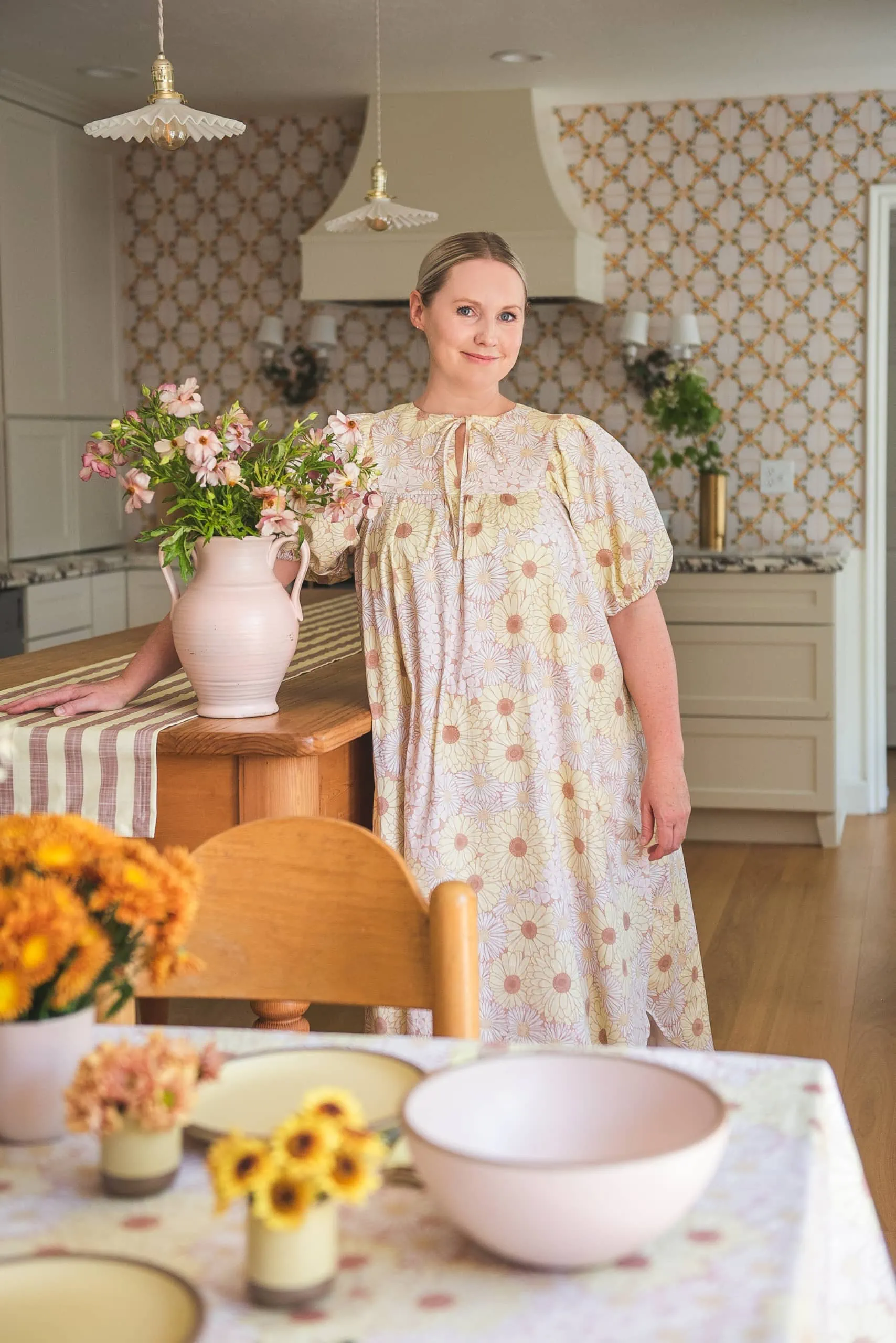
I celebrated my 41st birthday last month. Turning 41 is kind of…meh? I mean, it’s no 40 with the expectation to go all out ie: our girl’s trip to France (still need to blog about it! gah!). BUT, this year I decided to throw a small party for myself with my closest friends because that’s what happens when you have a birthday when you’re a grown up–you do it yourself! I partnered with our favorite, Spoonflower, who came out with a collaboration with East Fork, another North Carolina-based company that creates the most beautiful pottery, on all the details. Let me share the 70s vibe birthday brunch table setting I put together for it–I love how it turned out!
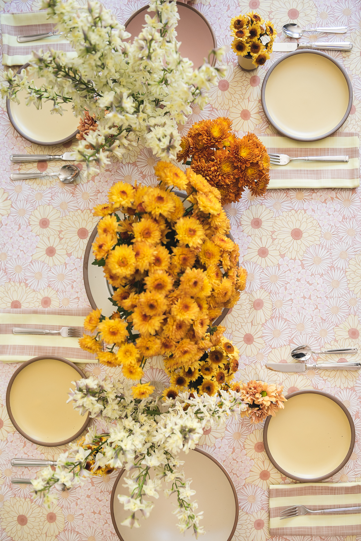
Spoonflower + East Fork
Spoonflower held a fabric design competition earlier this year with East Fork’s limited edition of pink (Piglet) and yellow (Butter) pottery, which are so so pretty. Paired with the more neutral browns of the natural pottery, it’s my favorite way to do color. I used Magdorama’s Edible Flowers pattern in sepia as the base for the theme. I love the 70s vibe it created with the daisies and mums with the sepia shining through in the back, just like the pottery. Shop the curated table setting collection with Spoonflower here. The 70s is having a real moment right now in interiors and clothing and I wanted to tap into it in the best way we know how for entertaining–through flowers!
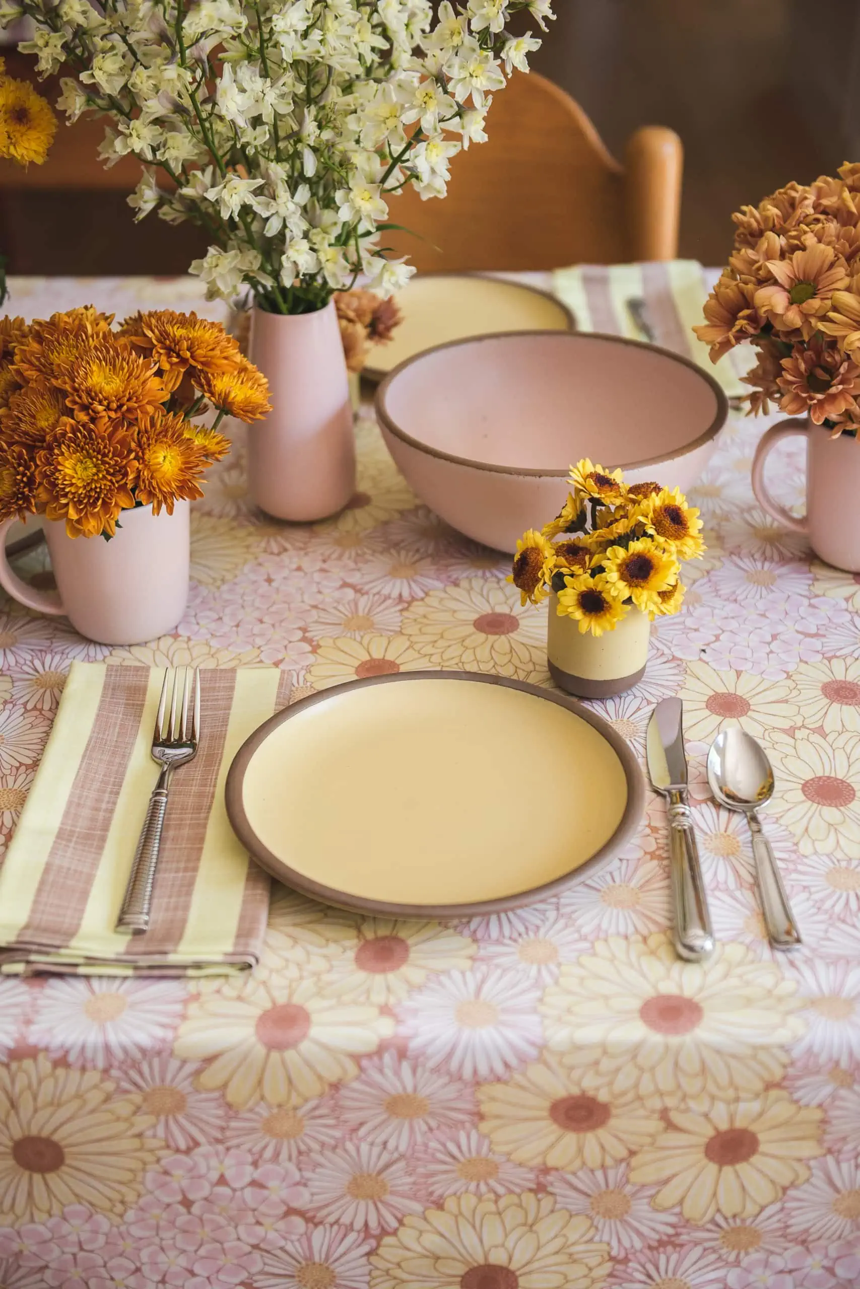
70s Table setting accessories
I wanted the 70s floral theme to spread throughout the kitchen, not just the dinner table, so I brought in accents throughout the space. Spoonflower is so awesome for things like that. There are tablecloth options in a variety of sizes and shapes, napkins, runners, tea towels, placemats, you name it.
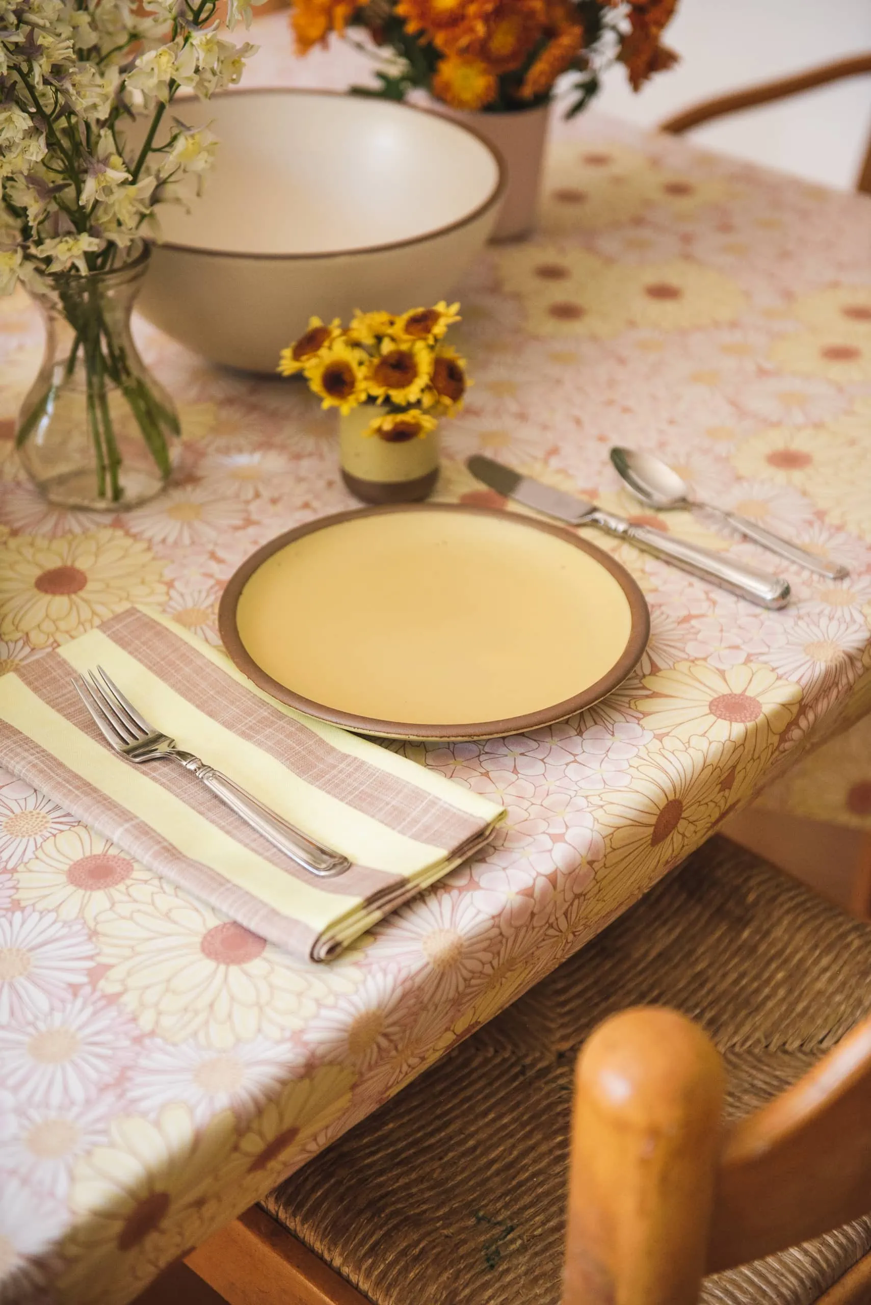
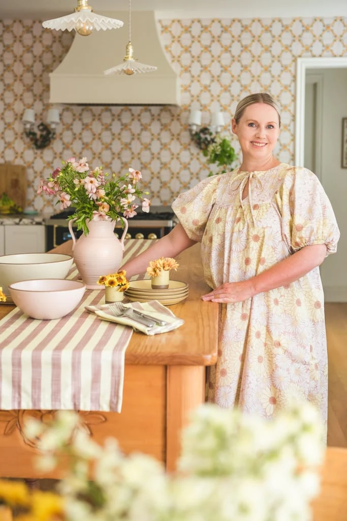
Starting with the kitchen table I used the floral pattern for the base as the tablecloth and worked my way up. I wanted a pattern that would contrast with the floral so I used a 1” stripe in the butter by Creativeinchi. I also applied this pattern onto the runner of the kitchen island table. To be honest, I’ve never been much of a runner-type girl, but I adored how it looked and how it brought all the elements together and now I’m on a mission to collect matching runners with my tablecloths.
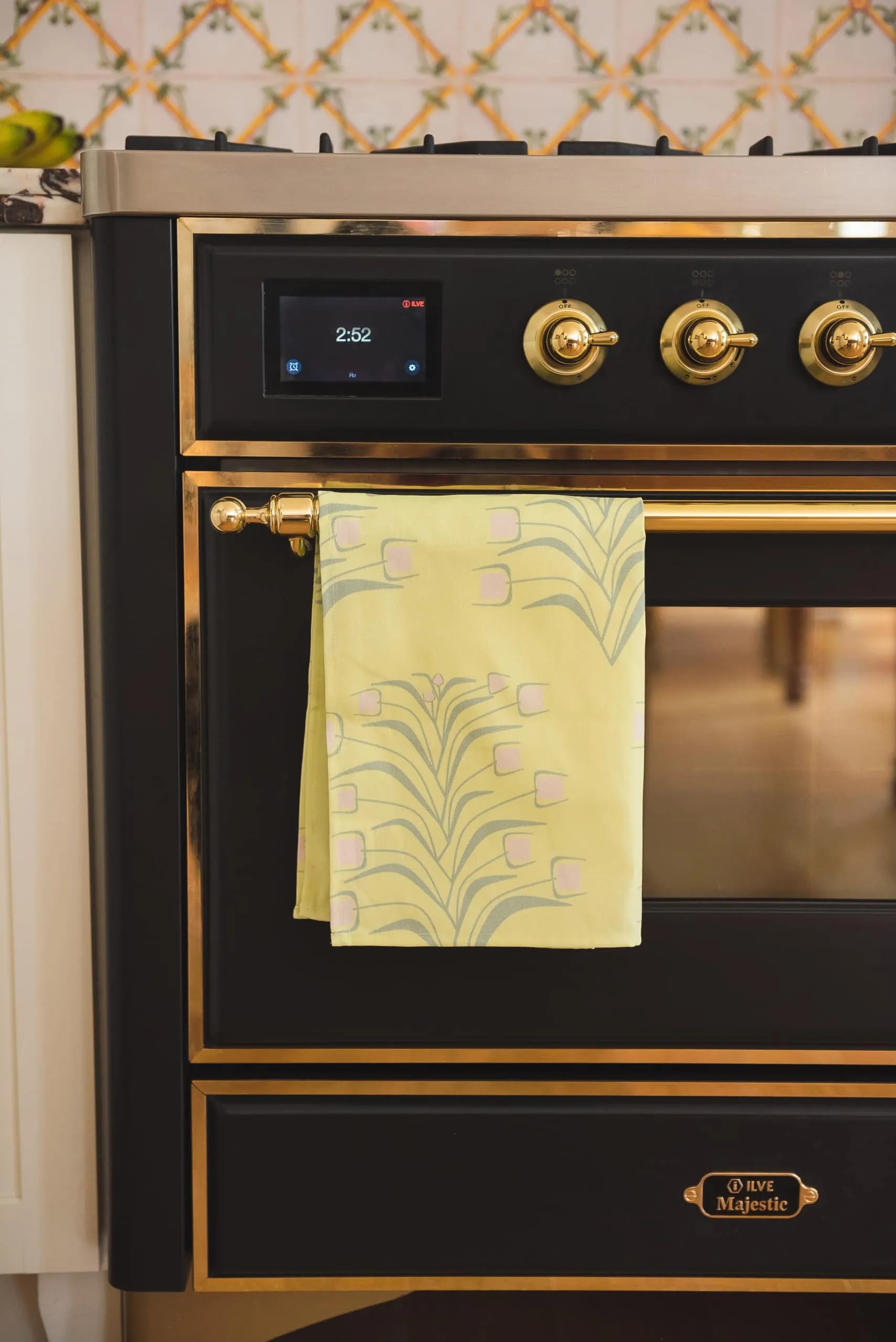
Lastly, I brought in another pattern with Caldes’ “Flowers and butter” tea towel that I hung on the oven and above the sink. I love how it looks super organic from afar, but once you get in you realize it’s pretty geometric, which is the artist’s specialty.
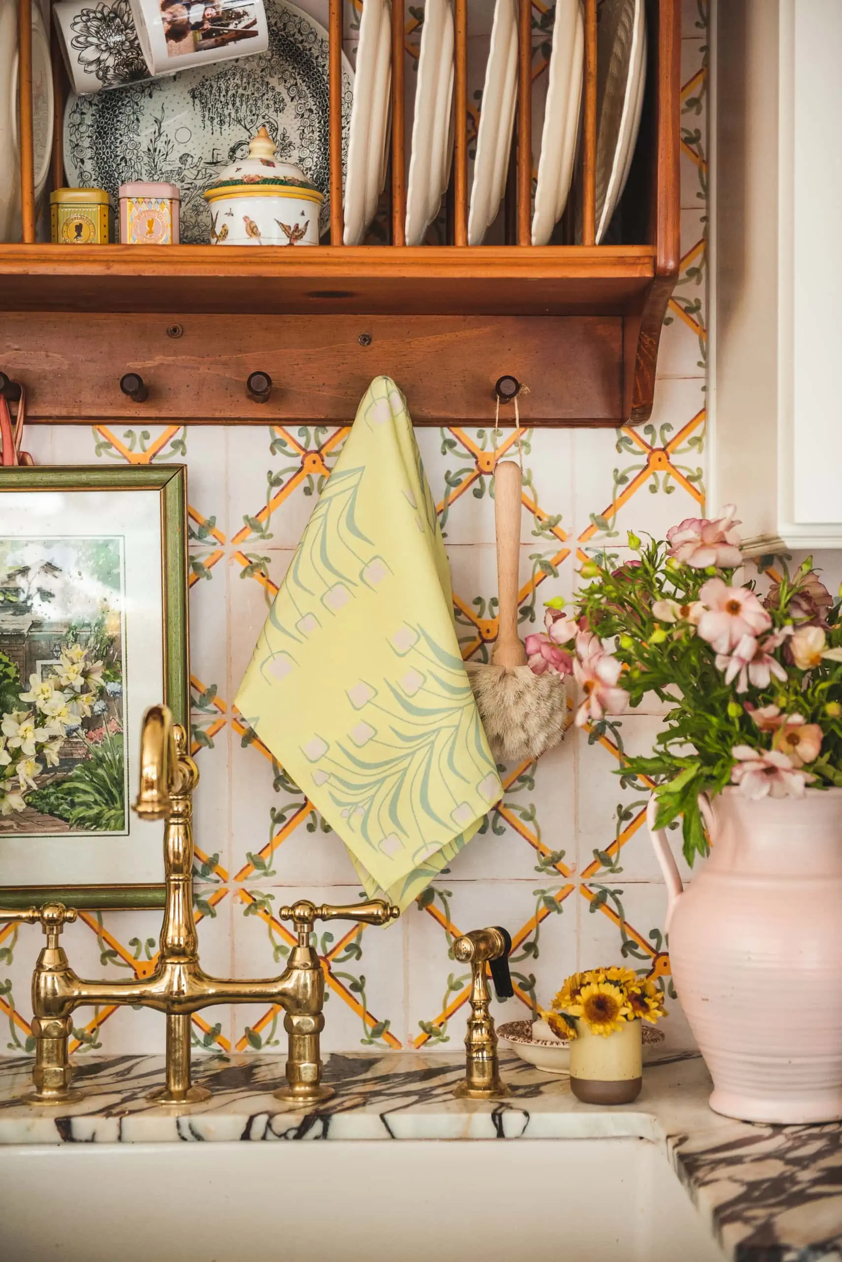
Here’s the rundown of the table scene:
Turning the floral into a dress
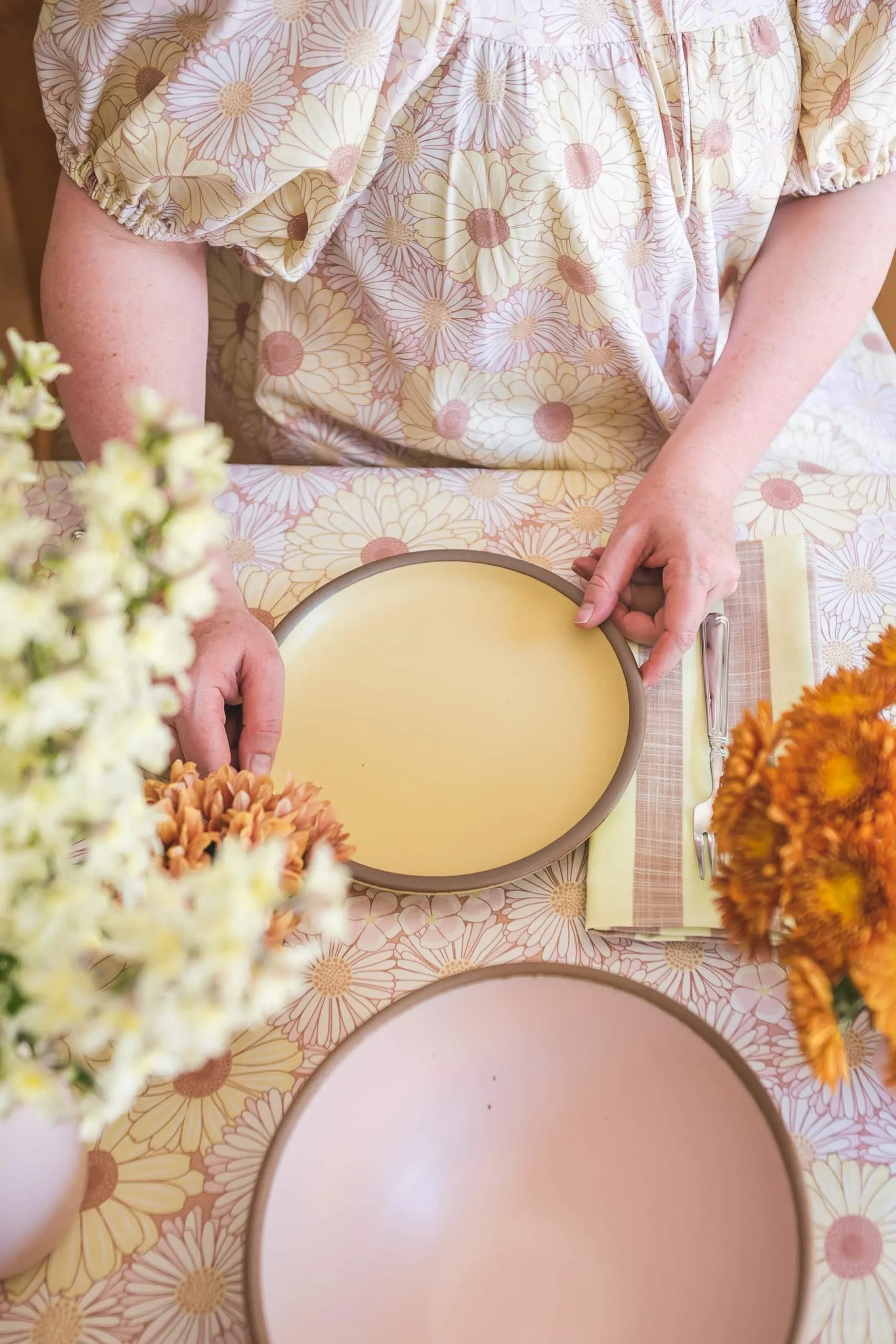
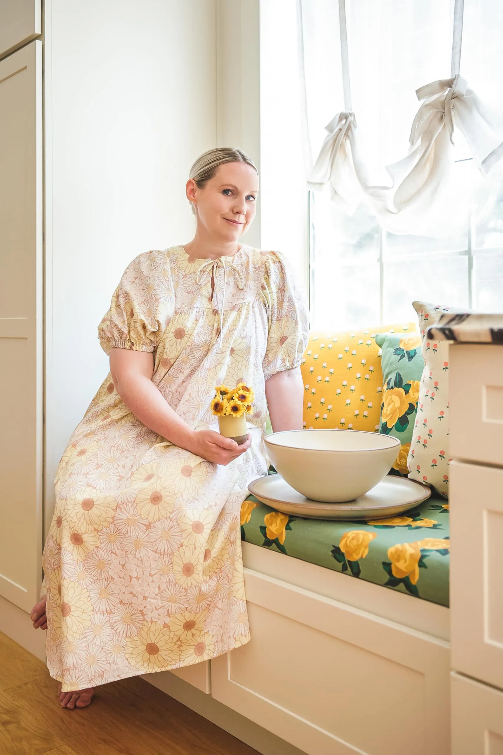
Ok, ok, I know what you’re thinking, “but why do you match the tablecloth?!”. Listen, matching the tablecloth is the new black…or something like that. Honestly, I adored the fabric so much that I wanted to wear it–ha! And now I’m going to write a lifestyle book about how all good hosts match their decor. It will catch like wildfire I tell you!
I made a list of some of my favorite dress patterns and got it off of there. It’s the Print Fantastique Vali dress using the Edible Flowers pattern from Spoonflower. We used the organic cotton sateen substrate and it’s so soft and gorgeous to the touch. I love how it turned out! It’s a bit thicker than some of the other cottons so the gathers were a bit bigger.
Setting the table
I used to be much more uncomfortable with deviating from a formal table setting, as taught to me by my grandmother, but I’ve gotten a bit looser over the years. I say, set the table like you want! Put the napkin on this side, put it on the other side. That said, I think there are some things that just make sense–putting items that most people use with their right hand on the right side of the plate. Same with the cup etc.
70s floral vibes
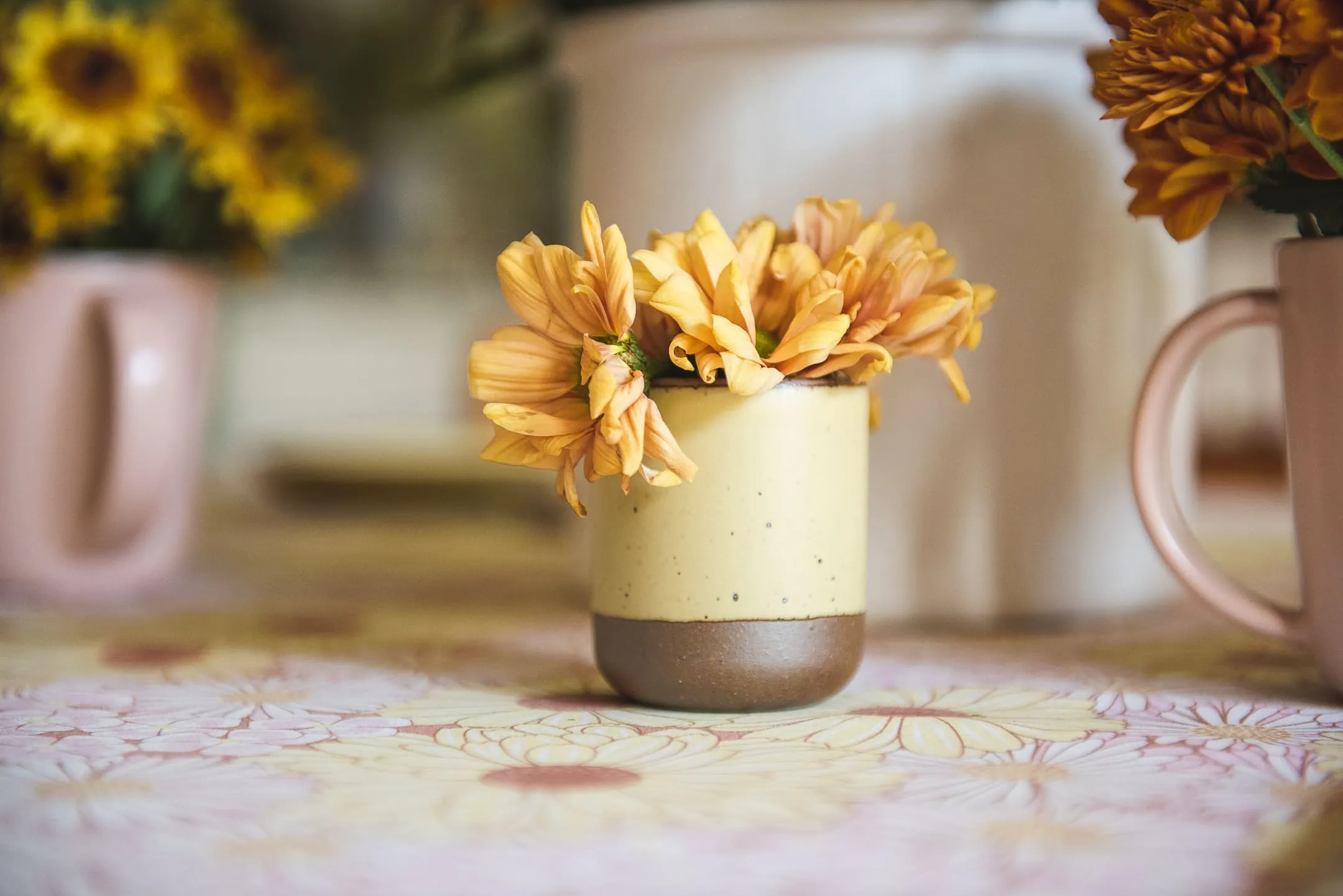
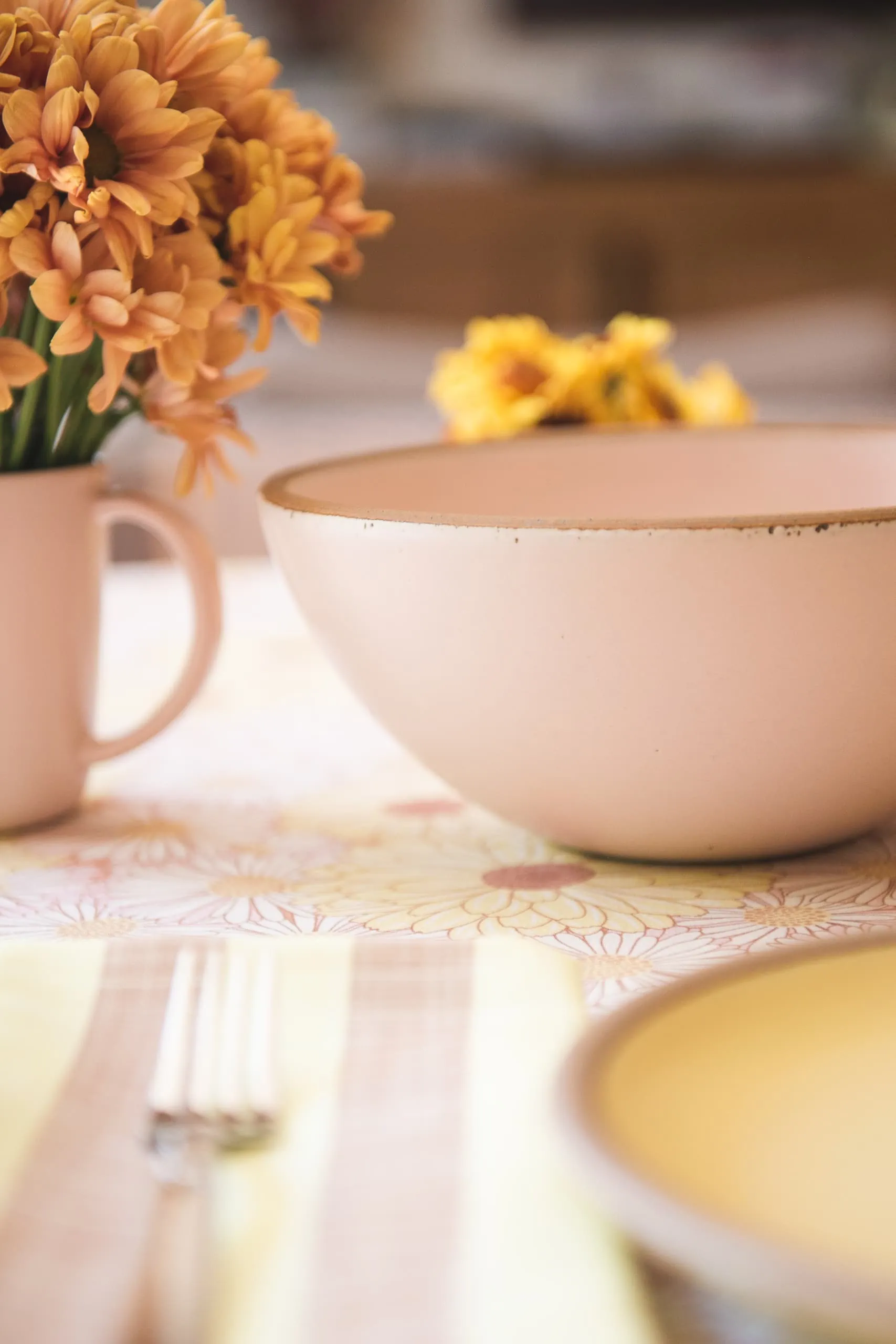
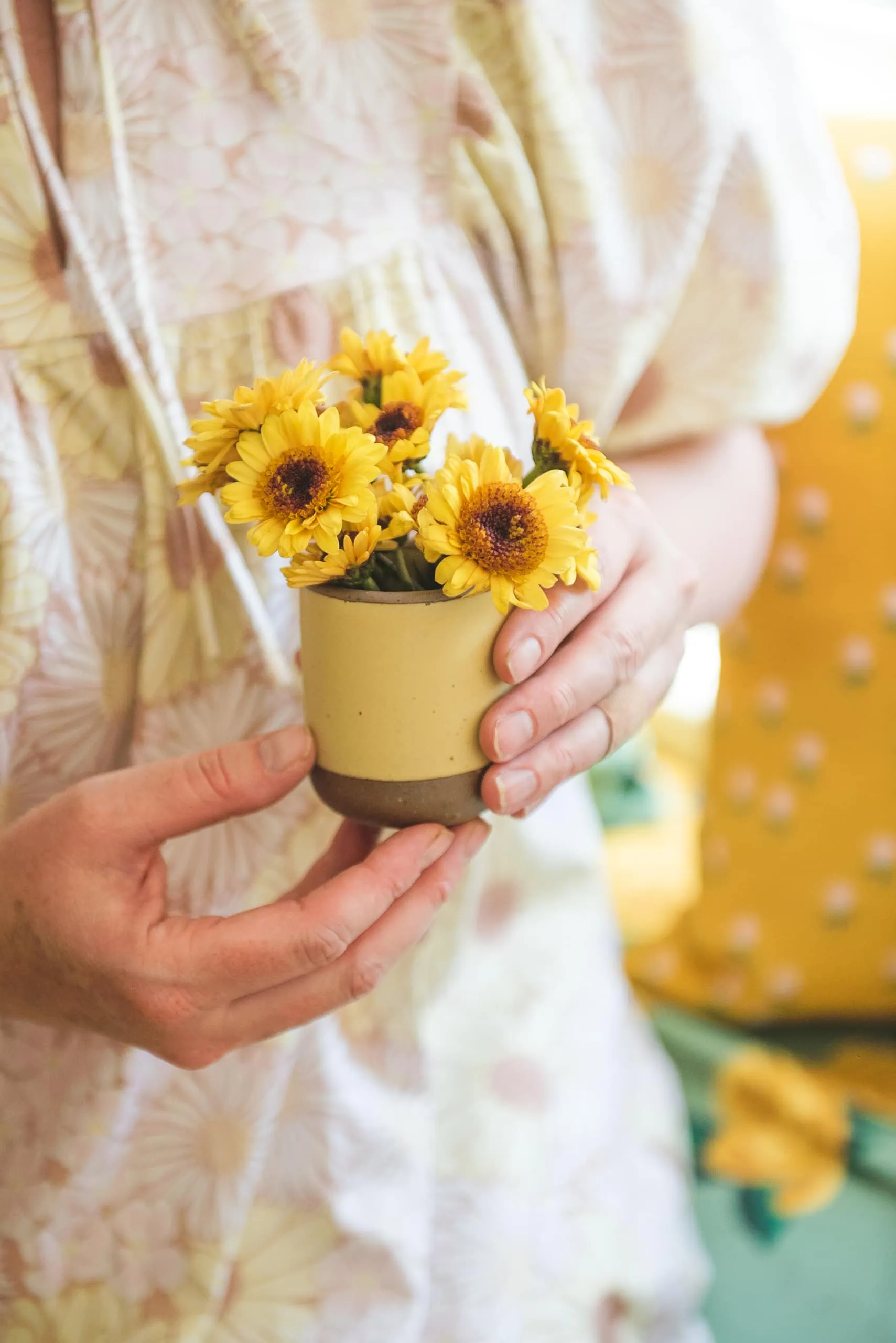
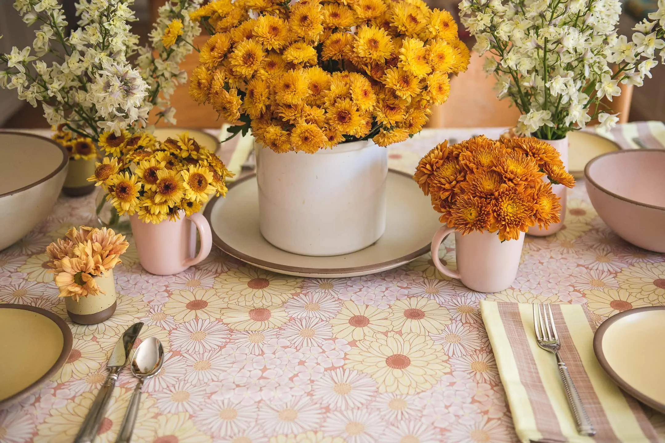
I had a ball going to the floral wholesaler and collecting the flowers. The feel was riding off the style of the tablecloth so I got LOTS of mums in various shades of yellows, browns, and soft pinks, and white delphiniums. I like to group all the same colors together rather than mixing them up so I put them in different vases, from big to small. I even used the East Fork tiny cups as vases too. My motto is: there are never enough flowers on a table.
Dinnerware
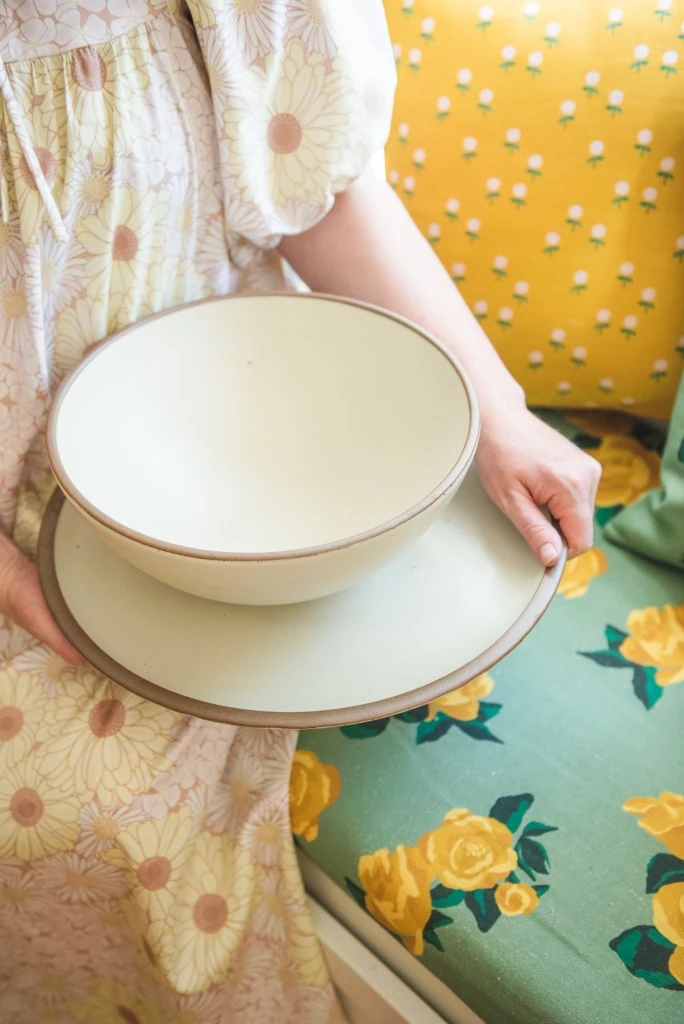
For the East Fork selections, I went with a combination of colors–the Piglet, Butter, and Panna Cotta. I love that they mix and match beautifully and that I can use them for various other settings too–they’re in my palette!
I went with the following items:
- Mixing bowl, Panna Cotta
- Popcorn bowl, Piglet
- Tiny cup, Butter
- Side plate, Butter
- Serving platter, Panna Cotta
Plus, the border of the natural pottery color, was a great frame on top of the all over floral pattern. They were made for each other.
Seating
I’m not sure you noticed a little change to the kitchen since last time I shared it a few months ago. I used to have a little green stripe on top of the bench in the kitchen, but I decided to switch it out for our new rose pattern in our Granny’s Garden collection. I included a few throw pillows too like our minni’s zinnies in cream and in yellow. It makes me so happy to look at it!
Here’s what we used:
I loved the challenge of setting up a table setting–it’s one of my favorite things to do. The making dinner part, not so much. We had a great time just sitting around chatting. It’s nice to get together even though we are all so busy. Now that I have a house that I’m becoming more and more proud of, but still have a ways to go, I’m much more interested in hosting people. I can’t wait to do more and more.
Spoonflower is having another design competition with East Fork for the fall collection of their core colors–it’s so fun to see everyone’s designs. Read more about it here.


Comments