As you’ve seen over the last year, I’ve been helping my business partner, Mary, renovate her house into something that better suited her tastes and needs. Mary loves the concept of a destination hotel: somewhere lovely and interesting, welcoming and restful. She wanted her home to be a place to retreat to, and in times like these, she got what she wanted!
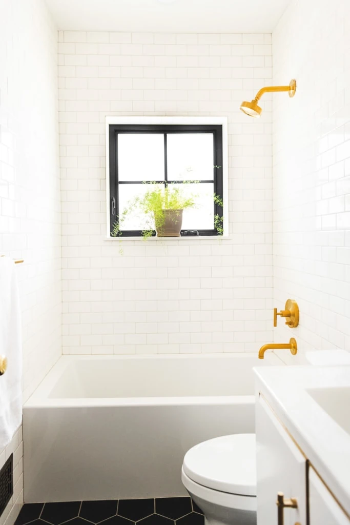
In collaboration with Wayfair and Kohler for their #wayfair1room challenge, we are revealing Mary’s bathroom transformation! Her bathroom is tiny and it’s the only bathroom in the house, so it needed to be functional as both a master and guest bathroom. Mary initially thought to put lapis blue in the bathroom, but instead chose to continue the color scheme of the kitchen into the bathroom and went with white. She wanted very clean lines and architectural features that could stand on their own.
Come take a look!
White Bathroom Renovation
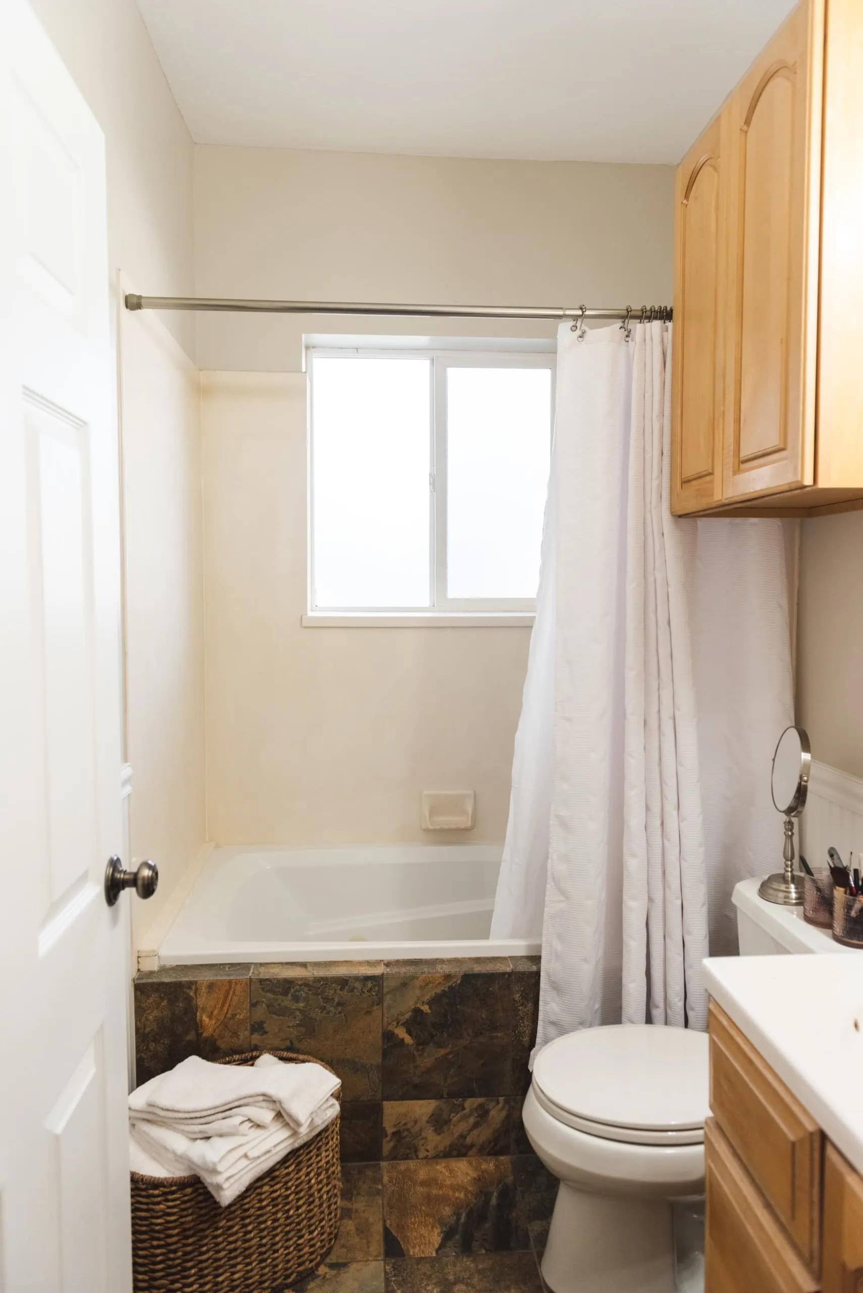
While a destination hotel was Mary’s inspiration, let’s look at where she started. It has a MAJOR case of the blahs, but you be the judge.
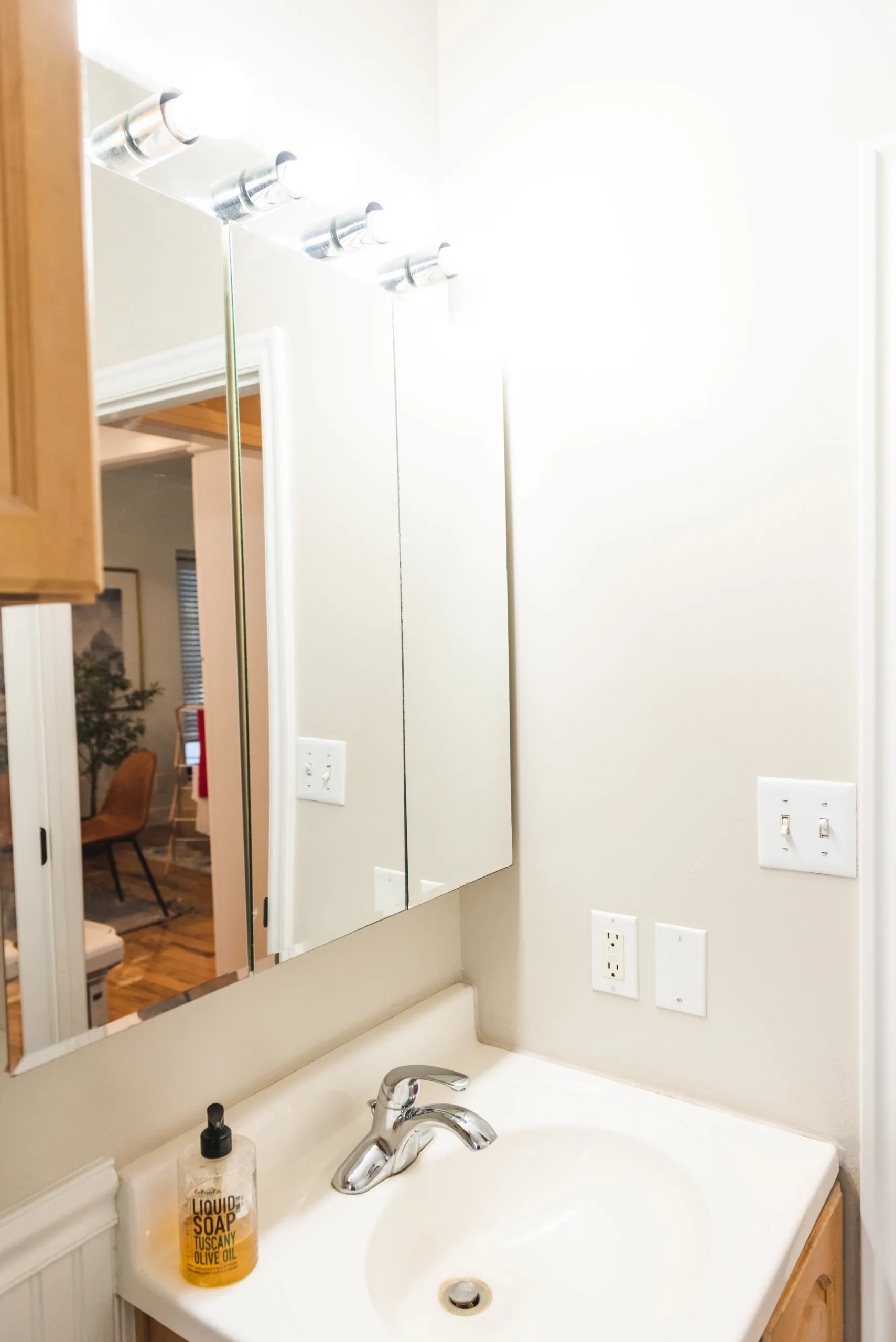
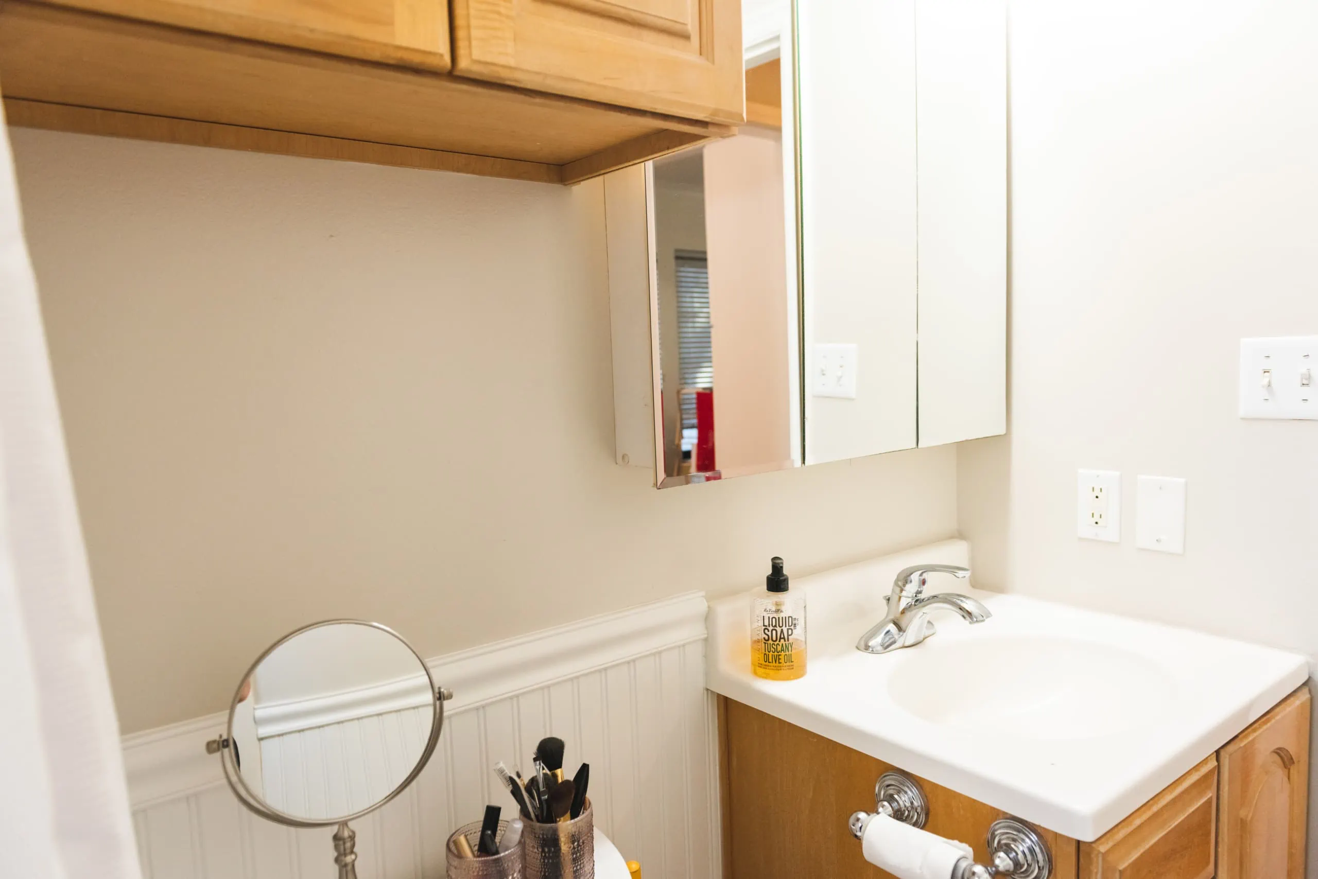
Before Pictures
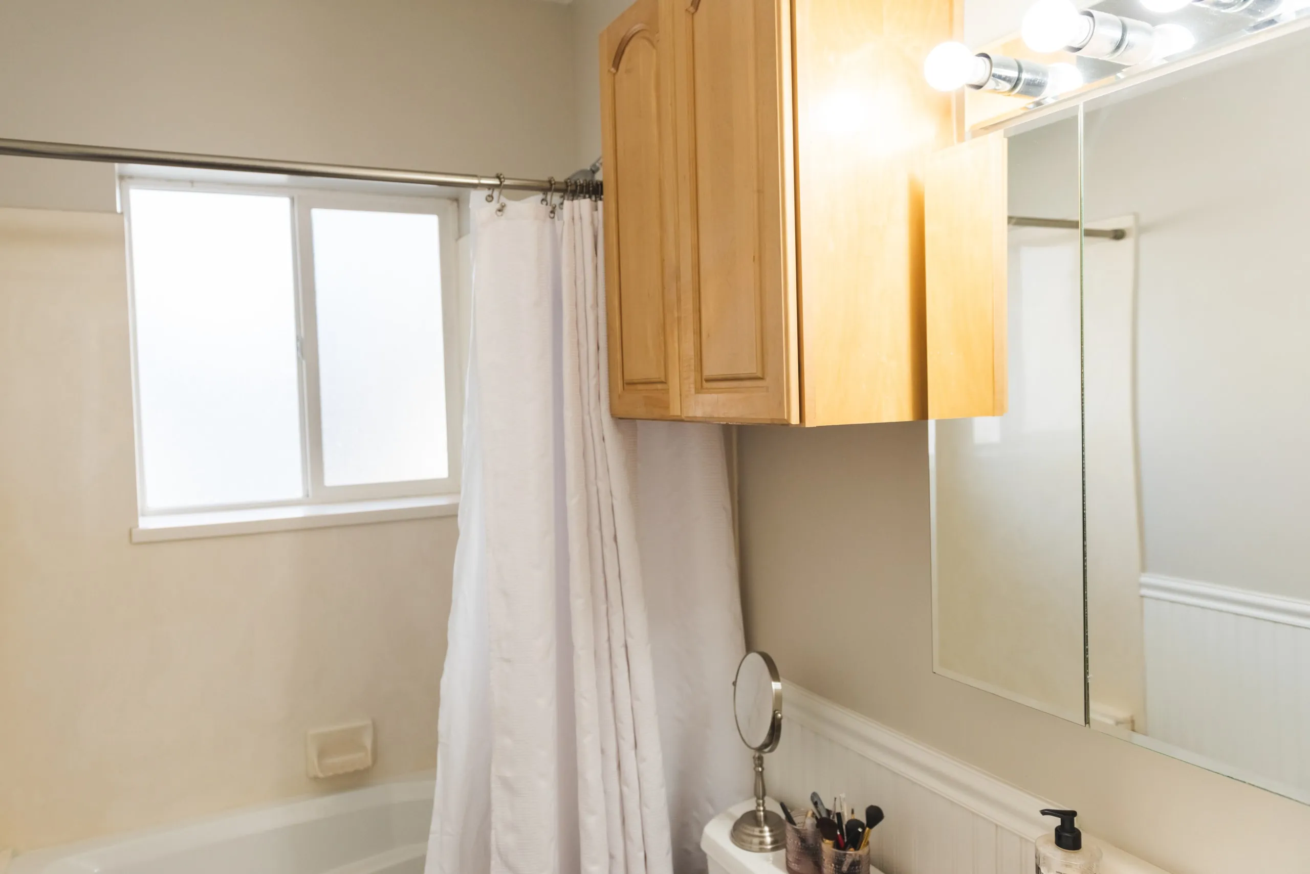
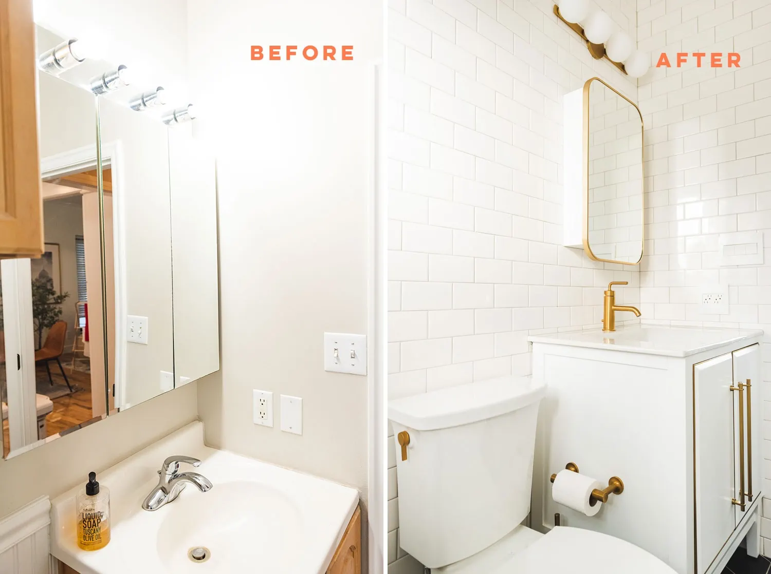
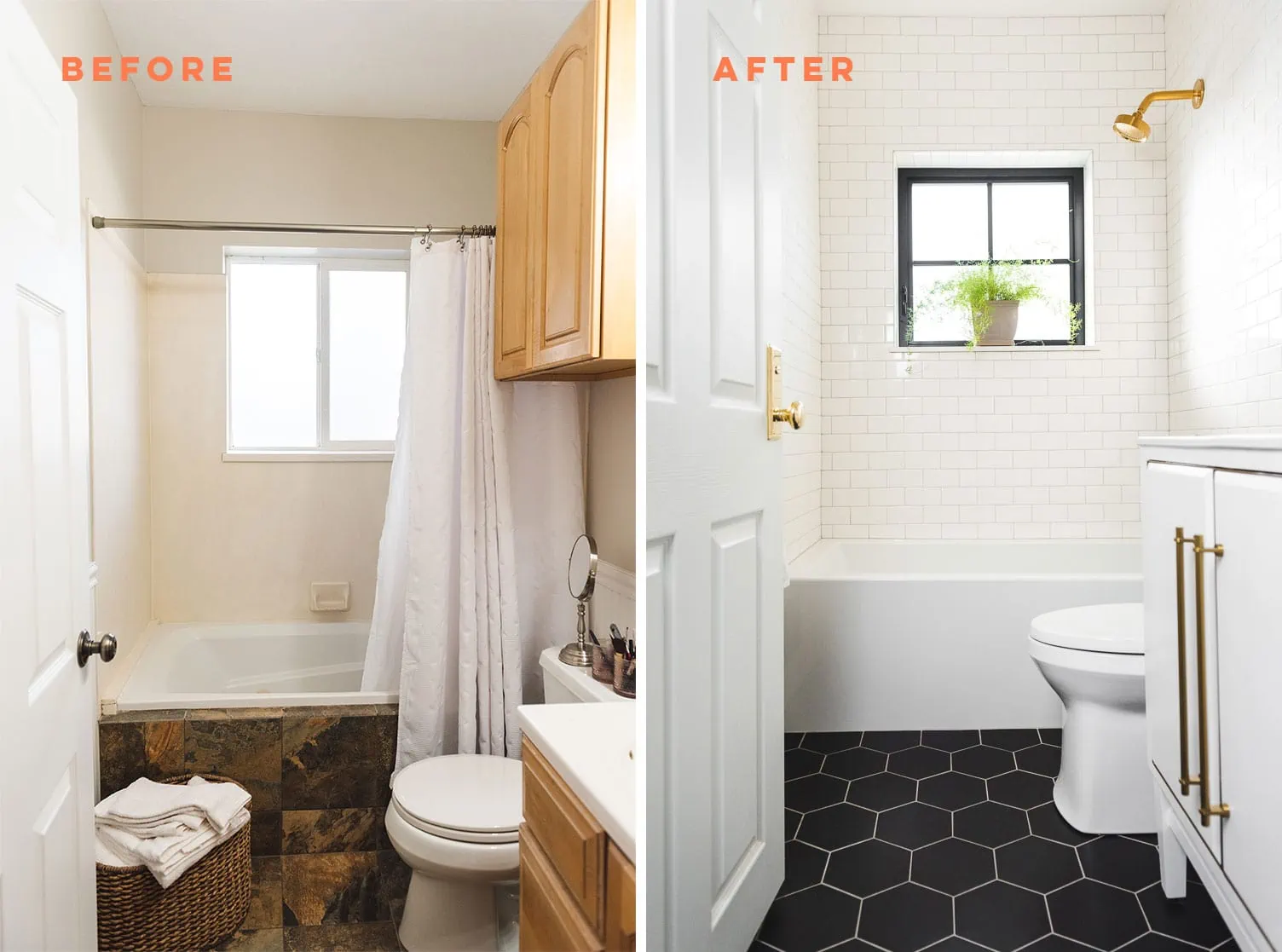
Ok, heres’ what she started with. Pretty standard. Aside from a few impracticalities like a floating storage unit and sink that didn’t really fit the space, the colors and finishes were not to her taste so she knew it had to be a complete overhaul.
Progress
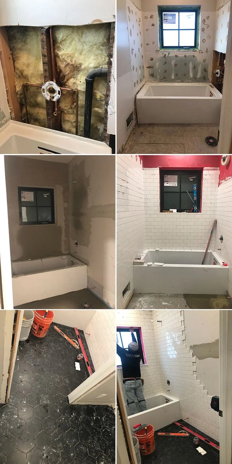
Mary started by tiling the bathroom from floor to ceiling. She wanted black hexagon tiles on the floor and white subway on the walls and lining the window. To finish the look, Mary removed the casing around the door and tiled right up to the jamb. It continued the seamless lines right up to the door, and looks spectacular!
Here’s some of the painful moments of ripping out the old fixtures.
And now starting to make progress by adding in the tub and tile.
It’s starting to take shape, huh?!
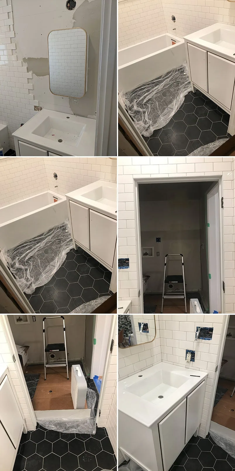
Now for the medicine cabinet and vanity:
Bathroom Fixtures
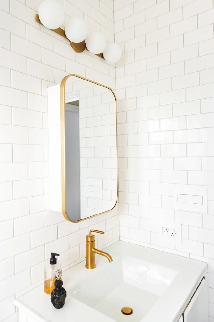
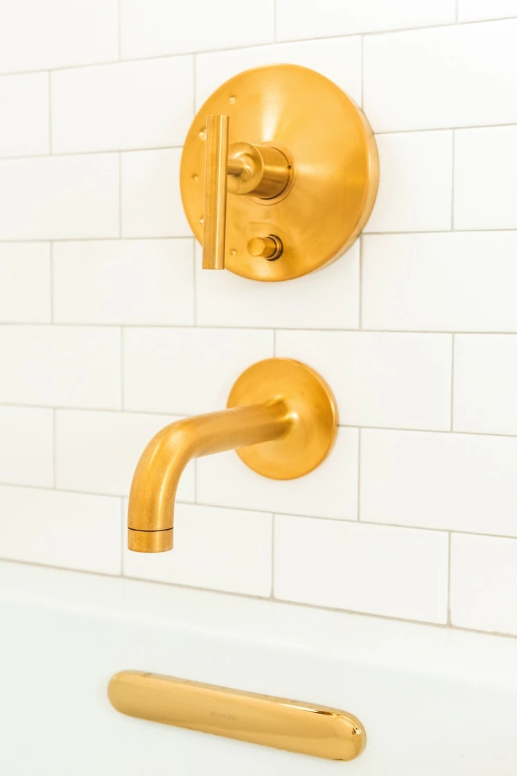
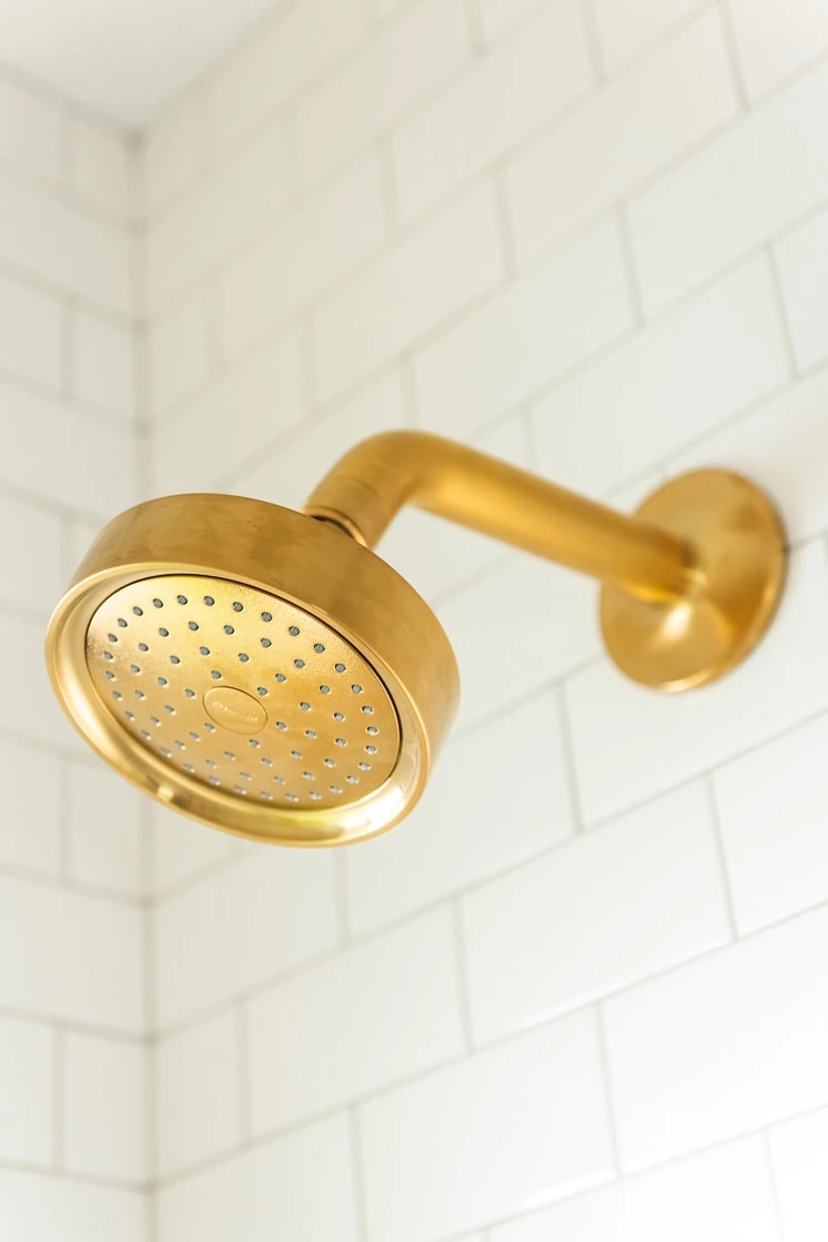
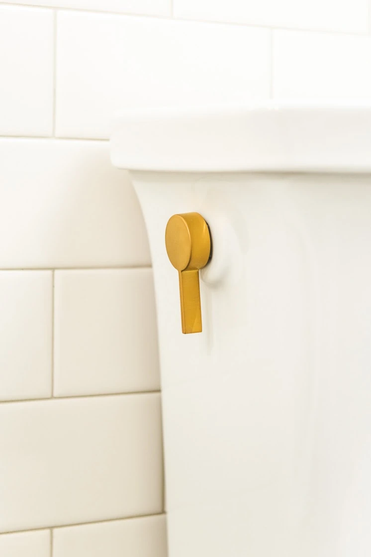
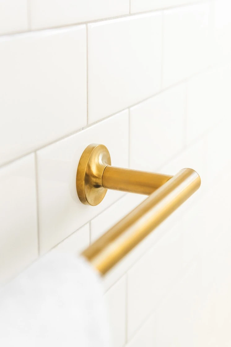
Wayfair and Kohler helped Mary out while she was selecting fixtures. She wanted pieces that looked contemporary, but still had warmth to them. Kohler had the perfect solution in the purist collection in the Vibrant Modern Brushed Gold finish. The best thing about selecting all your own fixtures from one collection is that everything coordinates perfectly, right down to your toilet lever, toilet paper holder, and towel rack!
Bathroom Storage
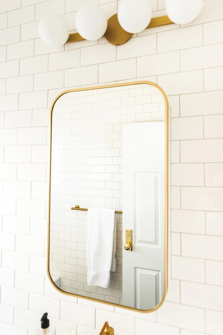
We contemplated adding some shelving for added storage, but Mary loved the clean tile walls so much that instead she decided to look for storage with a medicine cabinet and vanity. We couldn’t recess the medicine cabinet due to structural constraints, so it was installed before we tiled so it could be tiled around and have a more permanent look. For the vanity, Mary selected a piece with a pull-out drawer that fits around the existing plumbing. It maximizes storage, but still hides away when the doors are closed.
Handles and Hinges
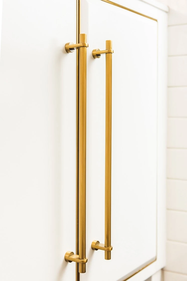
It really is the details that complete a room, so to wrap up her bathroom renovation, Mary was sure to select door handles and hinges in an unlacquered brass that complements all the brushed gold finishes throughout her bathroom. It all ties together so nicely!
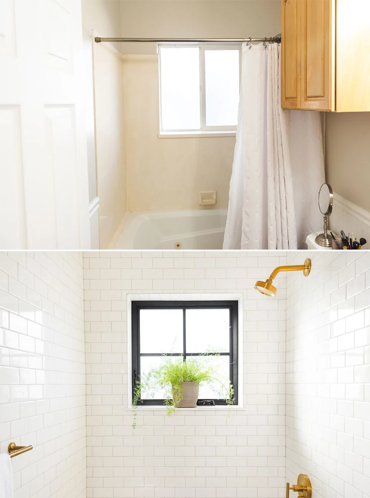
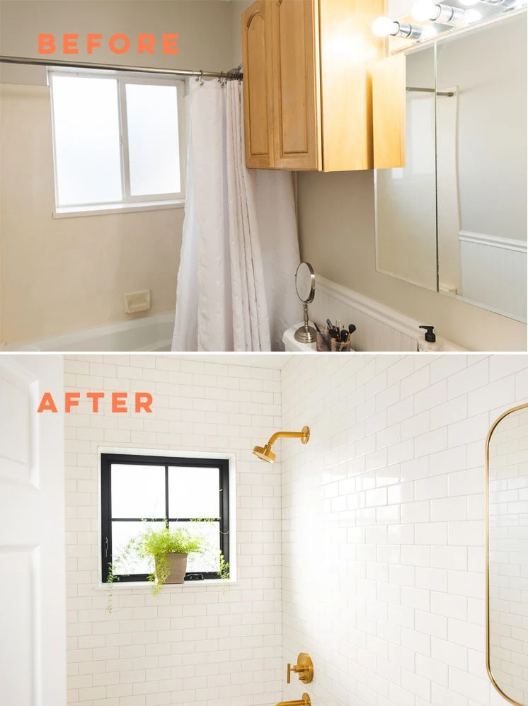
Before and Afters
Now for the moment you’ve been all waiting for. The side by side before and afters. These are so fulfilling! What do you think?
So good right?! And I think it totally fits the bill for her destination hotel. It feels clean, modern and interesting all at the same time.
Thank you to the Wayfair and Kohler One Room Challenge for making this happen!



Comments