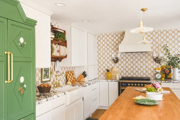
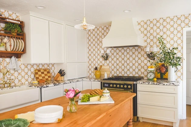
If you’re just joining in, we filmed an episode of a home renovation show called In With The Old on Magnolia Network and it’s available to stream on HBO Max and Discovery+ now!
Kitchen week continues! Not one to be brief, I’m going head on into ALL the details of our kitchen cabinets and a review of our new cabinets from Cliq Studios because this was a beast of a project and I’m going to let you in on every single over-thunk detail. Let’s go.
You can see all the before and after photos hereYou can see the kitchen renovation hereYou can read more about our antique-inspired oven range here
Materials:
Cliq studio Cabinets review
One of the first things I did when we moved in was to get going on phase 2 of our kitchen renovation. As you saw in our before and after post, the kitchen left much to be desired. I connected with Cliq Studios once again on the project. We had previously worked with them on Mary’s modern kitchen (Mary was my business partner for a few years) and I loved the quality and functionality. I knew we would be in good hands.
Plus, Cliq Studios had been acquired right before we bought our house and it’s better than ever, so it was a really great time. With their excellent customer service, I was in really good hands and they made the process so so great.
Before pictures of our kitchen cabinets from Cliq Studios
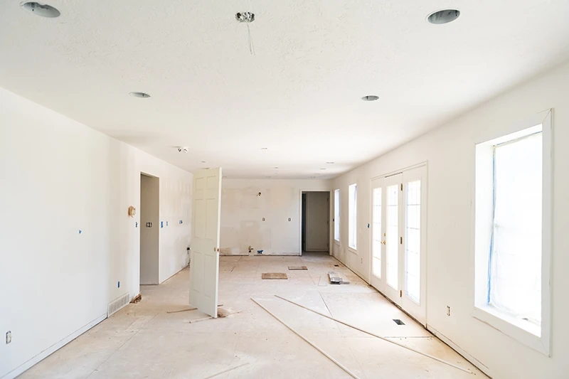
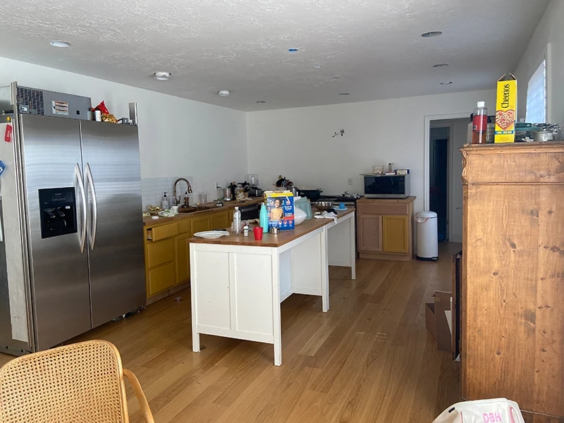
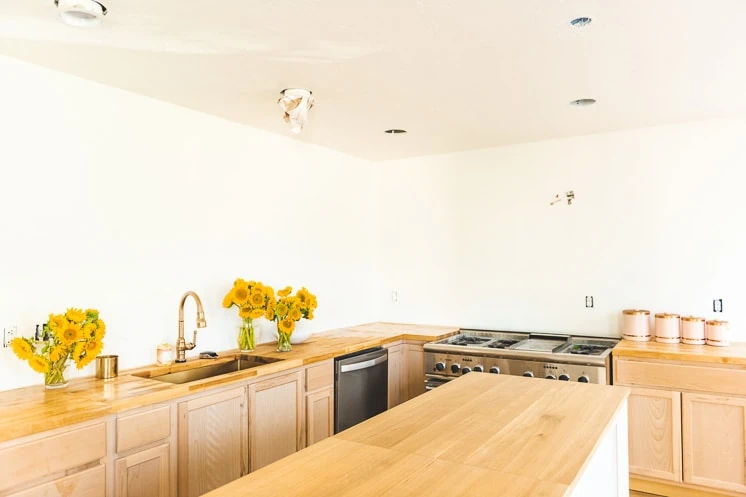
To remind you, here’s the progress of our kitchen until now. When we first moved in, the space looked like this:
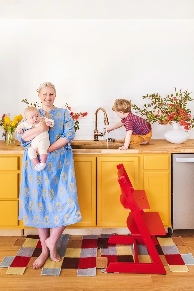
We immediately put in super basic cabinets so we could move in quickly while we figured out how we would design in.
Super super basic and tragic really.
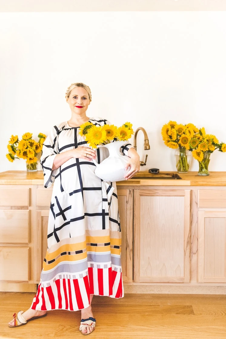
But anything spruced up with tons of sunflowers will always be bright and chipper.
Kitchen renderings of the cabinets from Cliq Studios
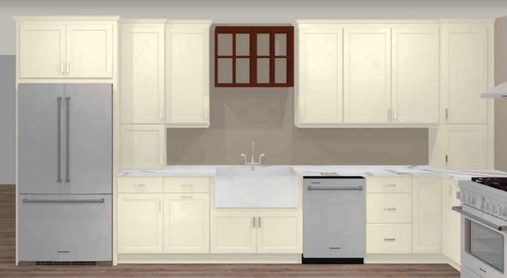
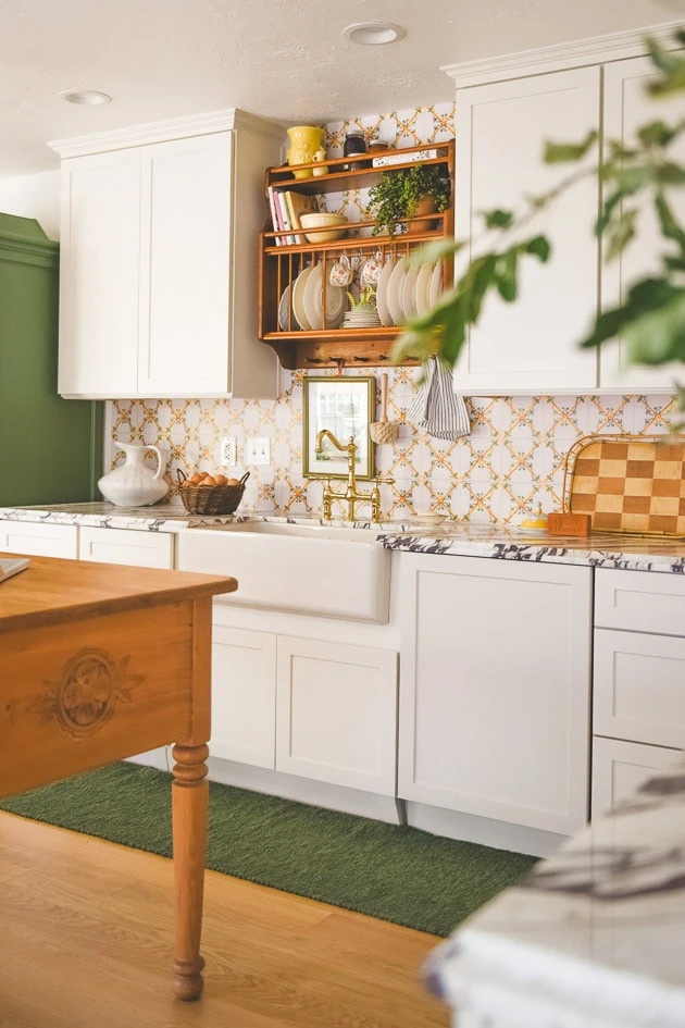
I began working with their designer, Erin, who was so patient with me as I came with a lot of direction. I supplied her with my inspiration board and the specifics of what I wanted it to feel like. We also had some existing pieces to work with like the plate rack. You can see one of her first renditions here:
In this one, we tried out having an appliance garage on both ends of the counter, which in hind site, I don’t mind for practicality. This was also before we decided to make the fridge into a cabinet and not integrated into the cabinets.
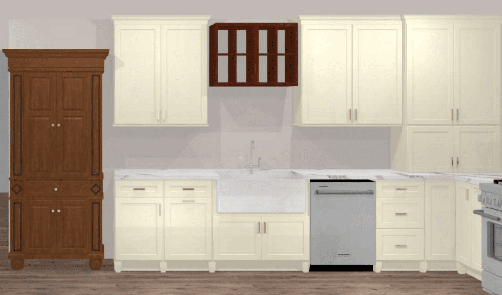
This rendering is what we went with. Please note, she wasn’t designing the furniture that we ended up with for the fridge, but using them as placeholders.
You can also see how we added in legs so that it felt more like an old English kitchen.
Floor planning of the kitchen cabinets
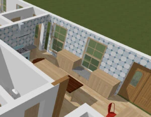
Prior to Erin, I get an iPad for my birthday so I could get a renderings app and try out some floor plans myself. Here are some combinations that I tried out. And I tried out everything!
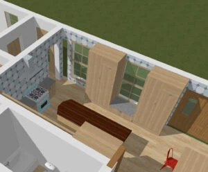
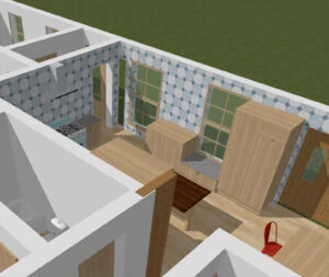
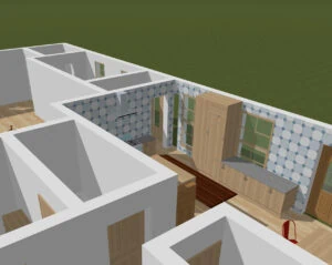
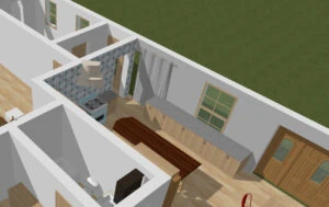
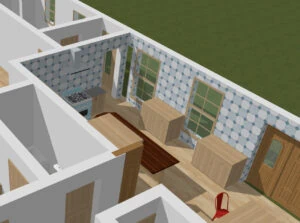
Even some scenarios where I covered up some of the windows, which honestly, I wasn’t opposed to, but nobody else liked the idea.
Style of cabinets
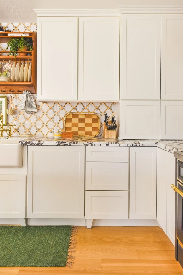
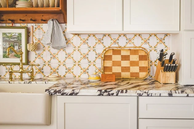
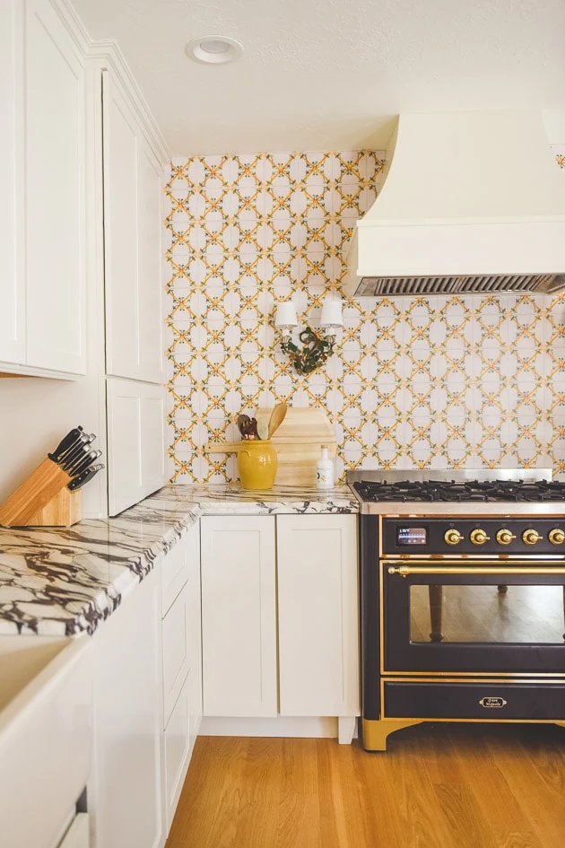
I used Cliq Studios’ Signature Plus line in their Newport style. This is their true Shaker style with the clean lines. I actually prefer the Fairfield style with the extra bit of ornament on each door, but we are planning on doing a DIY to it at some point where we add in our own colored trim onto the inside, which is why I went with the Newport style. If you’re looking for inset cabinets they do have that option too (see here). I love inset cabinets myself!
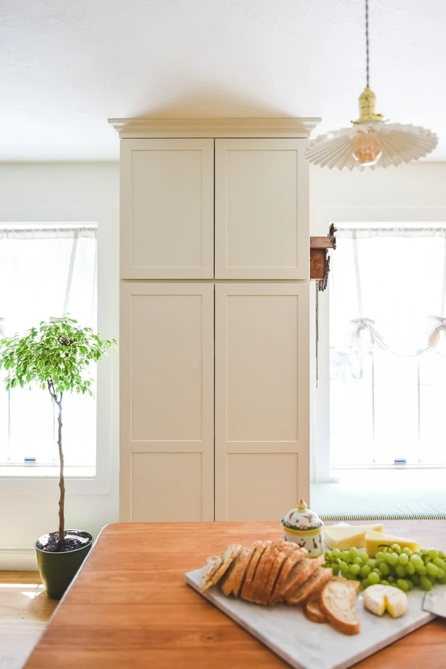
Here’s what we landed on for the window wall. A tall floor to ceiling set of cabinets with pull out drawers. We use this as a close pantry. Our actual pantry is down the hall and through the laundry room and I guess we’re lazy because a lot of things just didn’t get put back because of the walk. Thankfully, we had lived in the house long enough to know that this was a problem so we designed a spot for quick food grabs. I LOVE having this here! It’s really helped a ton!
This is one of the photos where I really see how not having hardware on yet really detracts. I think it will be much more interesting once it’s on there, but this is for now until I decide what direction to take the tile walls, which I haven’t fully designed yet.
Bench
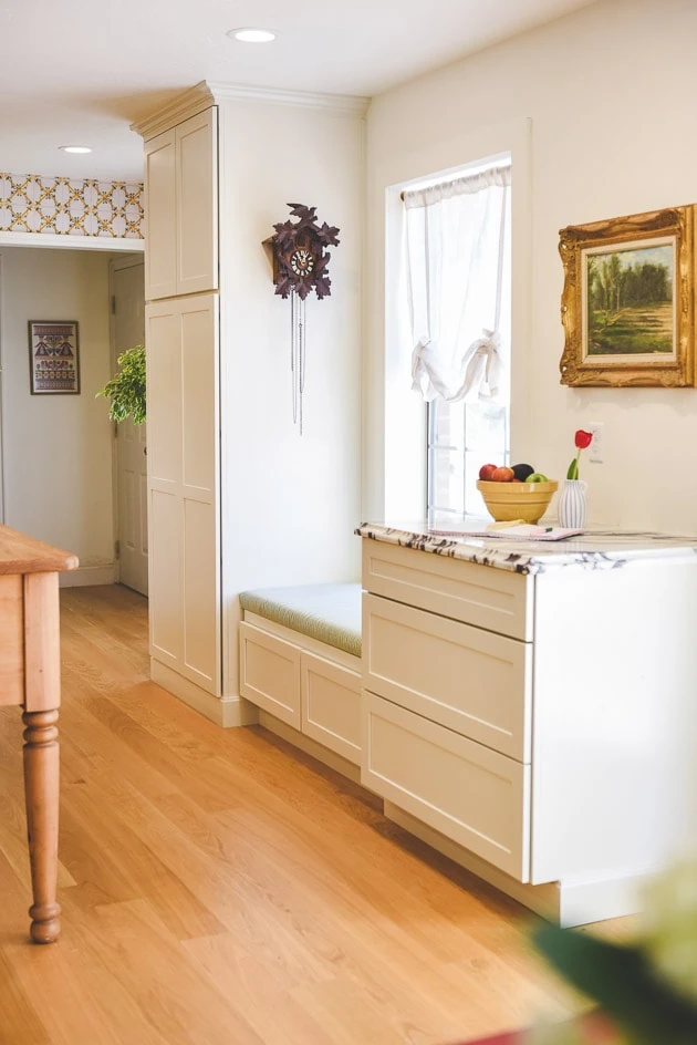
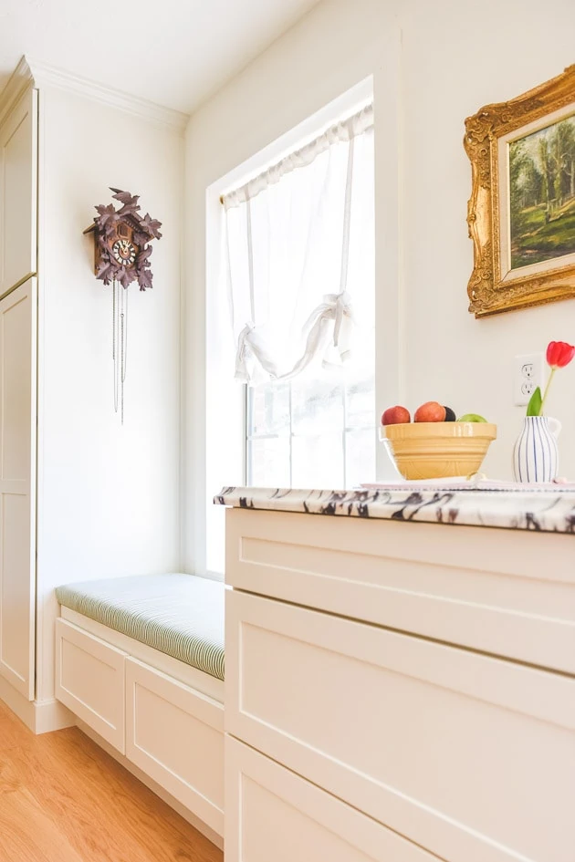
One of the elements I’m most happy with is the decision to include a bench under the window. We purposely didn’t put bar stools in the kitchen because I anticipate them getting in the walk way and our dining table is so close that we didn’t really need more seating. However, it’s so fun to have a little spot while we spend time in the kitchen. I’ve even taken a nap there! It leads into our backyard where we have some neighborhood deer run by.
Appliance garage
Another element I’m very happy with is our appliance garage that sits on the counter. I just wish I could have had it expanded even more because I like to hide it all.
Cliq Studios review
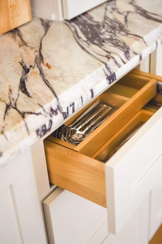
I had already seen the quality of the cabinetry from Mary’s kitchen renovation and I was already a fan so it made the decision a no-brainer. The touch feels smooth and the cabinets and drawers close like butter. We have some nice features like a lazy susan corner, a pots and pans drawer, roll out trays, and a two tier drawer for knives and forks (see more options here!). Honestly, happy customer here! Couldn’t ask for anything more! Plus, they have all the classic styles with great colors.
Regrets
I have a few regrets about the design. I wish I would have either added in a big of open storage to add in more visual interest or put in glass into at least one cabinet because the block of cabinets on the left seen below feels super blocky to me. But, I was also worried about open shelves or glass because of needing to keep them tidy. So for me it was a toss up.
Ok! That’s it for now. Stay tuned for more details about the kitchen tomorrow! Let me know your thoughts or if you have any more questions about our cabinets!


