Week 4 of our one room challenge is here! This week it’s all about the details. We’re showing updates on windows, trim, lighting fixtures, and outlets.
Read below for all of the details, and see links below for previous one room challenges!
We are four weeks into our One Room Challenge and the sprint to the finish line has begun. With a tight timeline, sequencing and scheduling are significant factors, and this week we tackled four large components:
- Windows from Amsco Window’s Restoration Series
- Trim from Metrie’s Option M
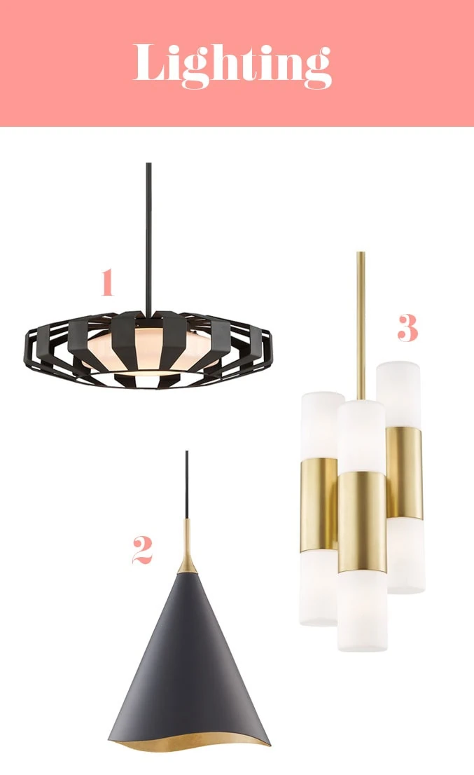
- Lighting fixtures from Hudson Valley
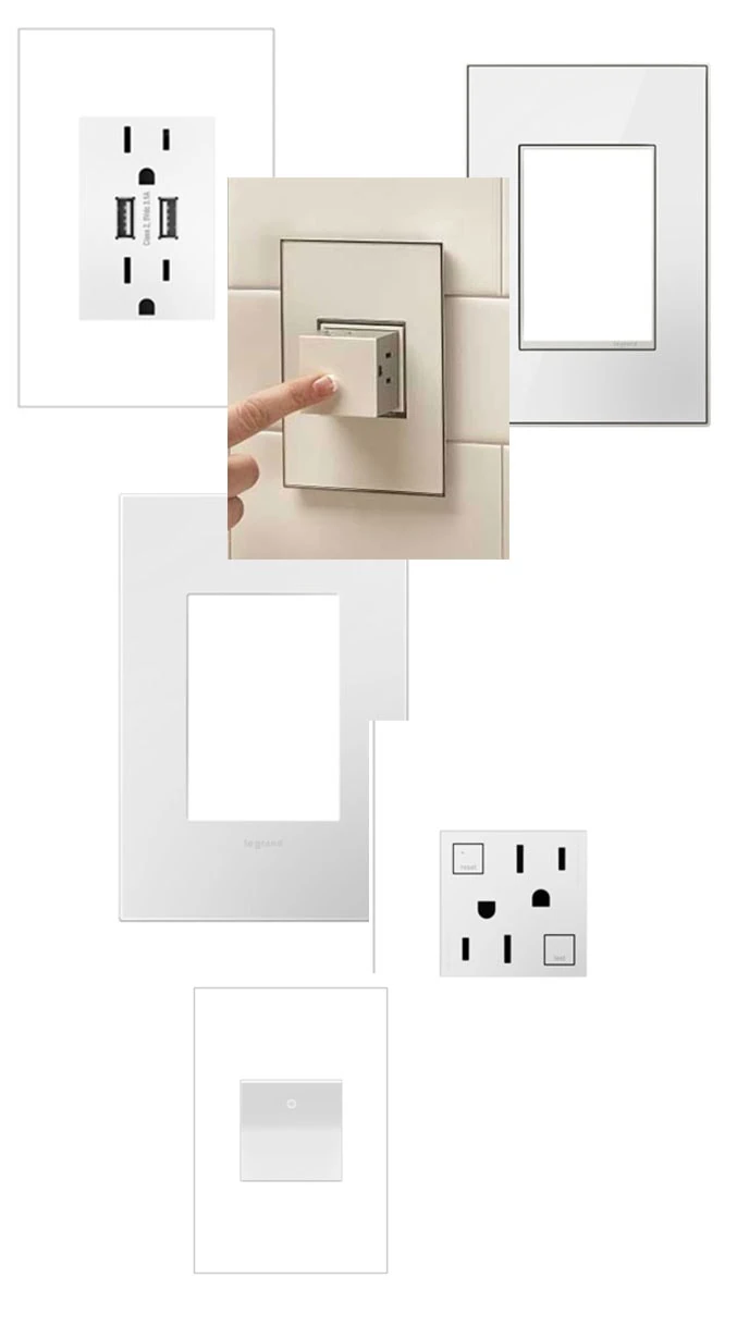
- Switches and outlets from Legrand’s adorne Collecton
We’re going into a LOT of detail here and it’s all to help you know what to avoid and what to do in your own renovations. Let’s go!
WINDOWS
As you may recall from Week 1 of the challenge, more natural light was at the top of Mary’s wish list. Making the window over her sink bigger and replacing her other windows to match was therefore a top priority. Of course, retrofitting windows can have challenges, and in our case these included the following:
- The home was built in 1901 and is a smorgasbord of materials.
- Not one wall is either straight or square.
- The exterior is stucco with a very old, mesh, chicken wire, crazy town base.
- Reframing a window with structural unknowns can introduce hurdles.
Amsco Windows Restoration Series proved the simplest, quickest, highest quality, most elegant solution for addressing our challenges and incorporating our design aesthetic AND they happened to be located right around the corner from us in Salt Lake City. Amsco Windows serves every geography, and they have a window for every remodel project and every remodel budget. They helped us navigate all the considerations you should weigh. We were so lucky to find them, and they were wonderful to work with. Bonus!
When selecting windows for a remodel, you should consider the following (all of which Amsco Windows provides):
- Color
- White
- Almond
- Taupe
- Bronze
- Black
- Color application
- Painted vinyl
- Capped vinyl (color is integrated into the vinyl frame making it 10x stronger than painted vinyl)
- Opening mechanism
- Casement (cranks open horizontally)
- Awning (cranks open vertically)
- Slider (slides horizontally)
- Single hung (slides vertically)
- Picture (doesn’t open)
- Budget
- Builder grade (Amsco Windows Vista Series)
- Mid-grade (Amsco Windows Studio Series–the best bang for your buck and an excellent option for retrofit windows)
- High-grade (Amsco Windows Artisan Series)
How to install a window
Because of our structural challenges, we were nervous about finding something that sealed properly against the old stucco. Amsco Windows Restoration Series include an option with a flange that nests into your existing opening and can then be sealed tightly against your existing exterior material.
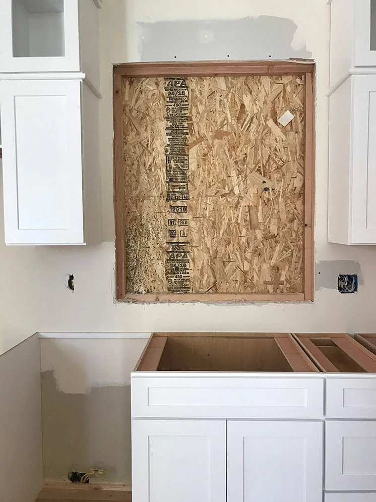
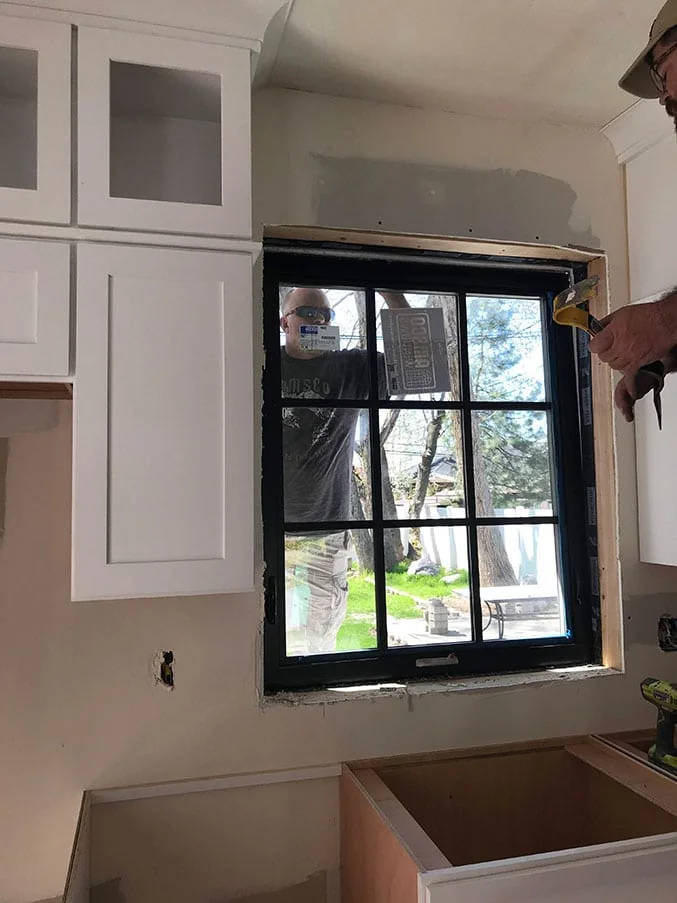
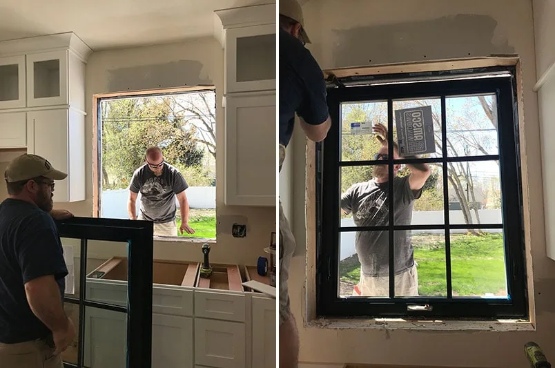
Mary’s new kitchen window went in on Friday. It was a custom size which Amsco Windows is uniquely suited to produce since the entire window construction process is done under one roof (from vinyl extrusion to glass tempering and cutting, to assembly . . . we toured their facility and it’s amazing to see how seamless the process really is!)
To prep for the window installation, Mary’s contractor cut into the stucco and reframed a larger window opening. When the new window arrived, the installer popped it in and sealed the flange, all in less than 20 minutes. And it is stunning!
We went with an awning window. And here’s why:
- The new window is large and awning windows are well supported by their headers
- It’s easier to open over a sink
- We could have a seamless pane pattern
Since it was installed, Mary can’t stop opening it. And we can’t wait to see the casement windows which will be installed tomorrow! (Stay tuned!!)
TRIM
Second on Mary’s wish list was an open space, and that involved knocking down a wall. The wall was load bearing, so we had to install a support beam which we decided to transform into a beautiful feature opening with an architrave, casing, and column base.
Remember our Metrie paneling from our office transformation? If you haven’t seen it, take a peek at our One Room Challenge 2017 Final Reveal.
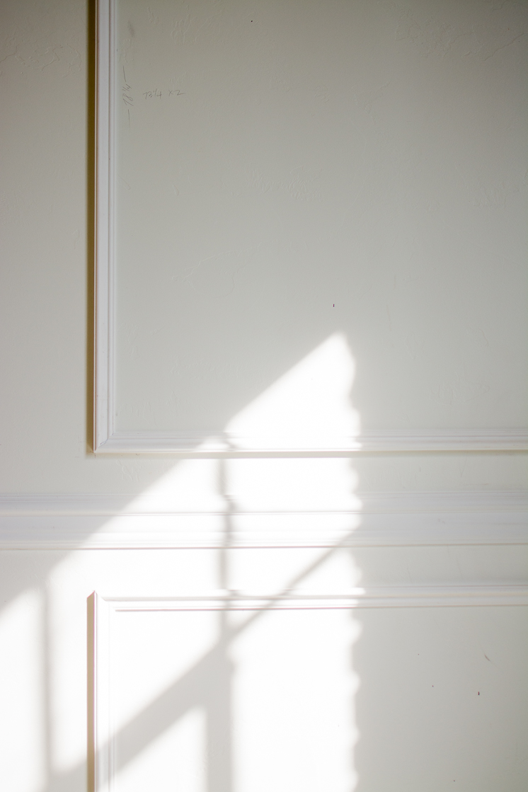
Of course Metrie’s Option M was once again our go-to source for the finish trim. Mary wanted something with clean, streamlined, square lines, so for Mary’s space, we selected the following pieces from the Vintage Industrial Collection, all sized for ceilings under 9 feet: Architrave, Crown, Baseboard, Casing.
In building out the trim for the new opening, we designed a faux column base, and then we used pieces of baseboard to case the walls leading up to the architrave which forms the header. We had to trim the baseboard down, but this proved a successful option as the baseboard pieces were wider than the casing options and provided a better balance to the header.
Since we’ve been in a bit of a time crunch on this one, we didn’t install the trim ourselves (as we’ve done previously). That said, for DIY installation tips and tricks, take a look at Week 4 of our 2017 One Room Challenge.
We will putty, caulk and fill in nail holes tomorrow, and then we will be ready for paint!
LIGHTING FIXTURES
Every room needs three sources of light. In Mary’s space, we now have loads of natural light with bigger windows (source 1). We are installing recessed lights to functionally replace an offensive fluorescent panel (source 2). But it is through the Hudson Valley fixtures that we are bringing the intention and the contemporary sleekness of Mary’s mood board into the light (source 3). . . pun definitely intended.
We chose the following:
SWITCHES & OUTLETS
The polish of a design comes in the very small details. Switches and outlets are such details that can elevate and complete a space. A comprehensive suite of options that is not only technologically advanced but also stylistically elegant, The adorne Collection from Legrand provides such polish.
Since the collection’s switches and outlets have the same square dimensions, the corresponding gang plates (aka switch plates or outlet covers in non-contractor speak) are interchangeable. And with so many options for switches, dimmers, and outlets, you can find the precisely perfect product for the precisely perfect place on your wall. We chose the following:
- Gang plate finishes:
- Gloss White-on-White for most of the walls
- Mirror White-on-White for outlets and switches placed in the porcelain backsplash (since the mirror matches the sheen of the backsplash)
- Switches:
- Paddle Switch for most switches
- Paddle Dimmer Switch for two switches controlling dimmable bulbs
- Outlets:
- Standard Outlet for most outlets
- GFCI Outlet for outlets next to water sources
- Pop-out Outlet for in the kitchen where Mary plugs in appliances with larger plugs
- Dual-USB Outlet for in the kitchen for easy device charging
Stay tuned for next week’s countertop, hardware, and fixture installation along with a few tips for working with contractors and subcontractors! You know, all the FUN STUFF! Ha!
Also, take a look at the progress our friends are making! It’s coming down to the wire and we cannot wait!
At Home With Ashley | Casey Keasler | Dorsey Designs | The Farmhouse Project | Home Made by Carmona | House of Funk | House of Jade Interiors | House Seven Design | House That Lars Built | Inspired by Charm | Jana Bek | Jessica Brigham | Kelly Golightly | Murphy Deesign | The Pink Pagoda | Sarah Gunn | Sherry Hart Designs | Sugar & Cloth | Veronica Solomon | Vintage Revivals | Media Partner BH&G | TM by ORC
Amsco Windows | Bertazzoni | CliqStudios | Daltile | Delta | Emtek | GE | Hudson Valley Lighting | Legrand | Loloi | Metrie | Minted | NDI | Overstock | SWD Studio
Thank you to all of our One Room Challenge Partners. All opinions are my own. Thank you for supporting the brands that allow Lars to create unique and inspired content for you.



Comments