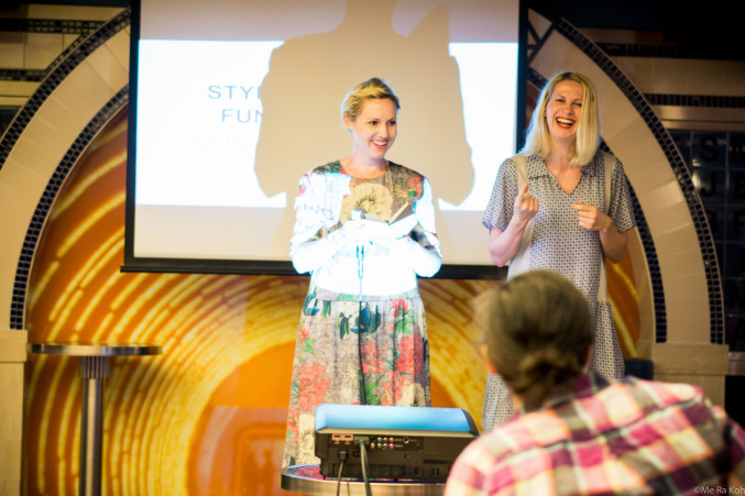
As you might recall from the previous post, Meta and I were asked to teach a photo styling workshop at Click Retreat in the Caribbean in January. In the group were a variety of bloggers ranging from mommy bloggers to food bloggers to fellow craft bloggers all there to a) have fun b) learn how to take better photos. Our workshop consisted of two parts, one learning design basics and rules and the other a hands-on workshop. Mind you, these ladies already have a firm grasp on what they are doing as they all have successful blogs, ranging from mom blogs to food to craft blogs. In a way, they should have been teaching us what to do! For the hands-on portion we divided them into groups based on color and asked them to bring props from the trip that went with their color. We turned it into a contest and asked them to submit their photos on Instagram to the feed #clickretreatstyled. These are some of their photos accompanied with tips on why they work.
- Select a color palette. For me, this is crucial. A color palette is the number one way I communicate with my readers and make my brand feel cohesive. A simple way to achieve this is to select one color. We chose a one color palette for this exercise because we didn’t have too much time to work. This yellow palette was a perfect way to communicate a tropical feel with yellow fruits and touches of greenery. Try it out with your own photos. This photo was created by Team Yellow, which included Super Healthy Kids.
- Tell a complete story. Sometimes when selecting props it’s easy to want to put in items that may have the same colors but don’t necessarily make sense with the story you are trying to tell. Make sure you select props that make sense and enhance the experience. This photo, taken by Staci of 7 on a Shoestring, tells a story of her travels on a cruise ship including what she wore (necklace), what she found (butterfly), and some other mementos.
- Create frames. Creating frames in your Instagram post will have point to where you want the viewer to focus. Shireen won the contest with this photo with her use of frames and gorgeous lighting taken of the same subject as #2. The objects are laid out on a grid, but the hands come in a shape it so you know where to look. Isn’t it interesting how you can capture the same subject but make it look so different? They are both good, just different.
- Crop. Don’t be afraid to crop! This is one that I struggle on because I like to show the whole object, but all you need to do is reference that an object exists then the eye will do the rest and will complete the picture.
- Work in a circle. This is one that you don’t necessarily have to follow all the time, but it’s a good one for practicing. A lot of my favorite Instagrammers follow this one (like Local Milk). Start by imagining your cropped Instagram square and then working around and placing objects that will get cropped off. Don’t keep it exactly a square by interject it with props that will make sense to your photo, like this one from Joy the Baker.
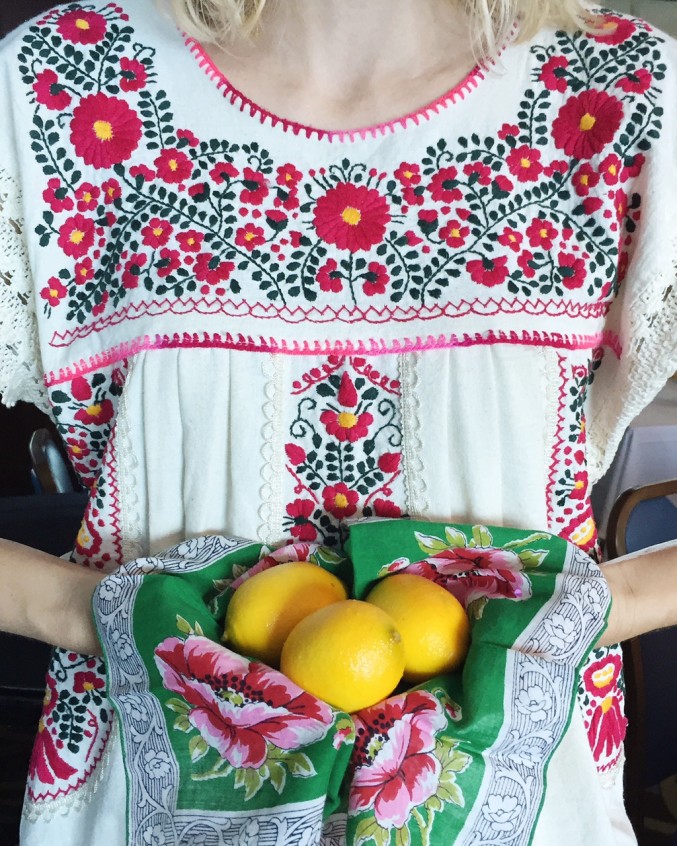
- Come in close. Because Instagram is seen from a phone the photos are small. I find that some of my most successful posts are those that are close ups of just a few objects like this one by Meta.
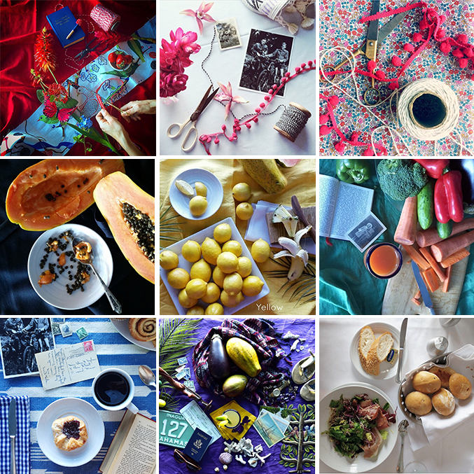
Here are some more images that the students created based on the color schemes teams:
Photo credits from top left: @tracyshutterbean, @stacyofksw, @momspark, @wonkywonderful, @superhealthykids, @beckyljames, @jetsetcarina, @mooshinindy


Comments