We have joined 20 bloggers (see the full list below!) for the biannual One Room Challenge. Join us for 6 weeks as we show the start to finish of our office makeover!
Last week I announced our participation in the One Room Challenge and showed some ahem, glorious, before photos of our office that we will be renovating. We got a late start on the challenge so we are in massive make-up mode over here, not to mention it’s our busiest time of the year plus two major deadlines this week. Doesn’t this crisis mode always seems to happen at the same time every year? Or maybe just every 3 months? 1 month?
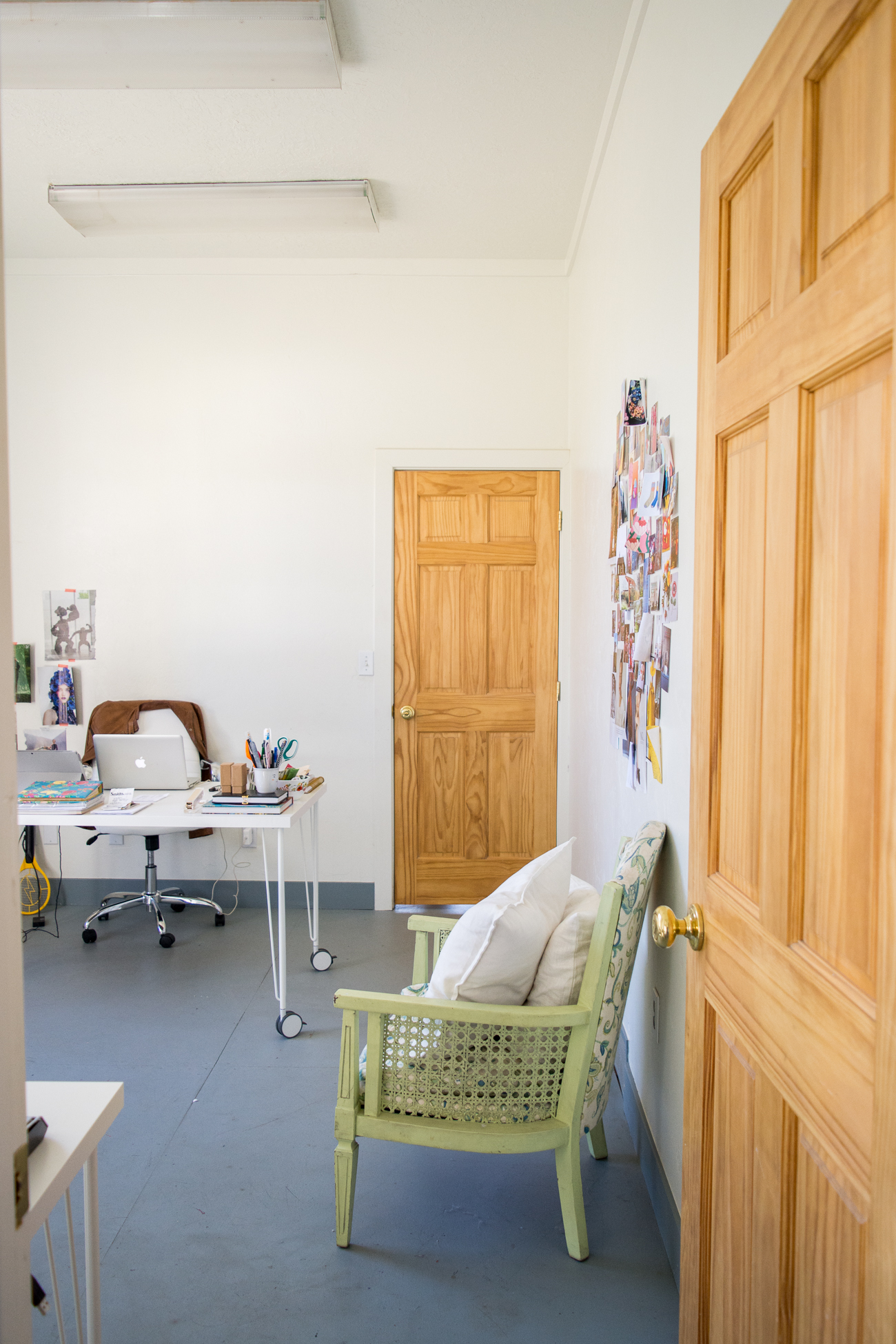
I wanted to start with some inspiration for the room like this one above. As you saw last week, currently our office, which I’ve not so cleverly dubbed the “business” office because our business director, Mary, and our business administrator, Amy, both work in there. Because we rarely use it for photographing purposes I figured we might as well go to town on it. The main studio room, which sits next door, is both my office and the photography studio and needs to be kept white because any type of color or pattern can influence the photographs. Fun fact: We found this out the hard way while photographing our book earlier this year. We had painted a diamond pattern all over the floor in bright colors on the first day of a ten day shoot. The second day we realized the bright pink squares were casting reflections onto our brassy scenes. No bueno.
ANYWHO! My friend, Meta Coleman, was currently in the process of adding some exquisite mouldings to her bathroom all by herself and I was totally impressed. I loved it! She was doing one of my favorite wallpapers on top and some mouldings on bottom and it look so beautiful. I know she’s going to be showing this off at some point so stay tuned!
Because we were short on time and needed maximum impact for such a small room AND because I knew we had a mouldings company on board, I decided that we had to have it too! I had even discovered that Old Brand New, one of my favorite interior blogs, who just so happens to be participating in this round of One room Challenge, did the same look for the last round. His is below in yellow. Isn’t it instant class?! I found a number of other inspiration images that confirmed what we needed to do.
Top left clockwise: Old Brand New, ModNest, Archello
Won’t it look so good applied to this barren landscape?!
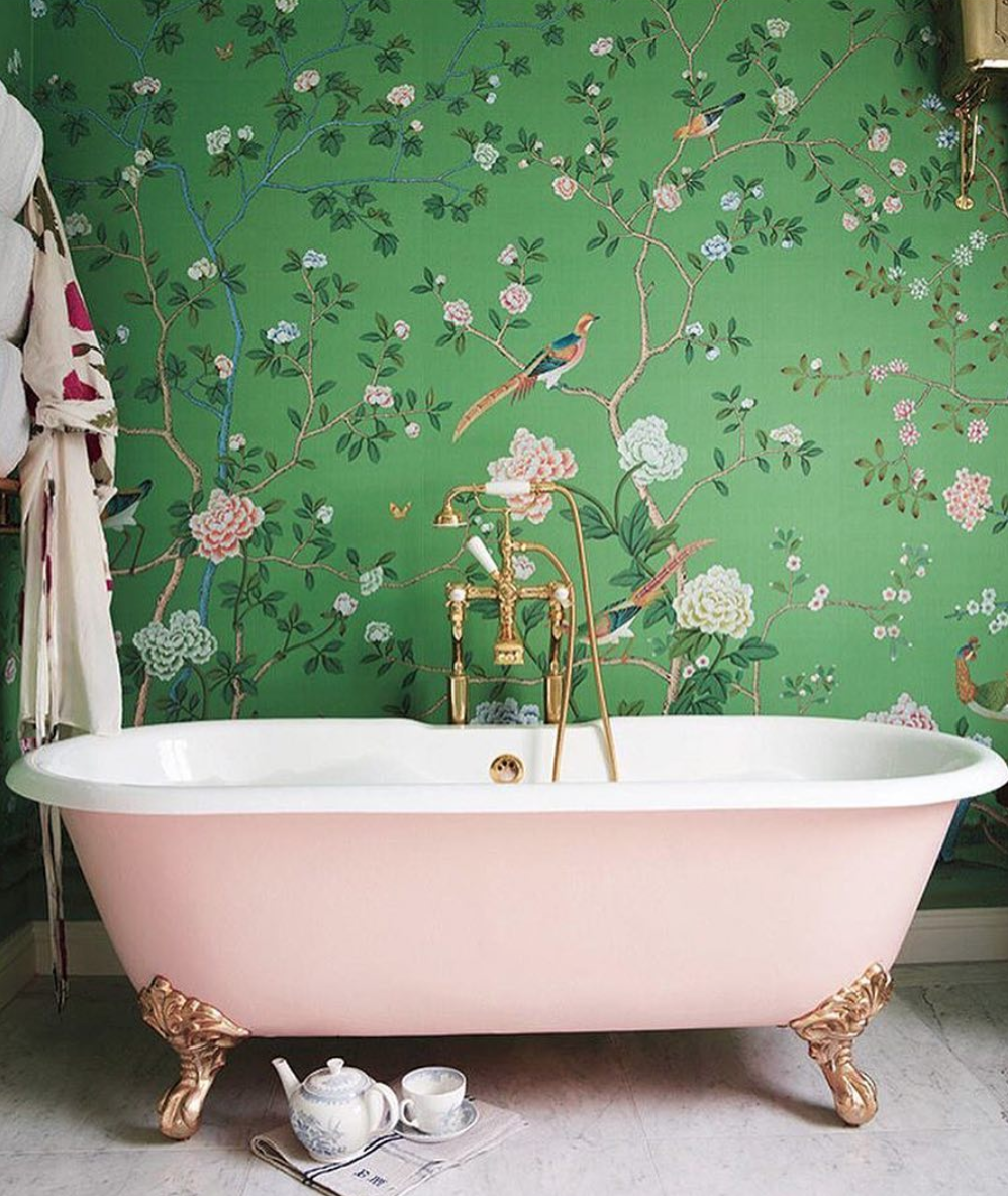
Which do you like better? Two toned like Dabito’s with the white on bottom and yellow on top? Or just one tone like the rest of these? I’m leaning towards one color BUT, I can never think of a redesign without thinking of wallpaper! I ache for wallpaper probably because I’m in a rental, but also probably because I just love patterns! My first thought was to do some sort of chinoiserie on the top and a solid on the bottom like the first image. Isn’t that dining room exquisite? And of course, I always love this green chinoiserie. I even posted about it on Instagram last week because this bathroom is unreal.
Photo of Poppy Delevingne from Architectural Digest
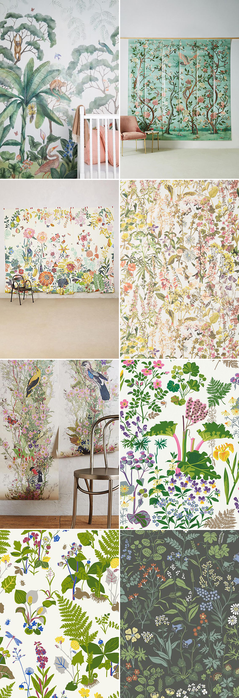
I did a preliminary search of ones that could possibly fit the bill and came up with these in a mix of murals and all over patterns. I love the idea of doing a floral (how could I not?!) with a solid too.
But again, this challenge is only 6 weeks and we’re worried about ordering/installation etc. so we just may need to eliminate the wallpaper aspect. Boo hoo! BUT, I also think about working in a small room that’s covered in all over pattern and I think…”too much?” Who knows! It’s also not MY room that I’m working in and I realize that my taste might be a little more extreme than others so painted walls might be more psychologically friendly for a work environment.
Well, there’s the inspiration for the small office. Next week I’ll be talking more about the furniture and lighting to give you an idea of how we’re making it a practical space to work in.
I’d love to hear your thoughts on our design. Have you ever installed mouldings yourself? How did it go? Any tips?! Our comments are currently out of order, but feel free to comment over on our Insta @houselarsbuilt
Check out last week’s post of the before pictures
See all the weeks here: WEEK 1 | WEEK 2 | WEEK 3 | WEEK 4 | WEEK 5 | WEEK 6 | WEEK 7
Boxwood Avenue | Coco & Jack | Design Manifest | IBB for DWD | The House That Lars Built | Little Green Notebook | The Makerista | Making it Lovely | Old Brand New | Old Home Love | The Painted House | Megan Pflug Designs | Pink Pagoda | Erica Reitman | Sacramento Street | Simply Grove | Jill Sorensen | Sugar & Cloth | Vintage Rug Shop | Waiting on Martha *
Media Partner House Beautiful | TM by ORC
Top image (I can’t seem to find an original source. Anyone know of one?)


Comments