

This post is sponsored by Behr. All opinions are my own. Thank you for supporting the brands that allow Lars to create unique and inspired content for you.
We love partnering with our friends at Behr and this time we have a dramatic makeover to reveal. As you read in yesterday’s announcement, our business director, Mary, recently bought a blank canvas house ready for some Lars loving. We decided to go CRAZY with it with a color blocked pattern based on my recent trip to Mexico City (see post here).
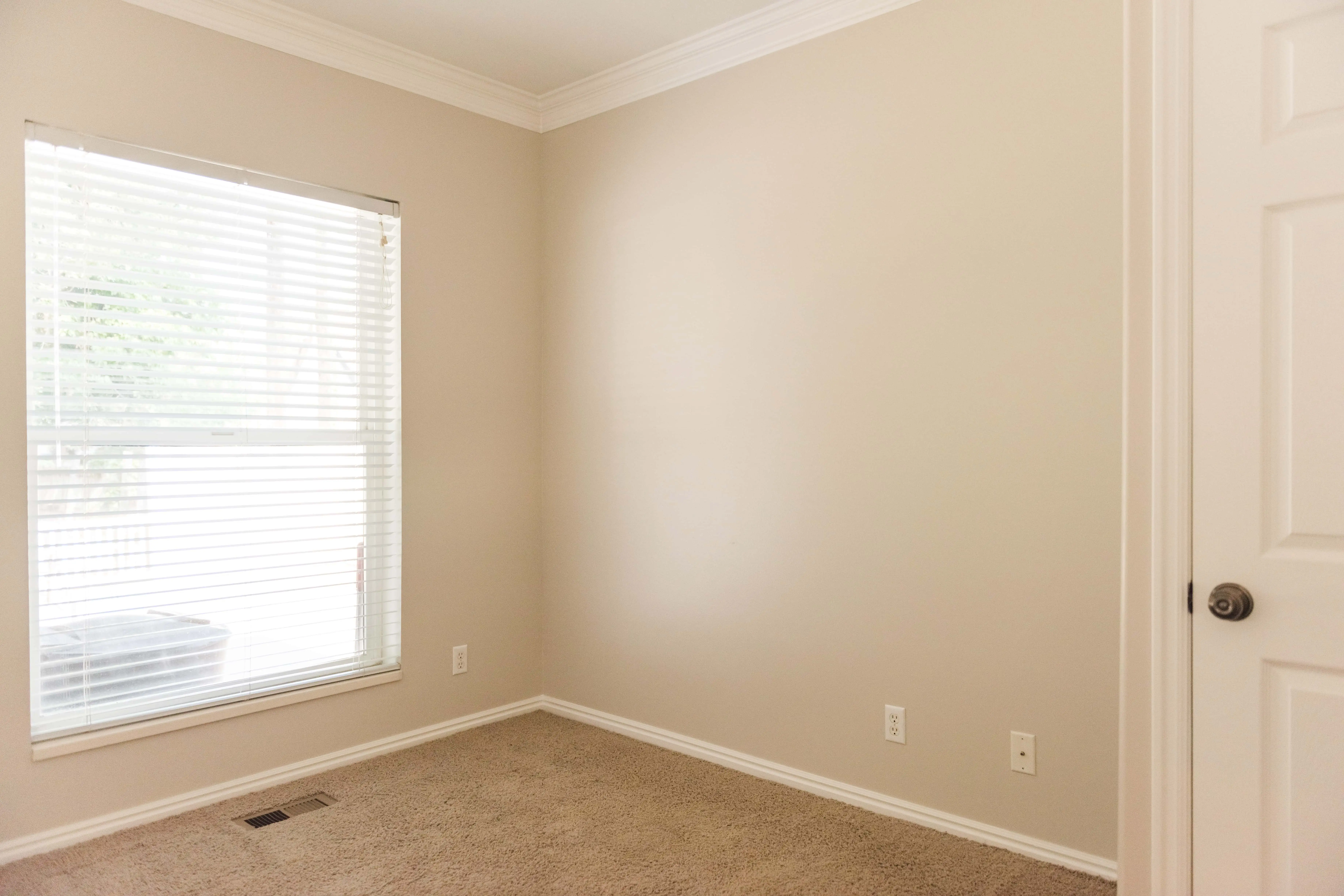
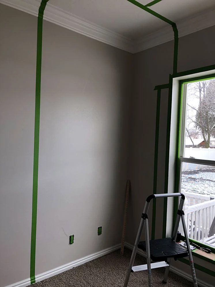
For this assignment, we knew we wanted to tackle her tiny guest room. Mary always has guests coming into town so we wanted it to be a conversation starter. The room was pretty standard: beige and carpeted so we knew we needed to add some PIZZAZZ.
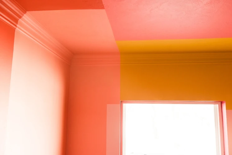
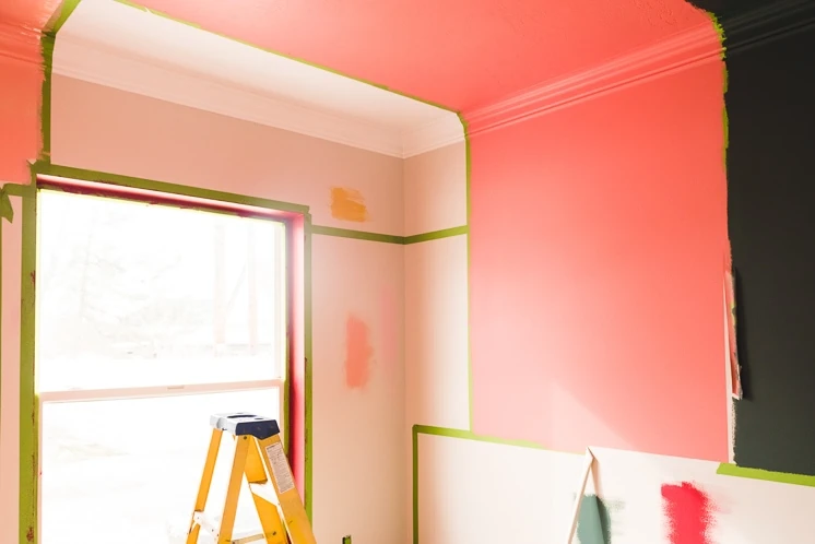
Before in all its beige glory:
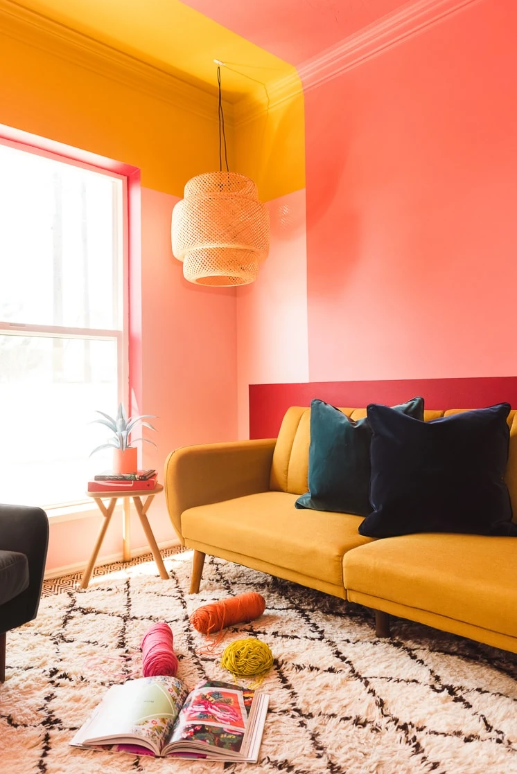
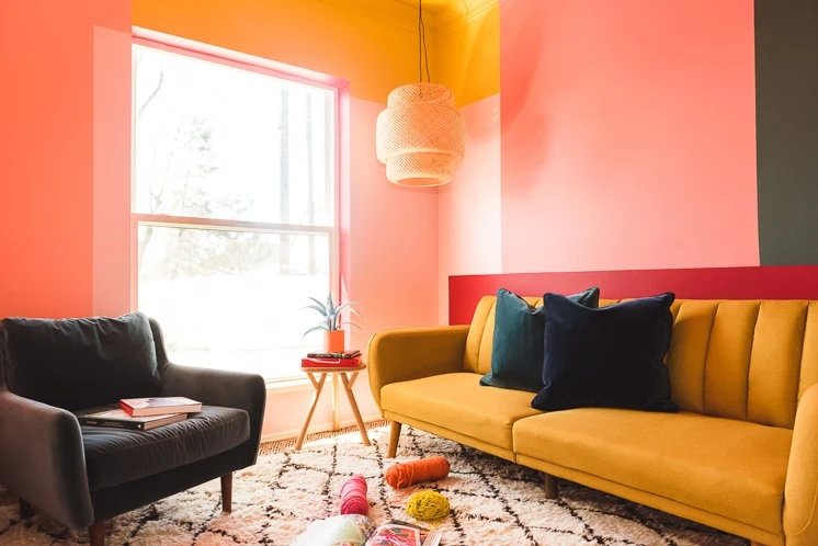
After: 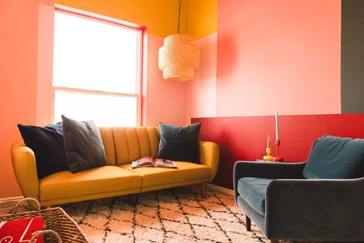
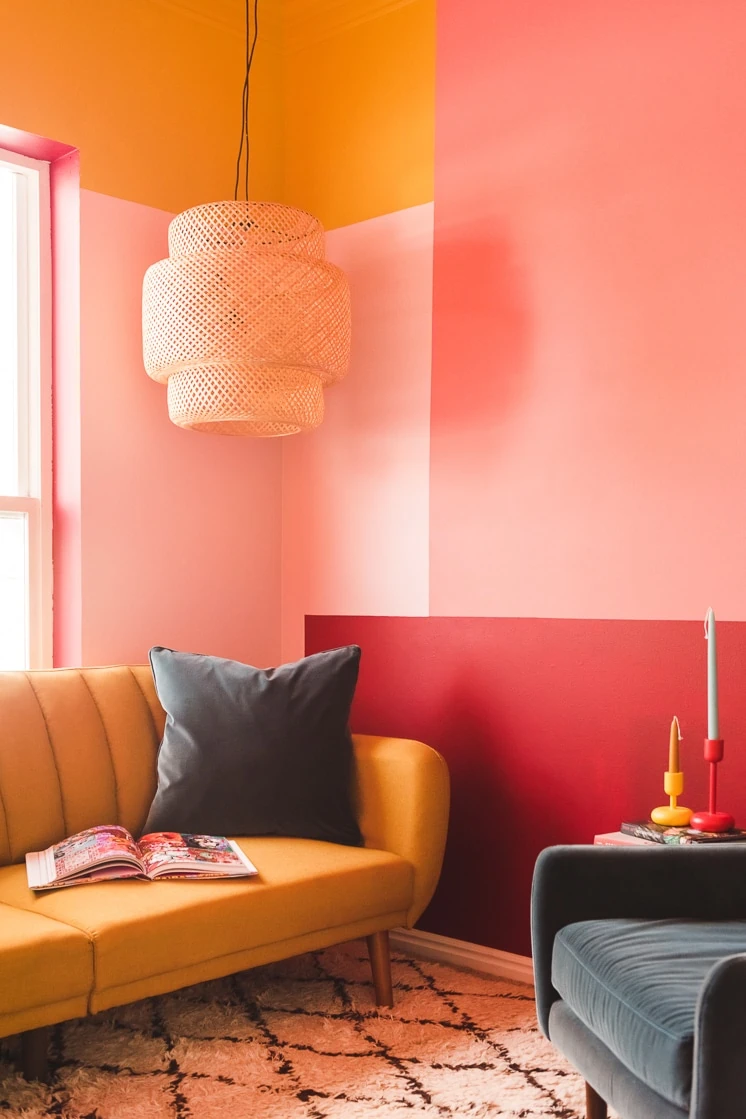
Big change, no??
Our top three tips for creating this look!
- Pick your inspiration:
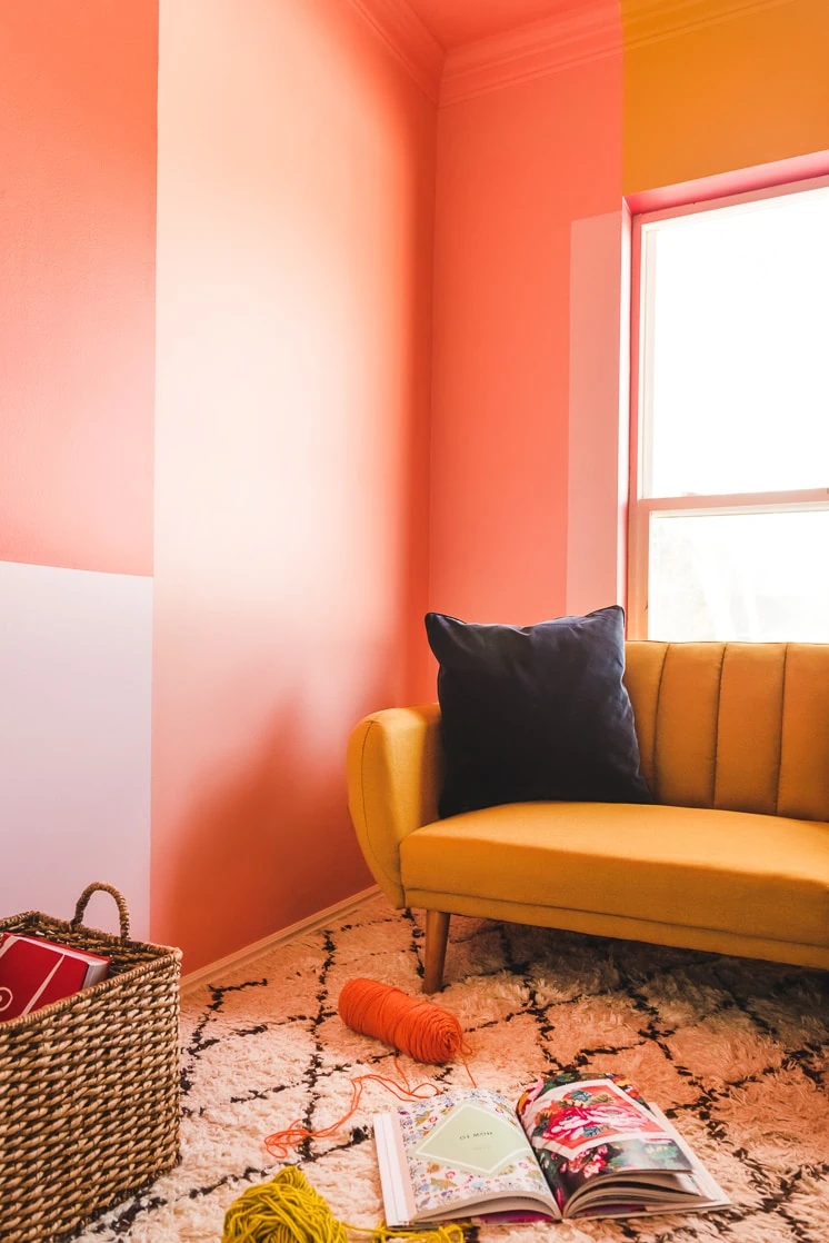
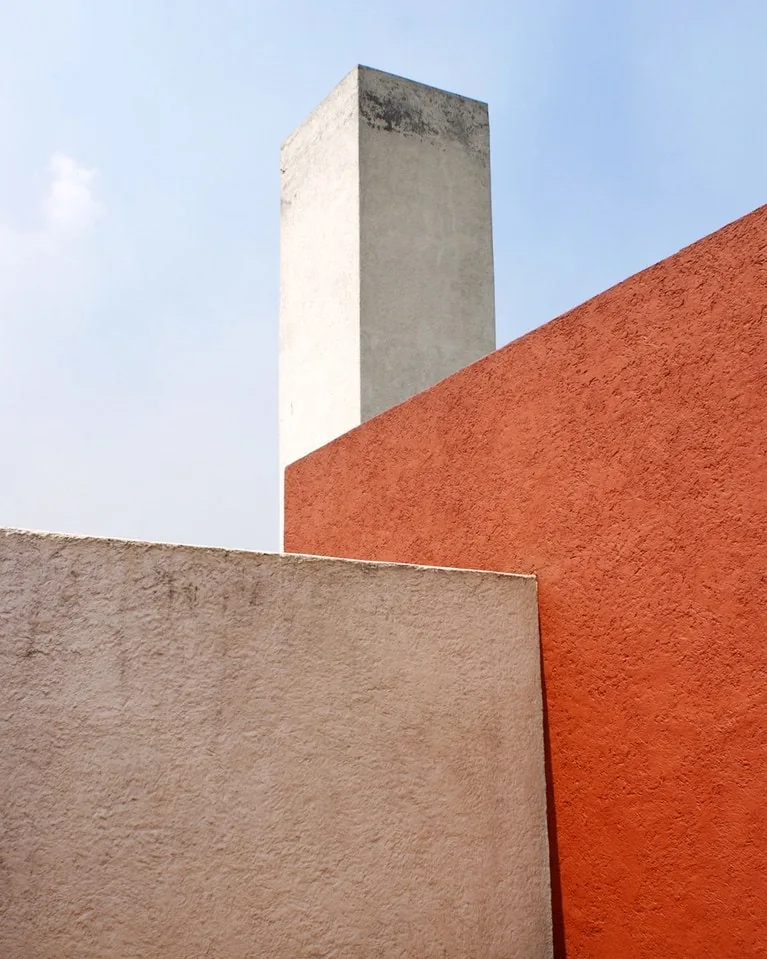
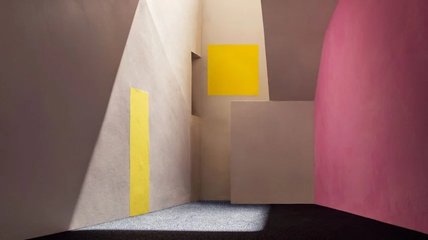
One of my favorite parts of Mexico was the work of architect, Luis Barragan. He’s a master of using light and colors for high impact. Usually his spaces are wide and expansive so here the challenge was to use color blocking in a tiny space. We designed a compacted version by creating rectangles of colors that extended from the walls to the ceilings and have the colors meet at various planes. The result we wanted was a high impact statement to a room that otherwise wouldn’t get much attention. Here are some of his spaces that inspired us.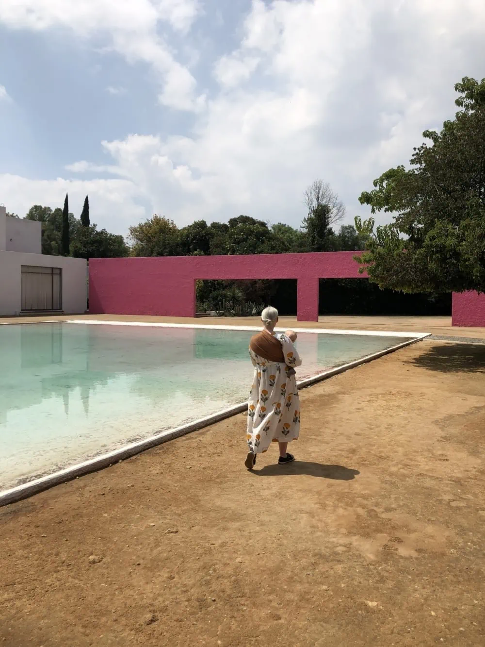
2. Pick your palette:
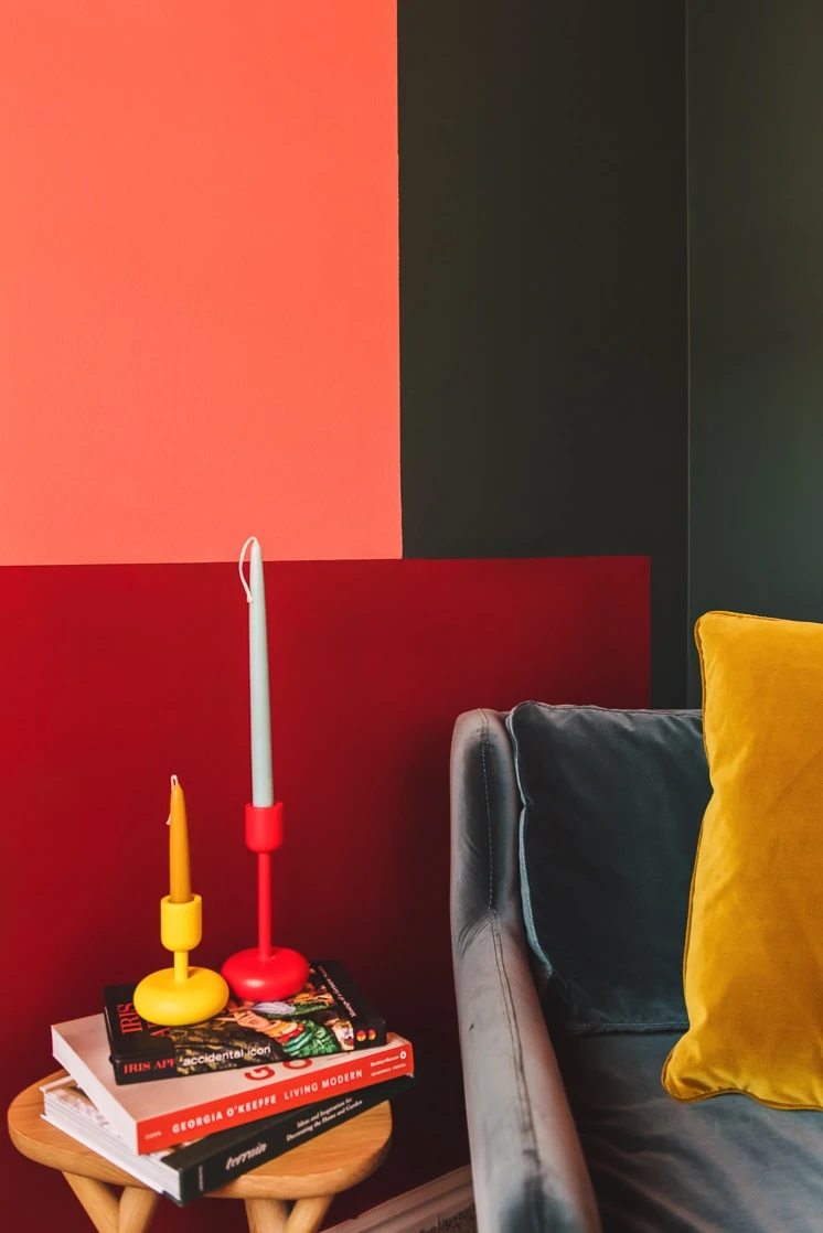
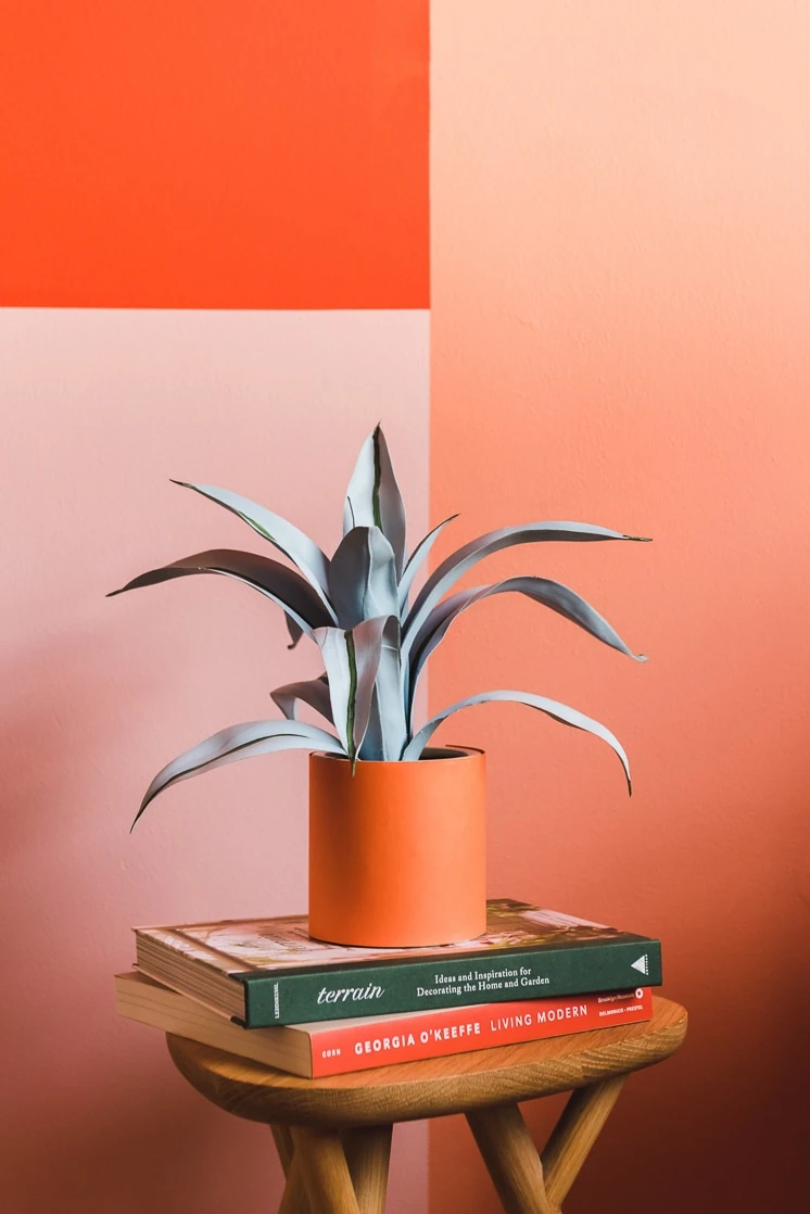
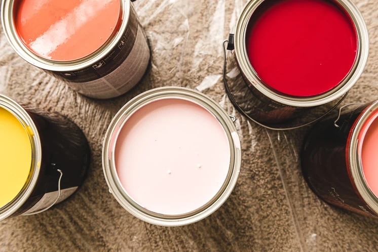
Picking the right color palette for your space is crucial. The success depends on your lighting, space size, texture, and feel. Here, we wanted each color to stand out but also be cohesive so we decided to go with one of our favorite palettes of the moment: forest green, marsala, coral pink, and mustard yellow. We used Behr Marquee® Interior Paint & Primer in One in a matte finish.
We used Behr Marquee® Interior Paint & Primer in One in these colors:
- Dark Crimson M140-7
- Pink Damask M160-5
- Tandoori M170-7
- Silken Pine N430-7
- Plantain Chips M290-6
- Priceless Coral M180-4
If you like this color palette, click here to view it on behr.com
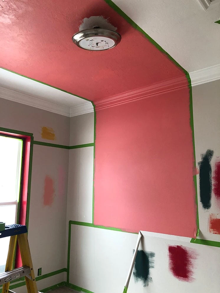
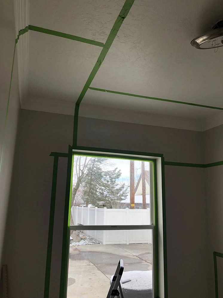
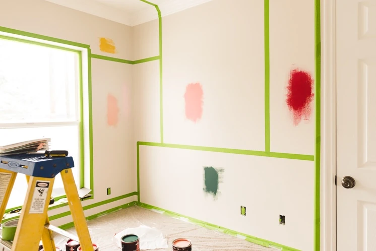
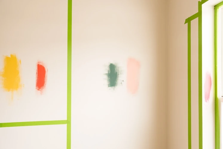
3. Don’t be afraid to change your colors around:
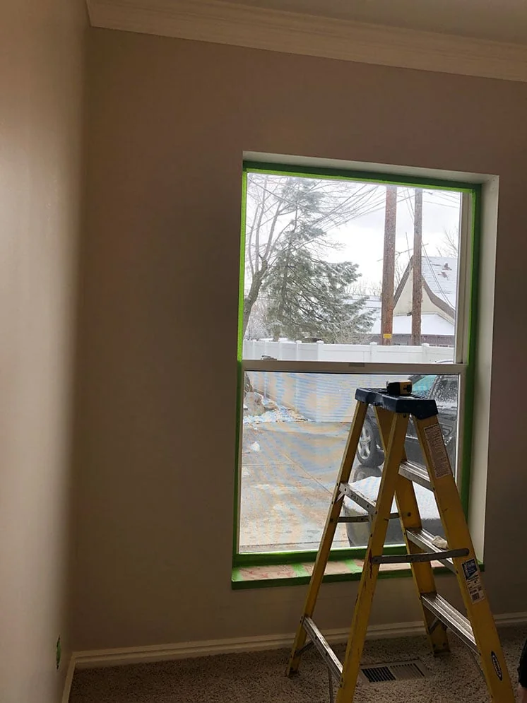
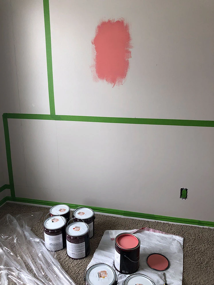
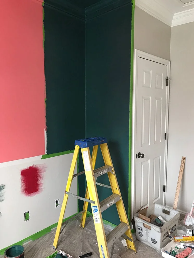
Once you’ve picked your palette, don’t be afraid to change the arrangement on the wall! We wanted the interaction of the colors to pack a punch and sometimes that changes from your vision to your actual wall. We taped each rectangle in the arrangement we wanted and then put some samples up. Once we saw how the light in the room and how it interacted with each color we knew we had to switch some colors around. You can see how we painted several colors on each rectangle to see how they vibed together.
Here were our concept sketches for the room:
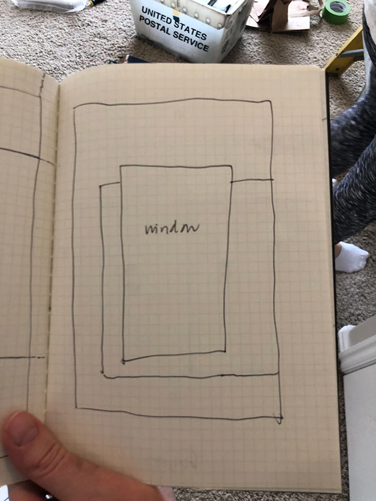
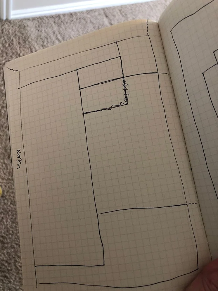
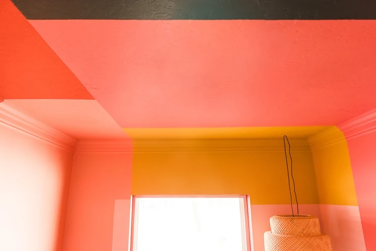
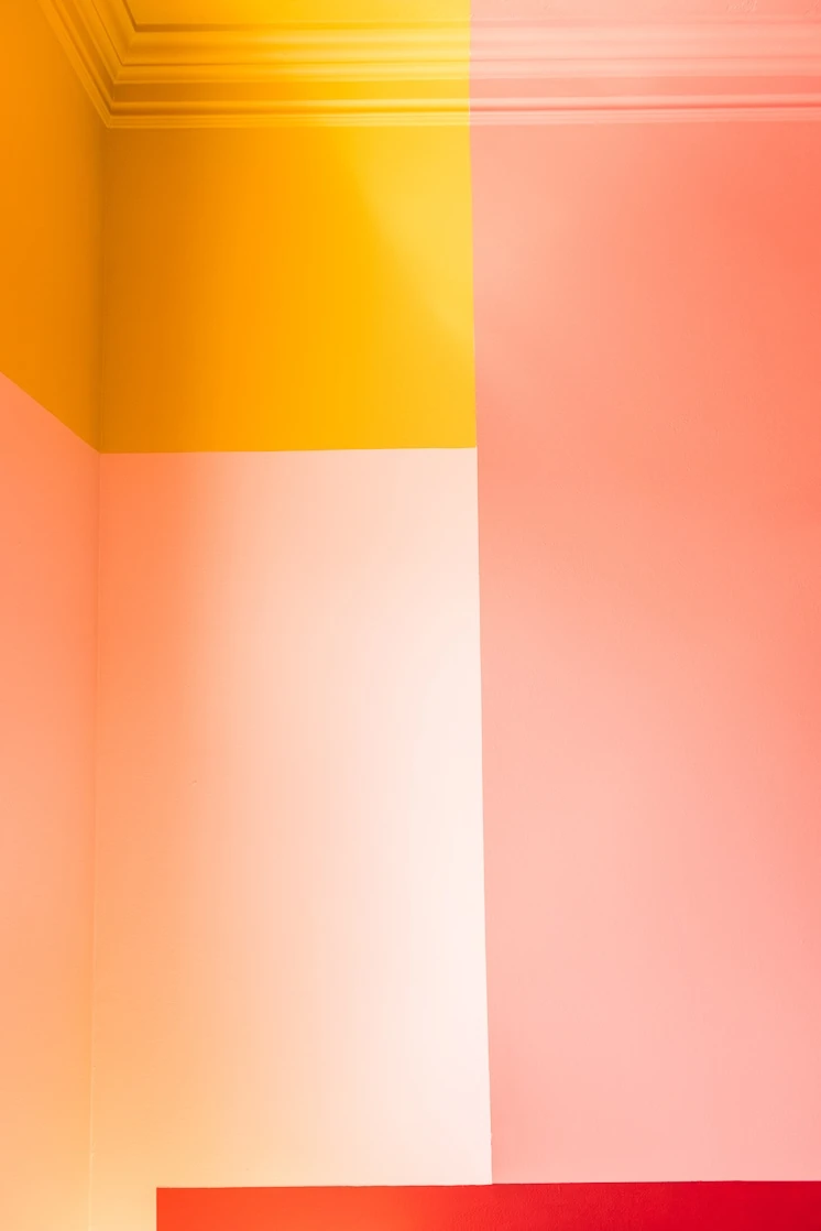
It was also important to look at how the colors came together at the ceiling point. We wanted the composition to be balanced, while also incorporating the colors evenly around the room.
What color schemes are you loving lately? And would you ever try something as daring as this? I have to admit that it’s not for the faint of heart, but big risks yield big results and I LOVE how it turned out. What do you think?!
On April 11, from 1-3p.m. MT, I’ll be participating in the Behr Color Clinic – a live Facebook Q&A – to answer all your questions about choosing paint colors and defining your style. Tune in to ask your color questions! See you there!
Comments