I am SO relieved to reveal our master bedroom FINALLY! I’ve been talking about doing something to it, well, ever since we moved in. But I have this thing where if I can’t do it right, then I don’t want to do it at all. Do you suffer from the same disease? Needless to say, when Spoonflower asked if I wanted to partner on their new bedding launch, I didn’t even bat an eye. Yes please!
We partnered with them earlier this year on some new pillows for my living room and some custom fabric to make a lampshade (see here) so I was already familiar with their great quality and options. And, because I had already done a lot of research on artists and fabrics, I knew exactly where to look. Their marketplace can be overwhelming because of the sheer amount of designers and products, so I spent a good deal of time making collections for each room. That was the easy part. Narrowing down the favorites list was the tricky part. You know the feeling, right? You can take the design so many different directions so you don’t know where to start???
What do you do??!
How to concept your interior design
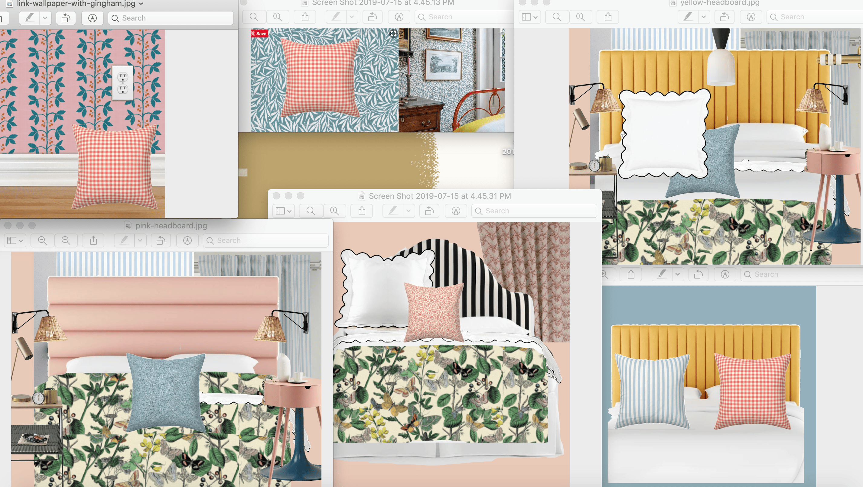
Start slowly! I decided to start with mock-ups by placing the products together to see which ones were really pulling me in.
Playing around with options I was able to visualize how to put together different patterns and colors, one of my favorite things to play with. I had so many favorites that I knew it would be tricky to put them together so this helped me narrow down.
To custom headboard or not?
I contemplated making a customized headboard, especially because the beauty of Spoonflower is that you can pretty much customize ANYTHING you’ve ever wanted. They have the ability to put any design onto any products and now, even more so! There are curtains, throws, wallpaper, bedding, you name it. Ultimately, I decided against the custom headboard because I wanted to save on time and headache so I knew I was probably going to find a solid colored one, since those were my options out on the market. Because of that, I wanted to add something decorative to the walls.
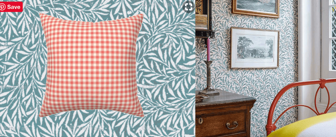
Concept 1
There’s one designer, Amy Vail, who references a lot of William Morris patterns and I’m INTO it! Look at this beautiful leaf pattern. I thought it could be fun to play around with some red gingham, like this one from another favorite designer, Peacoquette.
Concept 2
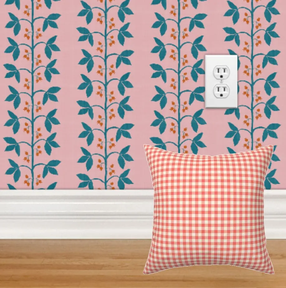
I’m loving on some pink right now and wanted to try it out on my walls. Here’s how it goes:
I also contemplated this fun berry and vine stripe pattern in pink from Danika Herrick. I still love it so much, but I think I’d love to try it for a girl’s room one day. Danika also has some really lovely chinoiserie patterns.
Concept 3
I knew I wanted a wallpaper, especially since theirs is renter friendly, so most of my mock-ups kept that in mind. However, in case my landlords wouldn’t go for it, I came up with a solid color paint choice that would still work. A beautiful grey/blue could do the trick:
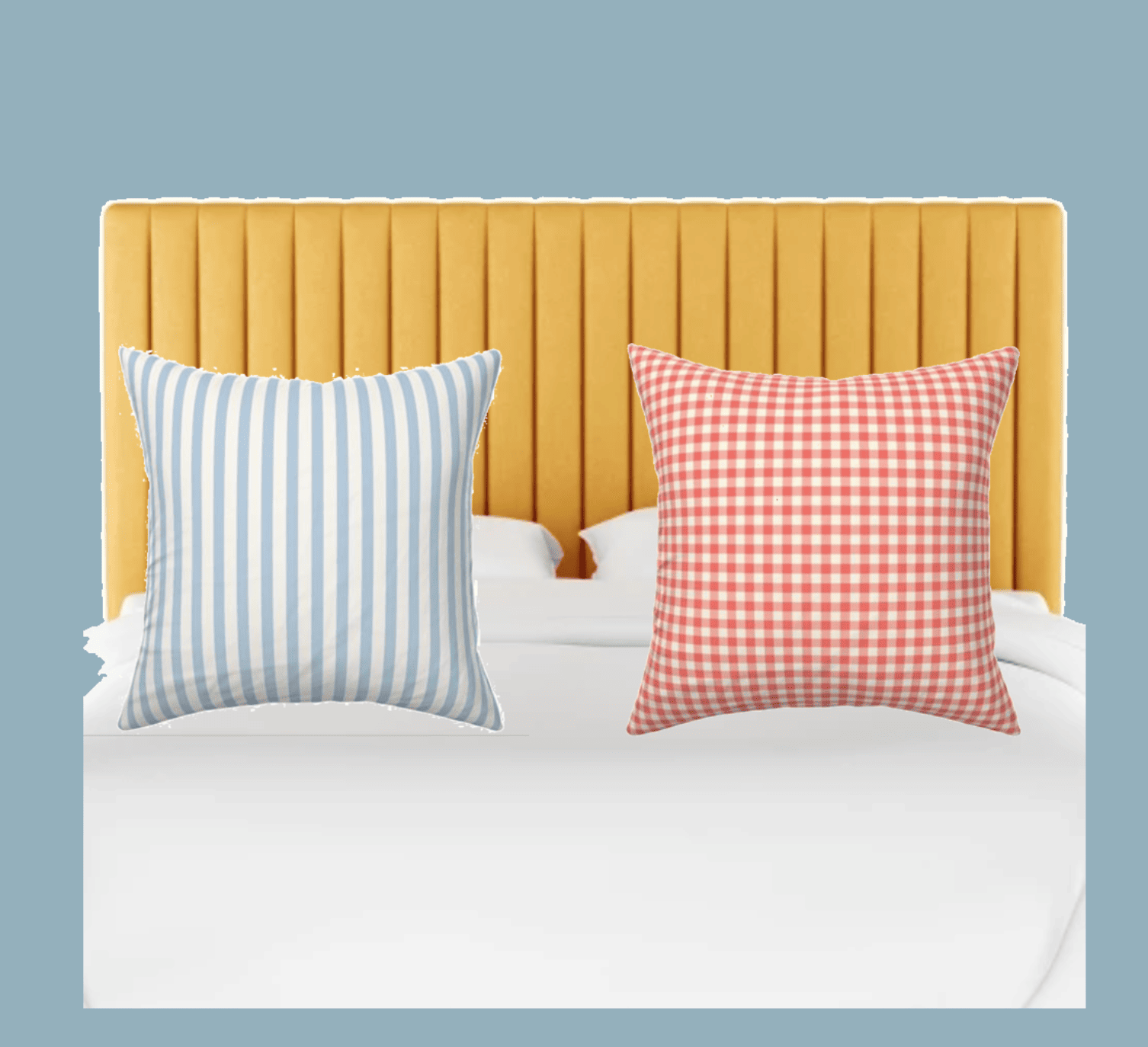
There’s already a blue theme going in Jasper’s nursery (see here) and I knew it would be fun to switch it up a bit so I tried out a blush pink (you know, because we haven’t seen that color ANYWHERE these days 😉
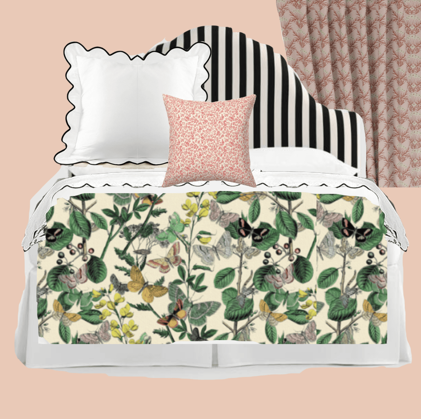
Concept 4
I love bringing greenery into a space because it really refreshes it, so when I found this green botanical print, once again from Peacoquette, I thought it would fit the bill beautifully. Then, I spotted this black and white striped headboard that would allow me to play with color and patterns all along with these pink art nouveau daisies that would be in the Spoonflower curtains. Top it off with this calico throw pillow and we’re good to go!
As soon as I spotted these headboards (here and here), I knew they were the perfect way to contrast the busyness of the wallpaper with the bedding. It needed a respite with a solid color.
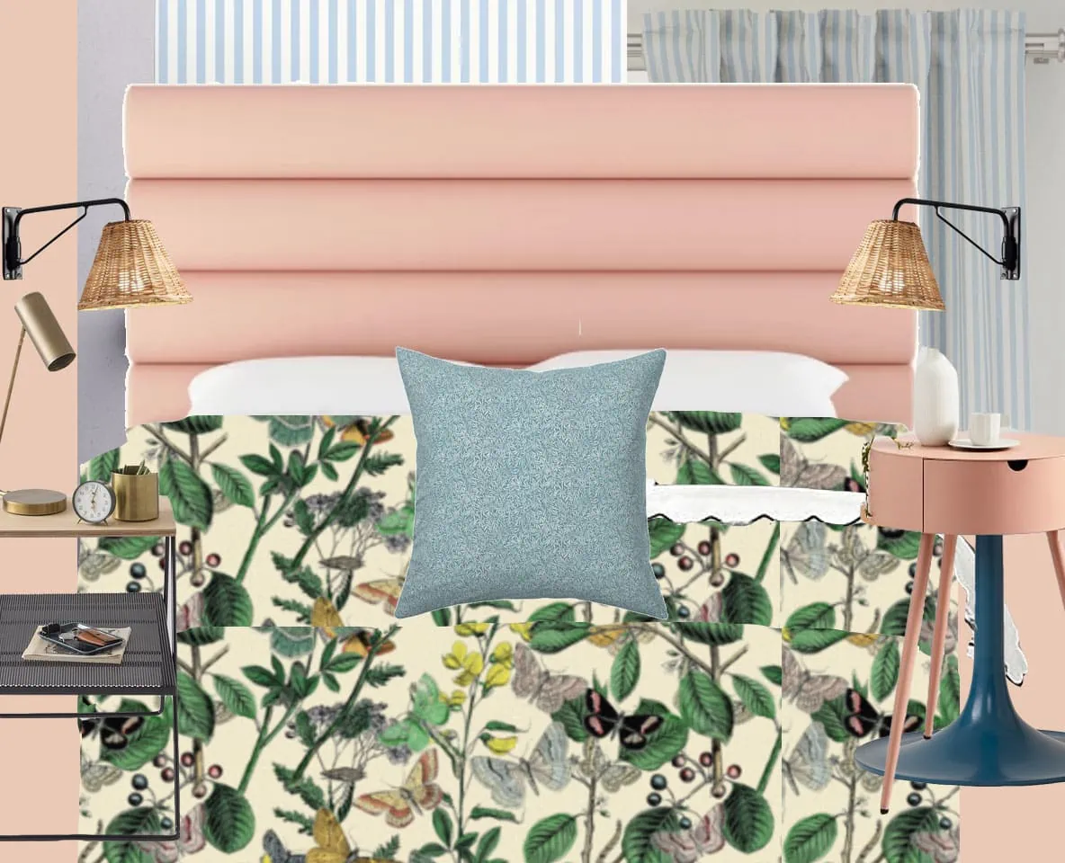
Final concept
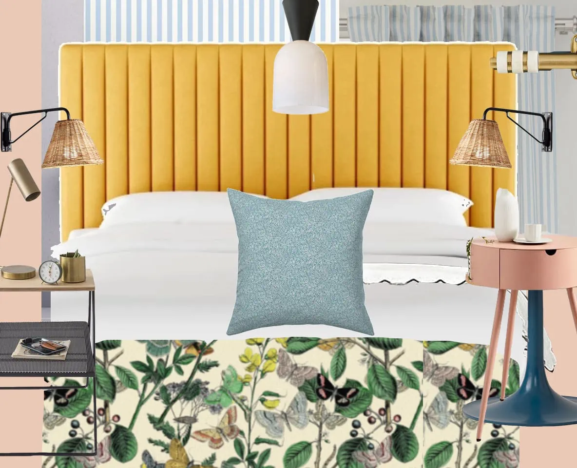
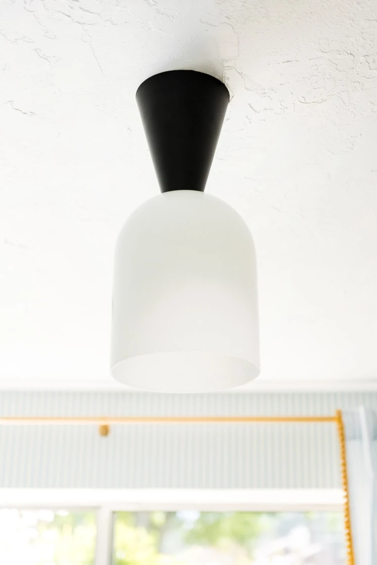
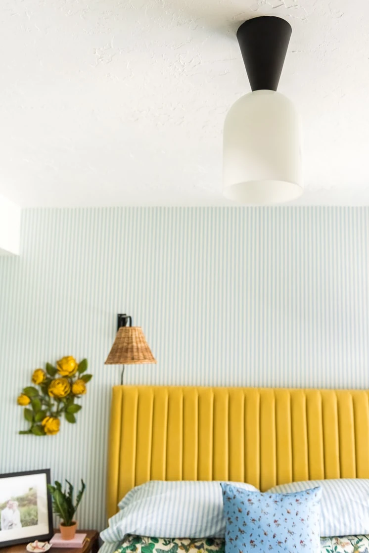
When I have elements that are more whimsical and botanical like the butterfly bedding, I typically like to have a few other elements that are more streamlined like the lighting fixtures. I found this rad surface lamp from Cedar and Moss called Belle and though it could have leaned too modern, I love how it toned down the whole design and made it feel less, for lack of a better word, “frou frou”. Plus, I loved the idea of bringing in traces of black throughout the room because of the black in the butterfly bedspread.
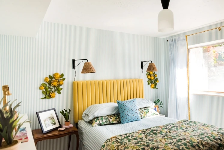
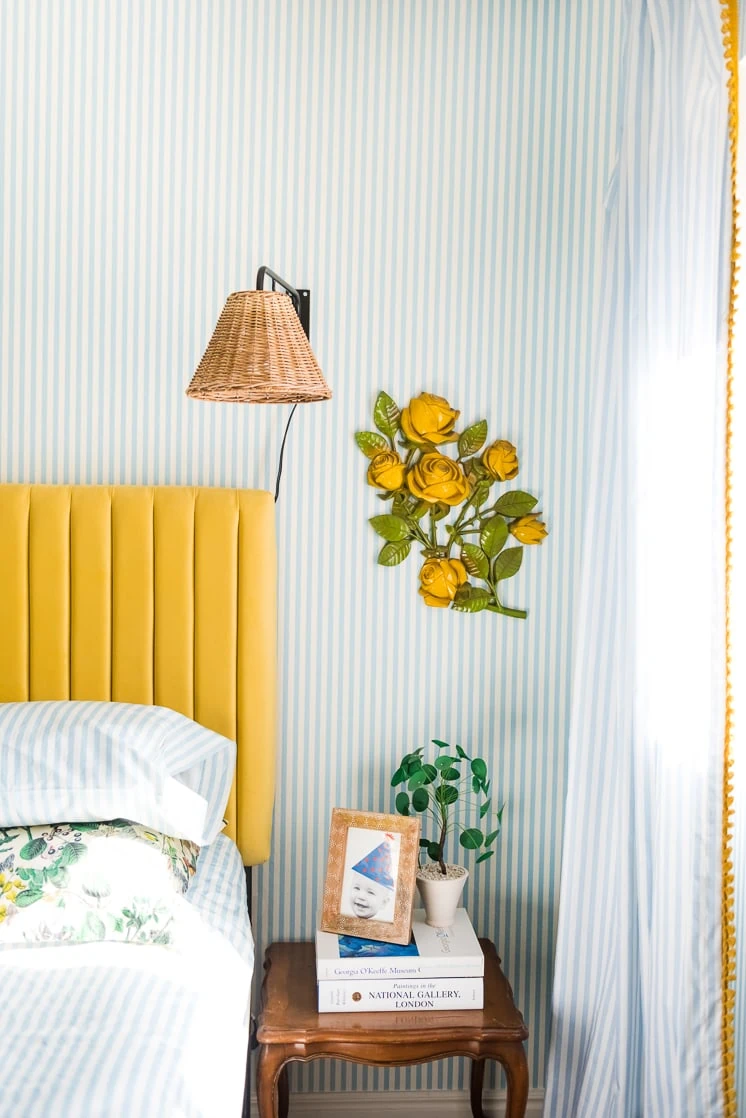
I’m SO into rattan and wicker right now. You too? I love that it’s slowly been making its way into our vocabulary again, and not in the 80s overdone, fluffy way. It’s become cleaner yet still warm. If found these sconces that did not break the bank and I love them so much! They add the perfect amount of texture.
Finding the right side table has been a bit trickier. I still haven’t bit the bullet yet. I loved the idea of bringing in another color and pink would be great so I found these side tables that would be great but then I also love this peacock blue one. Which one would you go for?
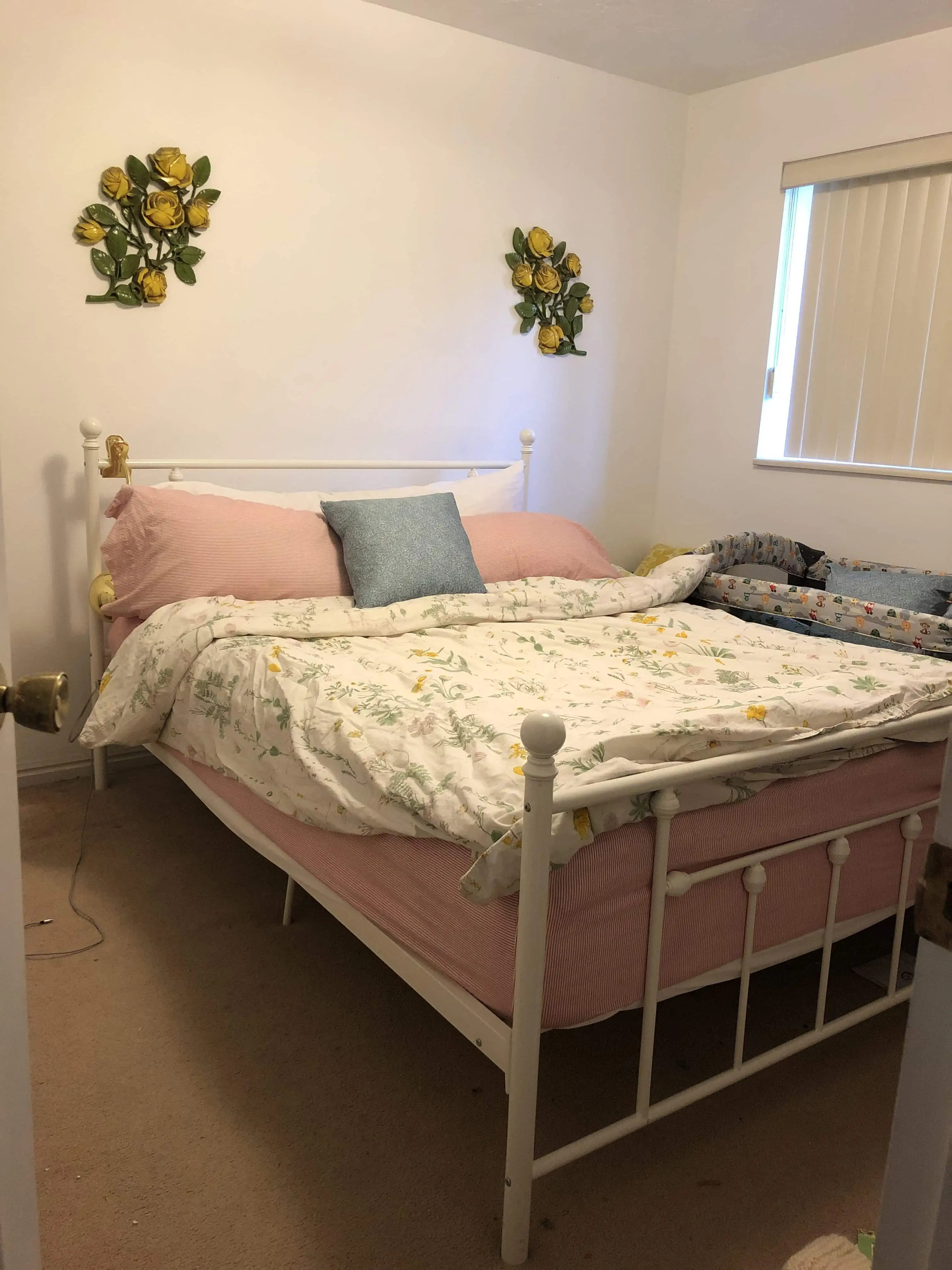
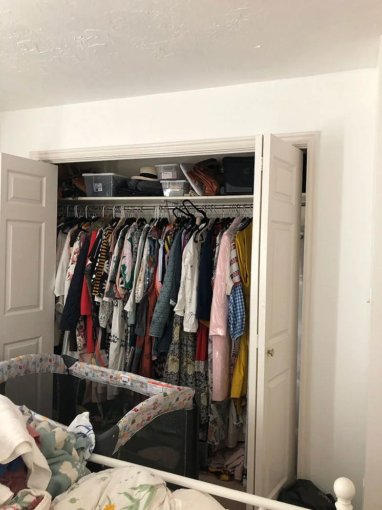
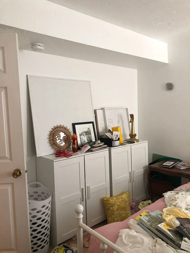
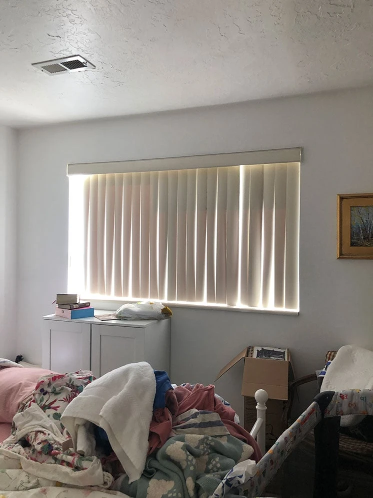
Before photos
Now, before we get more into the final photos, I want to show you the mess that we were working with. You ready for this? Big gulp….
OUCH! This hurts. I didn’t even clean up for you! You’re welcome! It’s a small room, about 10×10’ with plastic vertical blinds, beige carpet. I painted it white a few years ago so at least there was that. I like to say that the worst before pictures make the best after photos.
Now, you ready for the full reveal???
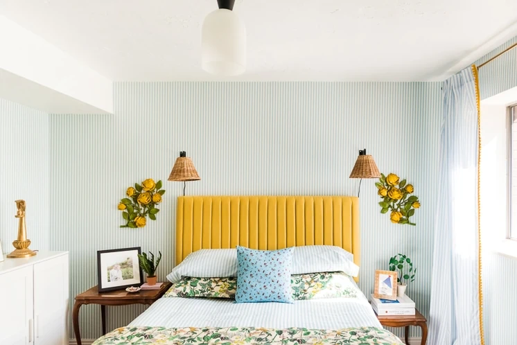
Final bedroom design
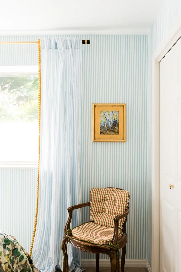
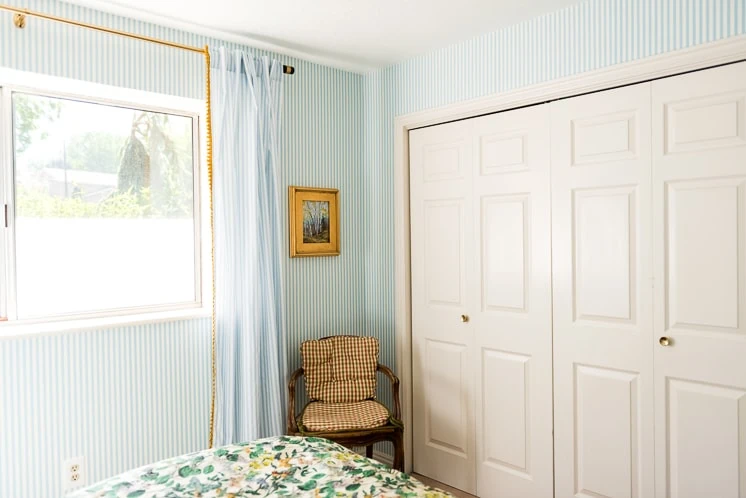
This chair above is one from my grandparent’s home. I haven’t changed the fabric at all, but I kind of like how it works.
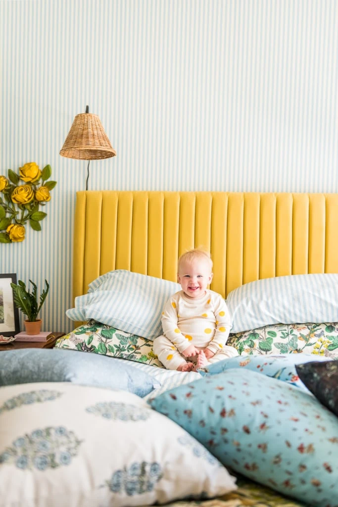
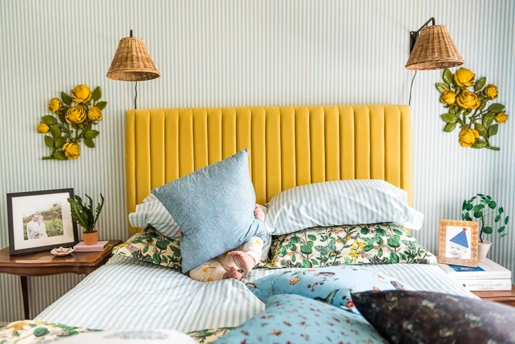
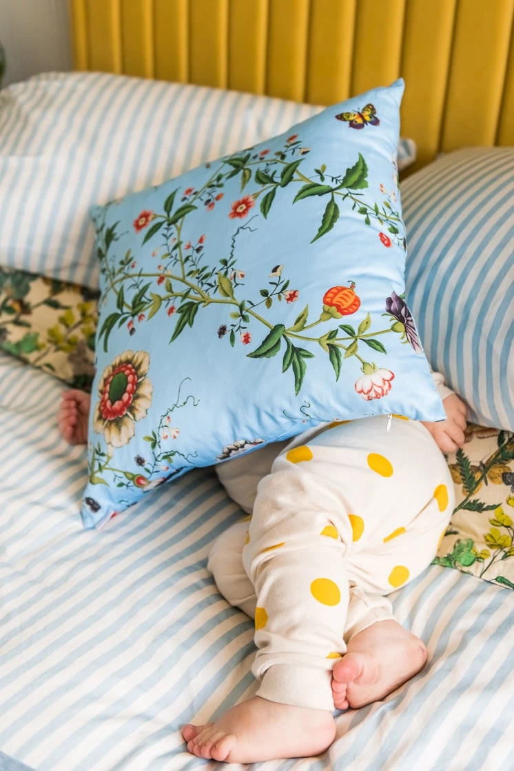
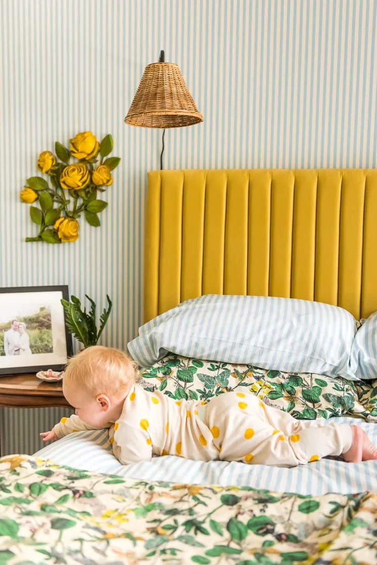
I had a little helper who loved jumping his way into the scene. Can you spot him? I’m sure it’s tough 😉
Bedding
Who doesn’t want glorious bedding to sleep in? This duvet, sheets, and shams not only make the design pop, they also make your bedding luxurious. The bedding pieces are made of cotton sateen, which has such a lovely polished look and feel. Jasper loves to snuggle up in it and spread his cracker crumbs everywhere. Yay!
Ok, sorry, I got distracted there…here’s the rest!
Curtains
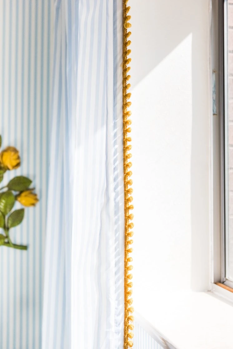
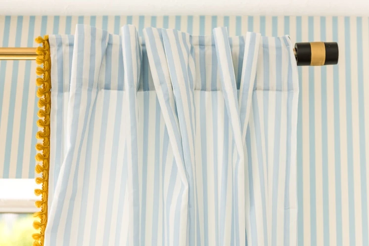
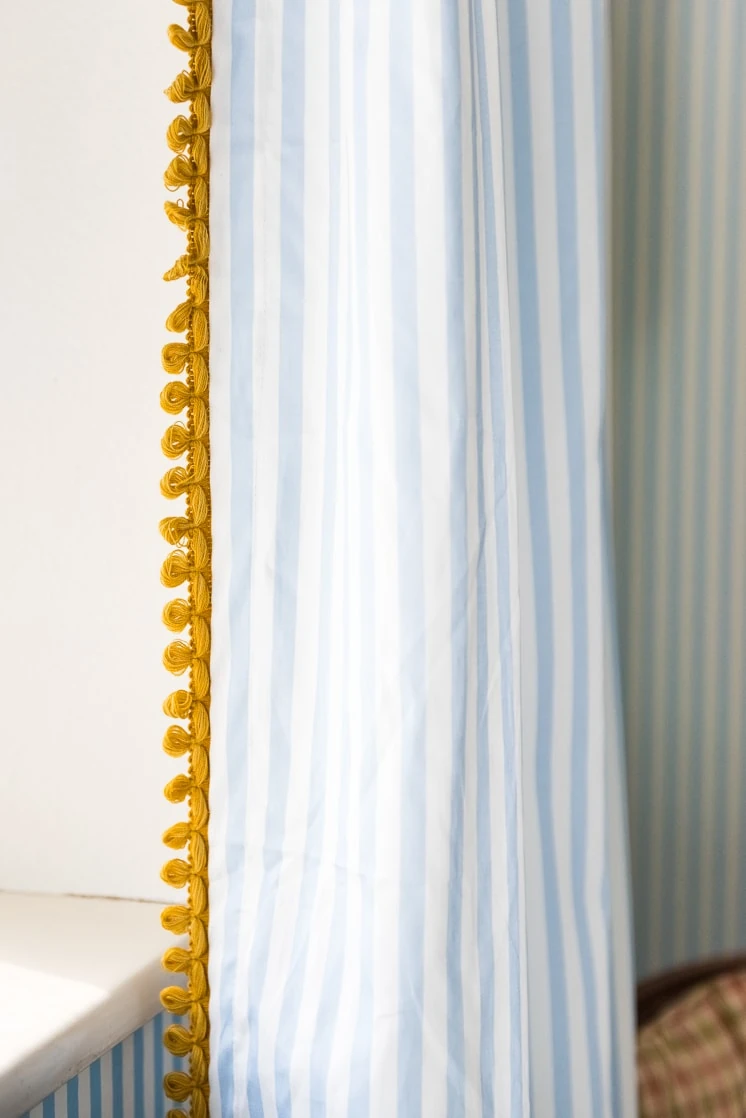
I decided to continue the stripe from the walls to the curtains. I loved the idea of an all over pattern (anyone remember Chloe Sevigny’s bedroom?!). And with this particular stripe, it’s just small enough where it’s not too contrasty and because it’s all over it begins to feel more like a solid. I wanted to add a bit of pizzazz into them so I found some yellow trim and handstitched it onto the edges. Love how it turned out! Voilà!
Throw pillows
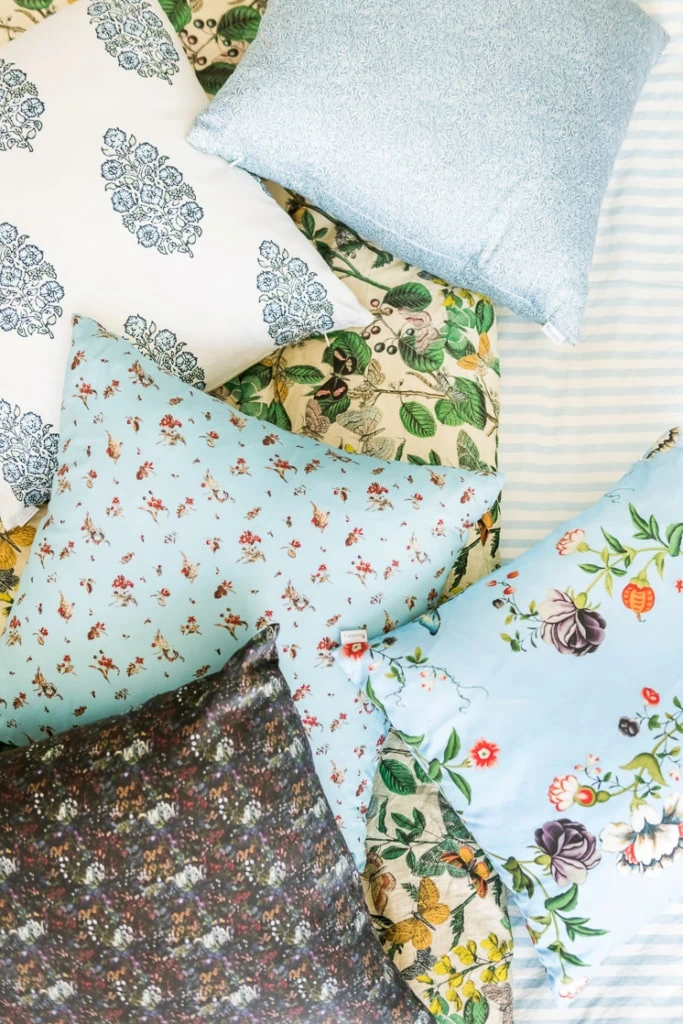
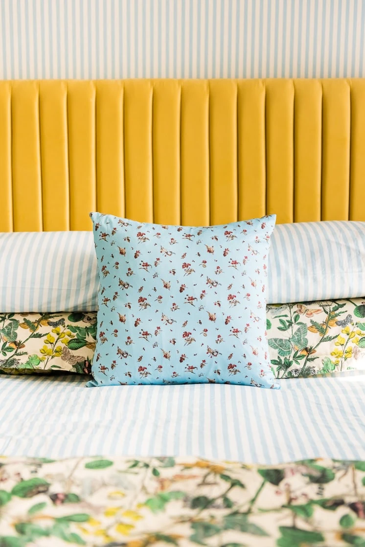
Spoonflower offers SO MANY choices (over 750,000 patterns) which can be overwhelming but more importantly inspiring! I loved that there were so many choices for the throw pillows and I had many options to mix and match. PLUS I love supporting independent artists and Spoonflower brings them all to one convenient place. You can find the links to the individual pillows in the product round up below!
Surface mount
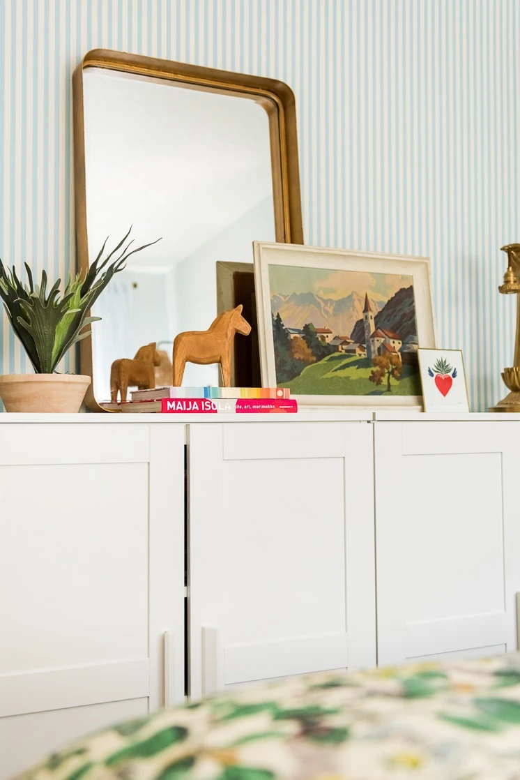
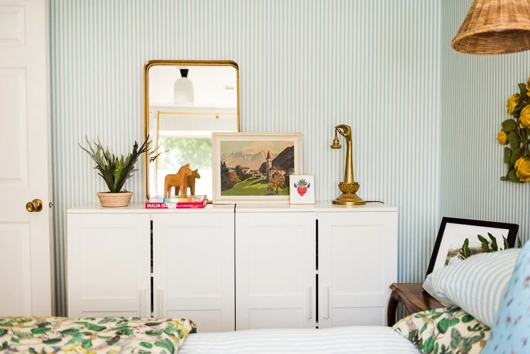
Here’s the gorgeous surface mount I was telling you about from Cedar and Moss. Isn’t it so pretty in the space?!
And let’s end on a few more of the Boo because he just makes everything better.
So sweet–trying to hit the camera lens. Doh!
I was showing my good friend, Merrilee, pictures of my new room and she reminded me of one of my favorite inspiration images of all time that I realized I was unconsciously referencing. Right?!
This was also one of our This Girl’s from a few years ago. Take a lookie here.
Spoonflower selections
Here’s a round-up of all the Spoonflower products we used to make this bedroom happen. From the curtains to the wallpaper and bedding, it was all Spoonflower!
- Stripe wallpaper
- Throw Pillow
- Throw Pillow
- Throw Pillow
- Throw Pillow
- Throw Pillow
- Throw Pillow
- Throw Pillow
- Bed sheets and Pillowcase set
- Stripe Curtain Panels
- Queen Duvet Cover & Shams
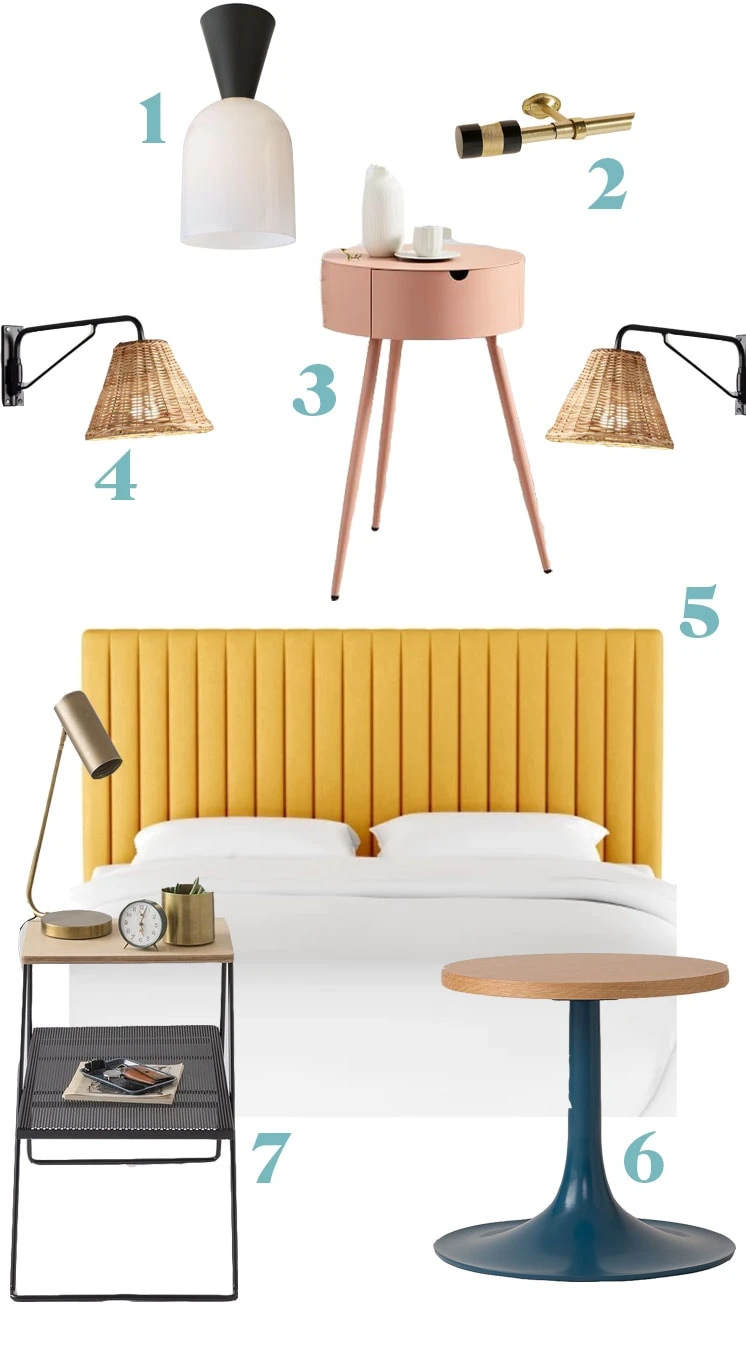
And here are all the accessories and furniture I used and/or I need your help deciding on!
- Cedar and Moss surface mount
- Curtain rod from Anthropologie
- Pink side table from West Elm–should I go with this one?
- Rattan Sconce from World Market
- Velvet mustard headboard from Target
- Peacock blue side table from Schoolhouse Electric–or should I go with this one?
- Metal side table from Schoolhouse Electric–or this one??
The flower decorations below the sconces are vintage items that I found at the Brooklyn Flea ages ago!
I really do love working with Spoonflower because of the limitless opportunities to customize and find great designers. I know that if I want to tweak the color for whatever reason I can approach the designer. I didn’t do that in this case, but it’s good to know that I can.
Head on over to Spoonflower to check out their new bedding and product collections. They’re so good!
This post is sponsored by Spoonflower. Thanks to the brands who allow us to focus on clever and original content for you!








Comments