Last week I revealed Baby Boy’s nursery mural! This week I wanted to share the full nursery reveal with you as I received a lot of questions about the design details. No need to fret! They’re all in this post! There’s a lot to talk about as it was a full on room transformation. We started with a very blank beige canvas if you recall last week’s before photos. Remember?! Once again, much like our office space, I’ve partnered with Blinds.com to transform the space with some wonderful window treatments and it made a world of difference. It set the tone for the full room and I couldn’t be more thrilled with how they turned out. Come take a peek at all the details!
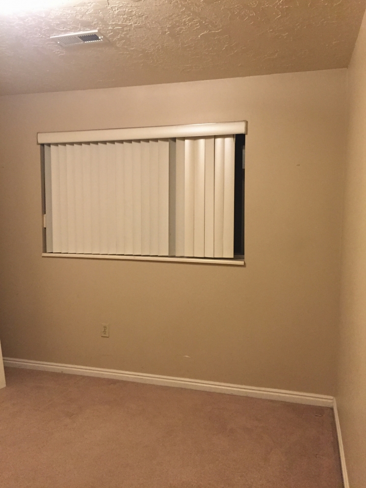
Ok, first I have to show the before photos again of the space. Yes, I do realize they’re all taken on my iphone at night so they wouldn’t have looked good either way, but man, this beige is killing my eyes!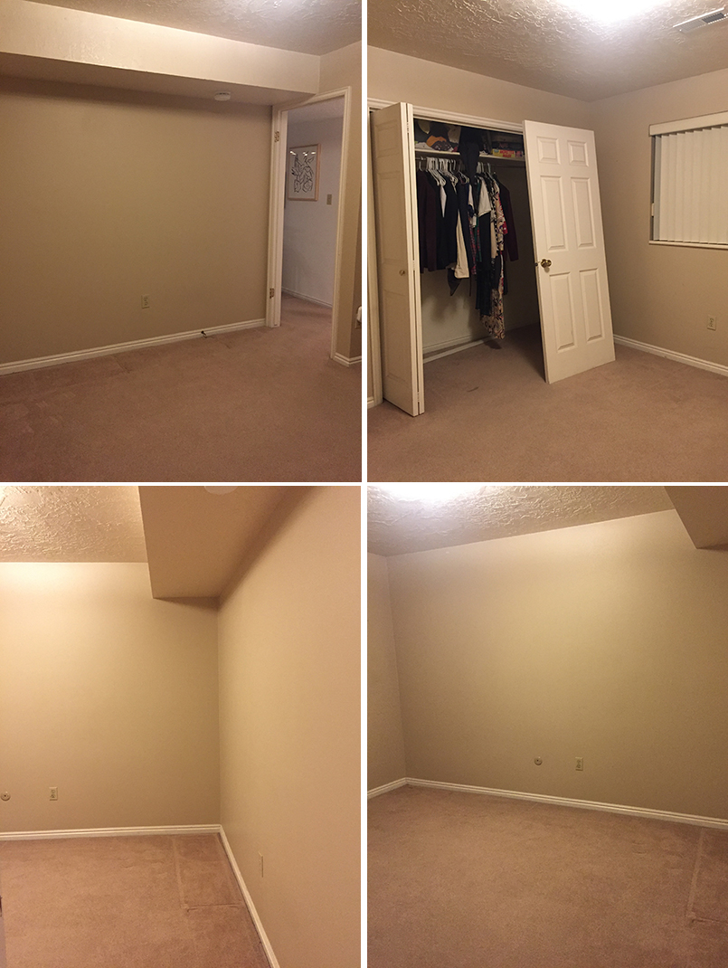
Clearly, something had to be done.
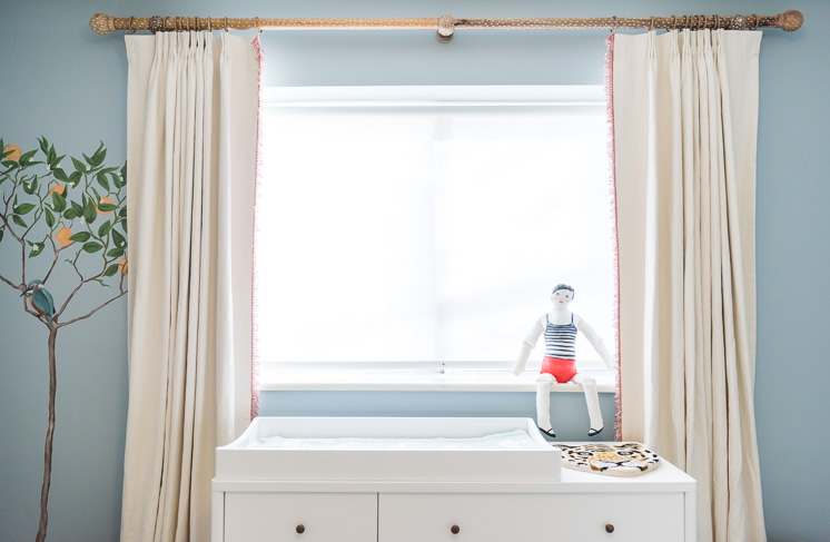
New window treatments
I was thrilled to work with Blinds.com on finding the perfect solution for our space. After a few phone consultations with their design expert, Danielle, to help me determine what we would need, she was so able to offer some suggestions. It was pretty breezy. I always always always love curtains so I knew that they to be a part of the mix. Donezo. Curtains are yet another way to add in color, texture, and print.
Signature Solar Roller Shades
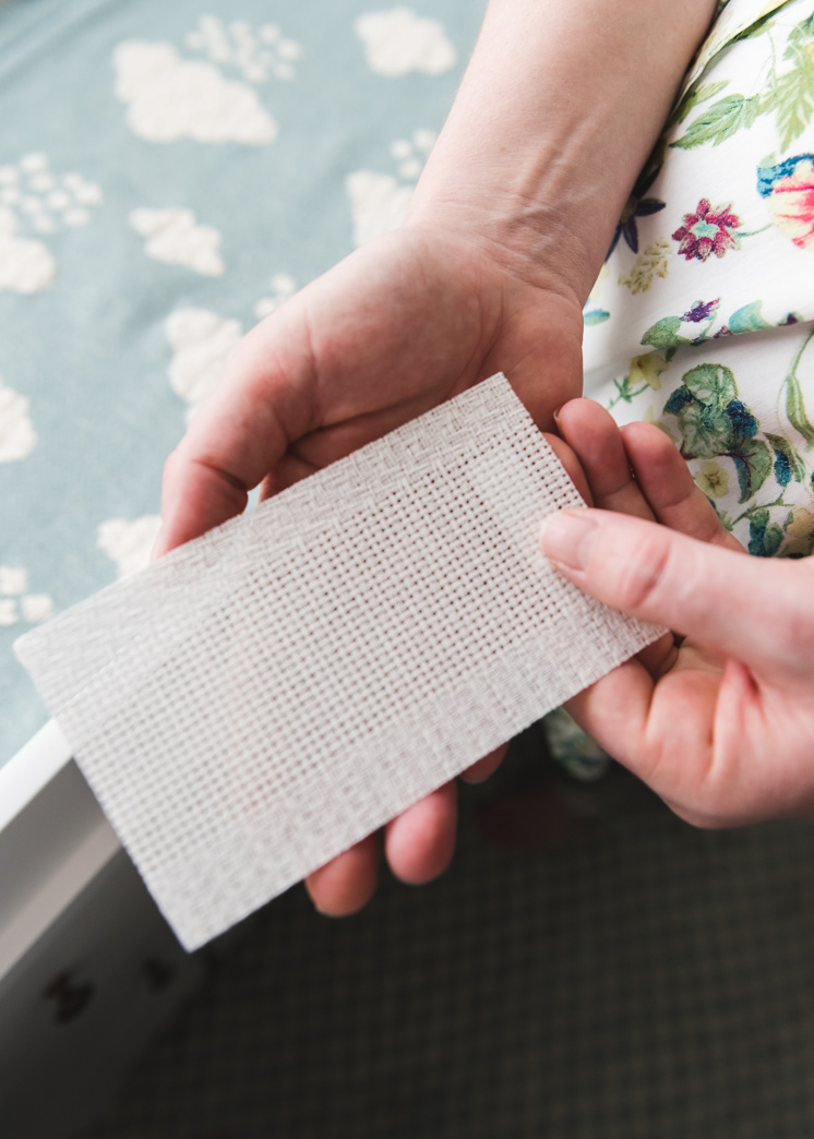
I also love the idea of being able to control the light with some sort of sun-filtering system. Danielle recommended their Signature Solar Roller Shades. This is what we have installed in our studio and I LOVE them so much. Rollers it was! I wanted a color and pattern compatible with the palette I was working with so Danielle sent me sample options in a variety of colors and textures. In the end, I chose an off-white textured pattern, Sarasota Off White, as I thought it would add a nice texture and keep it fitting with the rest of the room. The beautiful part of the rollers is that they’re cordless so all you have to do is pull it and then lift it to bring it back up. So easy. Being so close to the changing table, I knew it would be important to not have some long cords hanging off that baby could potentially play with.
Custom draperies
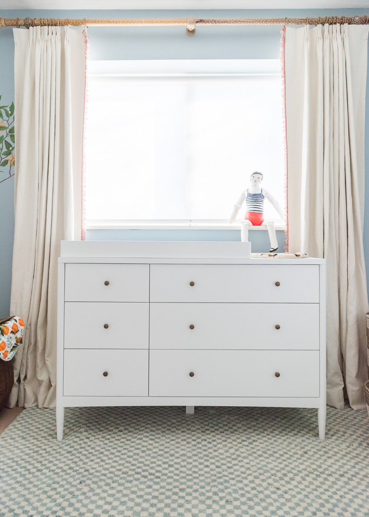
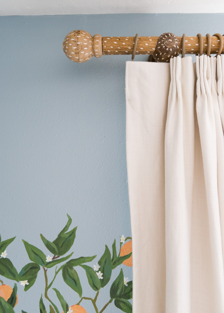
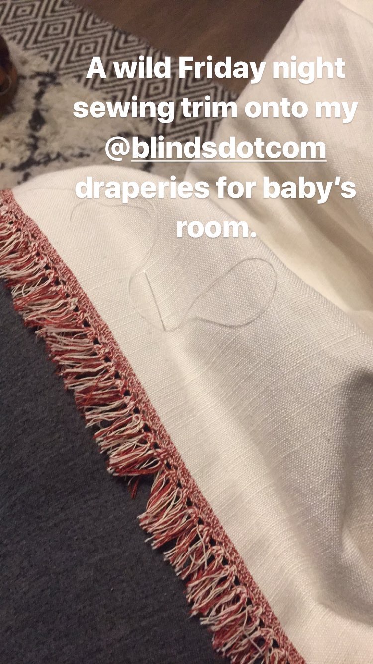
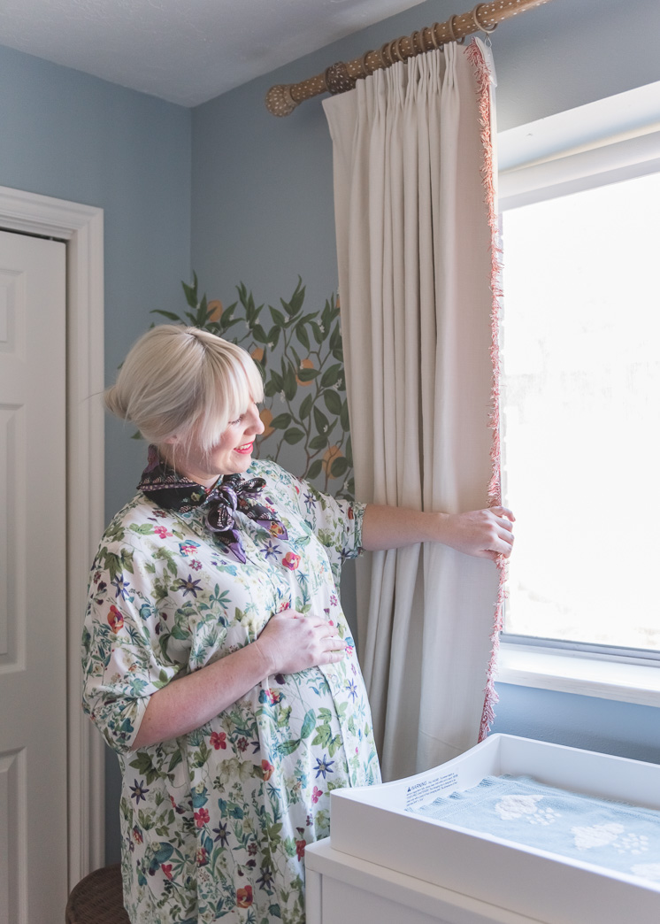
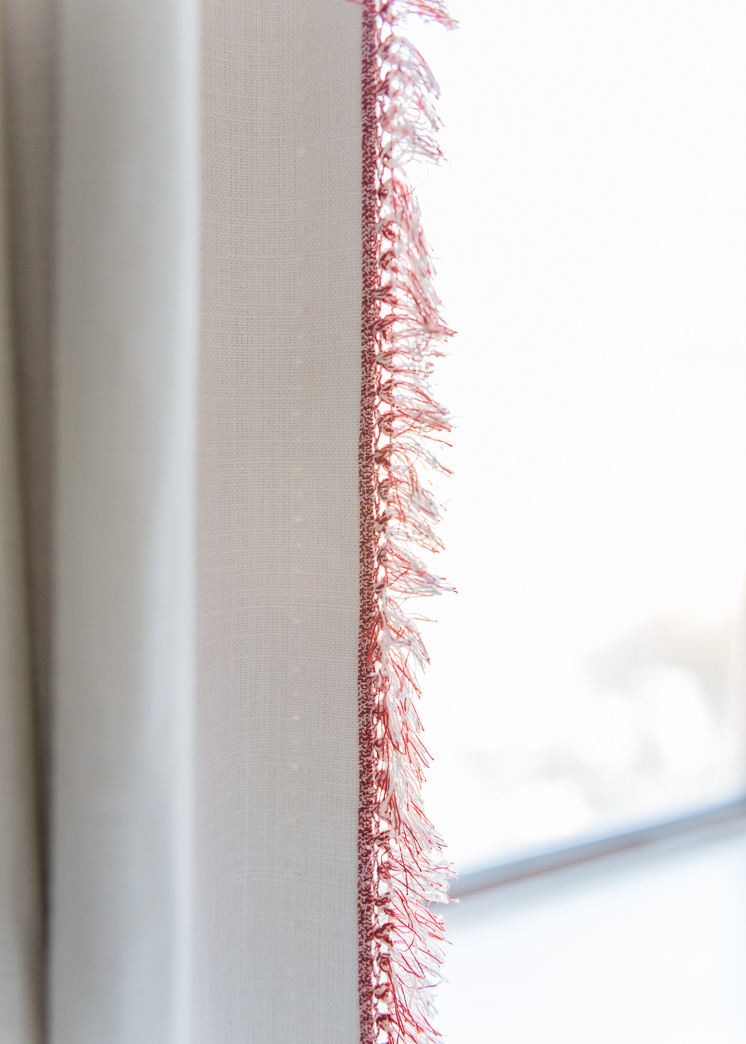
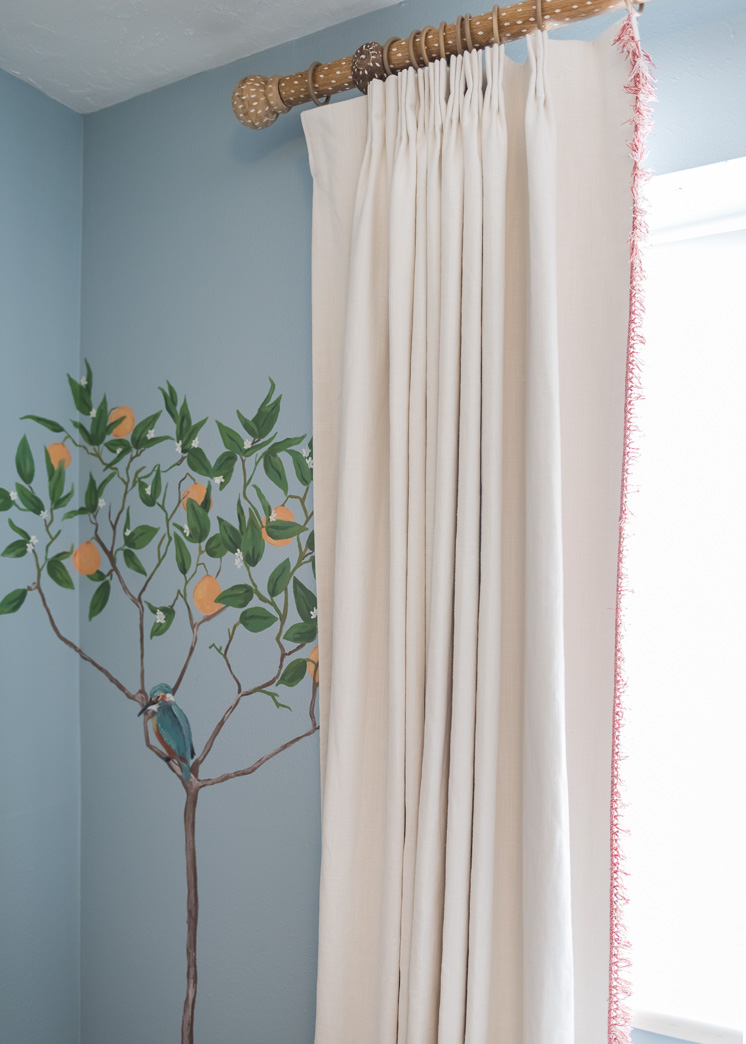
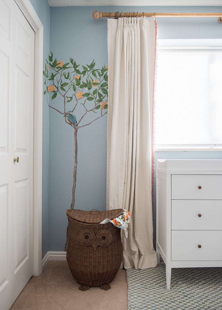
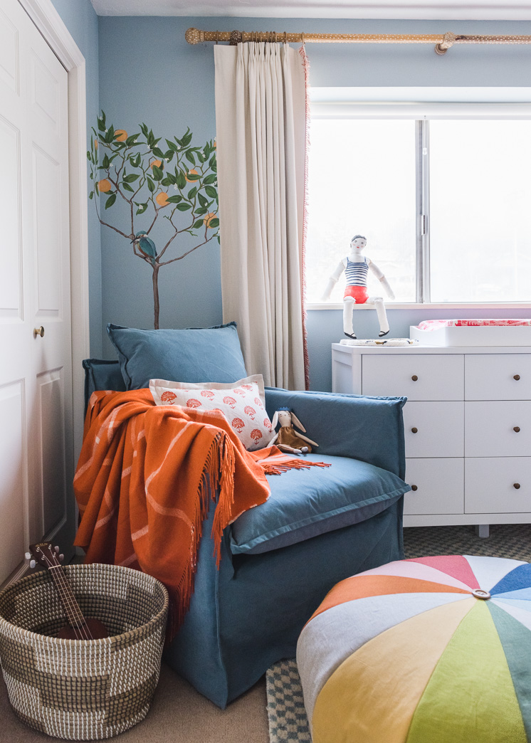
For the draperies, Danielle guided me to their Easy Classic Pleat Drapery. I selected an off-white linen, Gent Bisque, with blackout liners. I wanted the ability to completely black out the space, so this was a great option combined with the sun-filtering option of the roller blinds. Perfect! The curtains were screaming for a DIY element so I found my own curtain rod (from here) and combined it with these curtain rings that I spray painted to the color of the rod so that they would blend in better. They also needed some more and after much searching, I found this red and white trim that was the perfect color red to go with the other pops of red in the room. I spent an evening watching The Office and sewing the trim to the sides of the curtains. I’m proud to say that I’m now finished with the series.
I LOVE how they turned out. It was just the touch it needed to complete the look and add in a dash of whimsy. The curtain rings are super easy to maneuver and I even quite love how they are a tad more formal yet playful at the same time.
Lars readers also get 20% off any order at Blinds.com now until 2/28/18! Simply use the code LARS20 at checkout!
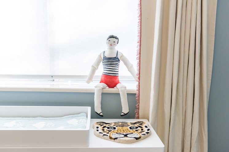
This little tiger carpet was something we found at Smallable concept store in Paris in October. I’m still trying to figure out how to display it. Maybe on the wall? And the little bathing man doll I bought from artist Michelle Christensen of My Little Belleville ages ago and finally feel comfortable displaying in my home as a grown adult.
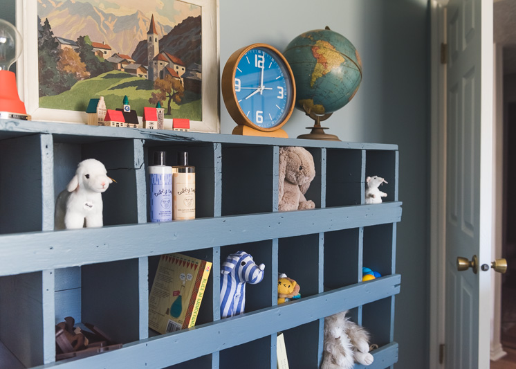
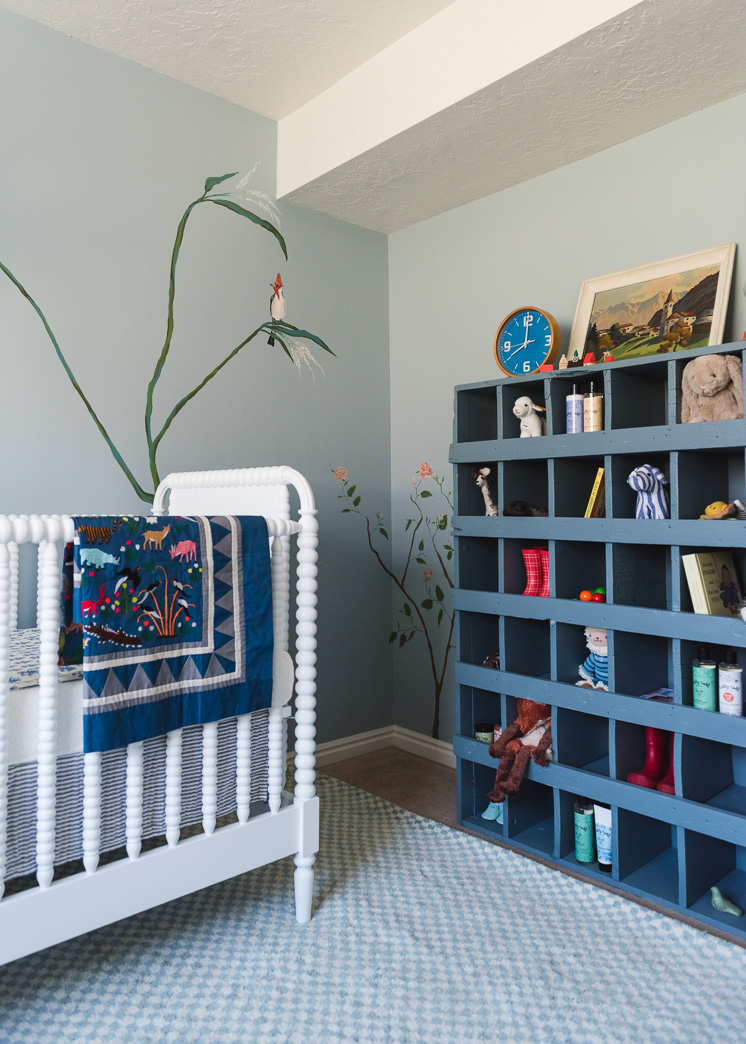
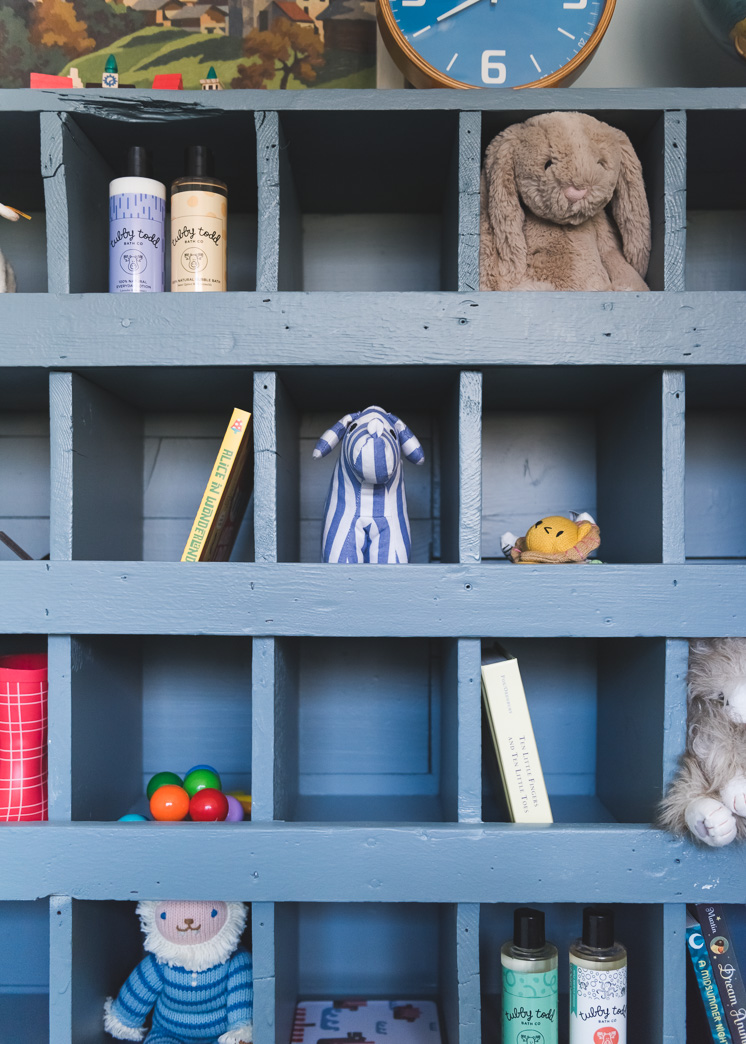
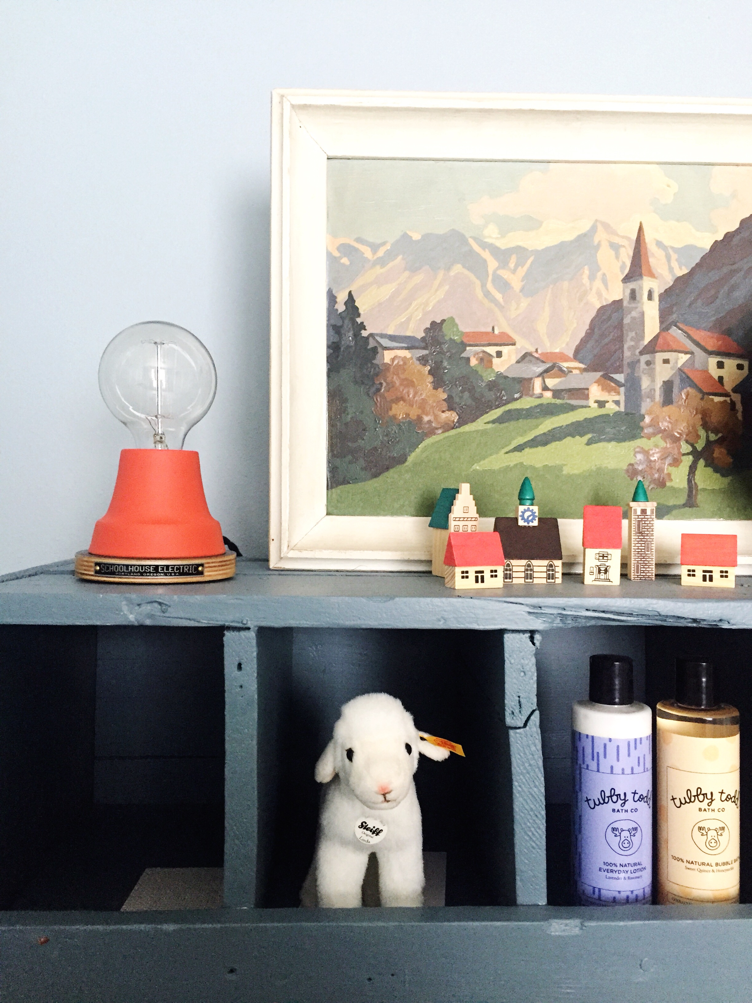
The cubby system is perfect for displaying all the little treasures we’ve been collecting over the years as well as the generous gifts from our dear friends. Fun fact: Paul likes to collect stuffed animals. Ba ha ha. He’s collected them from every city we visit around the world. I don’t know if he’ll be embarrassed about that fact, but let’s see if he reads this blog to find out. It will be a nice little test 🙂
Accent colors
I wanted to bring in some tomato red pops of color throughout the mostly blue space. When I spotted the perfect shade at Schoolhouse, I knew I had to get it in somehow. The Ion C-series box set in campfire red was the perfect shade of red and it was a great way to get another source of lighting into the room. You know the three sources of light rule!
I also found this oversized schoolhouse clock in persimmon from Schoolhouse as well. It’s just a tad too large for the space that I thought I was going to put it. I’m still trying to figure out where it should end up. Any thoughts?
The owl hamper from Land of Nod is the perfect fit for the aviary mural theme.
Furniture
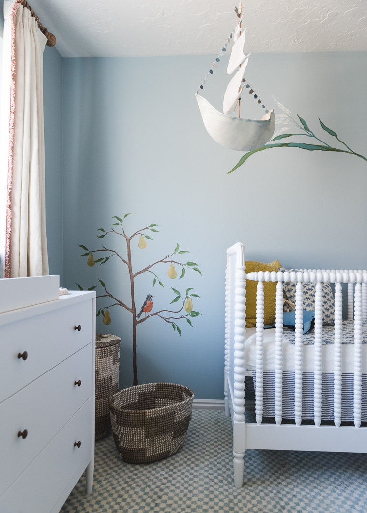
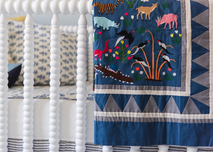
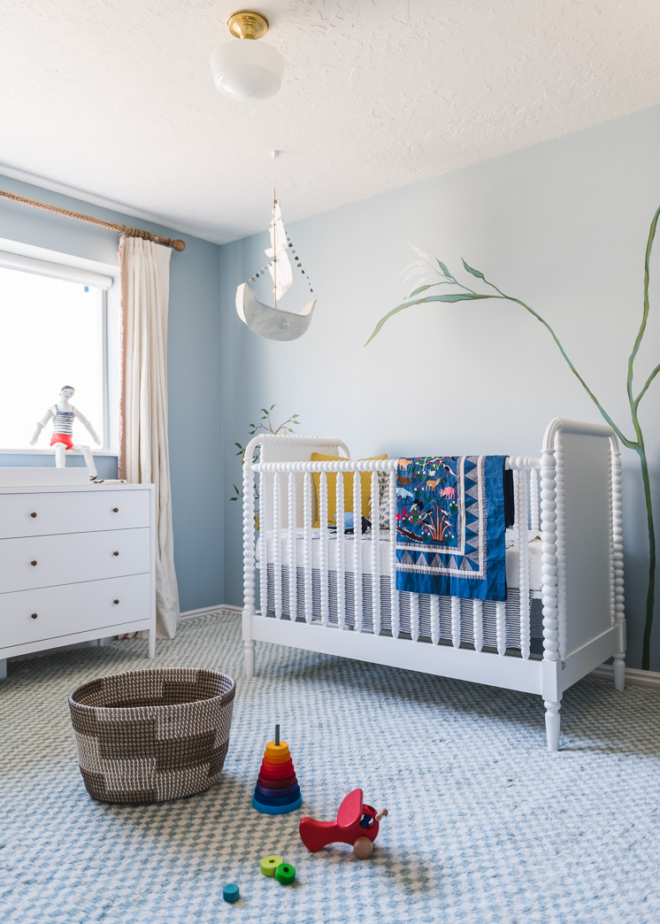
As for the furniture, a lot of you were asking where we got our crib. It’s a Jenny Lind crib from Land of Nod and I LOVE it. The knobby feel adds just the right amount of whimsy. I’ve been debating if I want to paint it a color. Either off-white or one of the colors in our color palette, but a huge part of me doesn’t want to mess with it at all as it’s such a great quality bed and I’d be worried about paint drippage and such. What do you think?
The dresser is also from Land of Nod. It’s the Hampshire 6 drawer dresser. I love the dainty antique brass pulls. They fit in perfectly with the rest of the hardware. We got the changing table to go on top so now Baby Boy can work his do-do magic. The floor basket is also from Land of Nod, perfect for little hands and toys. And the ship mobile is a tutorial from our site. All you have to do is cut out and assemble! I love how it works in here!
Ceiling Light
I thought a lot about what ceiling mount or pendant I wanted in the space. The room is actually much smaller than it appears in the photo above so anything large was going to take over the whole space. The room was calling for something simple and sweet and once again, Schoolhouse came to the rescue. It’s a simple vintage-inspired fixture called Newbury.
Rug
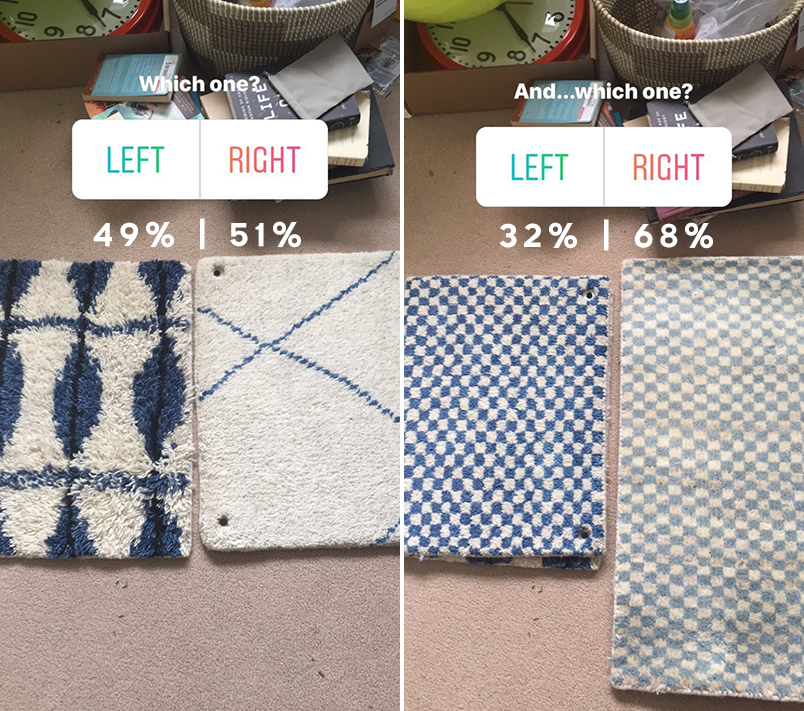
From last week’s post received a lot of questions about the rug and it’s one of my favorite parts about the room. I did a lot of Instastories about it because there were so many great options from Annie Selke and I wanted to get your opinion.They have a full category just for blue rugs and I found 4 solid choices. You guys certainly had a lot of opinions and you know what? They aligned with my hunch so it made it that much easier to choose.
Ultimately, I went with the Citra Robin’s Egg Blue hand-knotted wool rug by Dash and Albert from Annie Selke. I love it so much. Paul’s not the biggest fan of rugs on carpet and I admit it doesn’t make a lot of sense. But I mean, how could you not have a robin’s egg blue checker rug in Baby’s room?! Plus, it’s so darn soft. It’s magical. And thankfully, Paul now agrees.
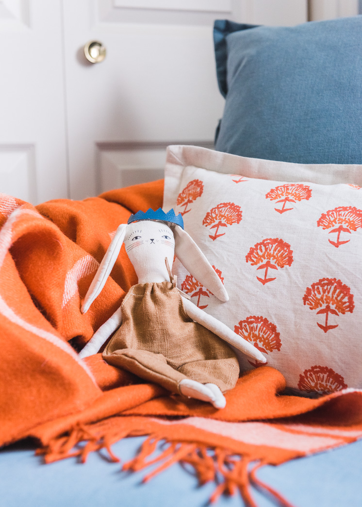
Edited: The Hayden glider from Serena and Lily arrived last week and I had to go back and edit it in because I LOVE it. I’ve already spent countless hours in it. I added in their Avery alpaca throw blanket and coordinating Astoria pillow and it’s now my favorite spot in the whole house. And that rainbow pouf is one we DIYd. You can find the tutorial here.
There are still some elements I want to add in to make it feel a bit more lived in. I want to bring in some darker tones and more vintage pieces to offset the new vibes it’s currently setting off. Now I’m thinking of all the DIYs we can add to it. I’m thinking something along the lines of an aviary-type mobile. Some rattan pieces also need to make an appearance. I’m also waiting on the glider, which should be arriving any day and that means a DIY ottoman. Ok, now I’m rambling, but you know, it’s always so fun to dream on! Stay tuned!
Thank you to Blinds.com for transforming Baby Boy’s space. I’m in love! Lars readers also get 20% off any order at Blinds.com now until 2/28/18! Simply use the code LARS20 at checkout!
Sources:
Roller blinds from Blinds.com | Draperies from Blinds.com | Curtain rod | Curtain rings | Red and white trim | White dresser and changing table | White Jenny Lind Crib | Owl hamper from Land of Nod | Red clock from Schoolhouse | Red lamp from Schoolhouse | Basket | Basket hamper | Rug | Toys on rug | Quilt on crib is vintage | Bedding in crib | Ship mobile is a tutorial from our site | Ceiling fixture from Schoolhouse | Bed skirt from Little Unicorn | Glider from Serena and Lily | Astoria pillow from Serena and Lily | Avery throw blanket from Serena and Lily | DIY Rainbow pouf from Lars
This post is sponsored by Blinds.com. We love working with brands to help us create wonderful, original content for you!



Comments