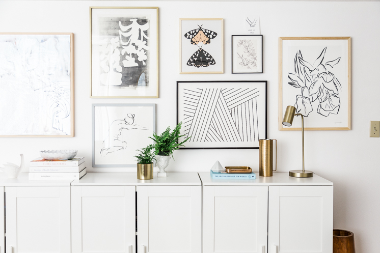
 Last month I shared with you my new TV, which is a camouflaged piece of art and you, rightfully so, went bananas, just like I did. I love my TV so much. I’m so pleased every time I walk in the door and look at it. It’s beautiful. We’ve been living in our apartment since we moved to Utah 4 years ago and I had been wanting to do something fun on the wall where it now sits. Originally I placed a row of bookshelves along the 15′ wall and thought I’d place some oversized pieces of art on it. I don’t know if you have the same problem, but I love the idea of accruing artwork from various places around the world that each tell a wonderful story of an adventure I’ve been on, but when it comes down to it, I rarely buy artwork when I travel because it’s super annoying to travel, not to mention unsafe and customs and tariffs and who even knows what. Well, like I mentioned, it’s been four years now and I had nothing on my walls as of a month ago. I knew I wanted something impactful to show you to go with the TV since the magic of it is that it does look like a piece of art, so I worked with Minted to help me create a beautiful gallery wall and you know what? They totally delivered. And today I’m showing you how I made it work, because it’s like one giant real-life puzzle. Let’s go!
Our old set up featured four open bookcases across the wall. I liked it at first but then I found it to feel really messy. You know how people love putting books in rainbow order? I tried it and it would look ok for awhile, but the truth of the matter is that it needed to be both functional and ok to look at and we just didn’t have enough rainbow books to make it work well. That, and it just became messy so often because it’s really the only place we have to put things away in. I used it as my personal control center where I’d put important docs and stuff and overtime it became an eyesore and visually so cluttery with all the books out in the open. I began peeking around on Ikea and had something in mind when I arrived, but I’m glad I went in person before purchasing, because I found something that I found to be a much better fit. It’s always better to see things in person, no?!
How to create a gallery wall to go with your TV
Selecting the artwork
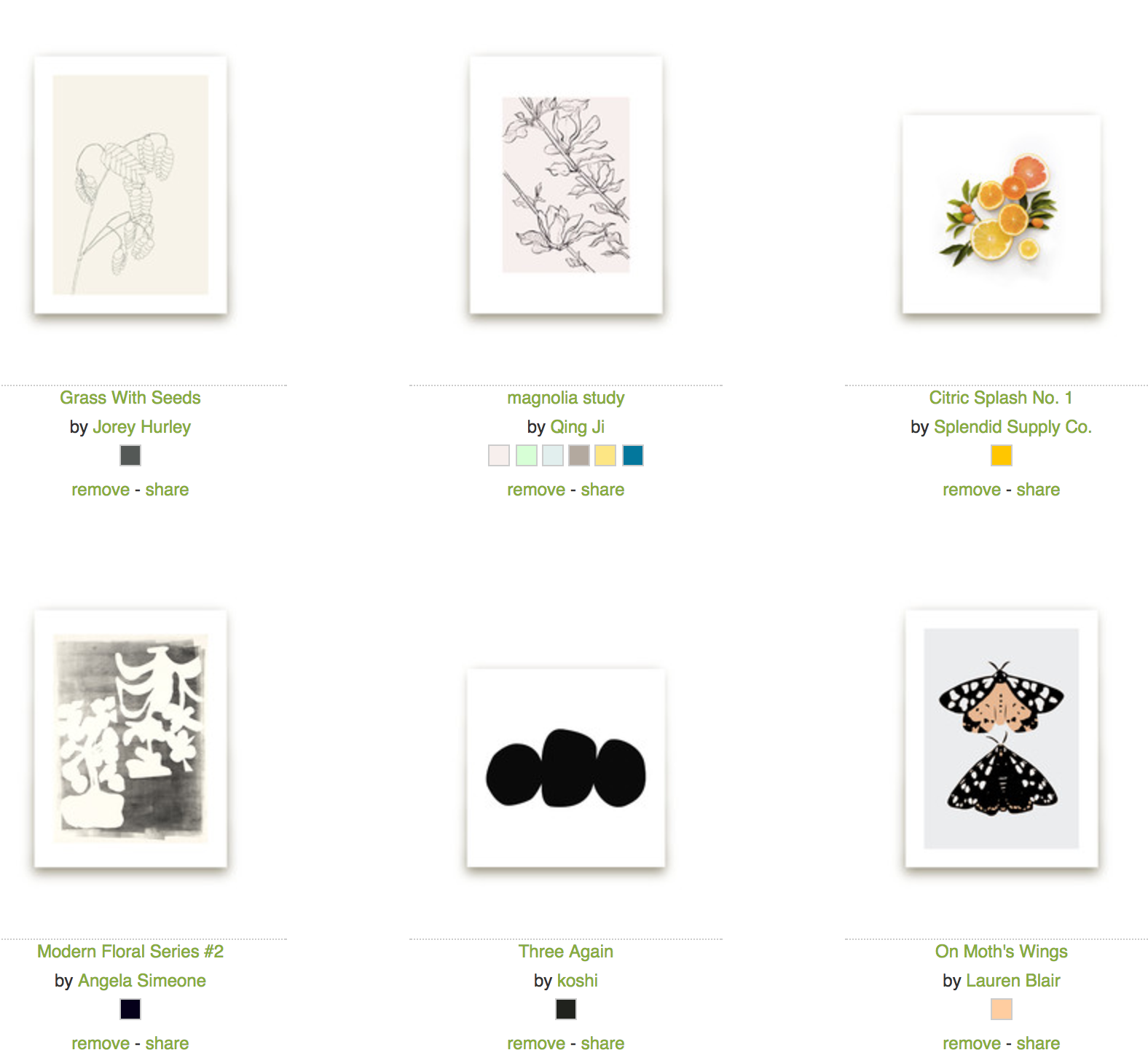
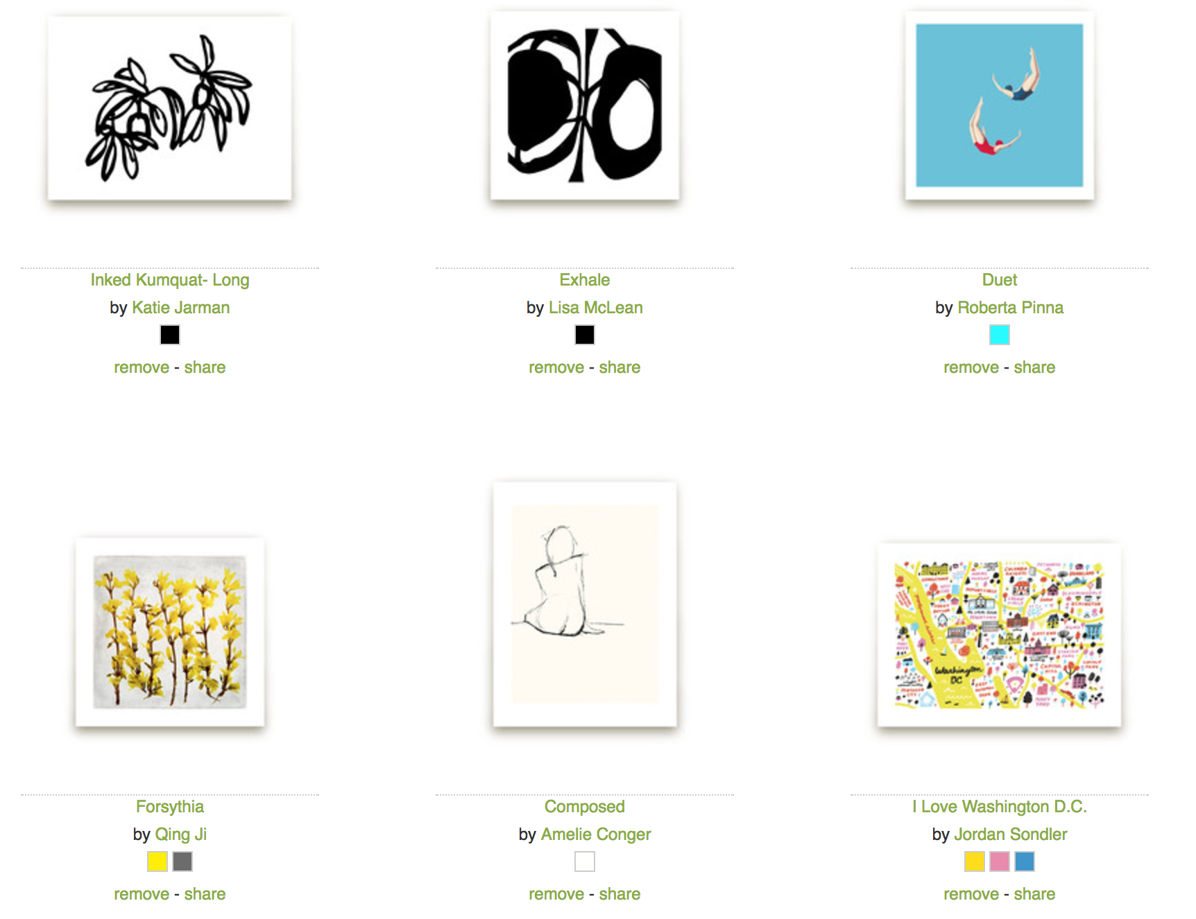
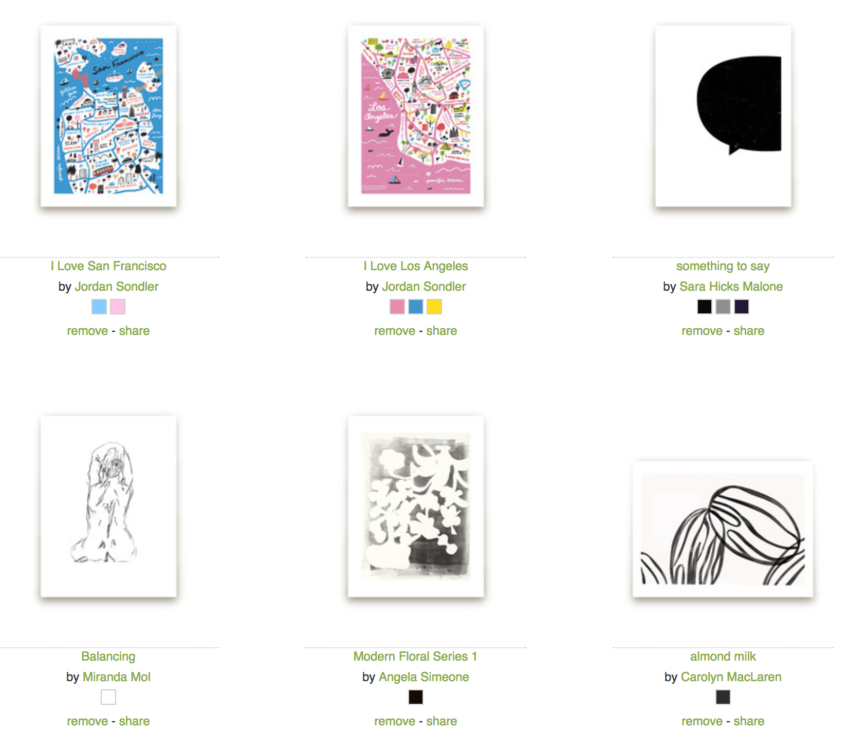
First I started out by scouring minted.com to find artwork I loved. I selected it all from the fine arts section here. Here’s a complete list of my preliminary choices. They have a “love it” option so you can see which ones you are filtering through. I just wanted to see what popped out before I made final decisions. As you can see it was a rather long list.
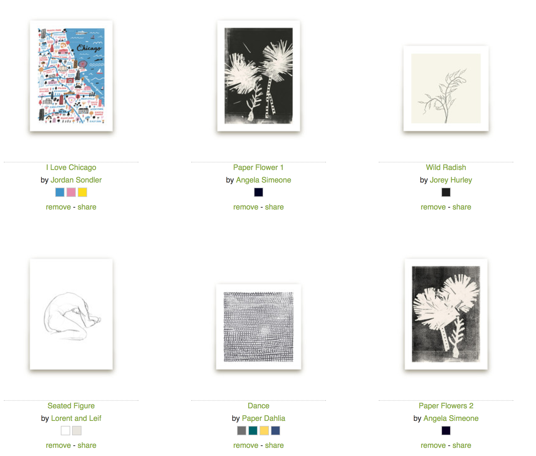
Make some rules
As you can see, there was a wide range of styles, which made it hard to narrow down. Eventually I decided to give myself some parameters so that I could make the gallery wall more cohesive. These rules included the following:
- a black and white theme with traces of color
- a mix of drawings, botanical, graphic artwork so that they didn’t all feel the same
With these rules I was able to select what I wanted more quickly and focus much better. I ended up liking this combination of artwork the most:
(and for some reason this one isn’t showing up)
Size of prints
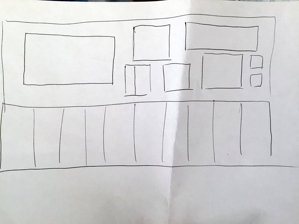
Next up was figuring out how large to make them. I wanted the artwork that I liked the most to be bigger so I created a few layout options. At the time I started planning I hadn’t yet seen the tv so I didn’t know exactly how it would feel in the space, which is why I needed to employ my old interior design skills to create a few layout options. Though I went to school for it and have a master’s in it, I haven’t really employed my drafting skills and this is the level of professionalism I do these days:
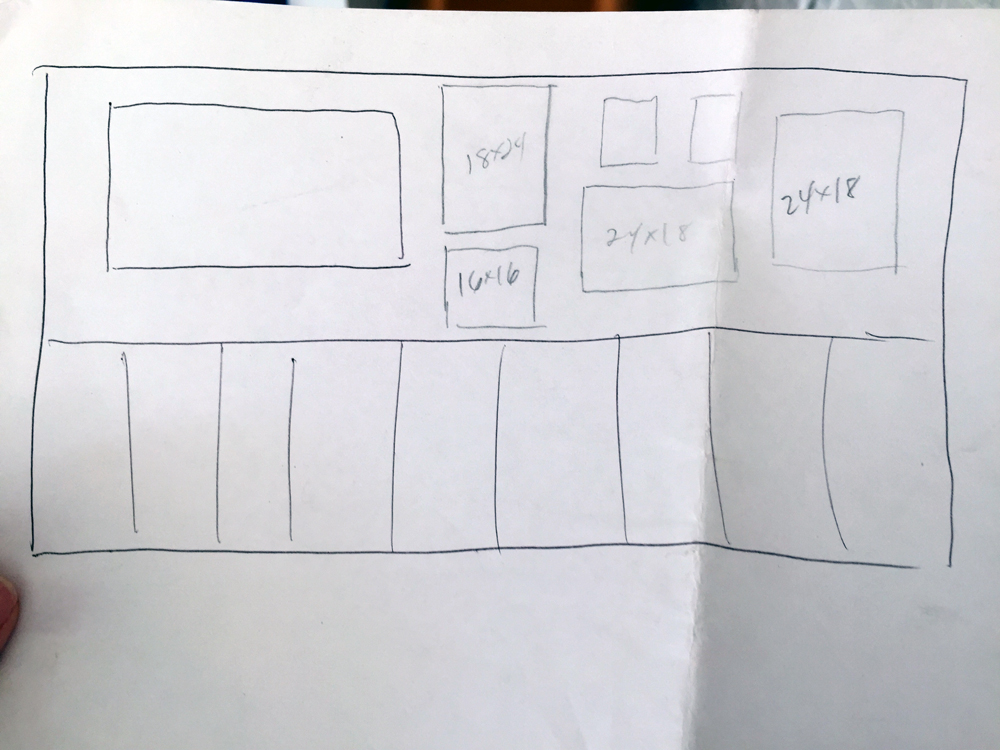
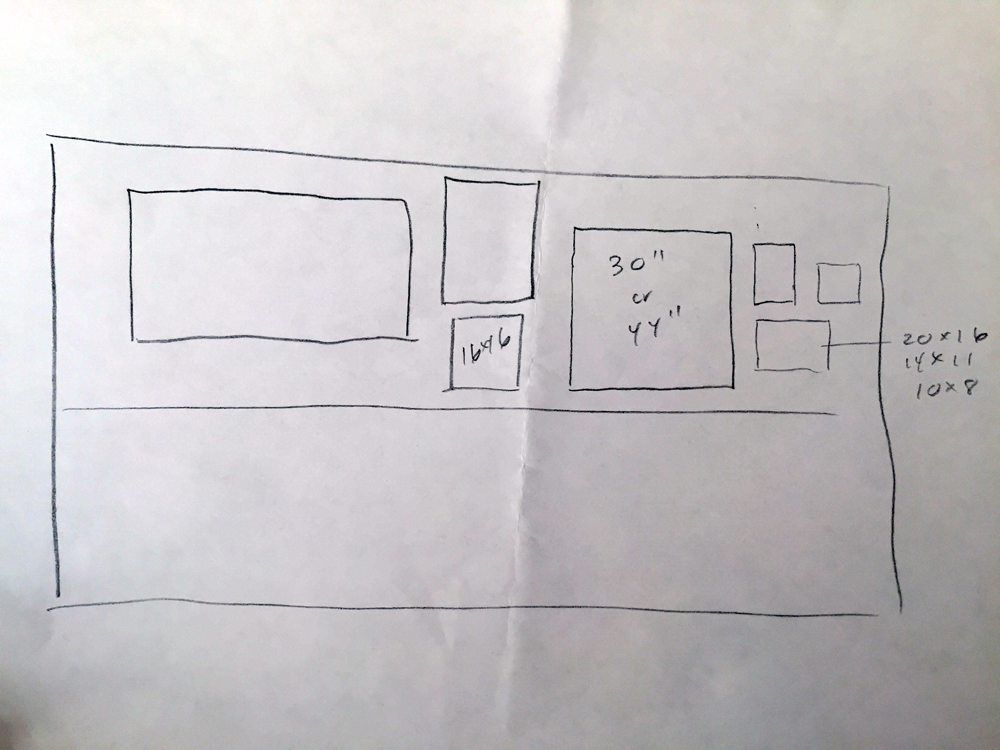
Fancy, right?! Due to the way the room is set up with the sofa in the corner, we needed the TV off to the left side of the wall, leaving a good half it for artwork. I spent a number of hours on minted.com first starring the artworks I liked the best, and then creating different scenarios where they could possibly work together well size-wise, visually, themed, color-wise, and frame wise. There are a lot of considerations! For example, because the frame of the TV is a wood I decided to go with a mix of wood, gold, black, and grey frames so that they wouldn’t be monotonous, but still work well together.
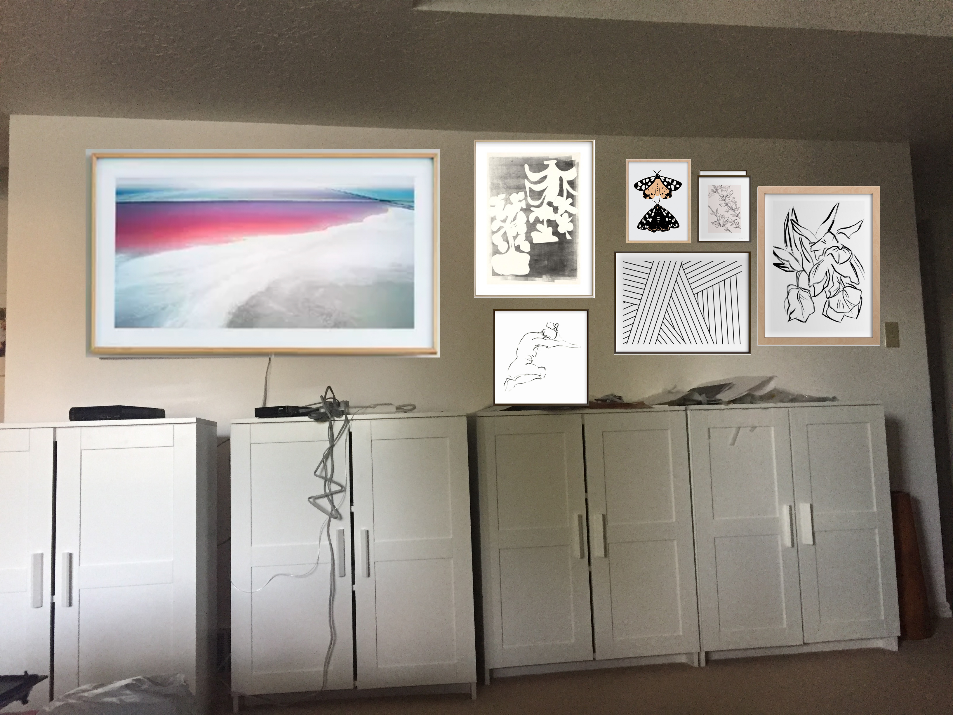
Based on my initial layout options I knew where I could put them. I went with the top layout option and so I put the larger pieces of art on the right side and next to the TV. But before I committed I created a mock-up for myself. I know not everyone has photoshop skills, but this is something you could do in Google Presentations or Doc. Just take a picture of your wall or room and then add in the artwork on top of the image. Adjust to find a combination you’ll like.
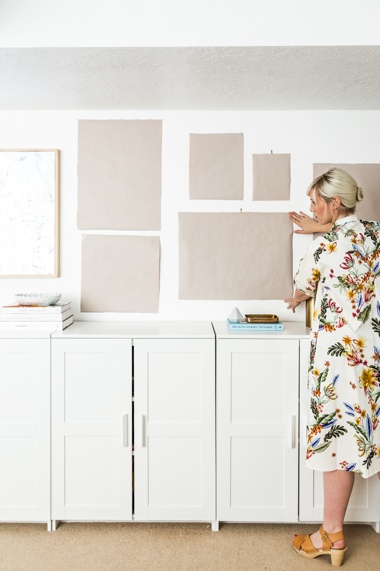
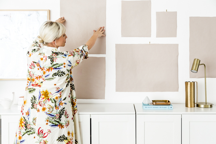
To REALLY make sure the actually artwork would fit well on my wall, I made the artwork a bit bigger because I know that the frames would add in extra dimensions. I used the measurements from the website and cut them out in cheap painting paper and hung them up. This was really helpful in knowing if I needed the change any sizes, because with Minted you have the option to select any size and frame and negative space that you want. And turns out, I liked it. Phew!
When the artwork did arrive I was able to place them over my place holders so the process was rather quick and painless. I used these velcro hooks to attach the majority of the artwork and the frames that didn’t have as much surface area for hanging I hung with normal artwork hooks. I do find that velcro hooks allow for more flexibility when hanging them up because you can fudge the lines.
You can click on the images above to see the artwork I selected but I’ll list them out as well:
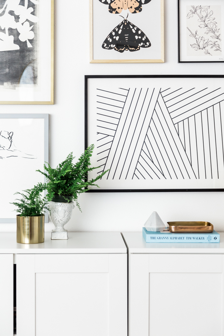
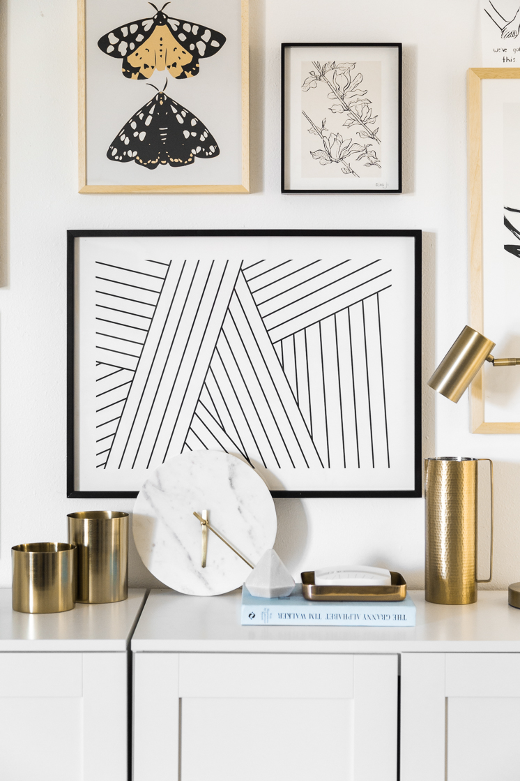
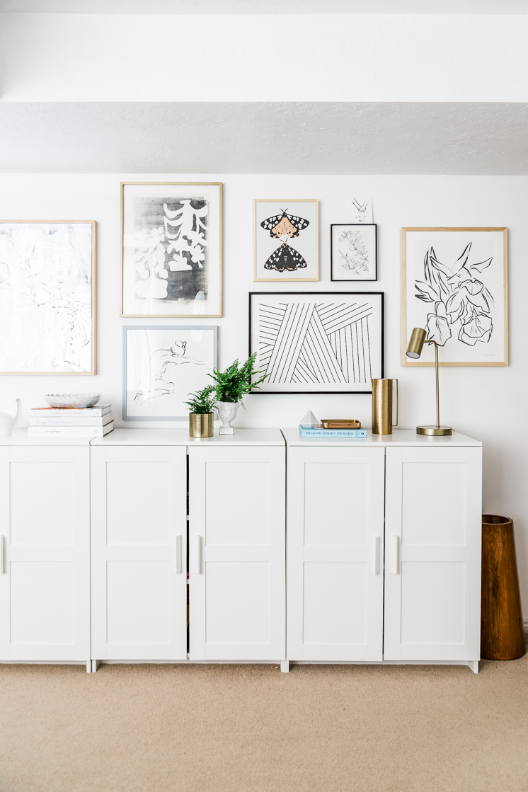
far right and clockwise: Parrot Tulips by Lynne Millar, Tension by Jamie Derringer, Model by Miranda Mol, Modern floral (top left) by Angela Simeone, On Moth’s Wings by Lauren Blair, Magnolia Study by Qing Ji,
SO, there you have it! My gallery wall that works so so well with my TV and not to become too redundant, but I LOVE IT SO MUCH. I’ve linked to all the artwork in the photo above.
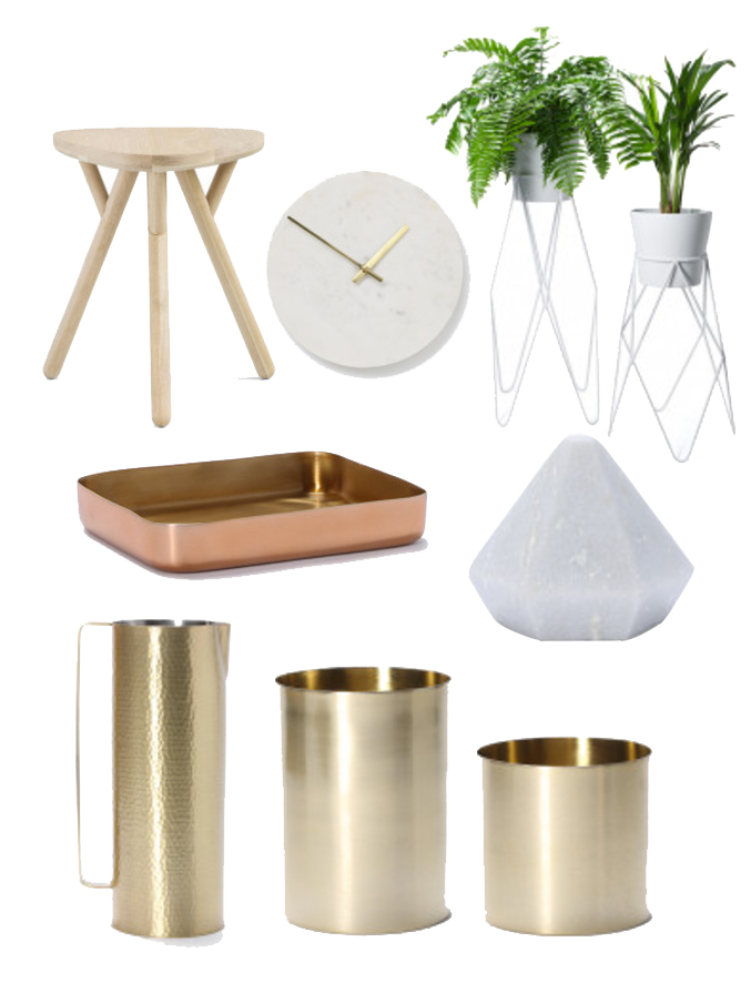
To add some beautiful home decor touches, Arro Home, one of my favorite home shops based in Australia, provided some awesome items like the gold vases/planters, pitcher, tray, and marble geometric paper weight. Some of them are on MAJOR SALE right now so I’d hop over and snatch it up! Some of these aren’t seen in this shoot, but you’ll be seeing them soon!
Wood Stool | Marble clock | tall planter | small planter | copper tray | alabaster prism | pitcher | tall gold vase | small gold vase
Let me know if you have any questions about how to make your own gallery wall. I’d be happy to answer them!
Also, I got my dress from here | TV from here
Thank you to Minted and Arro Home for making my home something I love to come home to!


