Take a look at all the components!
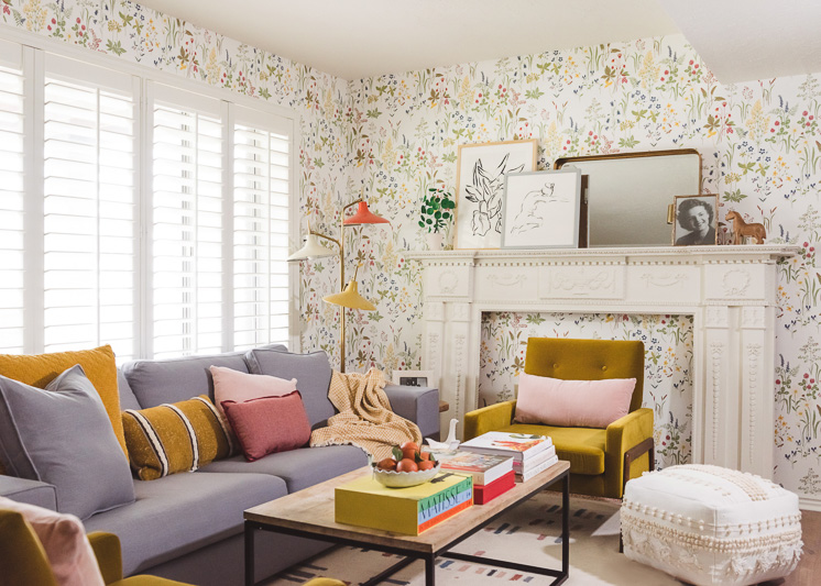
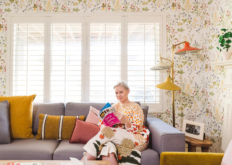
As I have mentioned before, I live in a walkout basement apartment, which means natural lighting is a hot commodity and hard to come by. We have a large front-facing window in our living room and we get some foot traffic so it needed the ability to have privacy, but since it’s our only light source for the room, it needed to be functional.
Previous to this, I had replaced the vertical blinds that the apartment came with curtains from Ikea. I had actually sewed two curtains together so that they would be heavier and you couldn’t see through them. Ha! Although they were an improvement from the vertical blinds, they were difficult to slide in and out and felt unprofessional. I was aching for some lovely treatments that were also functional.
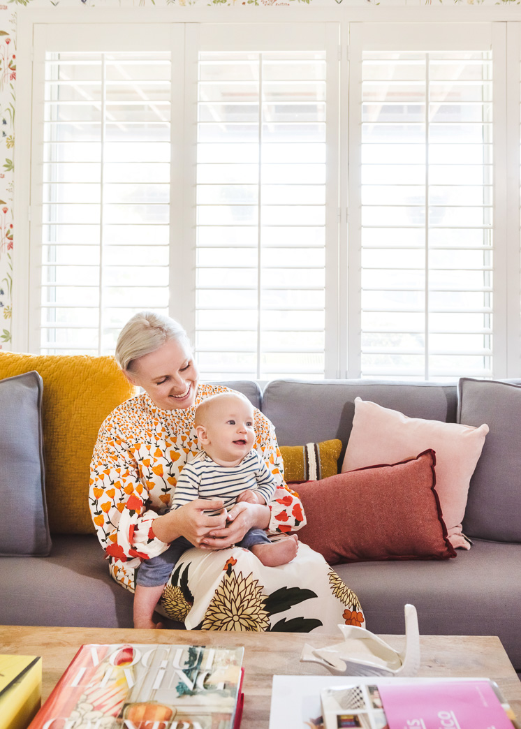
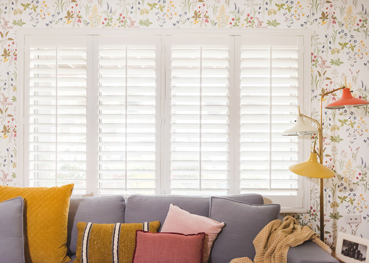
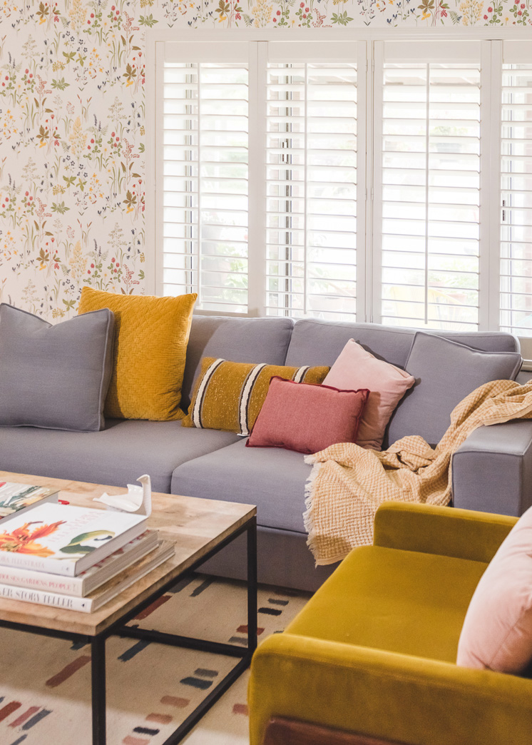
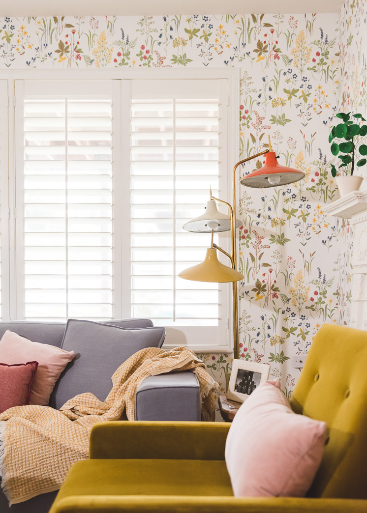
Blinds.com was the ideal solution with their timeless Wood Shutters in Off White. I’ve always been a big fan of plantation shutters and didn’t know if it would be possible in our apartment, but talking with their designer, Danielle, she affirmed that it would not only be a good choice but the best choice. I wanted something where it would darken the room well but also allow us to control the lighting at different points throughout the room. Plantation shutters do just that. I was giddy throughout the entire installation process. They made an immediate impact.
Lucky for you, Blinds.com is giving you 20% off your entire order at Blinds.com! Just enter the code LARS at checkout before December 31st to redeem!
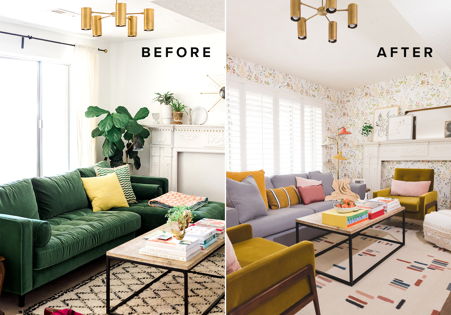
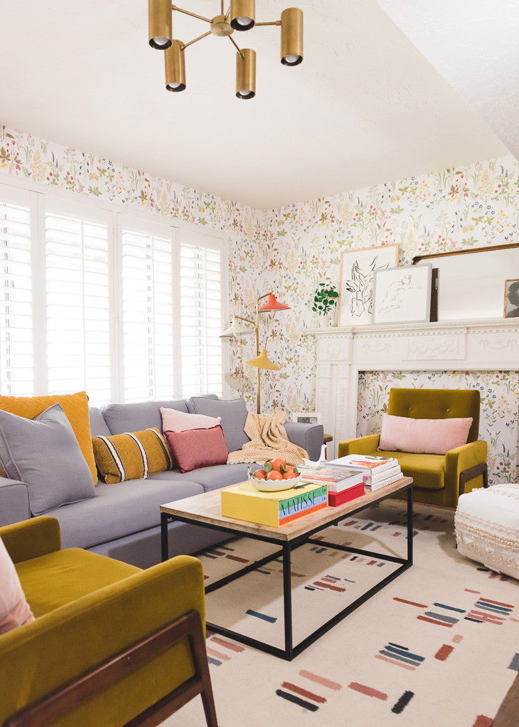
The wooden shutters alone make a world of difference, but I was so inspired that I decided to refresh the whole room. I had had a hard time figuring out a solution for the space that felt a) like me and b) like something suitable for a walkout basement apartment. Prior to this, I had an awesome green sofa I loved (see photo below), but couldn’t get the room to feel cohesive. You know what my solution was?
WALLPAPER!
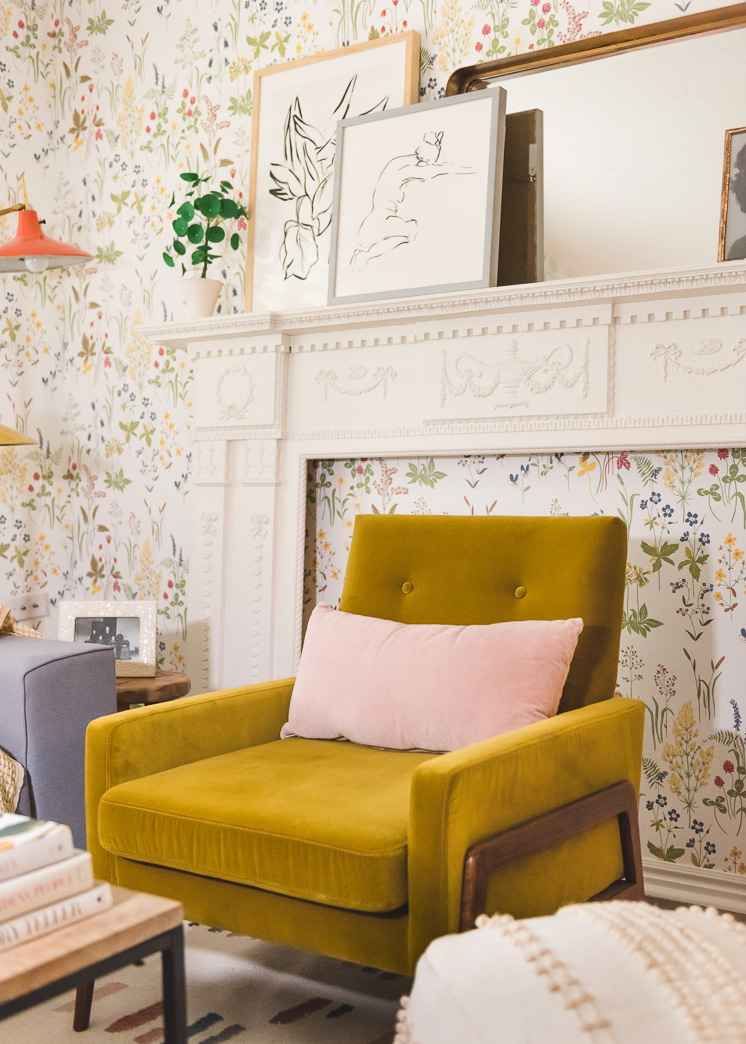
Wallpaper is an amazing technique to use to make a space feel deliberate because you’re deciding in one go the tone and color palette of the room. I know that a lot of you (my landlord included 😉 have a lot of hesitations about wallpaper. But it’s because you’re/he is basing it off of the 80s/90s stuff that was, well, not pretty. Nor was it easy to install or remove. Times have changed my friends! There is some LOVELY wallpaper out there and the quality is so improved. I found this Flora design from one of my favorite wallpaper companies, Sandberg, and knew it had to be the base for the entire room. It feels like you’re in a Swedish meadow. It’s floral, but in a more botanical way that feels refreshing. Plus, the colors, with hints of primaries, allow you to go in so many different directions.
Paint
My wallpaper guy knows his stuff. He was hanging it while chatting and executed it perfectly! He told me ahead of time that for best results, it’s best to paint anything aligning to the wallpaper with a fresh coat of paint. I worked with Farrow and Ball, who we also used for our office renovation. They make the most lovely shades of paint in gorgeous finishes and it’s an absolute treat to have it on my walls.
When we first moved into our apartment, the walls were a beige. One day I got so desperate that I went to the store and bought the brightest shade of white I could find and painted the whole house. Ha! Turns out, there is such a thing as something being too bright and I was kind of bummed out over time that it was so stark. I was wanting something with a bit more color to it. I went with Farrow and Ball’s Wimbourne White for my trim and aligning walls.
Next, I wanted to make more of a statement in the hallway leading to the kitchen, so I used their Calamine, which is a perfect shade of blush pink.
Furniture
I’ll be talking in more detail about the furniture choices in an upcoming post. Stay tuned!
This post was sponsored by Blinds.com. The Lars team is a huge fan of their products and all opinions are my own. Thank you for supporting the companies that allow us to continue to create original content.


Comments