Here’s the problem: Recently we moved studios (sharing the photos soon!). We left a studio that we had put some love into and it became a really lovely place. We painted, we trimmed, we moulded, we added flooring…you get the picture. It started out clean though, so the space never bummed me out. We moved into a historic home that had been renovated in the past ten years. The walls are beige, the carpet is beige, the lighting is…unfortunate..it’s Rental Beige to the max. Even as I type it and look around as I type, I know that the house has potential. All it needs is fresh paint, new flooring, new lighting, and we’re pretty good to go. They’re relatively simple changes for a major mood lifter. But in the mean time…I’m BUMMED OUT!
The same goes for our current home. We moved in 6 years ago to super rental beige conditions–carpet, walls, lighting, etc. A couple of years in I reached a breaking point and in an act of desperation, raced to Lowe’s and asked for BRIGHT WHITE paint. I didn’t even bother to get samples or try anything out. For me, the brighter the better. I went to TOWN painting our entire apartment, the ceilings, mouldings, doors, everything! And I got what I paid for–BRIGHT WHITE! Ummm, a little too bright. Since then, we’ve add in wallpaper, and other personality-fitting decor (see our post here) But we’ll get back to that later.
Bummed out about beige
Here’s what I’ve learned over time: I get bummed out about beige. But, it’s not that beige is inherently a bummer. In the right context it can be lovely. However, beige, when applied as a default color, is a bummer.
What do I mean by default? I think you probably already know what I mean…The contractor or landlord or city official or whoever comes in and says “just paint it so and so beige” or “I use blah, blah, blah grey for everything.” Or, the dreaded…”greige”. Shivers.
And that, my friends, is mistake #1.
What are default colors?
No color, if your goal is to create harmonious environments for maximum happiness and well-being, should ever be applied with a default color. A default color is one that is applied without proper research and is one that is “used on everything”. It’s one that is applied regardless of looking at the lighting type, natural light, personality of the person, function of the space, etc. Basically, it’s applied without humans in mind. “Used on everything” means that they haven’t done their research and are not taking your well-being in mind, however well-meaninged they are.
The goal: Creating a harmonious enviornment
Perhaps it’s even more important to highlight once again the goal of creating a harmonious environment, which, I’m going to venture to say, is not your landlord’s goal. Oftentimes their goal is cost, function, permanence, or resale-ability. And I get it. I do. But having lived in a few places where defaults reign supreme, I have less and less patience for it. It’s very likely that your landlords are not worried about your mood–they may not even know that they can affect your mood by their paint or carpet choice. But, I’m here to say that your environment can alter your well-being and you may not even realize it! Every color, fabric, piece of furniture, object, can affect you for the better…or for the worse.
How to identify the right color for your space
So, if we identify the goal to create harmonious environments but don’t take into account the variables of each environment, then it’s very likely defaults colors are being used. Here’s an example: when someone asks what color of white I used in my home and intends to use it for theirs, the suggested white is a starting off point. What your next step is is to take that sample, apply it into your space and see how it does. Some questions to ask yourself–
- What lighting is in my room? Is it a white light, yellow light? blue light?
- What type of natural light does it get? and how does it affect the space. Right now, my office faces the east and has one small window, which makes one wall light, and the rest of the room, rather dark. The majority of the space is rather dark, but the darkness creates a warm glow, not a blue glow, and that’s important to identify when selecting colors. North lighting typically produces a bluish glow.
- What are the colors of the furniture, flooring, ceiling, and fixtures. If you’re starting from scratch then you can choose the feeling you want with those options, but if not, you will want to pay attention to them.
How to become conversant with colors
It seems like a lot of work to learn identify all these factors, and it can be, but that’s when doing your homework, or hiring a professional to do it for you, is essential. A good designer will know their color theory and will be able to identify the effects of each color in the space and how it works to create a happy environment. Can you do it without one? Sure! It’s all about becoming conversant with the language of colors.
Now, when you’re not doing your homework and you slap a color onto it, that’s the default we’ve been talking with. The inattention to the space means that it’s very likely that the color is not the best choice. There are endless paint choices, and no “correct” answer necessarily, but there are definitely wrong choices. The odds that your contractor chose the best one for your space is very small.
Ok, that’s default color. Now, onto neutral colors.
What are neutral colors?
The definition of neutral isn’t “a color that goes with everything”, as your contractor might suggest. I don’t want to get super into color theory at the risk of becoming snooze city, but basically, a neutral is when you take a basic color, like red, and add its complementary color, green. It then becomes grayer the more you add to it (if you’re REALLY interested in how it works, here’s a video showing it in action) . You are “neutralizing” the color. I find that a neutralized, color, even just a little bit, is often more liveable for an interior space.
This means that neutralized colors still have a hint of red, or green, or blue, or yellow or whatever. You know you hear people saying, “oh this white has way too much blue in it.” Maybe you’re like, “what? blue? What in the world are you talking about?” I remember growing up with a mom who would say that she could see all these seemingly random colors in a single color. I had no idea what she was talking about at the time. If you don’t see these other colors and you’d like to, begin by immersing yourself in a color wheel, or paint samples, or again, hire a designer to help out.
Why not just any white is your friend
For example, remember my rash decision to paint my house bright white? It was a good idea in theory. But because I didn’t take the time to try out samples in my space, I ended up with a very bright white that had no personality to it. It really brightened it up, which I was thrilled about, but it was sterile, and didn’t go with the other whites in the space. It was an act of desperation, of which I have repented of since.
A default color that acts in the name of a neutral color “because it goes with everything” still has hints of all those colors so it’s very likely that the neutral color may not be the right one for your space. You see what I mean? It’s because you have other factors to take into mind.
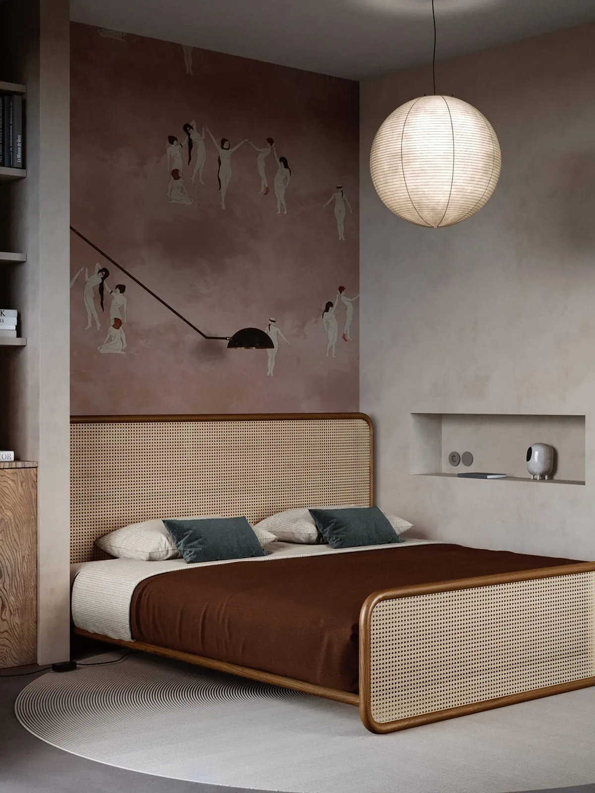
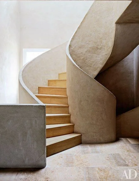
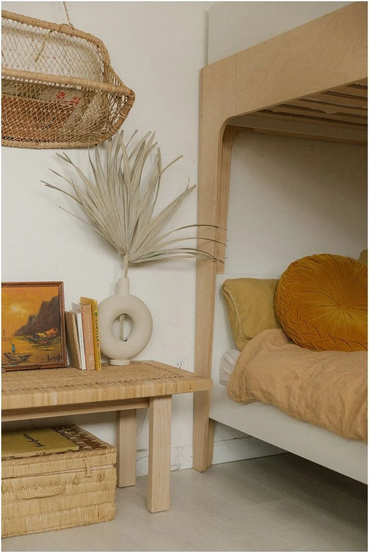
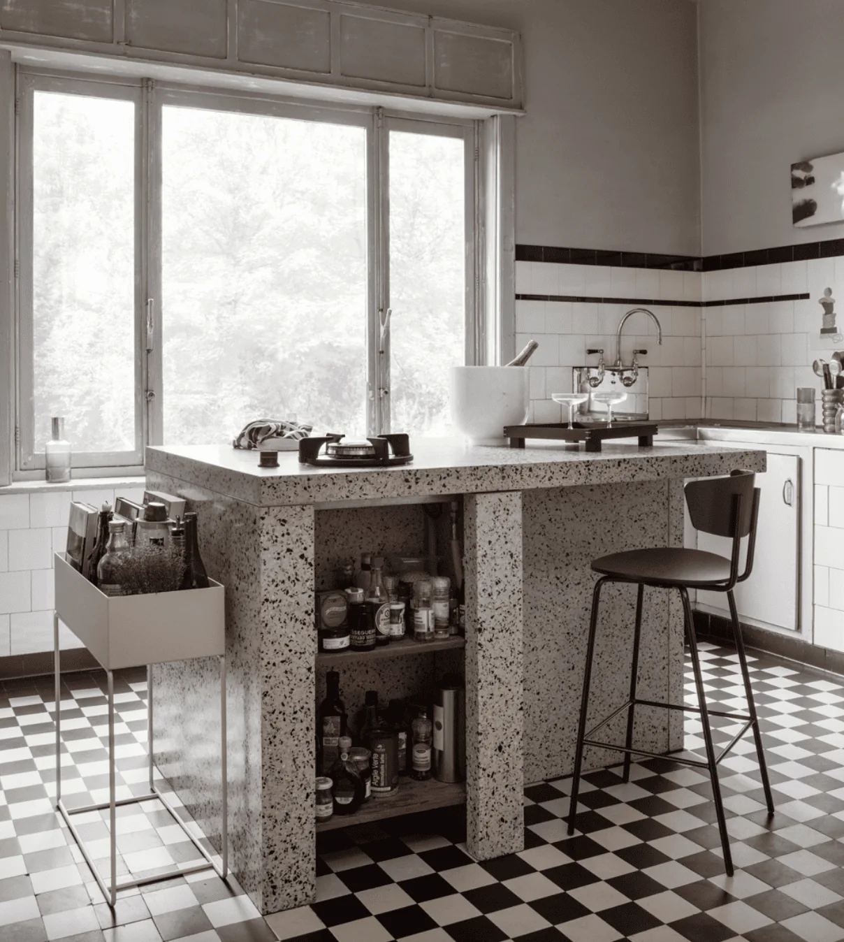
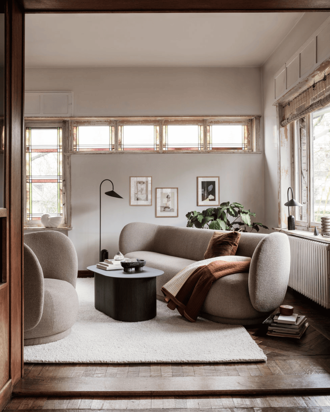
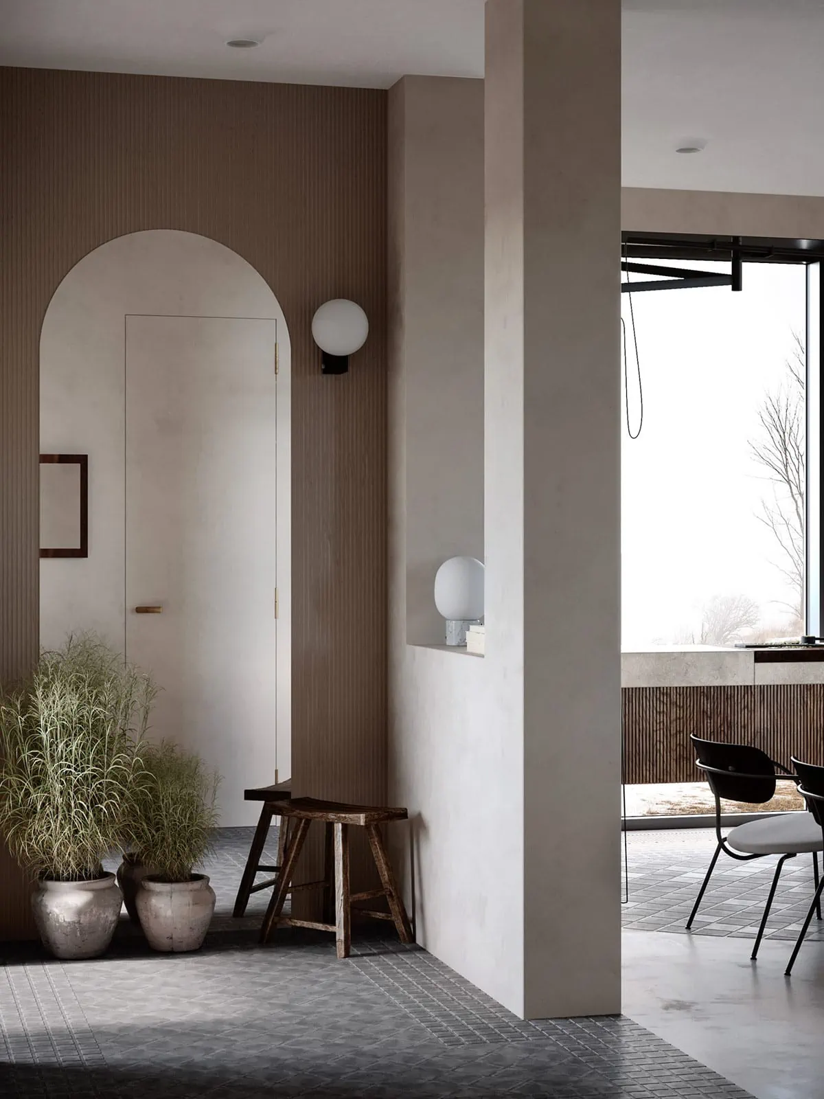
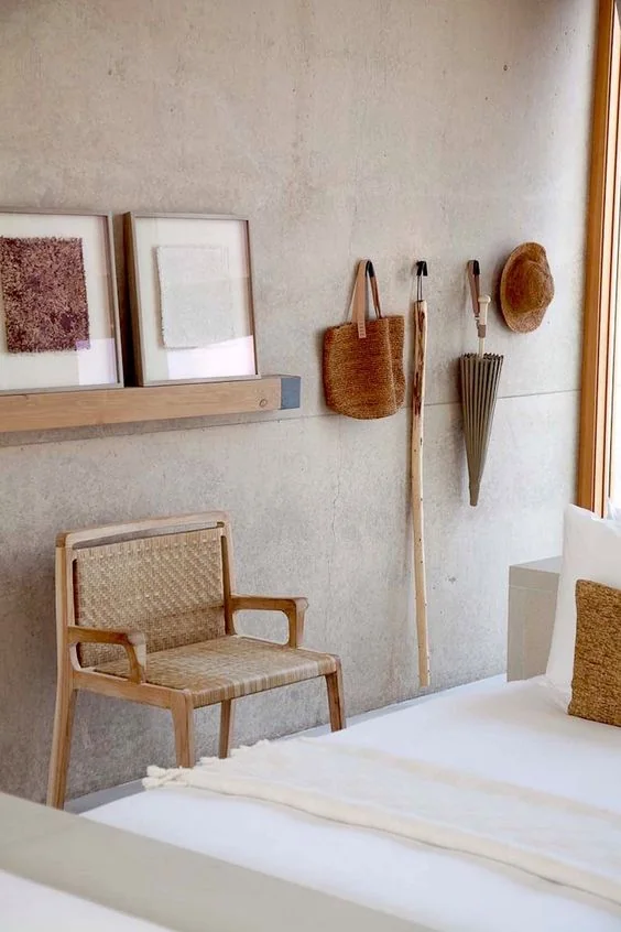
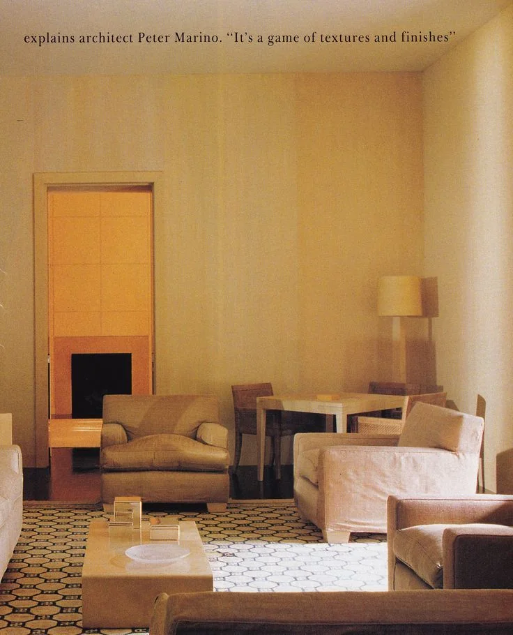
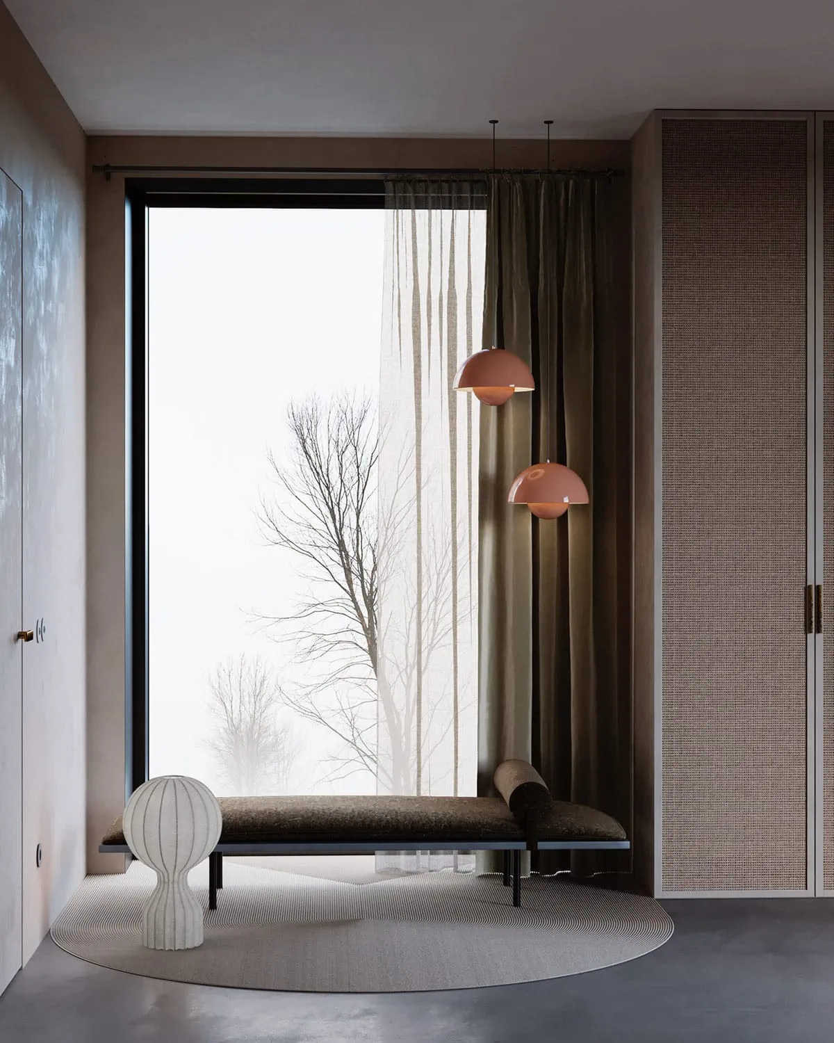
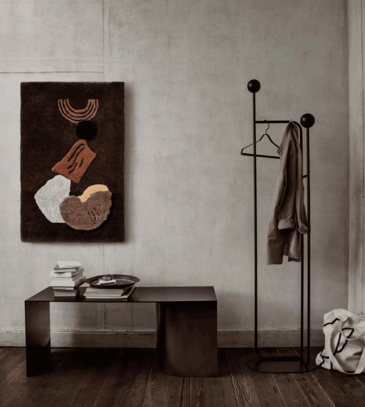
Again, neutral colors can be gorgeous when done intentionally. Here are some of my favorite neutral rooms, in addition to the rooms I’ve already shared.
Ok! Phew, everything you never wanted to know about neutrals and defaults colors. In my opinion of course! Take what you will. I’d love to hear your thoughts about it. Send me a line!
Photos from here | here | here | here | here | here | here | here


Comments