If you didn’t catch it, we were recently featured on the home renovation show In With The Old, on Magnolia Network. I’ve been doing a deep dive into each space we tackled. Last week it was all about the Scandinavian folk-inspired staircase and kitchen and today I’m sharing about a new room–Jasper’s bedroom. I love how it turned out! And stay tuned to tomorrow’s deep dive into the making of the bed.
Here’s how it goes!
____________________
Click here for all the before and after photos from the home renovation
See the full kitchen renovation here
Read about the kitchen cabinets here
Click here to read more about the kitchen hardware.
If you’re interested in seeing the oven, click here.
See how we turned the fridge into a cabinet
Materials:
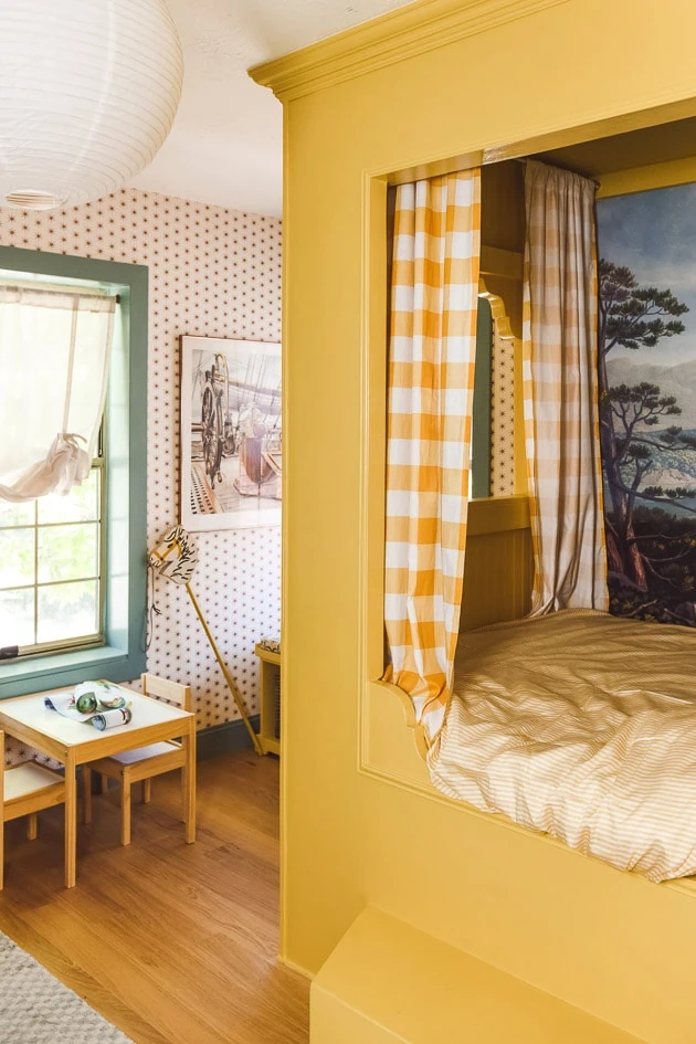
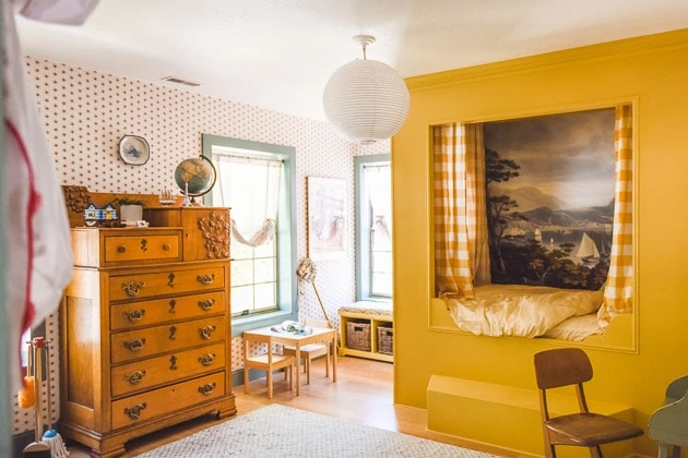
A sunny nautical-inspired children’s bedroom
Perhaps unconsciously I’ve assigned colors to my children–yellow for Jasper and blue for Felix. They just sort of came out as time has gone by and I’ve gotten to know them–it’s one of the perks of being a designer I suppose. So when I imagined Jasper’s room I envisioned sunshine. I didn’t know how that was going to play out, but I knew I wanted some sort of built-in alcove bed for sure and it just kind of came out from there.
Thankfully, the room has quite a bit of room so we didn’t have to worry too much about the lack of space so all ideas were on the table.
Before photos of the bedroom
To remind you (from this post), here are some of the photos from before it became Jasper’s room. It’s been quite the journey in the short 2 years we’ve lived here.
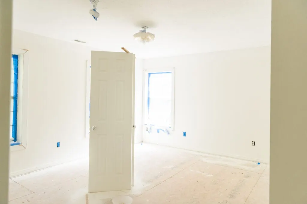
This is a photo of the room on the day we first looked at the house. The owners were in the process of renovating the home so doors were being painted, window trim was getting installed. Flooring was non-existent.
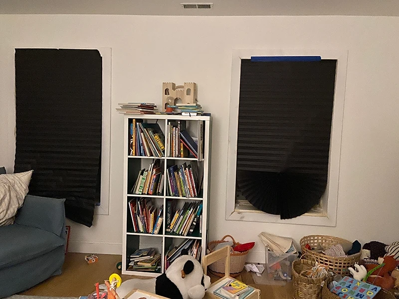
As you saw from the show, we actually had Jasper in a different bedroom, the one right next to where he ended up. It’s basically a mirror of this one. Here are all the glamorous photos.
Please note the fancy black out paper shades we used as “temporary” window coverings.
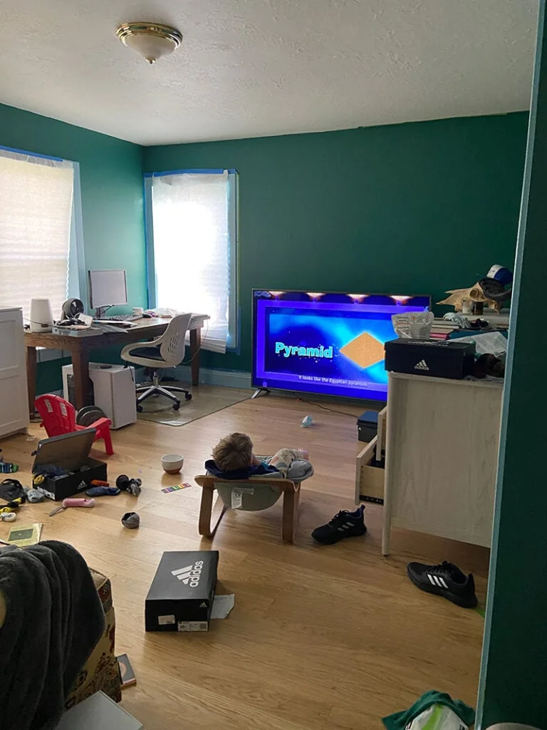
These are the photos I provided to our production company when we were discussing the possibility of doing the show. Because again, I AM FANCY. In full transparency, I didn’t want to take the time to clean up because I assumed this whole thing wasn’t going to pan out.
As you can see, we were in the midst of doing a phase 1 renovation to his space and I was considering lots of wallpaper options (I LOVED these ones from Marie-Clare).
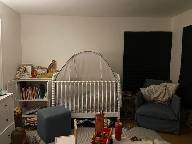
And his fancy tent to keep him in place! It worked until it didn’t.
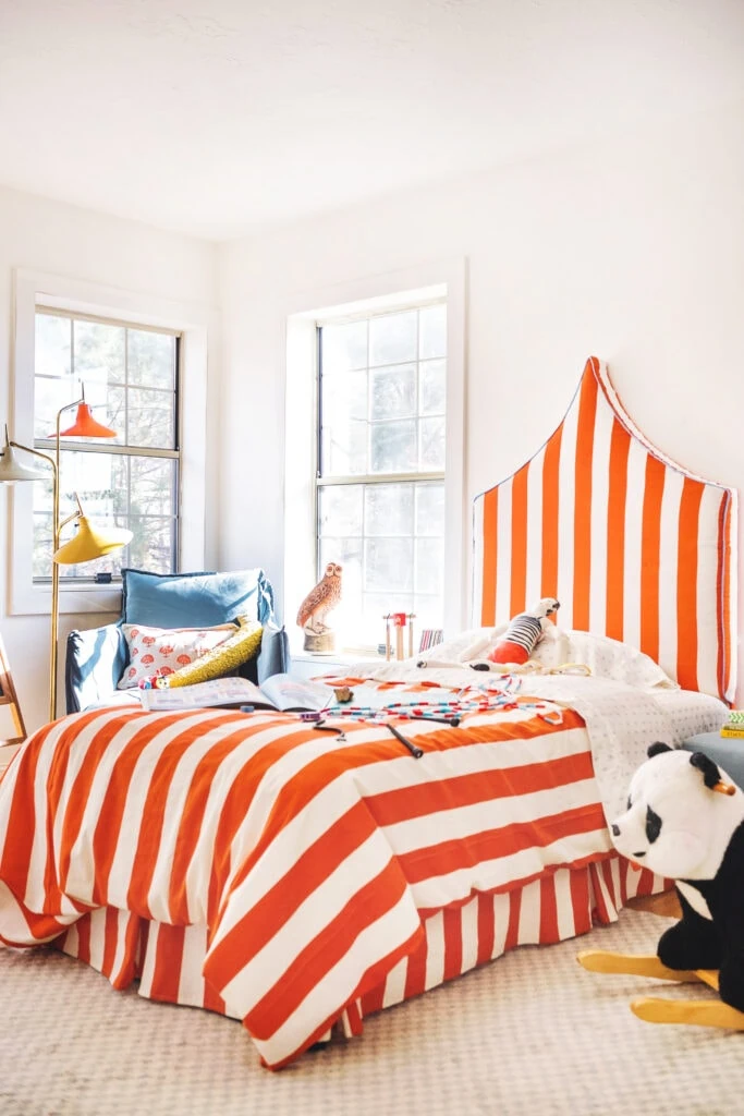
Then we DIY’d this circus tent-inspired bed for like a Phase 1a design? Ha! I didn’t really have a plan but I got this idea for a shape and wanted to see it through.
Meanwhile, over on the other side of the wall was Felix’s nursery, which then became Paul’s study, which then became a storage room while we worked on other rooms.
Jasper’s room transformation
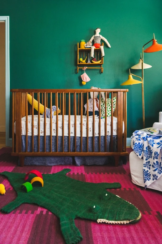
Here it was in all its glory as Felix’s nursery.
And then as the dumping ground while we worked on other rooms.
Basically, because of the layout of the two rooms, we couldn’t put in an alcove bed in Jasper’s former room because the closet door was too close to the wall. The mattress would have blocked the door by a few inches. The adjoining room had a closet that fit better so we switched Paul’s office with Jasper’s room to remedy it.
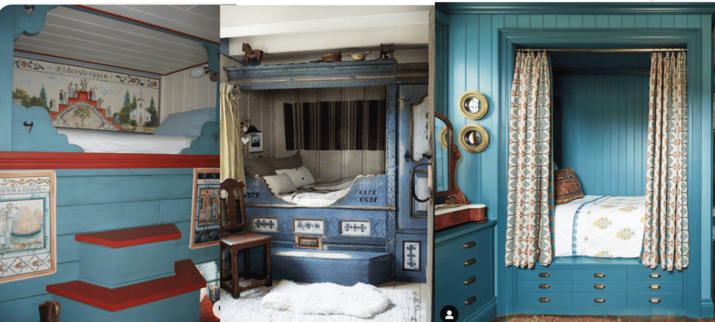
Inspiration for alcove bed
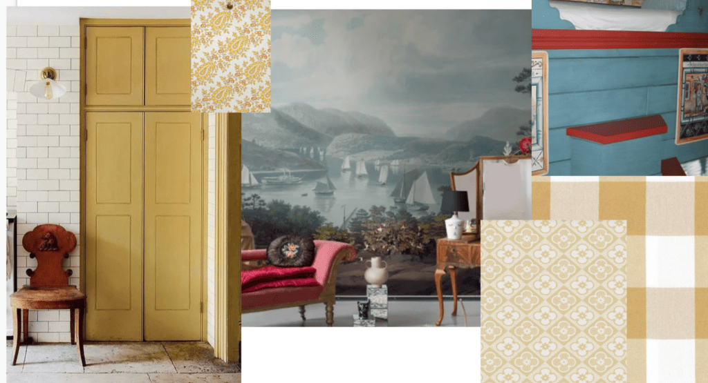
I looked to a number of inspiration images for direction and ultimately I narrowed it down to these ones.
I had reached out to a number of people to see if they could make the bed for me, but our timeline was so tight and people were so backed up with work that it wasn’t looking feasible. Finally, Handy Nanny Pat stepped in and said “I can figure it out.”
And that’s just what she did, folks. She found something like this photo, which, to me, looks way easier than it probably is. But thankfully for me, it got her to say yes!
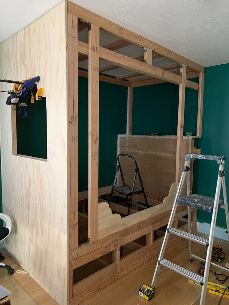
Constructing the alcove bed
I’m going to talk all about the actual construction of the bed tomorrow, but here’s one photo to give you some insight into the process.
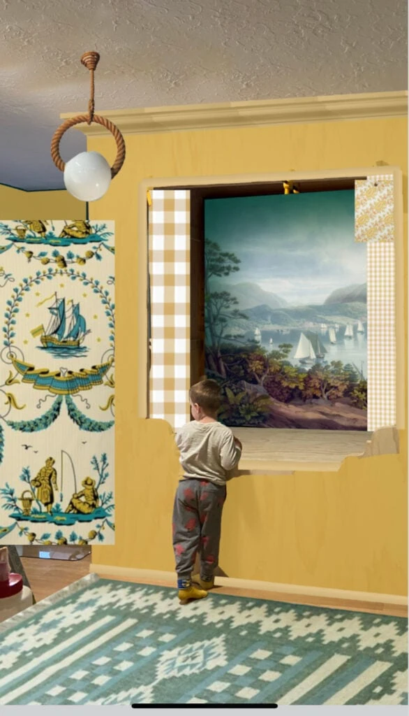
Nautical Mural in alcove bed
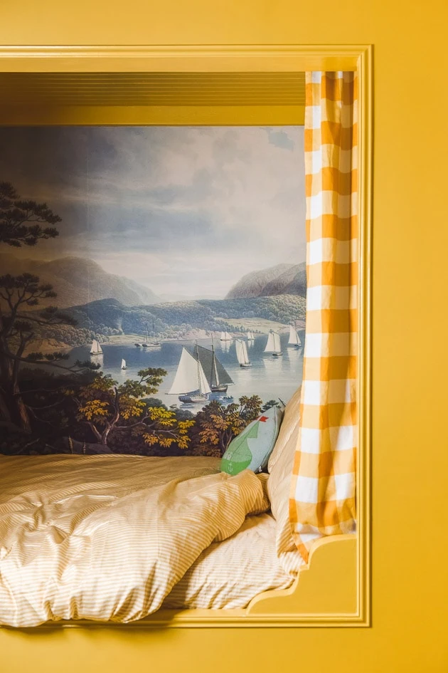
Once the bed was starting to take shape, Paul had the idea to put a mural in it. It hadn’t occurred to me and I loved the idea so I set off finding the perfect one. I found so many amazing options but ultimately narrowed it down to this nautical themed one from Rebel Walls, a Swedish mural and wallpaper company.
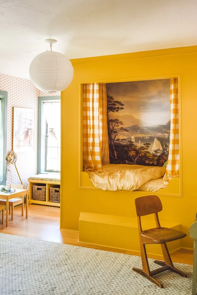
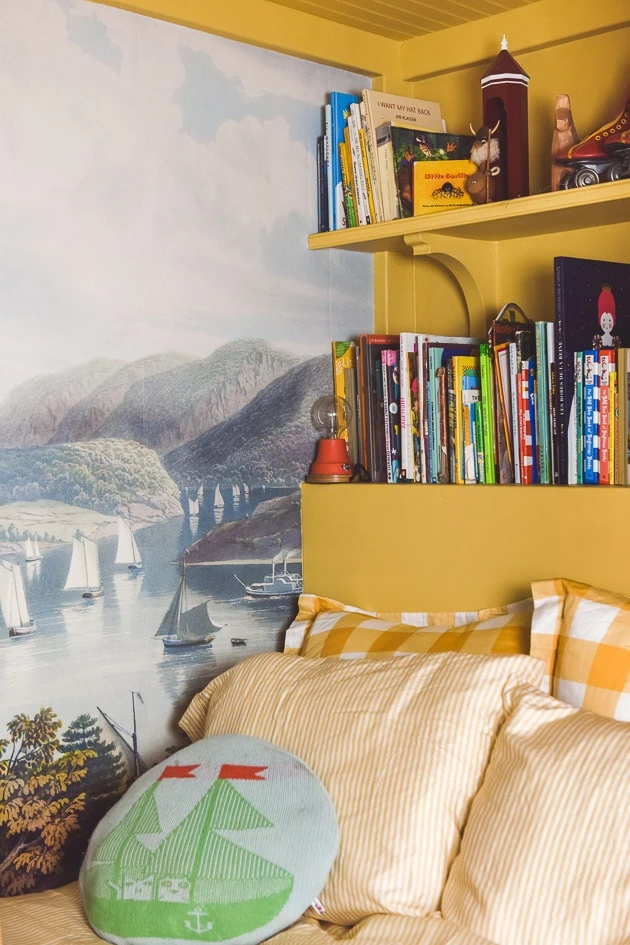
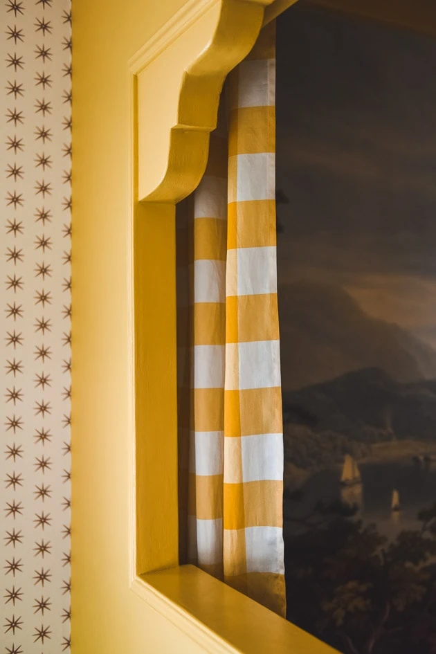
It was absolutely perfect. And the best part is that you can put in the dimensions and the artwork can adjust to it. We cropped in on the best part of the mural and I love how it turned out. It adds so much character to the room.
View this post on Instagram
I don’t really love a super obvious theme or one that goes too hard, but I loved how this was working out and decided to add in some nautical touches here and there to tie it in. And turns out I already had quite a few things that tied in perfectly. I love a kismet moment.
Wallpaper
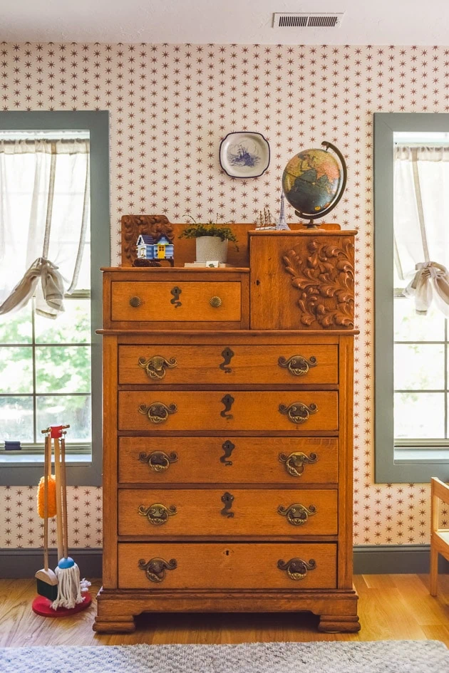
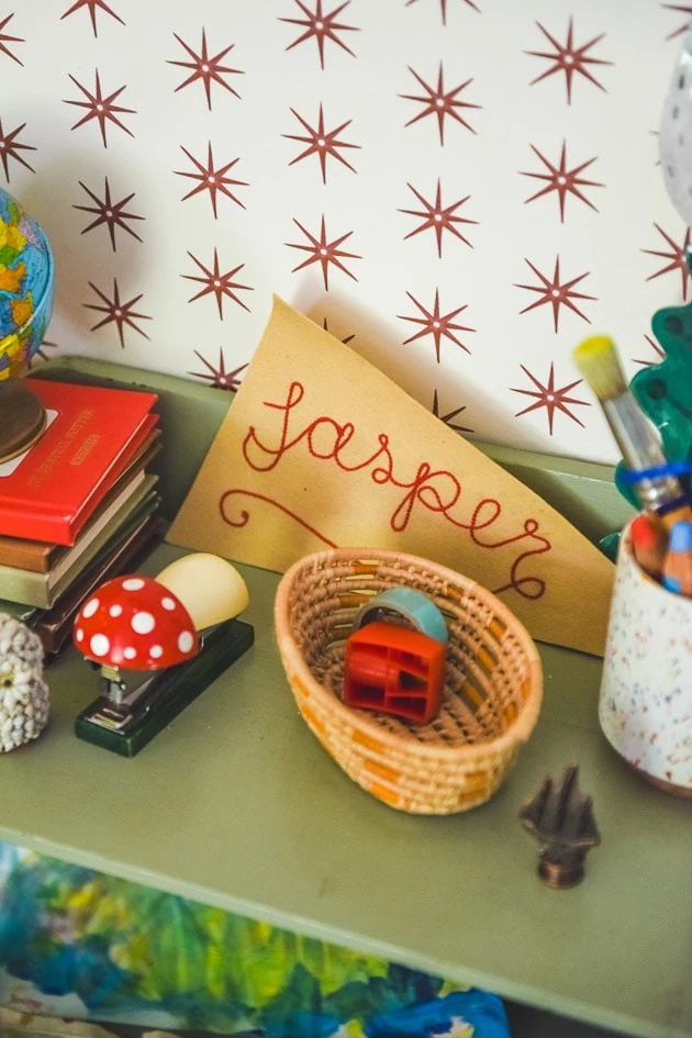
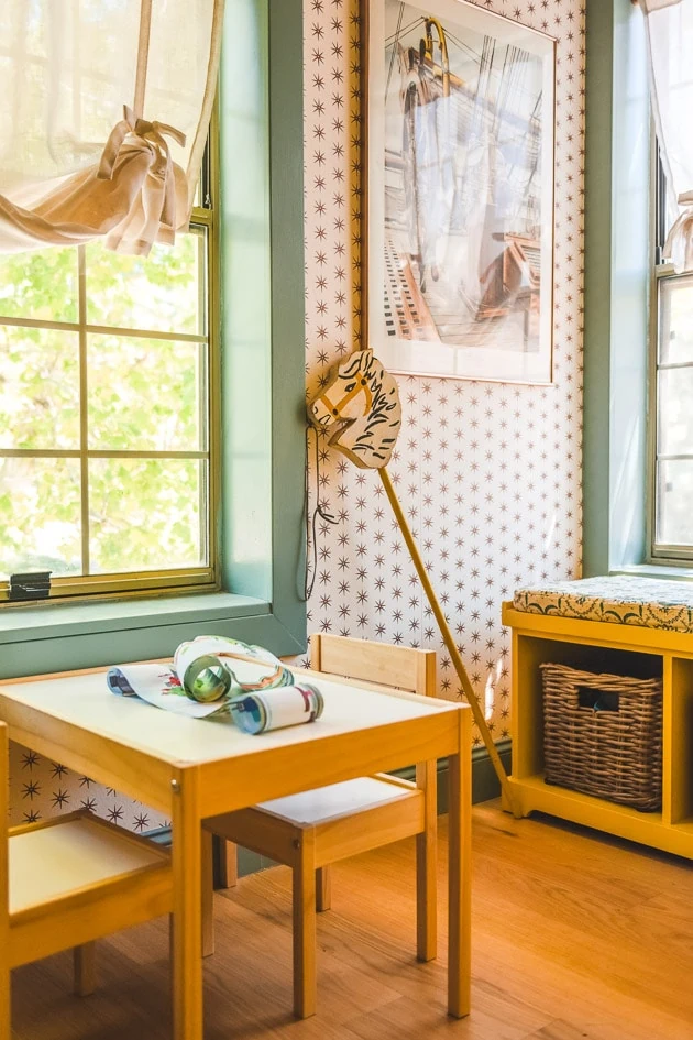
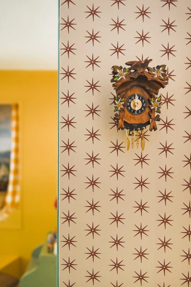
For example, I chose a star patterned wallpaper by Danika Herrick on Spoonflower. I thought it was subtle enough but also pretty fun. PLUS, she was able to change the color to brown because I love how yellow plays with brown.
Spoonflower
In fact, all the patterns you see in this space are from Spoonflower. We’ve worked with Spoonflower a ton in the past and they have become such a wonderful partner and I’ve become familiar with some really amazing options. I know it can seem overwhelming to choose from their vast collection, but if you know how to search you can find some great ones.
Gingham curtains
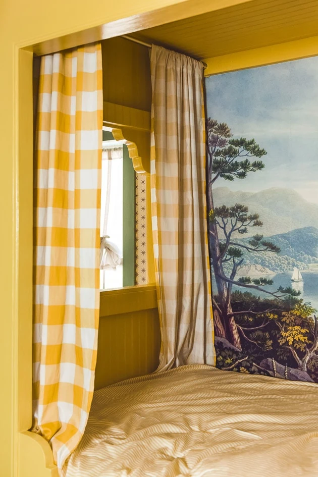
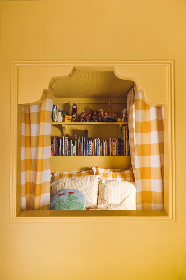
Included in that are the goldenrod gingham curtains. I’ve always loved the feel of gingham to reflect that of a Swedish interiors and wanted to get it in somehow. Meta Coleman had introduced me to a beautiful woven gingham that would be perfect but I knew I couldn’t get it in time, so I turned to Spoonflower once again. They make ready made curtain panels, but I actually used a sheet on these and thankfully there was enough!
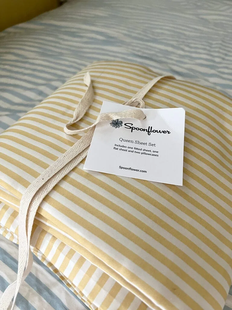
I also used Spoonflower for the subtle yellow stripe sheet set as seen here and the gingham Euro shams. I collected loads of options for Jasper’s room to help me inform my decisions. If you’re interested, you can see all of them here.
Pat put in a bookcase into the inside of the bed, which is an amazing feature for a book lover like Jasper. It really is so practical and cozy and more “scope for the imagination” a la Anne Shirley.
Funky Dresser
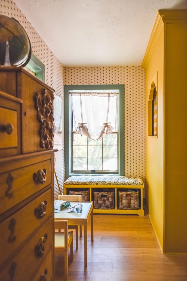
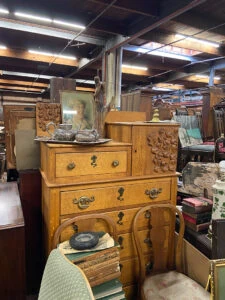
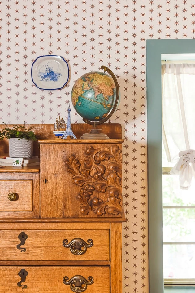
I had spotted this dresser at an antique shop in Salt Lake, loved it immediately, and knew it would be perfect for this space in between the windows.
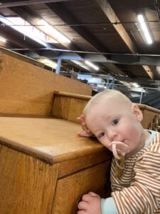
Felix loved it too so I took it as a sign.
The details are all a bit weird and I love that about it.
Personal details throughout
We tucked in a lot of personal details into the space too, which add so much meaning.
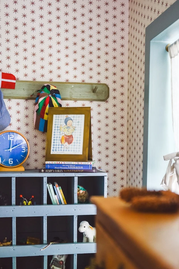
For example, this rack below was one that my mom had in her shop in the 90s. It was made by my uncle. He made French country furniture and she sold it in her shop in Corona del Mar. It was called En Provence and it was the most beautiful shop in the entire world. I dream about it.
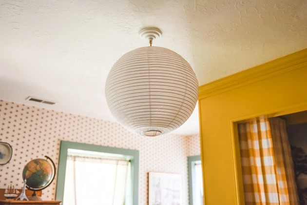
I REALLY wanted this lamp that you see in this mock up below. It’s vintage from the 50s by Audoux-Minet. It was more than I wanted to pay and I was hoping that they’d accept my lower offer, but no go. I will still dream about it. Maybe one day I’ll find something similar in that French rope style. Or maybe DIY it!
In the meantime, I used a rice paper lantern from here. I love the oversized scale of it.
Rugs
I looked at a LOT of rug options to go in the space and really had my eye on this one, but didn’t want to spend that much. I ended up using the rug that he already had in his room and it worked great. It’s no longer in stock at Annie Selke, but while I was looking I saved a bunch of amazing options here so if you’re looking for something similar, there are tons to choose from.
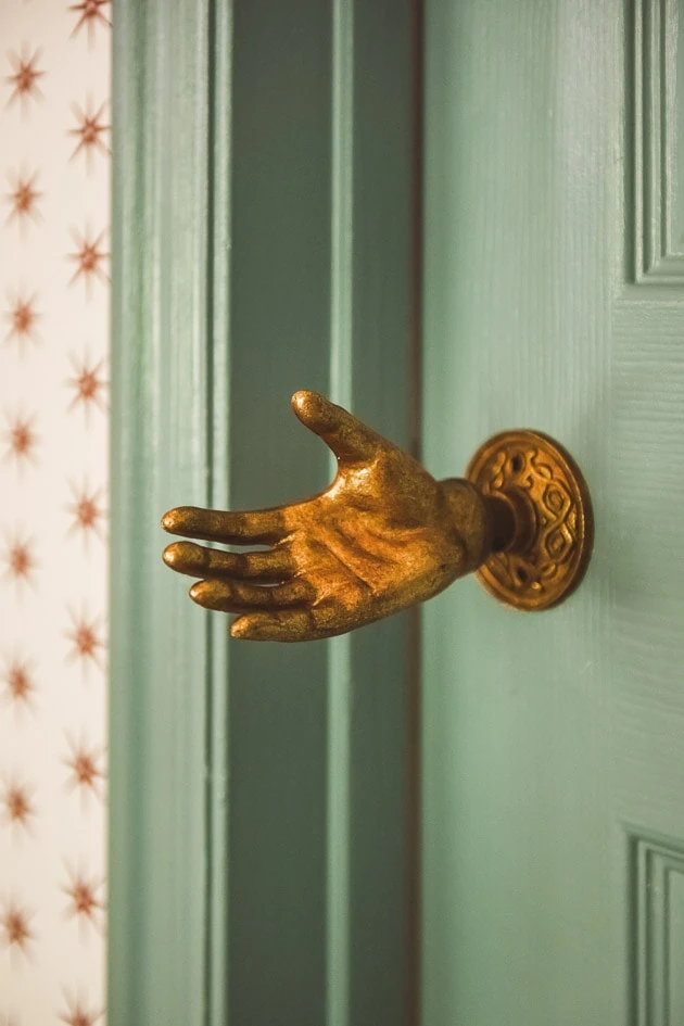
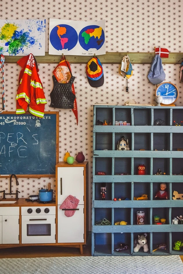
I added in some funny details like this hand door knob. I had originally bought it for my book, Craft the Rainbow, and finally got to use it in real life.
But warning: I had to take out the hand knob because my kids kept on hitting their heads on it and it ruined the wall in the closet. Ha! The wall is a mess!
There’s a hook for all of his costumes. It’s high, but he figures out how to get up there being the climber that he is.
Nautical Decor
I bought a few things off of Etsy to bring in the nautical theme a bit more like some plates and artwork. I even made a whole Etsy collection so I could keep track of everything. If you’re interested here’s the list.
Peek a boo window
One of my favorite parts of the built-in bed is the side window. I definitely wanted a window on the side because we put in a full-size bed and the windows are to the side of the bed and it would have been so dark with no window. It’s perfect for puppet shows!
Window Coverings
We were planning out our partnership with Blinds.com at this time and I didn’t know what I would want so in the mean time, I ordered these balloon curtains and installed these tensions rods in antique brass. I wish I would have done this right when we moved in rather than the temporary paper shades that made me feel like we were living in a shack. The tension rods don’t ruin the walls and they look great.
Cordless wood blinds
You can see the cordless wood blinds that we put in afterward. I love them so much! We got the ones in Montego Bark.
View this post on Instagram
And here I had a little too much fun:
View this post on Instagram
This globe below was given to me by my grandmother. It fits in perfectly!
Colors we used
For the bed, I was super inspired by this cabinet below and set out to find something similar. After testing out a lot of Benjamin Moore colors, I settled on California Hills and made it 50% lighter. I think the colors in the photograph might make it seem a bit more golden than it actually is and I think it is pretty close to the photo below.
For the window trim, I used a contrasting green color from, what do you know, the Magnolia line. It’s called Well-Watered.
I left the bed pretty plain, just the solid color you see, but I’m considering adding more to it. Maybe a contrasting detail here and there. Maybe some decorative trim work on the side against the wall–TBD!
Ok! I think that’s it for now. If I’m missing anything, let me know! Happy to answer your questions!
Resources:
Benjamin Moore yellow paint | green trim paint | seascape mural * | paper lantern | star wallpaper * | gingham curtains * | yellow striped sheet set * | gingham shams * | mattress* | Bench fabric* | Curtains | Tension rods | Cordless wood blinds*
*gifted items
Other articles:
You can find all the before and afters in this post
You can read all about the kitchen here
Read about our kitchen cabinets here
Read about our oven here
Read about the staircase here
Read about the fridge that looks like a cabinet here




Comments