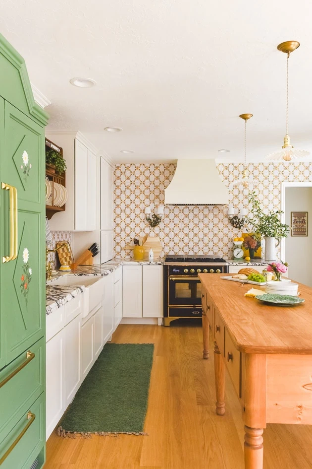
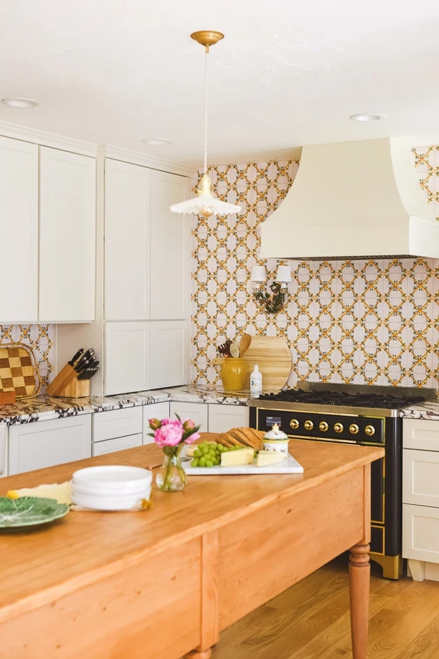
Welcome to our kitchen renovation! I’m excited to take you through it over the next week–there’s a lot to discuss! If you’re just joining, we renovated 5 rooms in our house for a home renovation show called In With the Old on Magnolia Network that is now available to stream on Discovery+ and HBO Max. In this post, I’ll be sharing the details of how we brought in an old world feel infused with our Scandinavian heritage, but you can see all the before and afters in this post.
Materials:
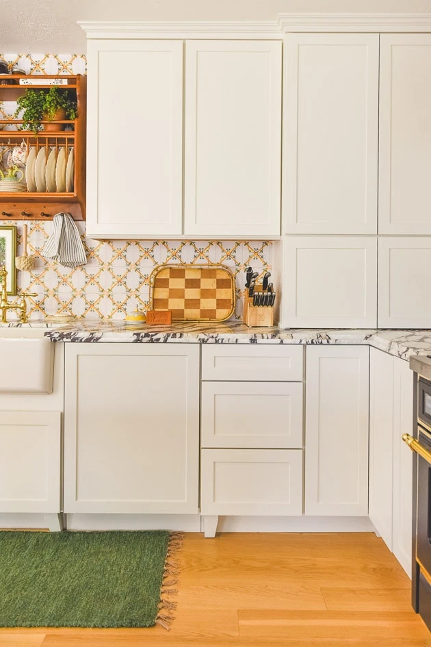
- Cabinets by Cliq Studios
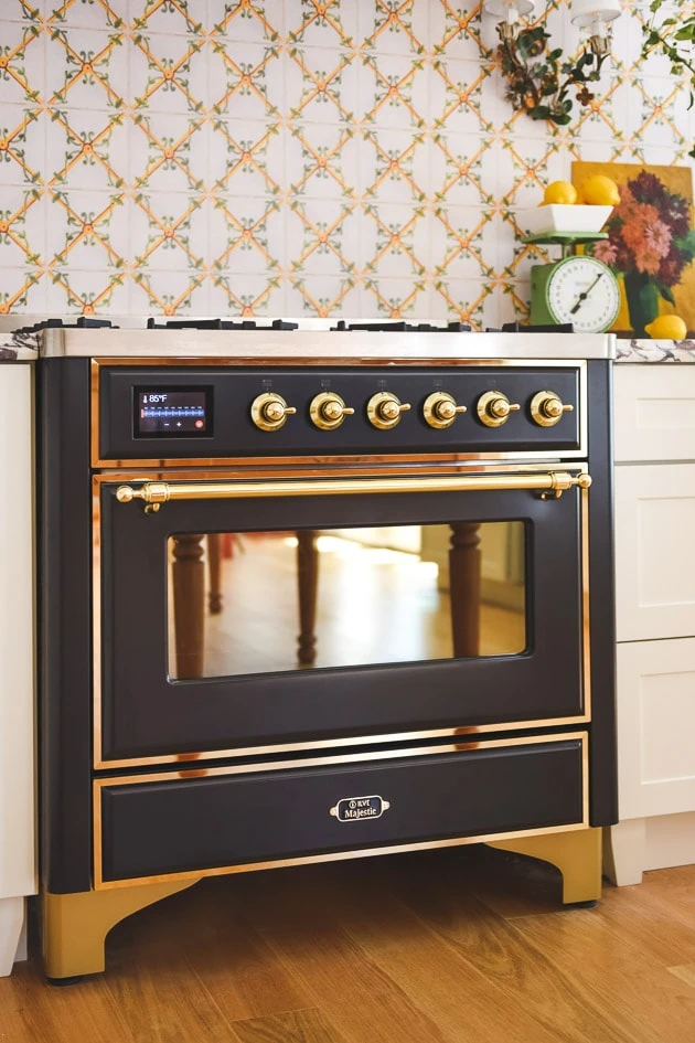
- Ilve oven range
- Hardware by Signature Hardware
- Work Table/Island by Beck and Cap
- Hood by Hoodsly
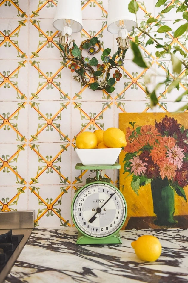
- Tile Wallpaper from our shop on Spoonflower
- Panel Ready Dishwasher by Forte
- Panel ready refrigerator
- Curtains
- Fabric on bench
- Pendant lighting
- Sconces
- Faucet
- Sink
- Hardware on fridge
Our kitchen renovation
You saw all the before and after photos of our kitchen renovation in this post here, but to remind you, here’s what we had to work with when we moved into our house: 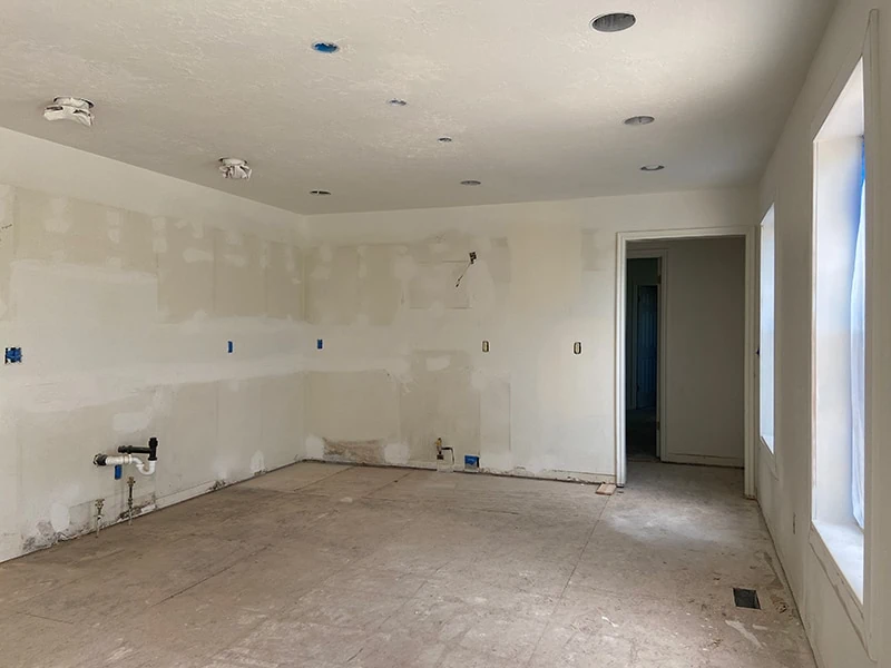
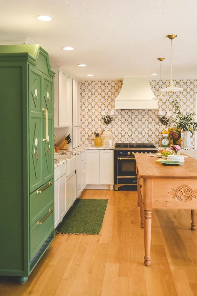
An old-world kitchen infuse with Scandinavian heritage
Our kitchen was one of the few rooms I was in the process of working on before we committed to doing the show though. My hope was to take my time on it, let the house speak to me, but all of a sudden we had 3 months to get 5 spaces done, which is obviously a major pedal to the metal moment. I had to make some decisions faster that I was used to so while I like the majority of what we did, there are a few things that I will be switching up at some point.
Inspiration for our Scandinavian kitchen
As you saw from the show, infusing our Scandinavian heritage was super important to the feel of our blank slate home. Paul is from Denmark and we lived there for the first few years of our marriage and I come from a long line of proud Danes so telling that story was important to us.
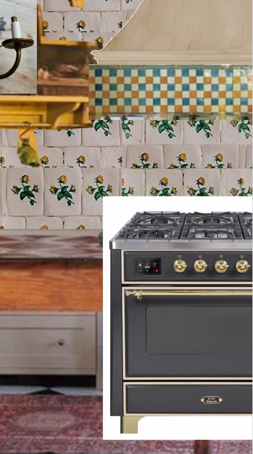
But the question was HOW to infuse our heritage into the design. Well, first I got this idea to do an oven hood inspired by antique Swedish tile stove, called a kakelugn, and began a huge search to figure out how to make it happen, specifically how to get tile and what kind of shape it would take. There was one I was particularly inspired by, which you can see here. I used this tiny mock-up to take with me when I went out and about to find samples.
Custom tile for the kitchen
It was a floral (surprise!) tile that was so so gorgeous. I searched high and low for ways to get it made. I got a sample made and it didn’t come back in a way that I was thrilled about. At that point, I knew it would 1) take too long for our timeline and 2) probably be WAY out of our price range especially now that we were tackling 5 areas at the same time.
Tiling the hood
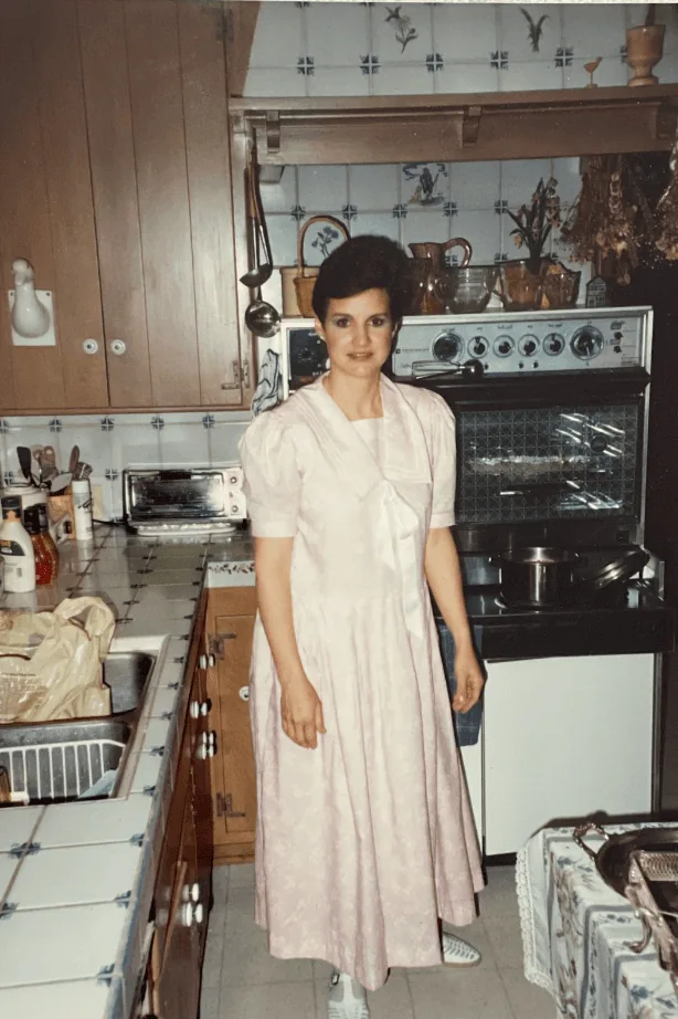
I’ll be telling more about the adventure of the tile and the inspiration behind it in an upcoming post, but I ended up look to my grandparent’s kitchen as the main source of inspiration after that. This photo is my mom in the kitchen she grew up in in Los Angeles, California probably on Thanksgiving sometime in 1987 or so.
Do you see all the French tile? And especially the tile on the back splash and hood? I love it so so much. Eventually I realized I probably wouldn’t be able to get a Swedish stove to act as a kitchen vent, but maybe I could just tile a hood like my grandmother did. I was so gung-ho on this! You can see more of the kitchen inspiration on my Pinterest board.
Antique tile
As you can see, I did not tile the hood like she did. In fact, I didn’t use real tile at all. Here’s the story–when I realized custom tile was not an option, I looked into existing tile from Tunisia to France to Portugal and everything in between. I wanted something that was old or looked old and not a Mexican tile, which is much easier to find. Eventually, I stumbled on a tile shop in Lisbon (online) and ordered a sample.
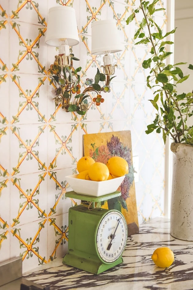
Wallpaper that looks like tile
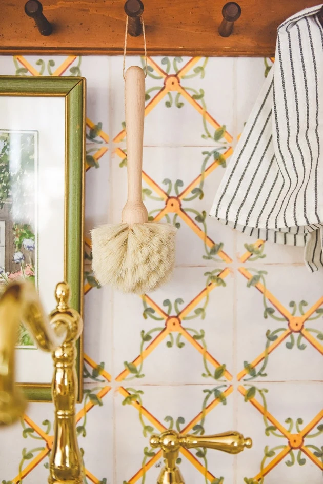
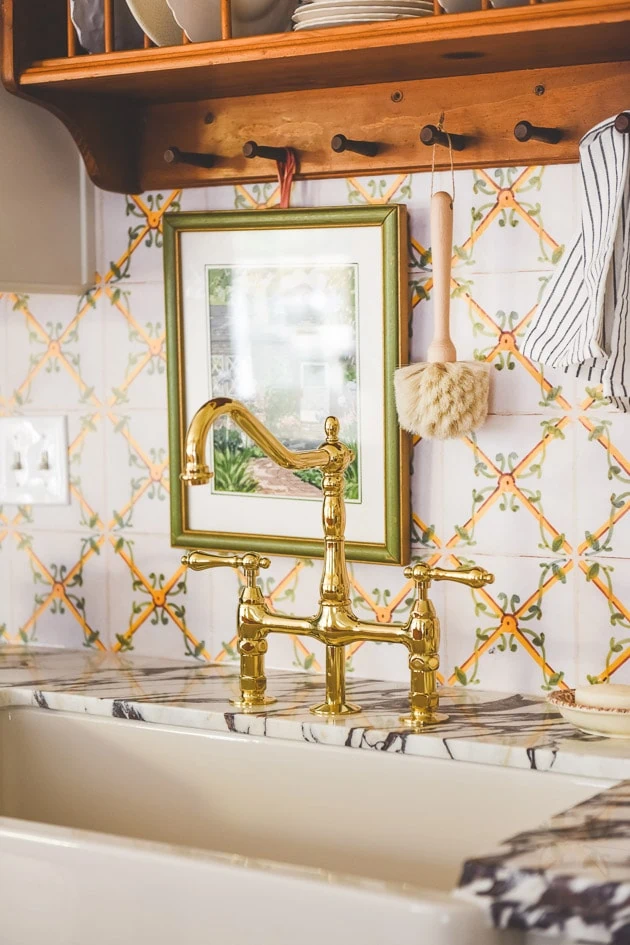
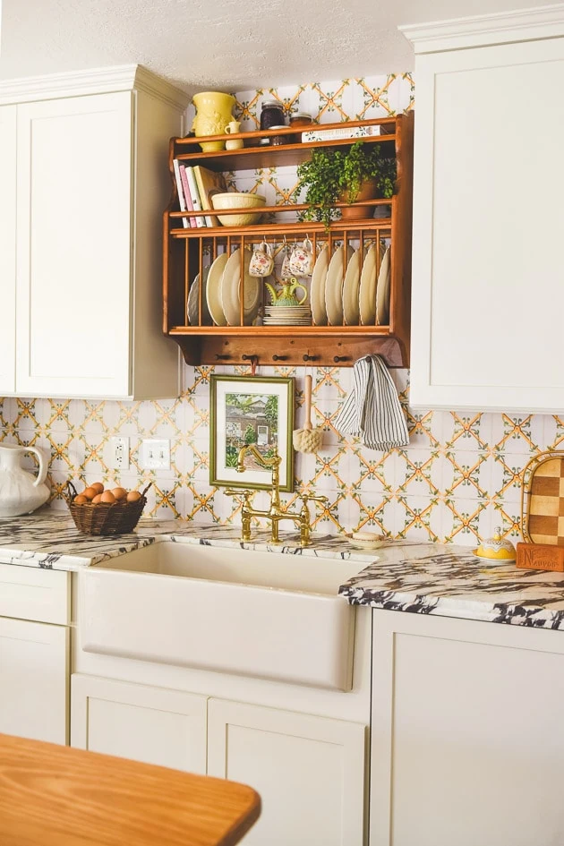
Because I was unsure what the rest of the kitchen would look like at that point, I didn’t want to spend a huge sum on it and regret my decision later. In the interest of time and money, we took a picture of the tile and turned it into a wallpaper that you can now find in our Spoonflower wallpaper and fabric shop. Spoonflower graciously provided the wallpaper for it in their prepasted removeable smooth option and to be honest, it fools everyone! Plus, because of the smooth finish, it’s easy to wipe up making it a great backsplash option.
Kitchen cabinets
I had already been in talks to collaborate on some cabinets with Cliq Studios so we revved up our engines and hit the ground running on it once the contract was signed. I loved what they had done on Erin Kestenbaum‘s kitchen so I was very hopeful that they could do the same for us.
Maximizing space for the kitchen
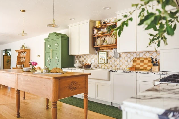
They had a wonderful designer, Erin, who I worked with to figure out the layout–she was so so patient as I presented her with the look I was going for. I also consulted with my dear friend, Meta Coleman, on layout and feel. She gave me lots of great insight into the amount of space we would need between the oven and the work table, lighting, and the fridge, which I’ll be talking about later.
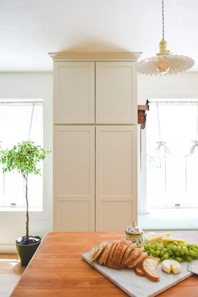
Adding in a pantry and storage
As you can see, there is no hardware on the cabinets just yet. I didn’t want to make any permanent holes in them before I knew exactly how it’s all going to turn out, and I haven’t reached that point yet, so it’s still a bit bare. I imagine it will feel much different in a number of months so come back then.
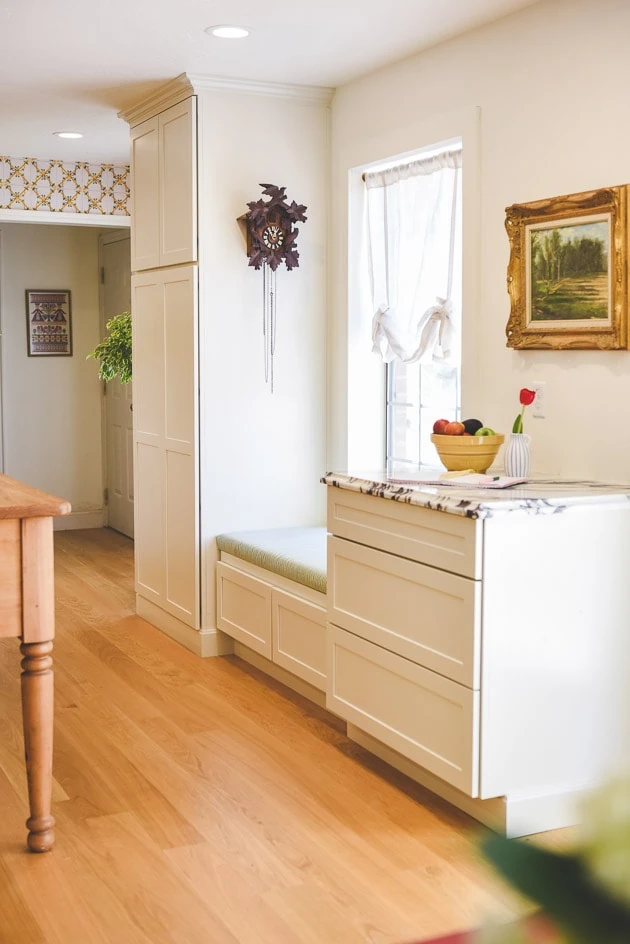
I wanted to take advantage of the whole room even though the original kitchen, from what I had been told, had only been placed as an L shape on two walls. We worked with Erin to set up a pantry, bench, and countertop drawers to achieve that. The kitchen also acts as a hallway into the garage and laundry room so I knew it couldn’t be too compact on that window side.
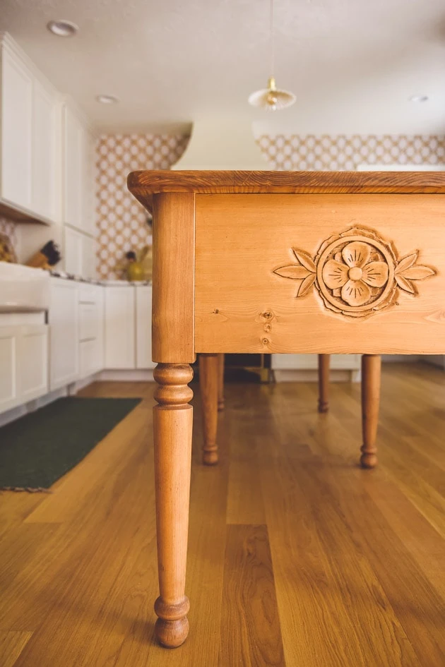
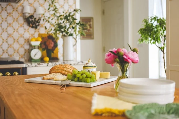
The work table kitchen island
Using all the inspiration that I had gathered, (this is one of my favorites!) I started to notice that each one had a work table that acted as a kitchen island in it so I went hunting for something similar. The problem was, I needed something with exact dimensions for our space. It had to be 30″ and I wanted it to span the length of the room, about 100″. Plus, adding in storage with the drawers is always helpful.
Custom wood table
Enter Tanner and Jana Roach of Beck and Cap. I reached out to them early in the process to see what their capacity was and they offered to make it for us, which was an absolute dream come true. I shared all my inspiration and they came back with some drawings and went to town.
Old Danish-inspired wood carvings
As you saw on the show, they delivered it on their truck from Montana and I was surprised to find the carved out flowers on each side. I had shared some photos I had taken in Denmark of some Danish carvings and they incorporated it as a surprise. I’m still stunned! They are the best! I’ll be doing a whole post about it because it was such a great collab. If you ever need custom furniture–they are your people!
The counter tops
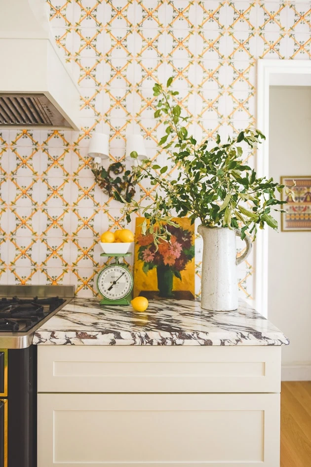
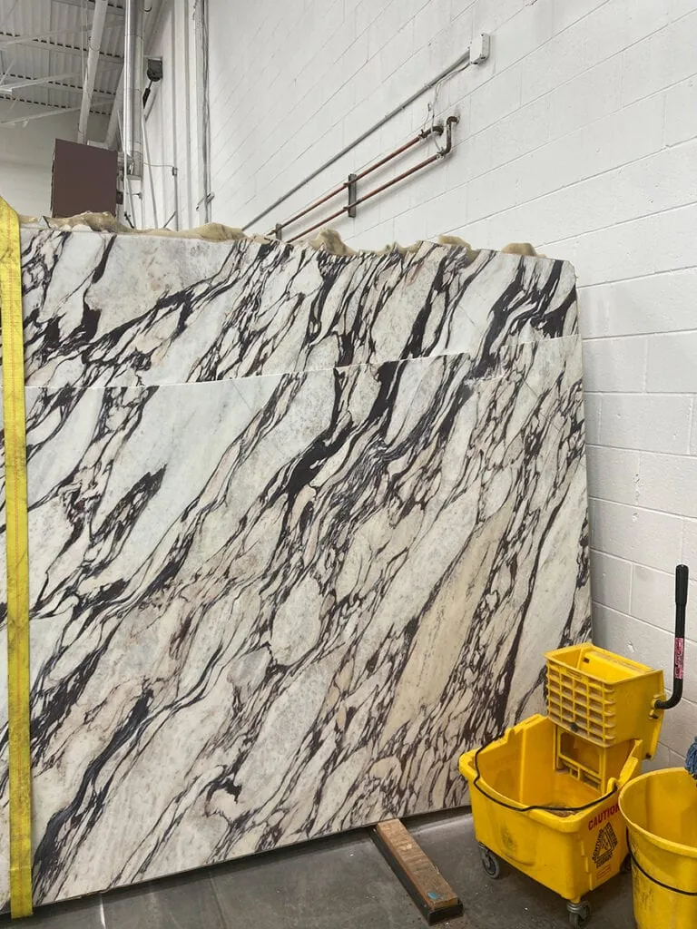
Meta took me to the slab yard where we looked at hundreds of marble/quartz countertop options. [insert photo here of the slab yard]. She convinced me that I needed the calacatta viola, which is the super veiny, dramatic marble with almost a purple in it. It was definitely the biggest purchase we made as well as the trickiest to install, and while I LOVE it, I don’t love it with a pattern on the wall.
I hadn’t brought Meta on the rest of the project so she couldn’t have known what I was going to do (and I didn’t know either!). This is why I’m probably going to go with a more solid tile for the walls at some point so it doesn’t clash as much. I have a plan that I’ll be sharing at some point.
Sconces
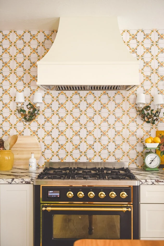
Meta spotted these beautiful floral sconces from Shiny Things London and encouraged me to buy them–always the good eye. They have the loveliest colors though I feel like the busy wallpaper and the lighting kind of blend together. I’m hoping to show them off even more with a more solid tile.
Faucet and sink
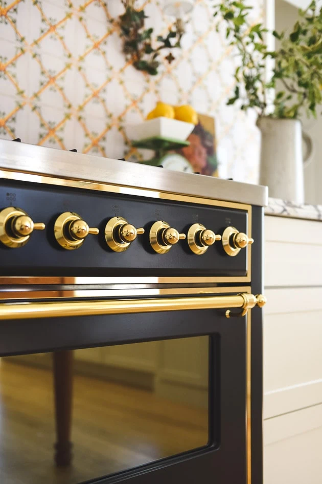
Once again, we partnered with Signature Hardware on the accessories. They provided a beautiful polished brass faucet, which adds in a bit of fancy and a lot of old world. It also works well with the brass accents of the Ilve range. I really love it!
We also used one of Signature Hardware’s farmhouse sinks. I got the 33″ double fireclay in biscuit, though I’m not seeing it on their site right now. In retrospect, I think I would have liked to mix up the whites a bit more and have more of a contrast with the off white of the cabinets because they have some with a bit more interest like this fluted one, but I do love mine!
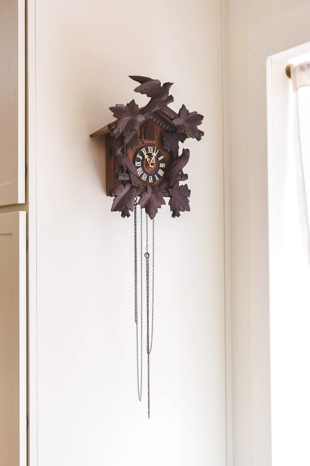
As you saw in the show, my parents moved to Utah from California while we were shooting and they shared some personal items with us to bring in more of our heritage like this cuckoo-clock that my grandmother bought while she was in Germany. It’s one of the most beautiful ones I’ve ever seen!
The hood
Our ceilings are on the lower side at 8′ so I didn’t have too much space to work with when I was envisioning that tiled stove idea, but I came across Hoodsly, who does only hoods in a variety of shapes and finishes. We needed one right away and they just happened to have the exact size and style that I liked in their warehouse–hallelujah!
It came in unfinished wood so after we installed it we painted it white to match the rest of the cabinets. Like the tile, I have some more ideas to do with it, but I love, love, love the shape and think it’s super classic and interesting. It feels like one of my favorite kitchens here.
Ilve Oven range
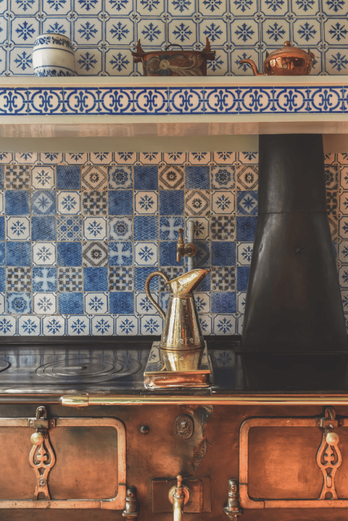
Now, when this oven range showed up to our house, I nearly lost my mind. It was provided by the Italian company, Ilve, and it’s so beautiful. Those brass details are gorgeous–like jewelry. You might be surprised that we got the graphite color (basically a black, but feels more historic), but I was looking back to Claude Monet’s kitchen, where he had something similar. I wanted it to feel grounding and could go with whatever tile choice we would eventually make.
We got the 36″ Majestic II dual fuel freestanding range. It comes with 6 burners and a full-width dishwarming drawer. Prior to this, we had a 48″ commercial oven and we liked it, but it was SO big and we didn’t need all the space. This allowed us to have more storage.
It uses a touch screen to work it, which I find a little clunky, but besides that we’ve had a very good experience. You can read more about our experience here.
Like beautiful fine jewelry.
OK! I think I made it–ha! That was a doozy. While I really like how it turned out, I have a few changes in mind like new tile (I even found some antique Delft tile in Denmark on our last trip!), glowing up the hood, new window treatments, and a little DIY that will add in some color.
A Scandinavian-inspired refrigerator
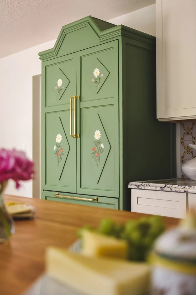
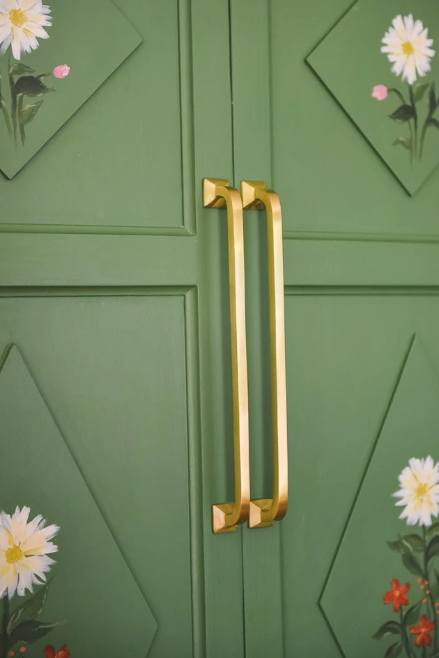
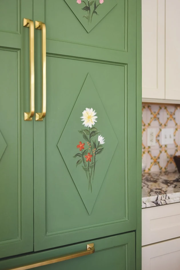
I’ll be doing a whole post about the refrigerator because it deserves a full in-depth post. We have Meta once again to thank for this concept. I was probably going to do a look to blend in with the cabinet so I’m so glad she suggested a fridge that looks like a cabinet. I had been so inspired by some of the Scandinavian wedding cabinets (we even did one for my bathroom!).
Painting on a refrigerator
I couldn’t find anyone to make it in the time frame we need so Handy Nanny Pat stepped up to the plate once again and made it all herself, because that’s what nannies do! Ha! She’s incredible. I sketched out the design I wanted based off of one that I saw in Denmark when we visited last year and she magically assembled it. We didn’t have the time to paint it how I wanted to paint so Carrie on our team added in some flowers onto the panels right before she took off to the airport on a personal vacation–ha!
We added in the Klein solid brass appliance pulls from Signature Hardware after some advice from Pat. She had done some reading about pulls that are open on each side versus ones that close in on each side here and how they can catch on a lot of things. With kids, we decided not to risk it and take her advice. 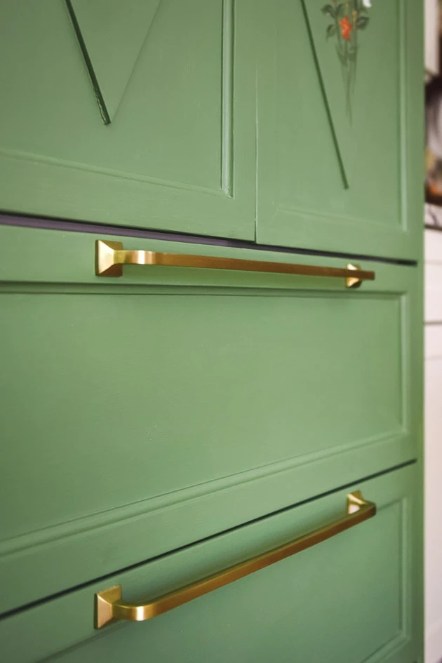
Overhead lighting
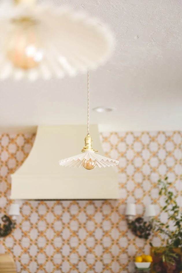
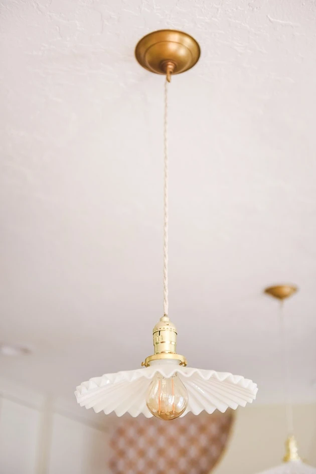
Once again, I went with one of Meta’s suggestsions. She recommended these opaline antique fixtures from France, which aren’t very expensive. We had to get lighting kits to go with them, but I love them. Dainty but also adds in some character. We got ours from here, but you can look up “opaline fixtures” to find some for yourself like these.
And I used a 4.7″ brass canopy for the tops from here. I don’t love the mix of the bright brass on the fixture (it came with the shade) and the matte brass so I’ll need to figure that out at some point.
Ok, I think that’s it–phew. That was a doozy! Let me know what you think! I’m happy to answer your questions. And stay tuned for more specifics!
Resources:
Cabinets * | Oven range * | refrigerator | pendant lights | pendant canopies | tile wallpaper * | sconces | Custom wood table * | Hardware * | sink * | faucet * | rug
*gifted items
Other articles:
You can find all the before and afters in this post
You can read all about the kitchen here


Comments