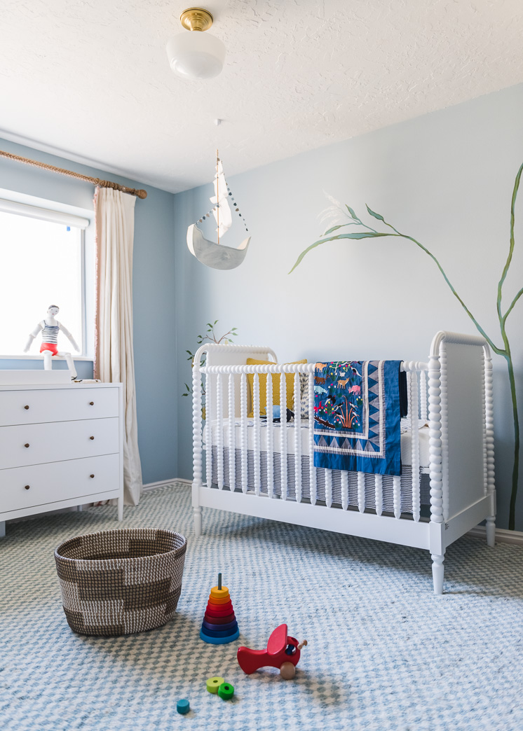
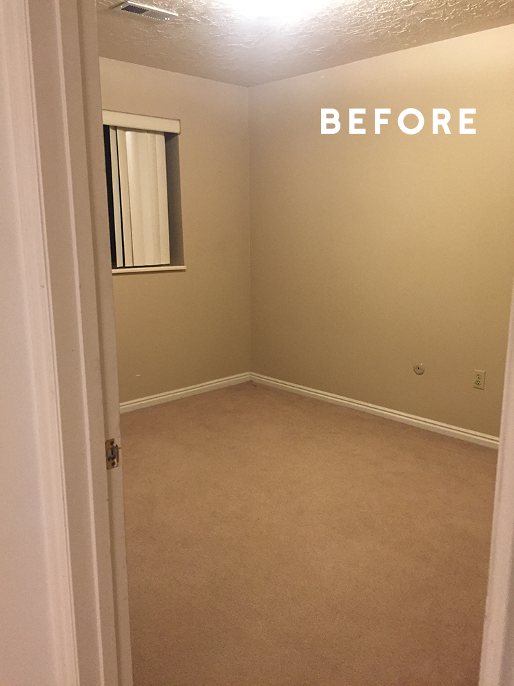
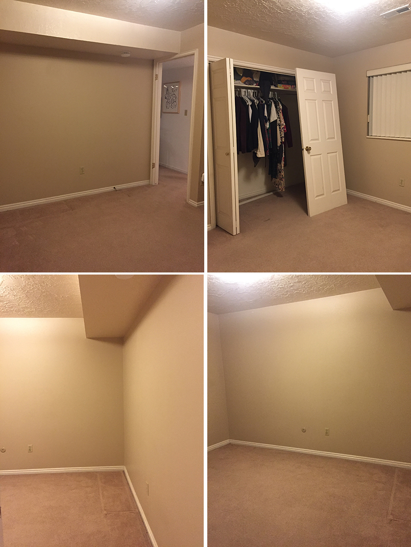
 If you follow along on Instagram Stories you will have spied a ton of sneak peeks of the mural we’ve been working on in our new baby nursery. You guys had so many sweet comments to offer and they really get me even more excited than I already am. Baby Boy Lars is due anytime now (gahhh!) so I’m trying to wrap up the details of his nursery (and work and taxes and life and etc. etc.). But, I just had to talk about the mural first as it’s so stunning and I’m super giddy about it. I teamed up with BEHR®Paint to bring it to life and had such a great experience. It’s because of them that I actually took the nursery seriously in the first place. Who knows when or IF I would have done anything about it. But clearly, something had to be done. Here are the beige before pictures:
Before and After of our Baby Nursery
You see what I mean?
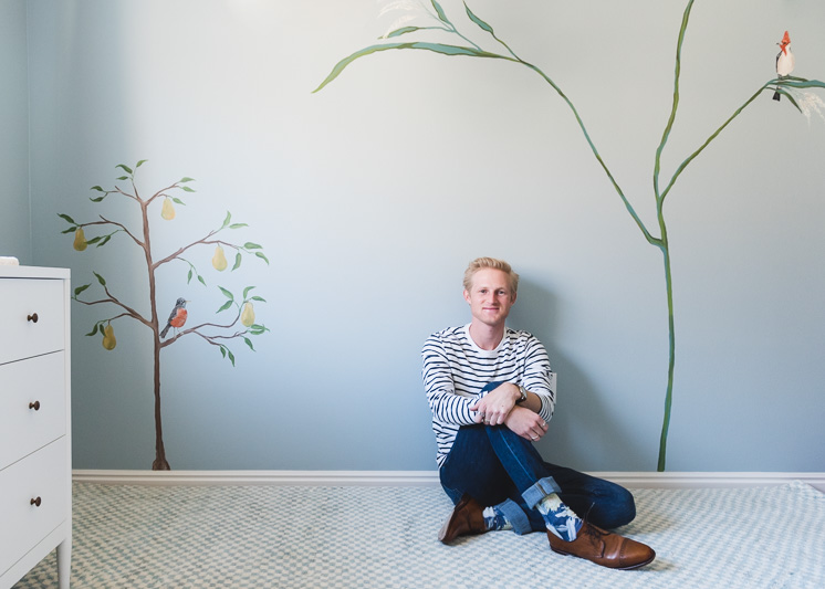
I asked our star intern from last semester, Drew Toolson, if he could lend his painterly talents and he so graciously obliged and far exceeded my expectations. Seriously, he made magic happen in a room that was otherwise beige, boring, and blah!
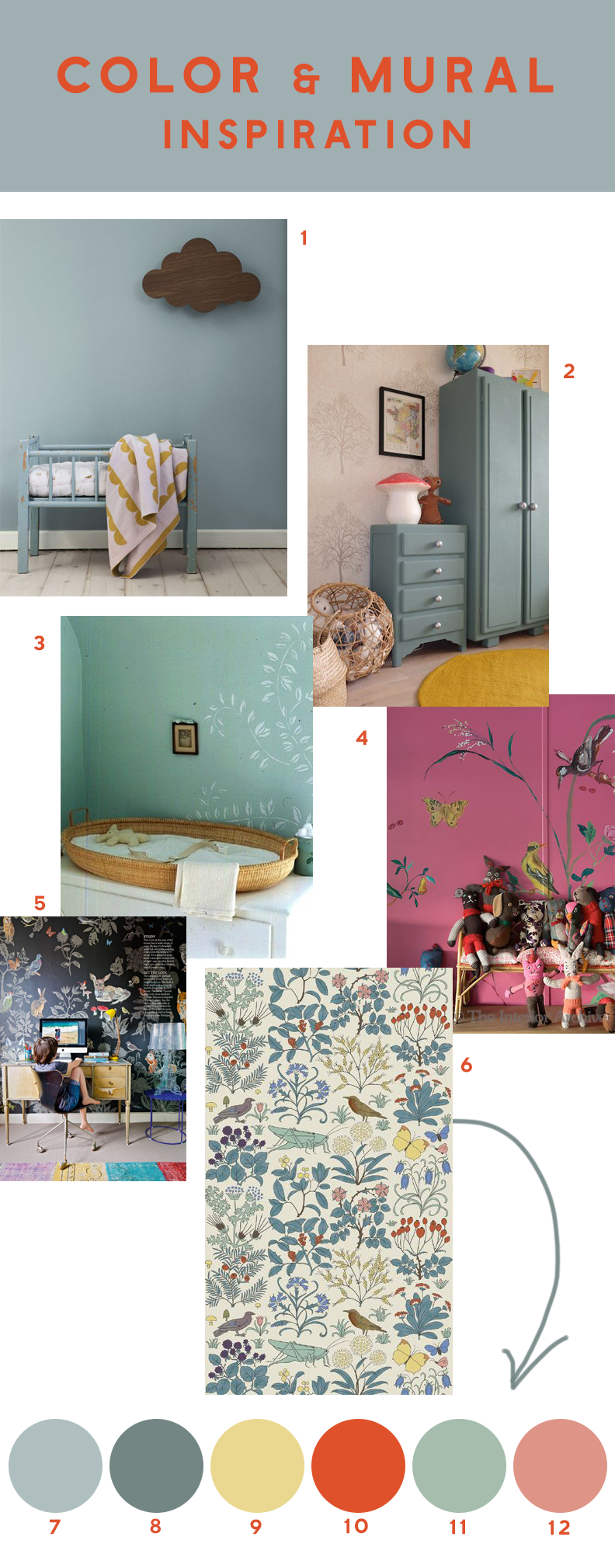
I knew I wanted something whimsical yet slightly moody and I came up with this inspiration board.
My inspiration board for baby’s nursery
When I first found out I was having a boy I was NOT, and am still not, into the idea of using blue just because he’s a boy. I think it would be so lovely for a girl. However, I started to fall in love with the moodier grey/blues/greens that I wouldn’t have been drawn to right off the bat. I’m so glad it forced me to think in ways that I probably wouldn’t have otherwise because I needed a change in color palettes recently. There’s been a lot of millennial pink going on lately, amiright?! I made it a personal challenge to try something new and I love it! And I’m pretty sure Baby Boy will love it too. (Speaking of Baby Boy, we need to get this boy a name! Any suggestions?!)
My color choices
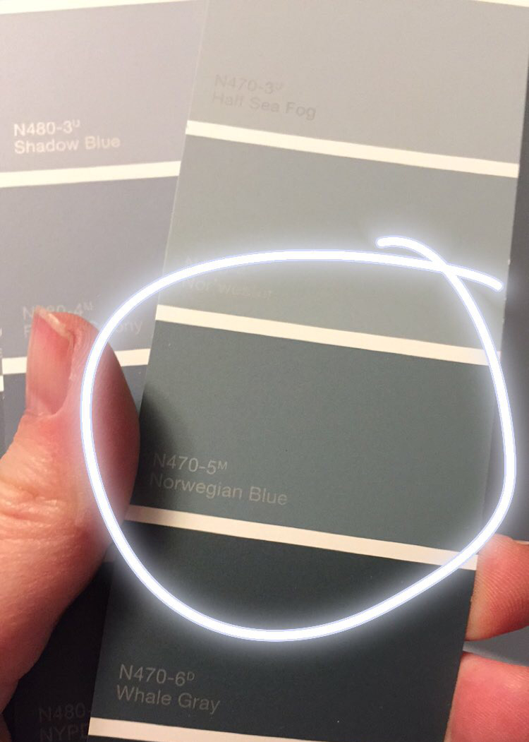
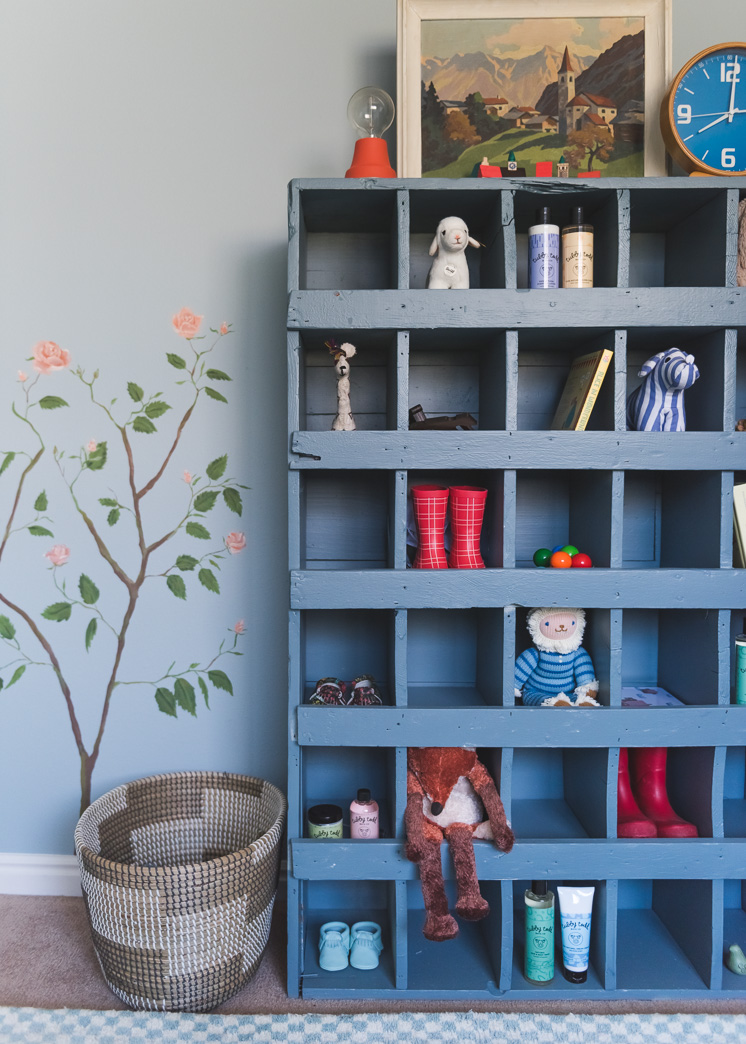
My first few inspiration images (numbers 1 and 2 in the image above) guided me to a lovely blue/grey/green fromBEHR MARQUEE® called Greenwich Blue. It was the perfect blue/grey for what I was going for. It was also not too dark to be a cave or too light to be washed out by the sun. We did an all-over paint job on the walls and then added in BEHR’s® Swiss Coffee (classic!) to the ceiling and closet doors. It feels so so good to have a lovely, non-beige! I had bought a dark wood antique cubby piece from the Rose Bowl a couple of years ago and we’ve had it at the studio this whole time. It needed a change of scenery so we gave it a paint job with BEHR’s® Norwegian Blue N470-5 and it looks divine and feels so clean. I’ve been adding Baby Boy’s little toys into the nooks and crannies and it’s perfect for little hands!
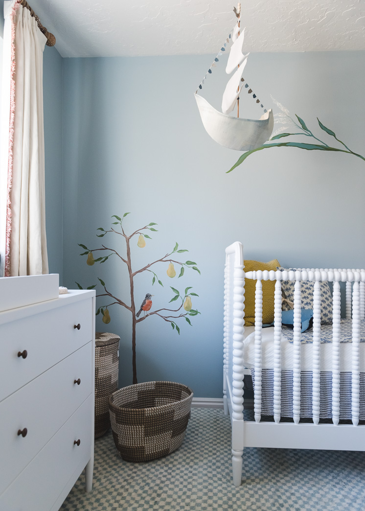
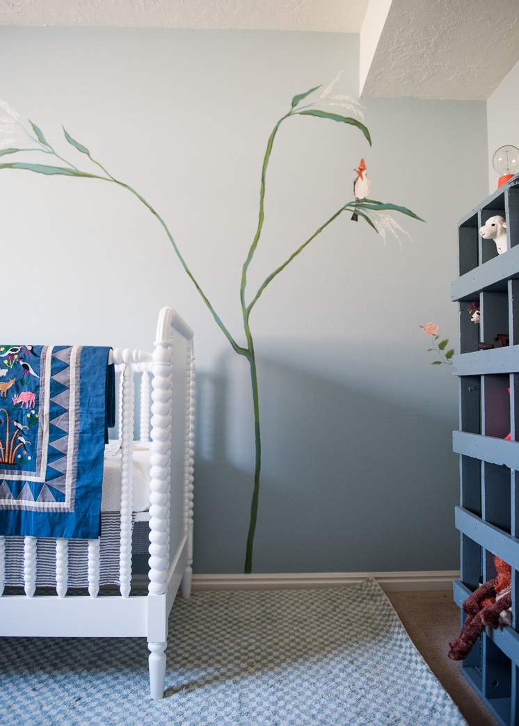
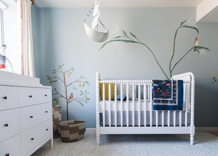
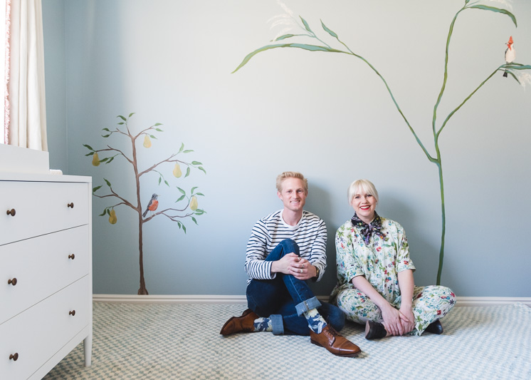
Aviary and fruit tree wonder!
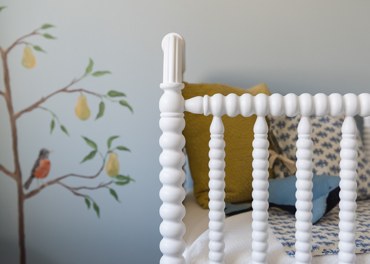
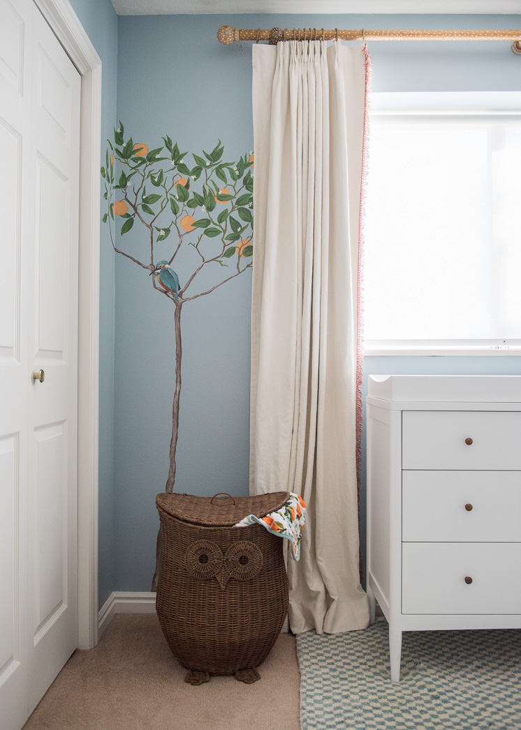
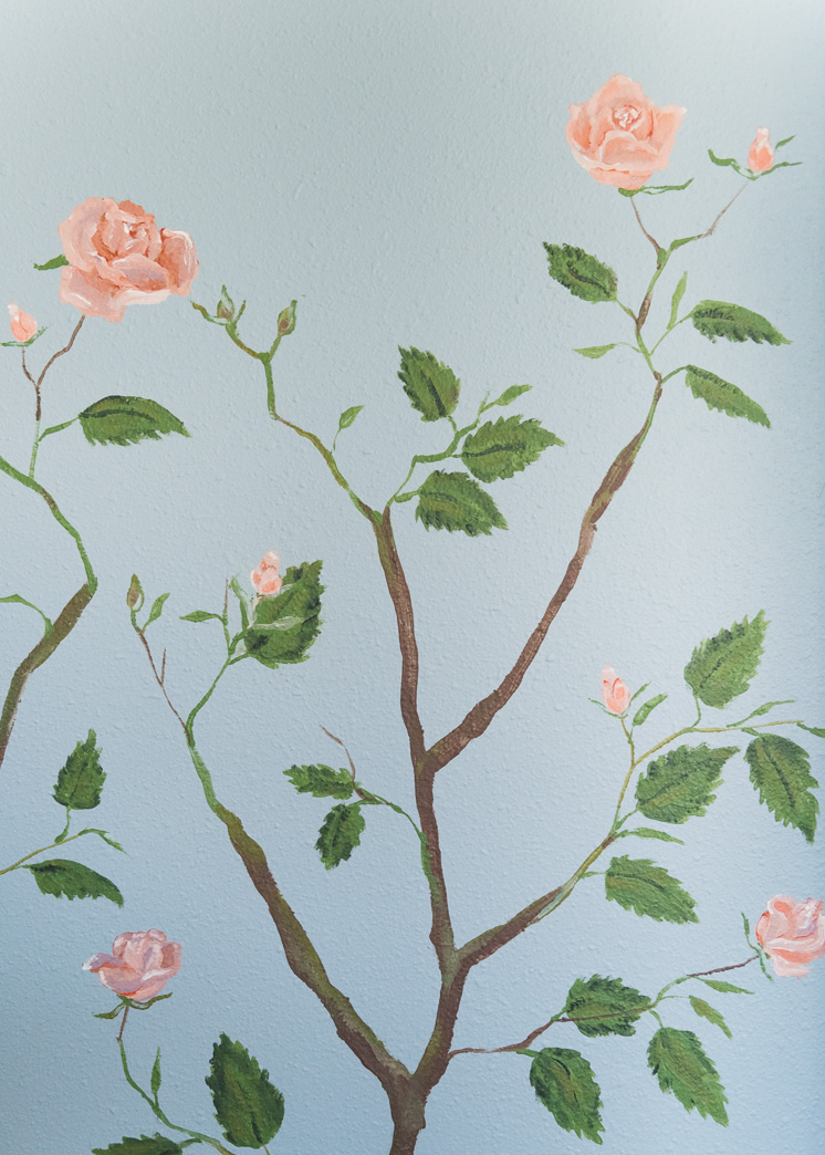
As for the direction of the mural, I LOVE wallpapers and was going for that de Gournay look, but wanted to avoid the more formal feel of it. I combined it with the whimsical nature of Nathalie L’ete’s illustrative work, #4 and the mural wallpaper of #5. You can even see that we used the height and elegance of that main plant in my version and then added fruit trees and roses bushes around the room. I LOVE fruit bushes, particularly citrus, so Drew painted a lemon and an orange tree. The lemon tree was an ode to the beautiful potted Meyer lemon sitting inside my living room window. It’s easily one of my favorite things I own. It’s currently giving off all sorts of gorgeous aromas. And an orange tree because well, I’m from Orange County, and it just had to be done.
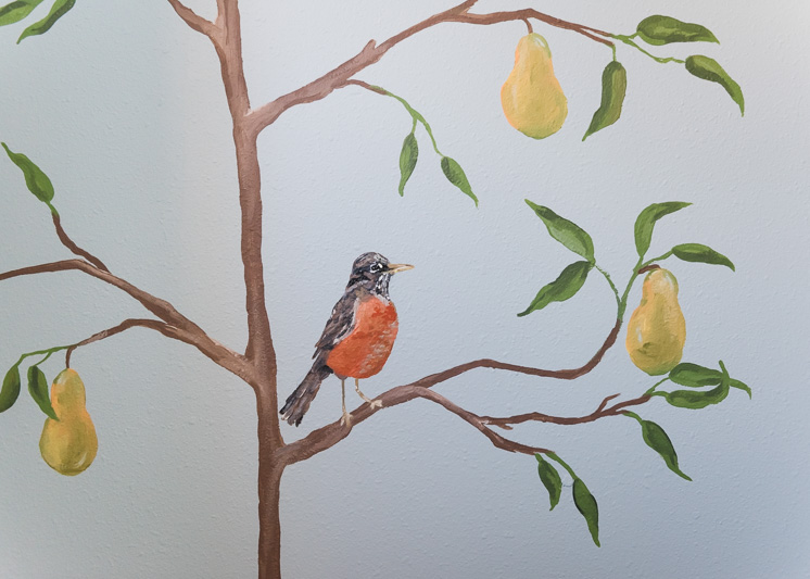
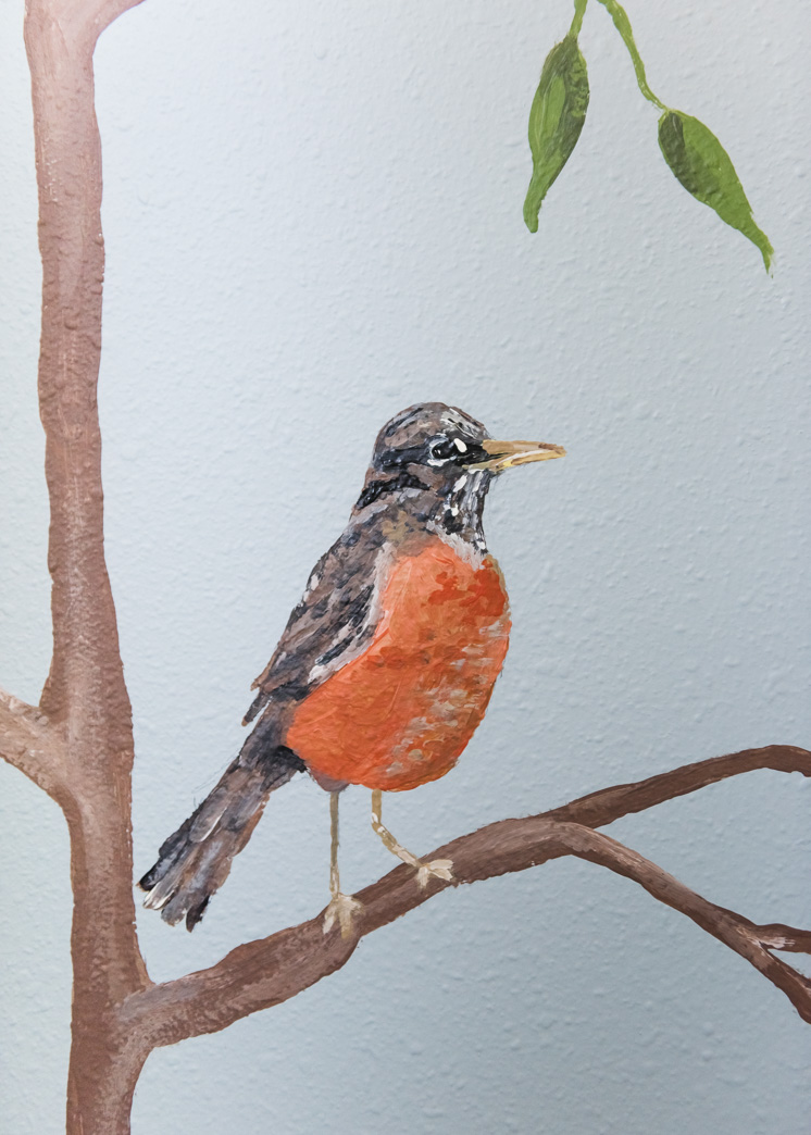
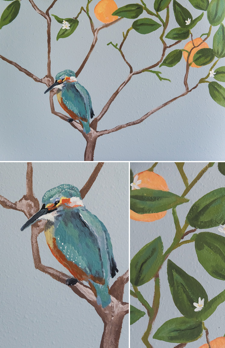
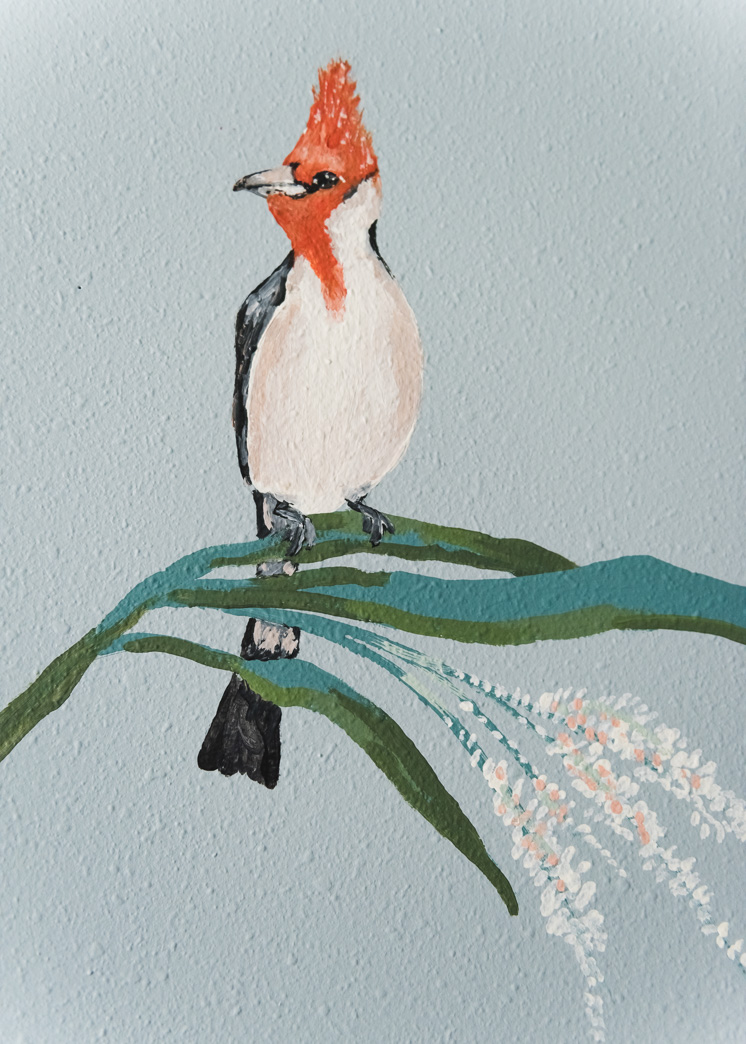
It got a little tricky to know what type of animals to include. Ultimately, an aviary was much more my style than any a menagerie of lions, and tigers and bears so we went in that direction. Drew asked for our favorite birds and Paul’s has always been the kingfisher so he thoughtfully placed him in the orange tree. I was more concerned with the colors of the birds, naturally, so he made sure there was a robin with a little red belly, as well as a cardinal. I wanted red accents to play a secondary role to the Greenwich Blue so I wanted it in as much as possible. You’ll see it featured more when we reveal more of the decor in a following blog post.
You gotta see the detail of the robin:
Isn’t he adorable?!
And the kingfisher bird in the orange tree? I mean…c’mon!
Color inspiration and specs
For the overall color palette, I used one of my favorite ever wallpapers, Trustworth Studio’s Apothecary Garden, #6. My friend, Meta, had coincidentally just wallpapered her bathroom in it and loaned me a sample so I could fall in love with it in person. I taped it to the nursery wall and it left me drooling. I matched up the colors from the pattern to the exact BEHR®paints and it led me to the palette of numbers 7-12 above. I wanted to get all those colors in as much as possible. You know me, and I can’t bear the thought of leaving out any portion of the color wheel.
Here are the additional colors we added in for the full-color range:
7. BEHR® Greenwich Blue
8. BEHR® Norwegian Blue
9. BEHR® Green Papaya P320-5
10. BEHR® Deep Fire M180-7 and Behr Tiki Torch M180-6
11. BEHR® Ponds Edge S410-3
12. BEHR® Pink Abalone M190-3
(not pictured but used in the mural):
- Additional Greens: BEHR®Fern Canopy M380-6, BEHR®Hidden Treasure N300-5, BEHR®Fertile Green s340-6
- Additional blues: BEHR®Jet Set S530-4
- Additional yellows: BEHR®Lemon white P300-1
- Additional browns: BEHR®Derby N180-6
The Painting Process
I found Drew’s process so fascinating. He started with the trees and “sketched” them out with blue tape. That way he could see more visibly the lines he was creating versus a pencil, which would have blended into the wall too much to be seen from afar. Once he got the shape he liked, he painted in the base layers of the trees and then added in more layers for shading and a more layered look. Next, he added in the leaves and then the fruits. Lastly, he added in the birds, my favorite part, with beautiful detail. They’re exquisite! He did such a beautiful job.
I did a number of Instastories documenting the process and thought I’d compile it all into one video. It’s more of a VLOG format, so you can see the whole process complete with the taping, filling in of the paint, and the details. Drew is a patient man as you can see. I was mostly just there for cheers and chants.
Thank you to BEHR® Paint for kicking the nursery into high gear. Without them, I’m not sure the nursery would have gotten done! Sometimes you just need a kick in the pants, like the threat of exposing it to hundreds of thousands of people ;). I’m absolutely thrilled with the results and as you can see. Baby Boy is one lucky little dude!
I thought it would be fun to take a pic of the artist and the commissioner…Sorry Drew, it looks like you’re married to a pregnant woman with cankles that can hardly be controlled with two hands.
Stay tuned for the details of the furniture!
Photography by Jane Merritt and step by step photos taken on my iphone
Mural artwork by Drew Toolson
This post is sponsored by BEHR® Paint. Thank you to the brands that allow us to make unique and original content for you!



Comments