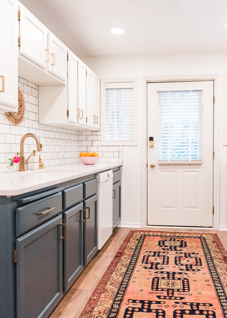
The story of my kitchen is a lesson in stubbornness. We are renters and really had no intention of staying here for 5 years, but alas, the longer we live here, the more I approach the space as a challenge to see how rad I can make it. Don’t tell me it can’t be done, because I will set out to prove you wrong! Ha! Well, last week I revealed our kitchen makeover and you guys were just as shocked as me to see the transformation. Our dreary little basement apartment kitchen went from 80s fabulous to timeless and refreshing with mostly small aesthetic changes and switching out some key components.
Today I’ll be taking you through the transformation process and telling you exactly what we did that provided the most impact including notes on the products, tips on how to work with the installers, and my ratings. I’m a big believer in reading reviews so here are my thoughts! It really is in the details, folks!
Our 5 year kitchen transformation
Let’s start off with some basic facts. If you can only change one room in the house, I’d highly recommend tackling the kitchen first. It really sets the mood for the rest of the house as it’s one of the most actively used rooms. It’s a tricky combination of practicality and aesthetics. Additionally, because of the amount of tasks performed in the space, it is also one of the most expensive. I knew we wouldn’t have the budget, or the need, to invest much into it as we don’t own it. Thus, I wanted high impact for little cost. Maybe you can relate?
Here’s the timeline of our kitchen transformation:
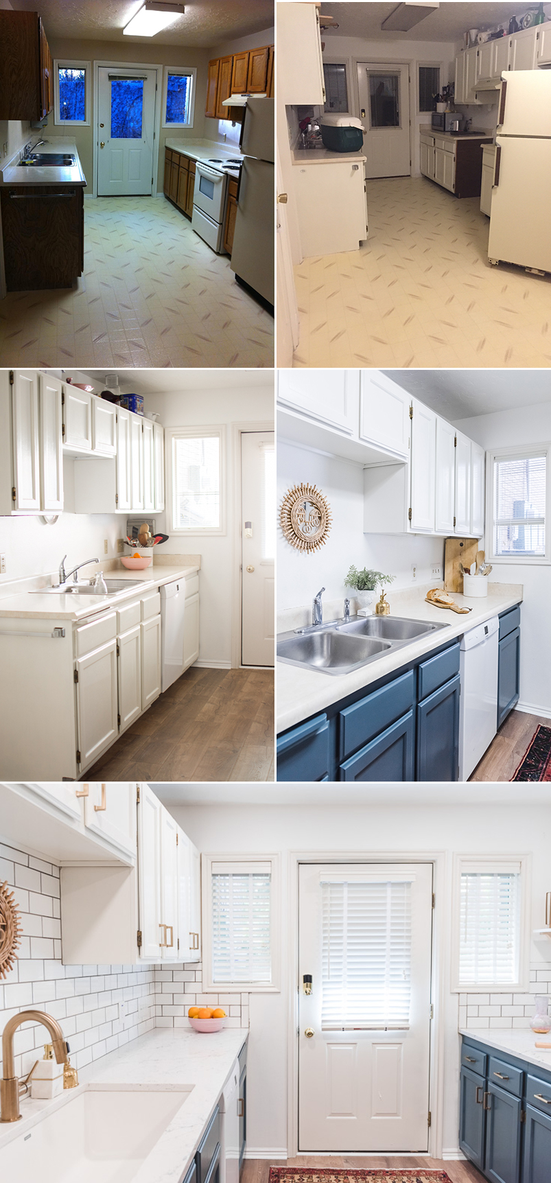
2013 We move in. The kitchen looks like the top left photo below. It’s clean and functional. It has laminate countertops, fluorescent lighting, metal mini blinds, laminate flooring, beige walls, aluminum sink, oak cabinets, no backsplash ( = food on the walls!)
2014 Our landlords surprise us while we’re away on vacation by painting our cupboards white. We were truly shocked when we came home! It lifted the room right up. Top right photo below
2015 I couldn’t handle the beige walls anymore so I painted the whole house white myself. I wasn’t really paying close attention when I selected the white so I chose a bright white as opposed to the more yellow white of the cabinets. C’est la vie!
2017 We install new laminate wood flooring and it feels like a new space once again! Getting rid of the yellow laminate tiled flooring was key. Middle left photo
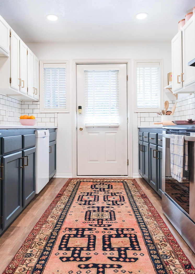
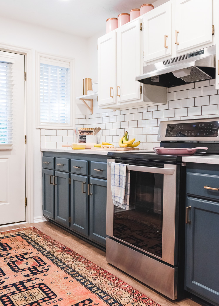
April 2018 I wanted something that felt more “designed” than just plain white cabinets so we painted a two-toned color scheme. White up top and dark blue on the bottom (see the post here). All of a sudden, it took a nice, clean kitchen and created a statement room. It felt intentional and refined. It still had a little ways to go to feel finished.
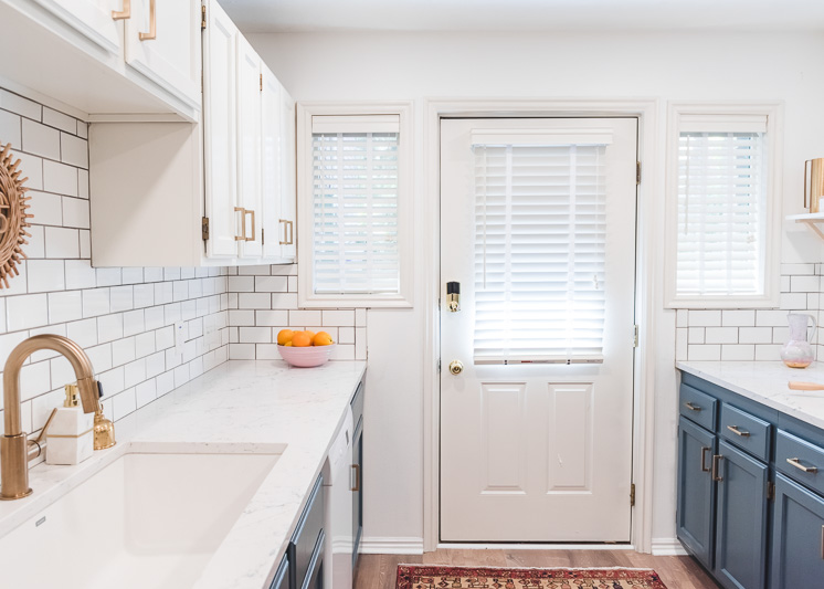
June 2018 We added in a Caesarstone countertop, tile backsplashes, removed mini blinds and added in wooden blinds, replaced the aluminum sink with a granite composite, new brass faucet, new brass hardware, new LED lighting.
Let’s talk details, huh?! Starting with…
Quartz Countertops
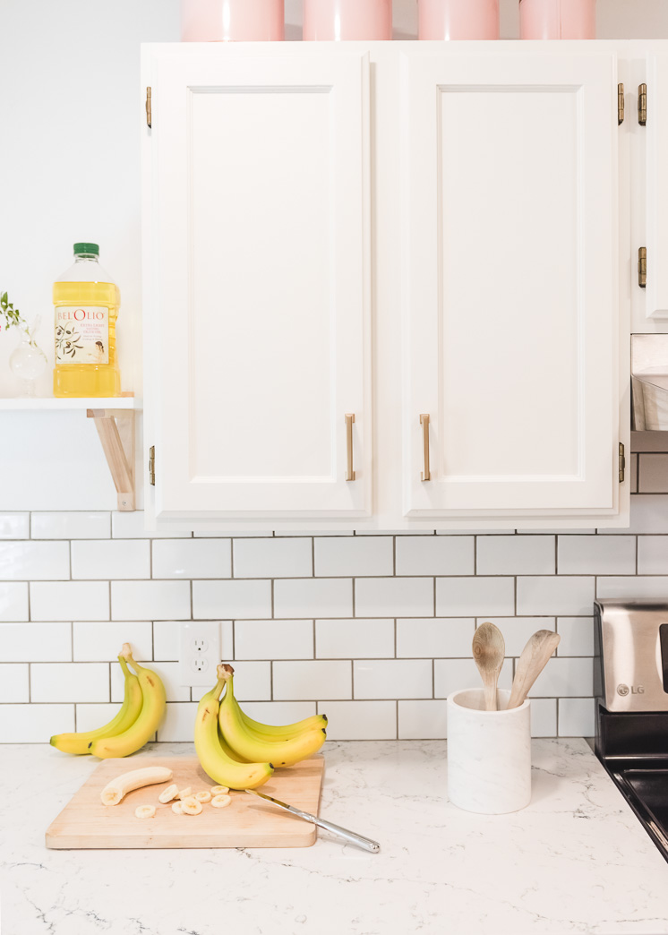
Long-time readers might recall when I wrote for Interior Collective, Caesarstone’s interior design blog. I gave tips on interior design and in the process learned a TON about these beautiful quartz countertops. I had the opportunity to do a lot of research on the pros and cons to each top of countertop: wood, laminate, marble, granite, concrete, you name it and ultimately I learned that quartz countertops are an awesome choice for the following reasons: stain and scratch resistant, maintenance free (no polishing or sealing required!), non-porous so bacteria can’t get inside and make itself at home. SCORE! Plus, even though it’s an engineered stone, it looks REALLY good.
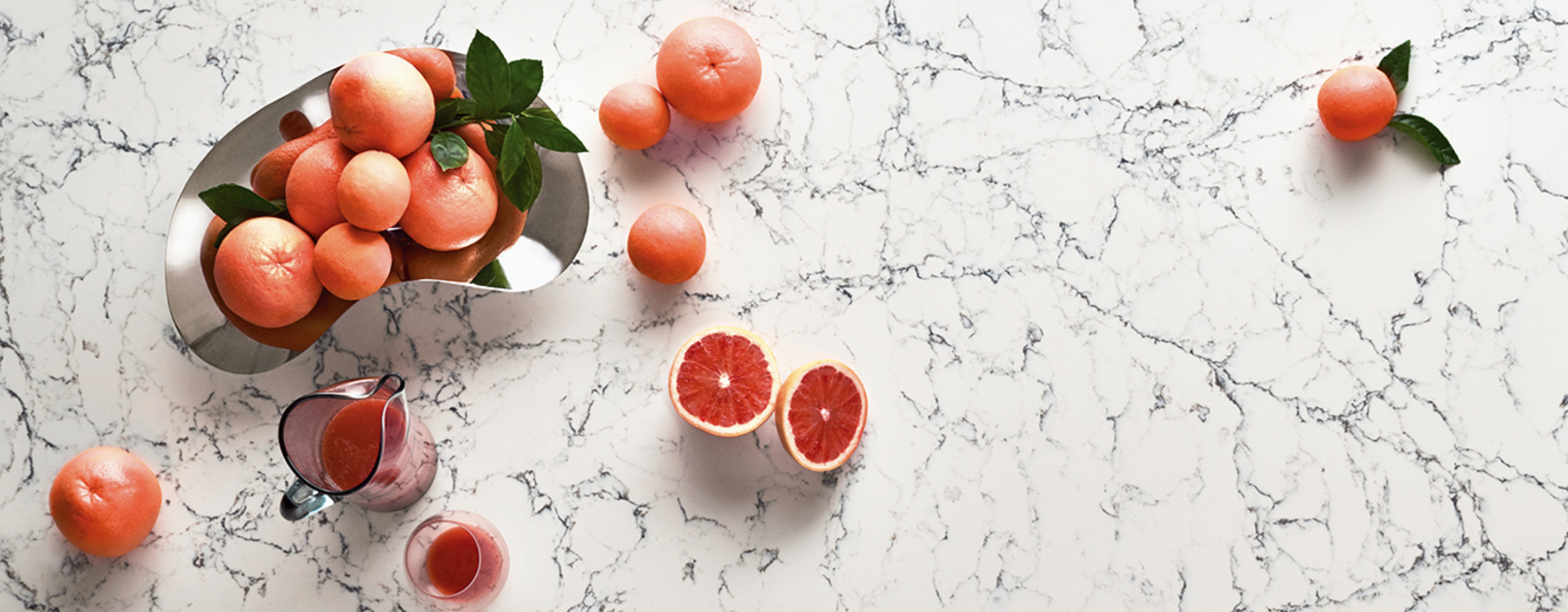
I chose to go with their White Attica™, which features a clean white base with dense, dark grey interwoven veins. I chose it because it goes well with the whiteness of the cabinets and walls yet the veins add a nice interest to it. They have the option of a 2cm or 3cm thickness. I wanted a thicker look so I went with the 3. If you want something even thicker, you can put a couple of them together.
What we used:
- Caesarstone White Attica™ countertop in 3cm thickness
What to know when installing countertops
I was a newbie to countertop installation, but let me tell you how the process worked for me so that it will alleviate some of the questions when it comes to doing it yourself.
- Caesarstone recommended an installer in my area who we went with after making a few calls around for price comparisons and yelp reviews.
- After we selected the type of quartz we wanted, one of the installers came to do a “template” in our kitchen, which basically measures the space creating a plan for where the sink goes, etc.
- The slab was shipped directly to the installers. We also had the sink shipped directly there so they could cut it out. We didn’t have any other holes cut out other than for the sink but other ones to consider would be one for hand soap, water dispenser, dish soap. I wish I would have thought about these things so I could have put them in, but it didn’t even cross my mind and by the time I found out about it, I didn’t have enough time to order some.
- It took about a half day for installation.
A few tips:
- Before we painted our cabinets we had asked the countertop installers if we should paint first or install the countertops first. They advised us to paint first. Looking back, I would have installed the countertops first because the new one is smaller than the previous laminate and because of it we can see traces of white from the cabinets that didn’t get painted mostly at the top, just below the countertop.
- You have the option to put in a 4″ backsplash of countertop. We chose not to do so because I wanted the tile to start at the bottom. Usually you put in a 4″ backsplash when you don’t put in tile, but you can do it if you prefer.
And how do I like it? I LOVE our countertops. They’re beautiful and clean and almost make me want to cook. Almost.
My Rating:
5 stars Can’t speak more highly about it.
Subway tile
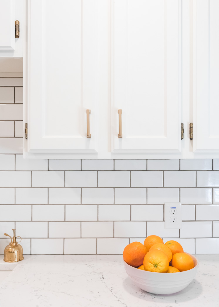
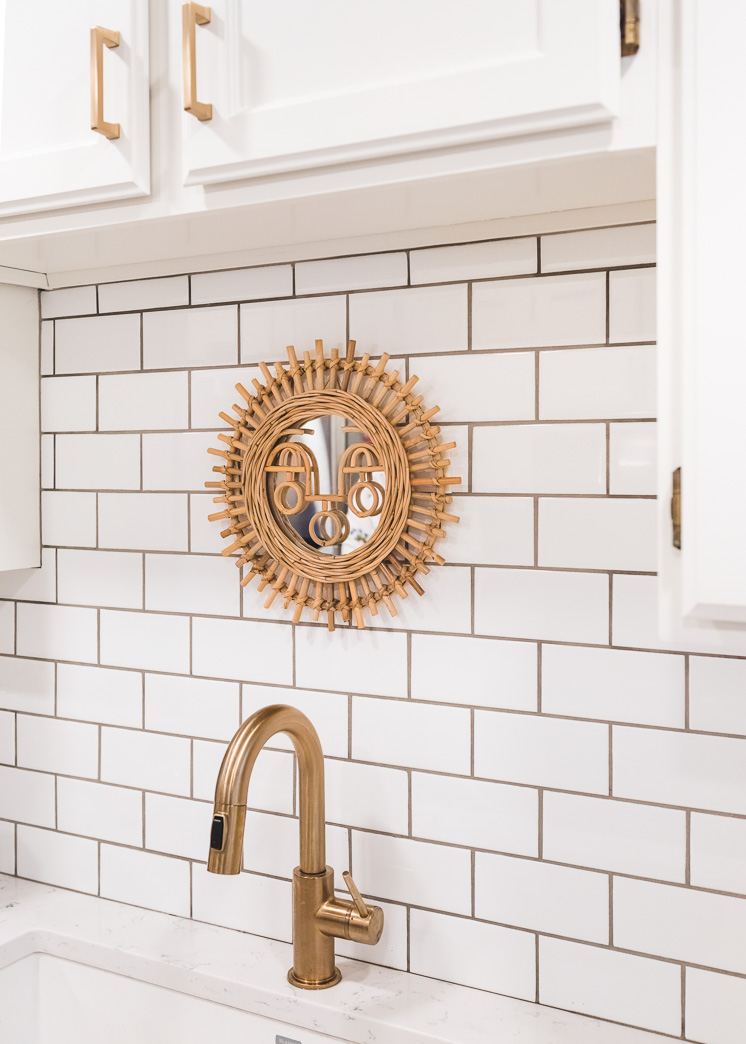
Like everyone else these days, I chose a subway tile. Subway tile is classic and cheap. Maybe in my one day dream kitchen I’ll go with something that’s a bit more crazy, but honestly, it’s so great! Wayfair provided us with the tile for the kitchen, as well as the grout. I love a dark grout with white subway as it adds more interest AND it’s great for stains.
What we used:
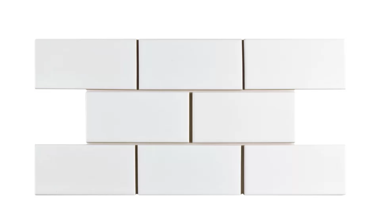
- We used this 3×6″ glazed white subway tile from Wayfair
- We used this sanded grout in natural gray from Wayfair
- We used a dark gray caulking where the tile meets the countertop from the home improvement store
What to know when installing subway tile in a kitchen:
Once again, I was a newbie to installation and learned a lot. I didn’t DIY it, though admittedly, it looks kind of fun (kind of ;).
- I found out that the guy who installed our countertops also does tile, so we hired him to install the tile. He did so at less than half the cost at other places so it pays to ask!
- We went with a 3/8″ spacing because I wanted to see more of the grout than 1/16″. Because of the spacing we used a sanded grout.
- When I ordered the tile from Wayfair, I didn’t realize that there are specific beveled tiles that you used to finish off the space. I ended up having to go to the local home improvement store to find some and luckily they were pretty close in color, but not exact.
- Though I liked the dark grey grout we used, I would have preferred a black grout so it would have looked even more intentional. Grey kind of looks like plain.
- It took about a half day to complete.
- Wayfair has a great measuring tool on their site that helps you know how much to order.
My Rating:
5 stars and I’ll be adding my review to Wayfair.com
Hardware
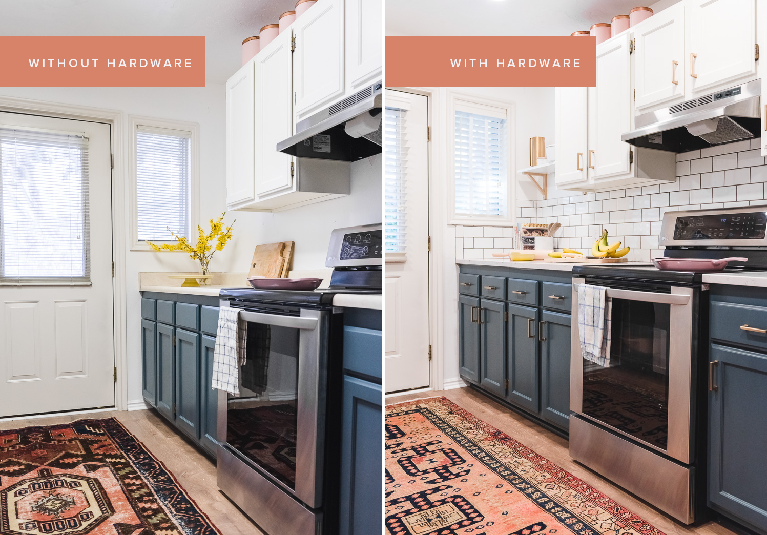
Out of all the details on this refresh, the one I didn’t anticipate making as big as an impact as it did was the hardware. It’s like an outfit that’s ok on its own, but REALLY amazing once you add jewelry. Take a look:
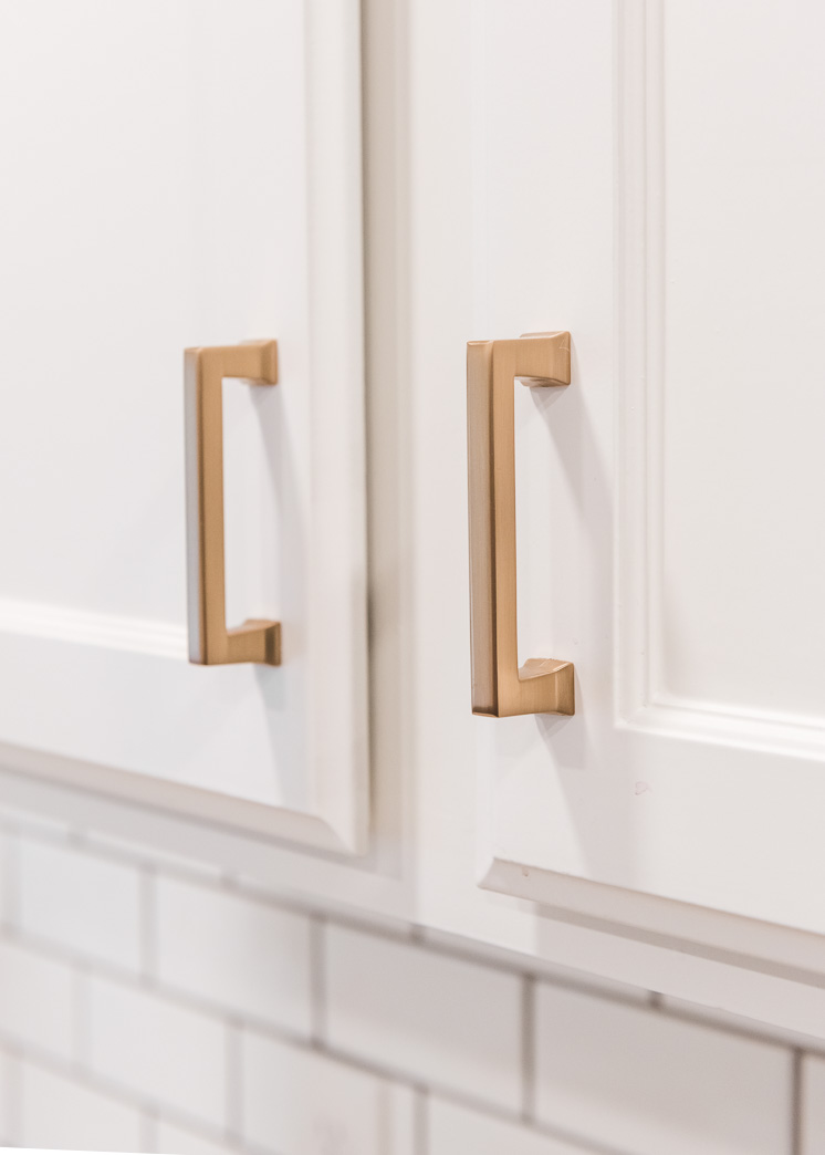
Right? We had used Emtek hardware on our office renovation (see here) and loved them so much that I immediately turned to them for my home. Because our cabinets are traditional, I wanted a handle that was one part traditional and one part modern. Too drastic and it wouldn’t have worked. The Alexander bar pulls were the best choice! They come in an 8″, 6″, 4″, and 3.5″ inch.
What we used:
- 3.5″ pulls in satin brass for the small drawers and all cabinets from Wayfair
- 6″ pulls in satin brass for the larger drawers from Wayfair
You’ll notice in the picture below that I miscounted the amount of pulls I’d need so three of them on the left don’t have any pulls. My bad!
Notes about the installation
There was some debate of where we should adhere the pulls. Do you line them with the woodwork line or slightly above or below? We decided to line them up flush with the lines after researching lots of photos of kitchens I liked.
My Rating:
5 stars and I’ll be adding my review to Wayfair.com
Here’s a close up of the hardware. See that silhouette? The perfect blend of traditional and modern.
Sink
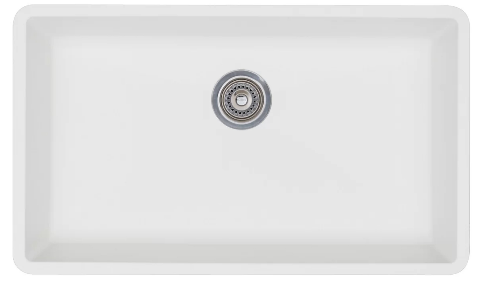
Selecting a sink was a rather tough. I love the look of a farmhouse sink, but after some research I found that a porcelain sink is subject to a lot of chipping. Since we aren’t the gentlest of users, I decided to find out that would be tougher on wear. Additionally, I didn’t want to have to have someone cut into the cabinetry below the sink, as farmhouse sinks need to do, to save on labor costs. I scoured Wayfair (seriously, they have EVERYTHING!) and found this Precis sink. Our previous sink had two compartments and I was worried about going to one though I did I find two to be a bit cumbersome (though awesome for infant baths!) because pans don’t fit well. With our one compartment, we have plenty of room for pans. We’ve been loving it!
What we used:
- 32×19″ Precis single sink by Blanco (it’s one sale right now!) from Wayfair
Notes:
Never having ordered a sink, I didn’t take into account the garbage disposal system. I had ordered this strainer thinking that it’s white and matches, but, ding dong! We had an existing garbage disposal. The countertops people had removed our sink and took it back to their location so we had to have our plumber go and retrieve it. Our garbage disposal is silver while our faucet is brass so there’s a discrepancy there, but overall, I don’t mind because one hardly looks into the sink.
My Rating:
4 stars and I’ll be adding my review on Wayfair. I find it a bit tough to get everything to nicely flow into the drain. It takes a bit of work. Maybe it needs to be designed so that it slopes a bit more? But other than that, I love it.
Faucet
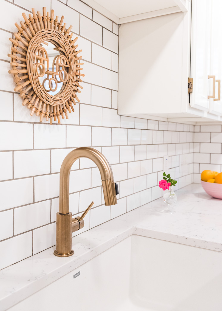
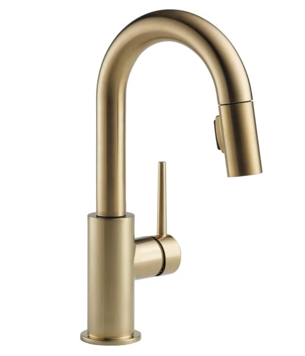
I was unusually stoked to find a rad faucet to go with the brass hardware. After doing lots of research, I came across the same faucet over and over. All the brass faucets you see in pretty Pinterest photos are this one. It’s Delta’s Trinsic pull down faucet in champagne bronze. It’s beautiful, practical, and AWESOME. As our plumber was installing it, he commented on how amazing it was and somehow I became even more excited. Adult excitement is so
What we used:
Notes:
I mentioned it before, but I would have added in a couple of soap dispensers thought I couldn’t find any in bronze or brass.
My Rating:
5 stars and I’ll be adding this onto Wayfair’s
Lighting
As an obsessive light lover, you can imagine my excitement about replacing our not so beloved fluorescents. AU REVOIR! I would have loved to have added a statement light fixture because I love a good statement fixture, but we don’t have the hugest ceilings (though pictures are deceiving!). I decided to go with these white ultra slim LED 6″ recessed lighting kits from Globe Electric Company. Much like our plumber, our electrician fell in love with them. He asked if he could take them home with him. Ha! They’re so slim that they fit really well into narrow ceilings. And they are bright bright bright! We put 8 into our kitchen. 4 into the kitchen area, and 4 in the breakfast nook and, I never thought I would say this, but maybe it’s too bright? Maybe?
What we used:
- white ultra slim LED 6″ recessed lighting kits from Globe Electric Company from Wayfair
My Rating:
5 stars and I’ll be adding my review to Wayfair
Accessories
The fun continues, folks! It’s time for the finishing touches on this beauty.
Rug
I worked with Loom and Kiln on some rugs for the shoot. Paul doesn’t believe in rugs in kitchens (men!) so we didn’t purchase it, and hence the reason why we have different rugs in the before and after photos. The rug completes the room! It’s like a frame on a painting. Sadly, I’ll never live to feel this completion.
What we used:
The ones we used are both sold out now since they are antiques. Take a look at their site and find your dream rug!
Shelf
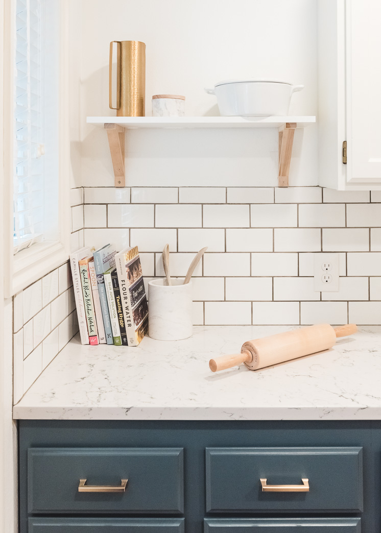
I added in an Ikea shelf above the tile for more storage
Pops of pinks
The pops of blush pink canisters above the cabinets are vintage, but the pans and bowls are new from Le Creuset and I got them all from Wayfair. I got them a few years ago so I don’t see the pink in their inventory right now, but check in once they get more.
Marble accents
I used some marble accents around the kitchen like the following:
-
- marble soap dispenser (so pretty!)
- soap dish
- marble salt box
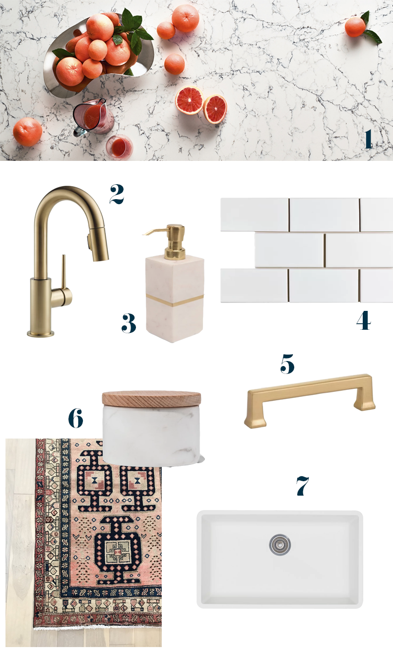
- Caesarstone countertop in White Attica
- Delta bronze faucet
- brass marble soap dispenser
- white subway tile
- brass hardware pulls
- marble salt dish
- white sink
- Persian rug
Ok! I’d love to hear your thoughts on the refresh. What do you think was the most impactful change? How did you go about doing your kitchen? Let me know if there’s anything I can answer for you!
The countertops were provided by Caesarstone in exchange for a review of their product. The rest of the items, unless noted, were provided by Wayfair.




Comments