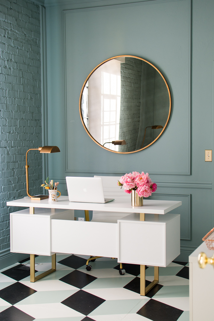
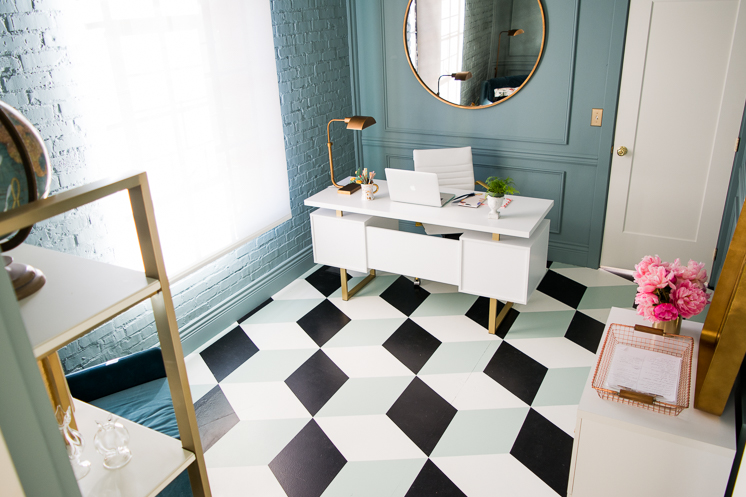
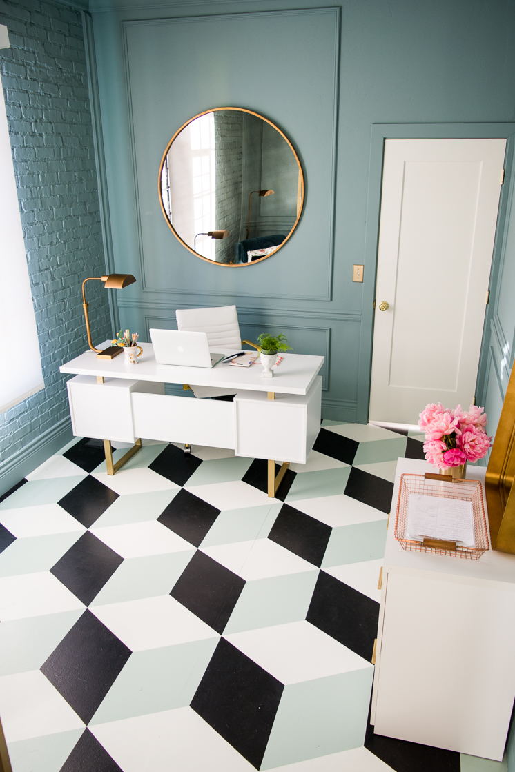
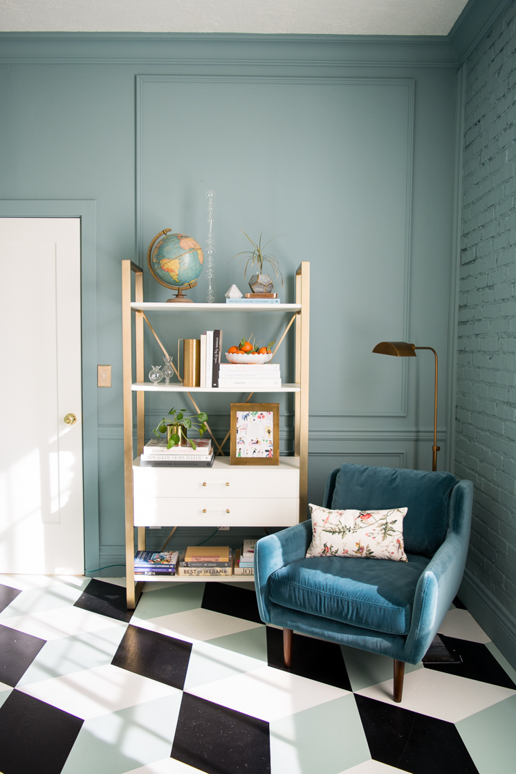
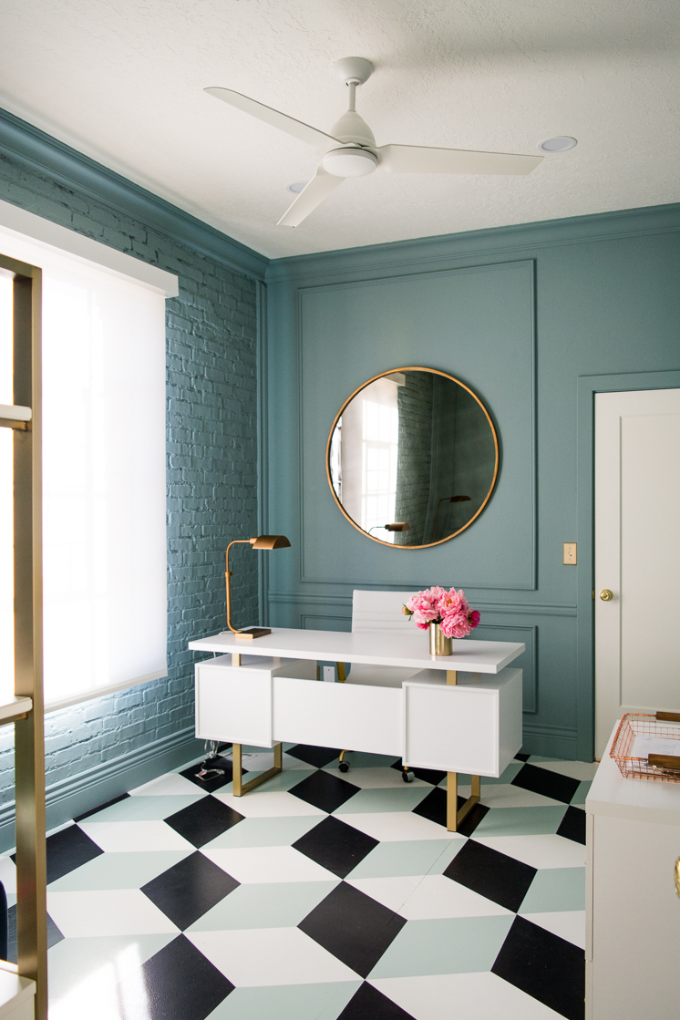
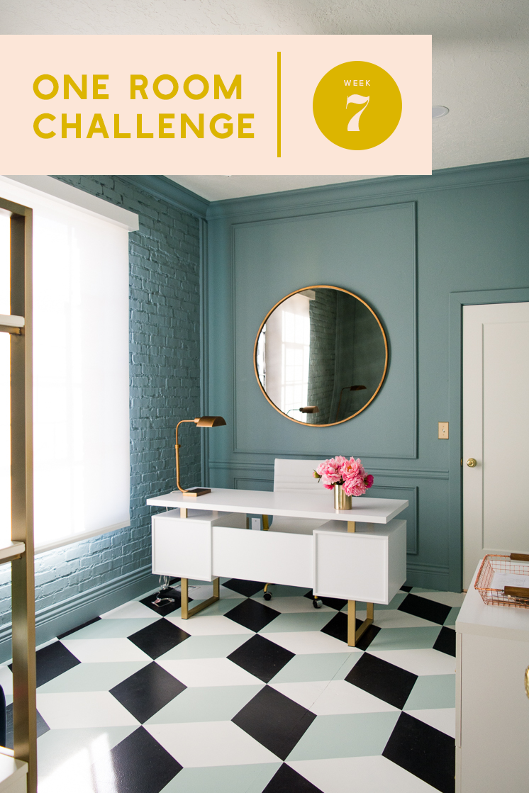
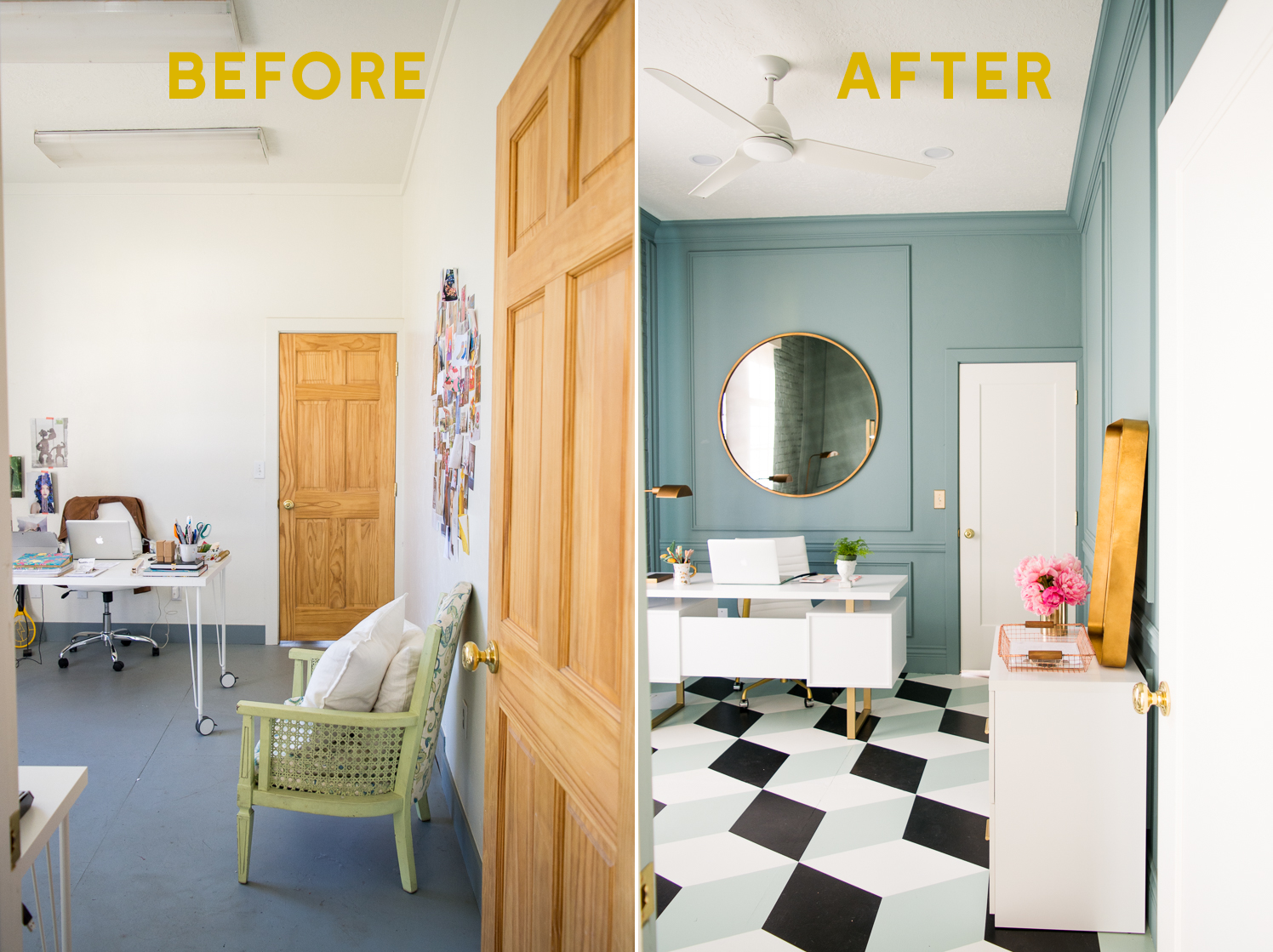
 You guys! Can you even believe we made it to week 7, the final reveal (click here if you’re just joining in)? I’m pretty surprised myself! This One Room Challenge was a TON of work and it’s all thanks to so many generous people who made it possible as well as my awesome team, particularly our business director Mary, who put in so much time and enormous effort into making every detail perfect. In addition to running the business side of Lars, she plays an amazing contractor/DIY role. I mean, the detail work of that floor is nothing short of a miracle. Every single point lines up perfectly! I’m absolutely floored at the work that she did along with some awesome volunteers (victims???). We are so grateful for the countless hours, the late nights, and the sore muscles people sacrificed to help us make this office truly magical. Because it is! I’m so pleased with how this vision came to life. From top to bottom this office has been completely transformed with the help of some amazing companies we were privileged to work with. We’re going to take you through all the elements and little details that brought the entire look together, so buckle up and get ready!
One Room Challenge Week 7: Final Reveal
We’ve got to start with the moldings from Metrie. The wall paneling and molding we installed elevated the room and made it so much more sophisticated. We used the New Traditional Design Option from Metrie, making it easy for us since they made all the decisions for us. We installed everything ourselves (and by “ourselves I mean Mary and Adam. Thank YOU!!!) and you can view a tutorial in the Week 4 post!
Metrie also provided our new gorgeous doors. We were lucky enough to get 5 of them for all of our office doors and man, what a difference! The doors are by True Craft Door- Solid and painted white with Farrow and Ball’s Wimbourne White.
Paint
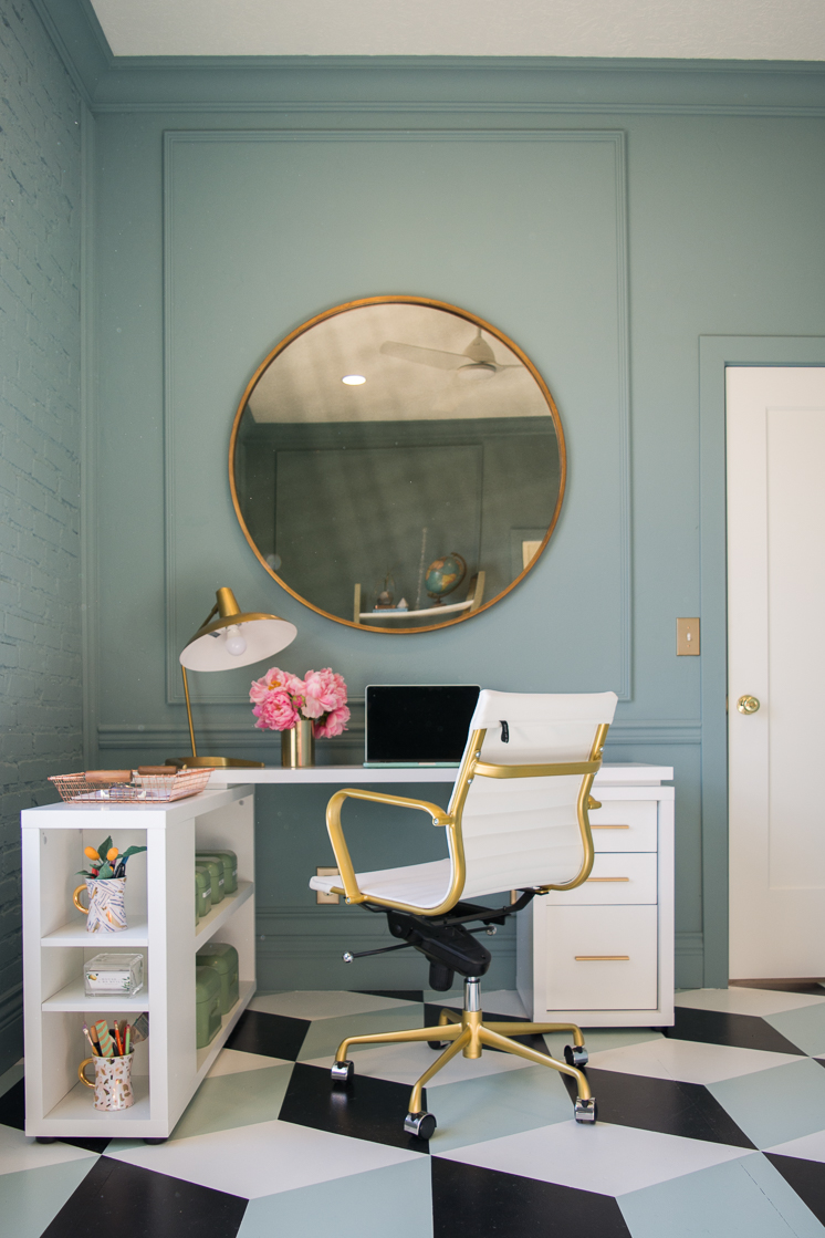
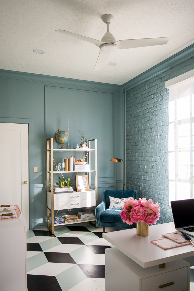
I’ve said it once, I’ll say it again, paint is the ultimate transformation tool. We were lucky enough to use the lovely paint of Farrow & Ball. This stuff is the highest quality and their signature finish left our whole staff amazed. It’s like buttah. For the walls we used Oval Room Blue, and the floor pattern was created with Wimborne White, Pitch Black, and Teresa’s Green.
Let’s just take a moment of silence for the floor, shall we? We chose to create a tumbling block pattern, inspired by the pattern used in ancient Greek and Roman interiors. The floor is definitely the show stopper of the space and we couldn’t be happier with how it turned out. View a tutorial on how to create it in the Week 6 post.
Furniture
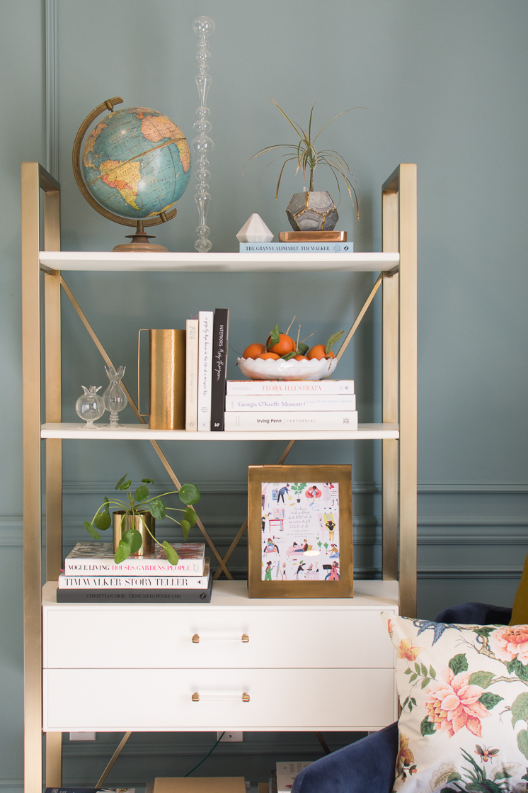
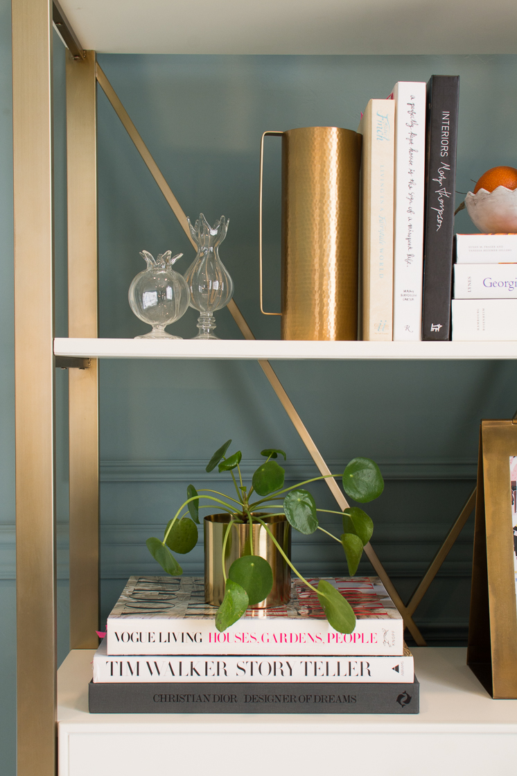
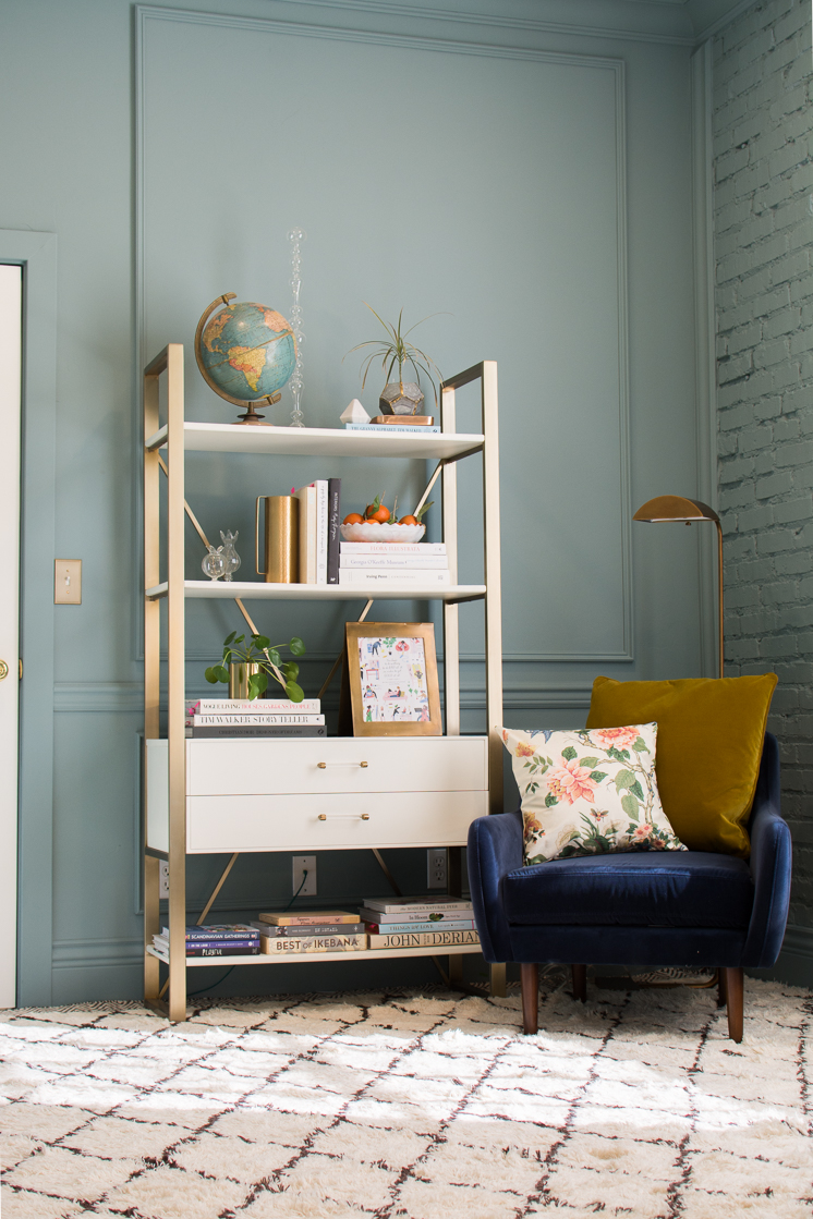
When it came to furniture, we wanted to stick primarily to white pieces with touches of gold for a polished and clean look. The Mine was a great resource for office furniture. We found this beautiful bookshelf with gold accents that also had drawers which were an added bonus! We also found the beautiful Monarch desk. It originally had chrome detailing, but we spray painted it gold to better coordinate with the bookshelf and other pieces. We’d choose gold over silver almost any day! You can never have too much storage, so we got this filing cabinet to hold all our odds and ends.
Hayneedle also proved to have a ton of furniture options. For an additional desk, we chose an L-shaped style that could be set up for a corner or rearranged for a longer option. The flexibility is great, especially for us as we’re often changing things up and moving things around. The desk also has tons of cubbies and storage options which will be perfect for supplies and in-process projects. The white and gold chairs are the ideal desk chair in our opinion. Style and great functionality in one!
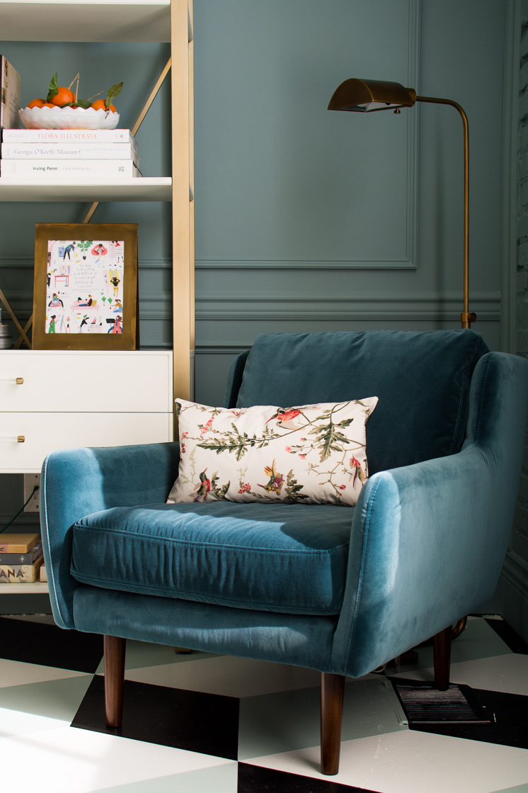
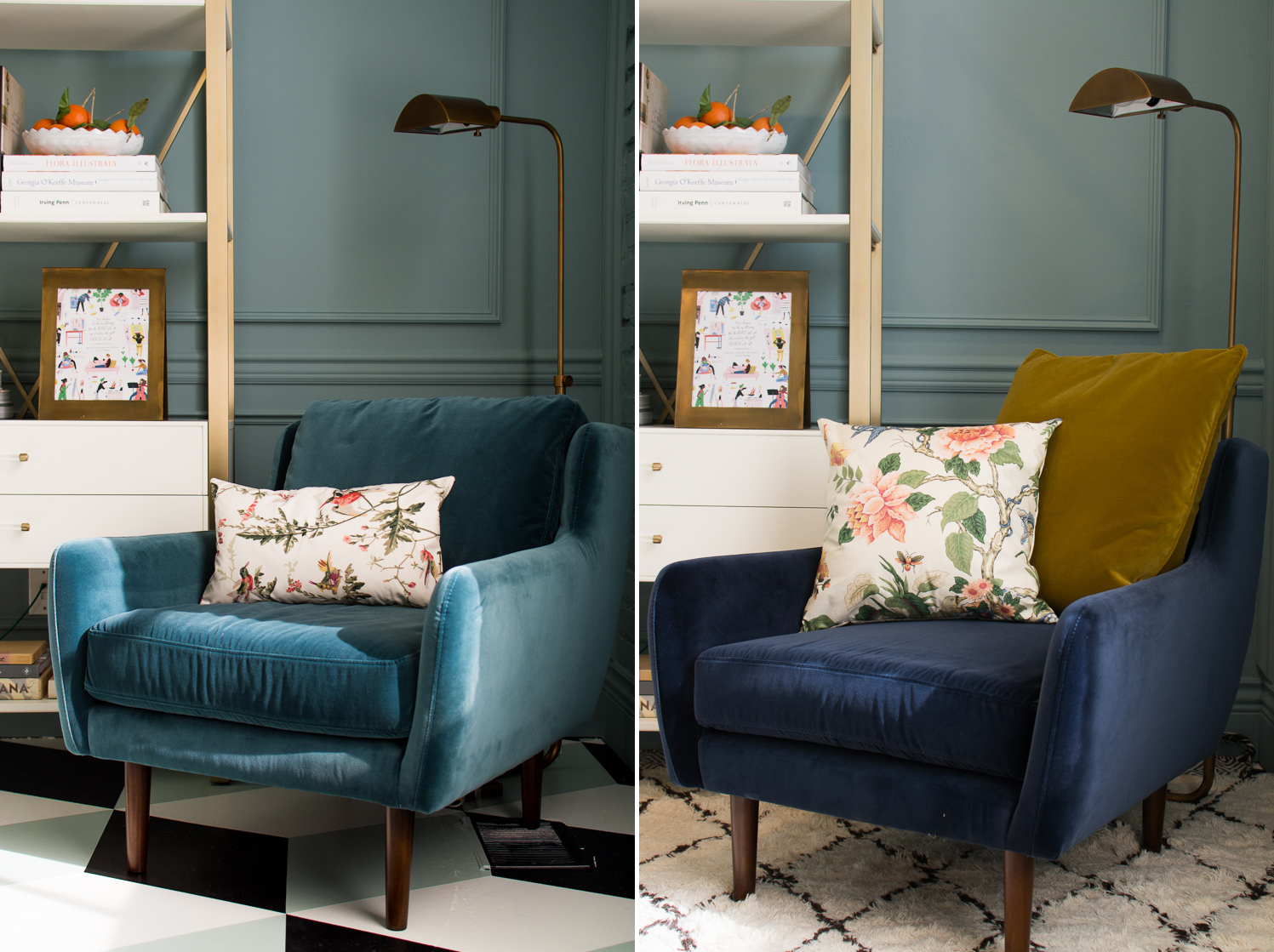
Velvet is such a luxurious fabric that I couldn’t pass up having in the office! We found the most beautiful velvet chairs from Article that added the perfect addition of texture to the room. If softened everything up and it is one of the comfiest chairs I’ve ever sat in! The chair comes in a myriad of beautiful colors, but we chose Pacific Blue. Complete with a velvet pillow, this chair is a dream and just where I want to be sitting for a meeting.
Prior to seeing them in person, we chose out a blue and the blue green and found that the blue green worked much better in the space. Take a look. I know I styled it a bit weird with the yellow pillow so it’s looking super odd, but I think you can still get a chance to see how the blue green is a better choice. What do you think?
Accessories
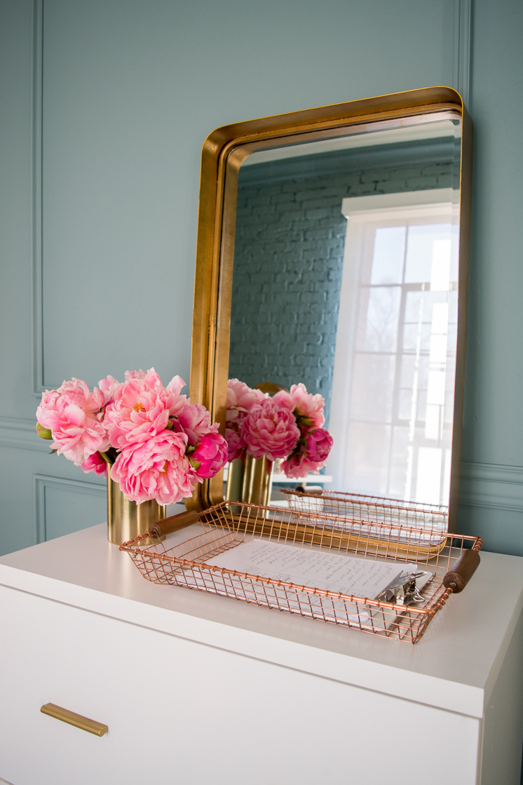
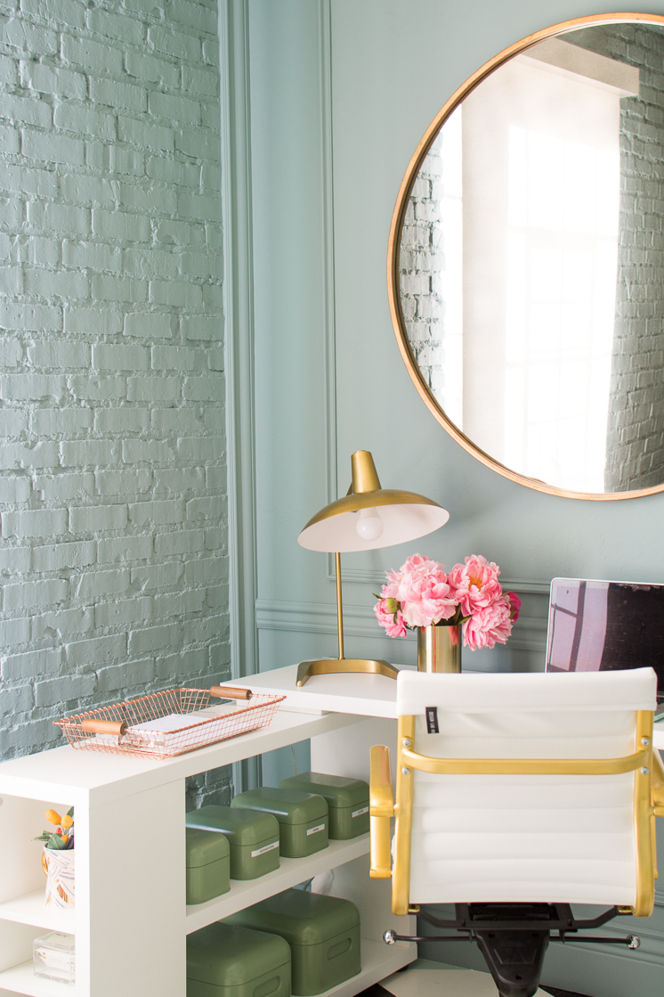
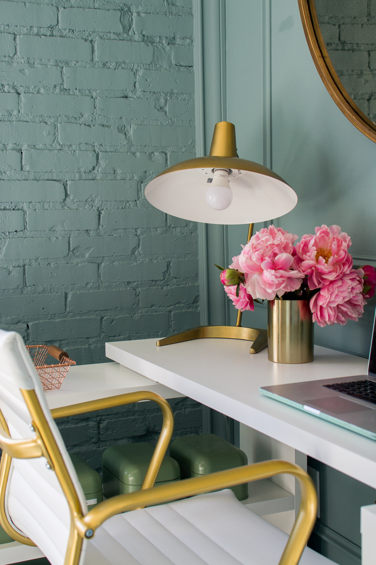
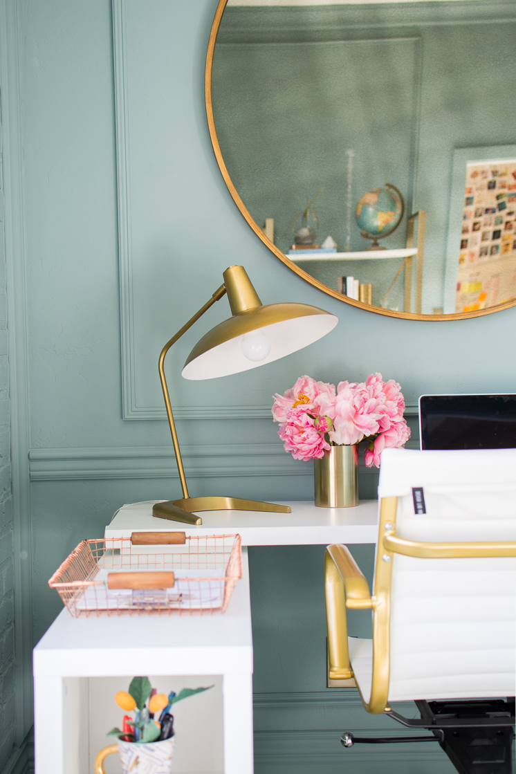
You can’t miss the mirror when you walk into this room! It’s such a great statement piece. I love how much larger the mirror makes the space seem. The mirror is from Bellacor, as is the other rectangular mirror. We also found all our lovely brass lamps from Bellecor. Lamps have the ability to warm up a room and we like how they tie all the other gold accents together. We chose these three lamps to brighten up the space.
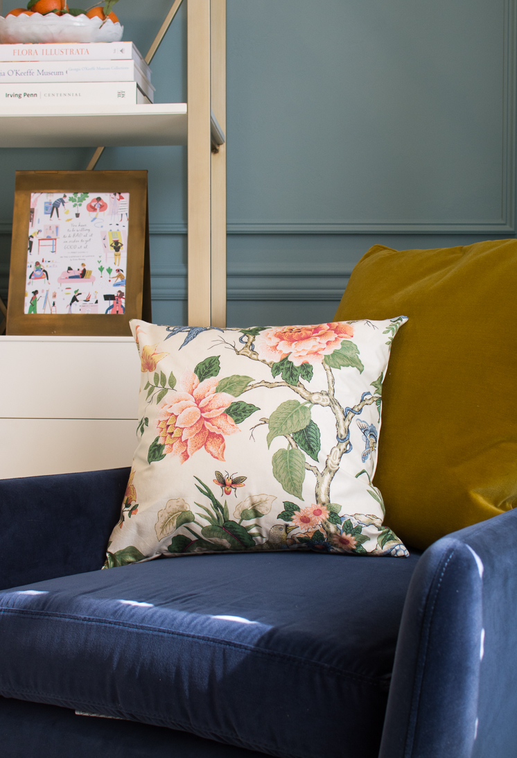
To add some more pattern, this lovely floral pillow from Arianna Belle was just the right dose of softness and color cohesion. I couldn’t design a room without some sort of flower pattern if only just a bit! We love the elegant but playful feel it brings to the room. We a couple of options for pillow and chair colors and we played around with the options before settling upon the greener chair in the office versus the blue and the hummingbird pattern lumbar pillow verses the square floral, as seen here:
It’s so pretty, but the blue just wasn’t working out in the space, and we realized we needed a pillow with slightly less impact.
A Few Extras!
Now, let me remind you, this process was not all smooth sailing! There were a lot of ideas and things we wanted to make work but in the end, just didn’t. We fell in love with this Dash and Albert Kenzie Wool Woven Rug from Annie Selke the minute we saw it. I know it’s a popular and rather safe choice, but we wanted to keep the floor somewhat neutral without being a solid and this Moroccan diamond pattern is such a great choice. However, once we decided on our tumbling block painted floor, we just couldn’t make the rug work. Don’t worry though, we’ve got big plans for it in another office! Here’s how we tried to make it work:
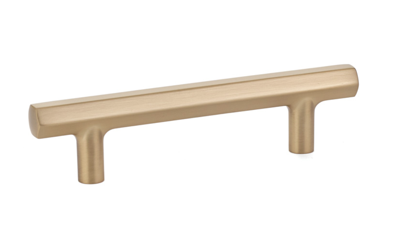
Additionally, we knew we wanted to use all gold hardware to coordinate with the theme of the office. Most of our furniture was outfitted with silver or chrome hardware, and that just wasn’t our cup of tea. We ordered some great drawer pulls from Emtek to work with our desks and cabinets, but unfortunately, they weren’t the right sizes. There’s always a bump in the road, right? We love the gold finish of them though and would highly recommend their products!
Lastly, though I’m not a lover of ceiling fans, because of the hot Utah summers and our not-so-reliable AC, we were desperate for a fan option. These fans saved the day! They are clean enough to be unobtrusive and shapely enough to be cool (pun totally intended). These are also from Bellacor, where we got the gorgeous fans. This one is by Minka Aire Java Flat White 54″.
ALSO! We were soooooo thrilled to FINALLY replace our fluorescent lighting with a different option. Recessed was our choice for even lighting and once again, Bellacor saved the door. The lights are Lithonia Lighting 13 Ultra Thin Recessed Ceiling Light and we put 4 into the space. What a world of difference it has made in our mood and well being too. There’s nothing better than replacing harsh, hideous lighting as fluorescent boxes.
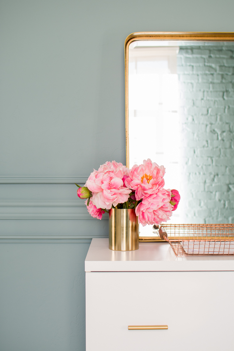
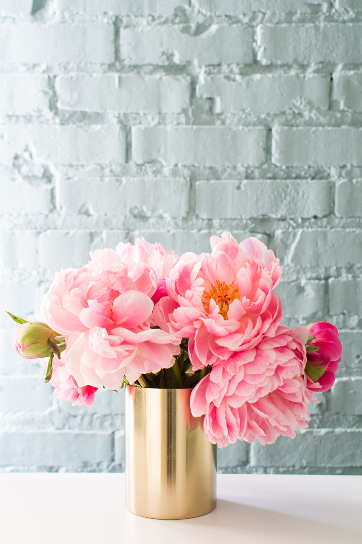
Lastly, I just have to give a shout out to these peonies that are fresh and beautiful and exist in November. That’s all.
Thank you so much for joining us on this ride. I’ve given a ton of sneak peeks over on Instastories and it’s been so fun to hear your reactions as we’ve been doing it live. Thanks for your feedback and input. Now, go and check out the other participants. I can’t wait to see the magic they’ve created. This is the best week by far, huh?!
Sources: New Traditional Design Option moldings from Metrie | True Craft Door- Solid and painted white with Farrow and Ball’s Wimbourne White | Oval Room Blue for the walls and Wimborne White, Pitch Black, and Teresa’s Green for the floor | White and gold bookshelf | Monarch desk | filing cabinet | L-shaped style desk | white and gold chairs | velvet chairs from Article | velvet pillows from Article | round mirror | rectangular mirror | desk lamp | desk lamp 2 | floor lamp | lumbar throw pillow | square floral pillow | Moroccan rug | Emtek handles | ceiling fan | recessed lighting
You can check out our previous weeks here: WEEK 1 | WEEK 2 | WEEK 3 | WEEK 4 | WEEK 5 | WEEK 6
Boxwood Avenue | Coco & Jack | Design Manifest | IBB for DWD | The House That Lars Built | Little Green Notebook | The Makerista | Making it Lovely | Old Brand New | Old Home Love | The Painted House | Megan Pflug Designs | Pink Pagoda | Erica Reitman | Sacramento Street | Simply Grove | Jill Sorensen | Sugar & Cloth | Vintage Rug Shop | Waiting on Martha *
Media Partner House Beautiful | TM by ORC
Media Partner House Beautiful | TM by ORC


