Close
why I only wear dresses
and where I buy them
Explore over 5000 posts
Lately on Lars
Holiday
New Year’s
Valentine’s day
St. Patrick’s Day
Easter
Cinco de Mayo
Mother’s Day
Father’s Day
Juneteenth
Fourth of July
Midsummer
Halloween
Thanksgiving
Hanukkah
Christmas
Royal Wedding
DIY & Crafts
Arrangements
Backdrops
Balloon
Bouquets
Cake Toppers
Cardboard
Centerpieces
Coloring Pages
Craft the Rainbow
Cricut
Crowns
Dinnerware
Garlands
Gift Toppers
gift wrapping
Home decor
Illustration
Kids Crafts
Paper
Paper Flowers
Pinatas
Real Florals
Sewing
Tablescapes
workshops
Wreaths
Decor & Interiors
Architecture
Bathroom
Bedroom
Before and After Makeover
Chandeliers and Fixtures
Exteriors
Fabric
Flooring
Furniture
Garden
Home
In With The Old
Kitchen
Laundry Room
Living Room
Tabletop
Wallpaper
Style
Accessories
Casetify
Dress the Rainbow
Fashion
hair and beauty
Shoes
Shop the rainbow
Food & Entertaining
Cake
Food Crafts
Recipes
Lifestyle
Advice
Artist Feature
Artist Interview
Becoming Interviews
Book Club
Collaborations
Entrepreneurship
Events
gift guides
Motherhood
My Life In Color
travel
Things We Love
About
Partnerships
Press
Contact
Our Shop
Books
Courses
FAQ
Dresses with Printfresh out now!
About
Partnerships
Press
Subscribe
Books
Courses
Our Shop
The House That Lars Built
an artful life
Search
Close
holiday
DIY & Crafts
Decor & Interiors
Style
Food & Entertaining
Lifestyle
Things We Love
All Posts
/
Decor & Interiors
/
Furniture
Furniture
35 Posts
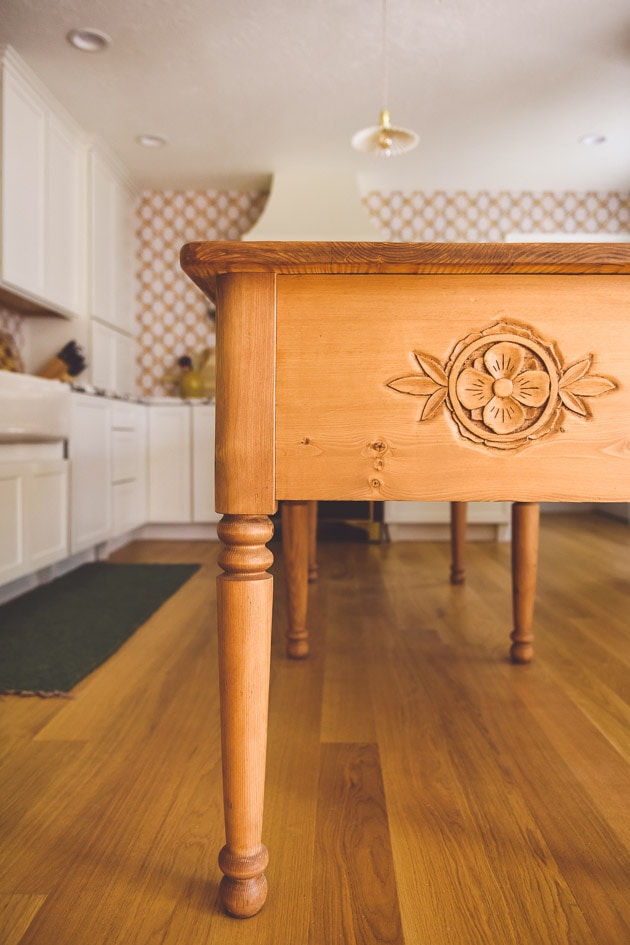
5 ways to bring your family history into your home
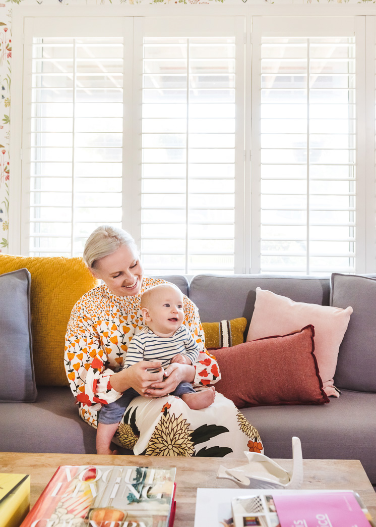
Becoming Danika Herrick
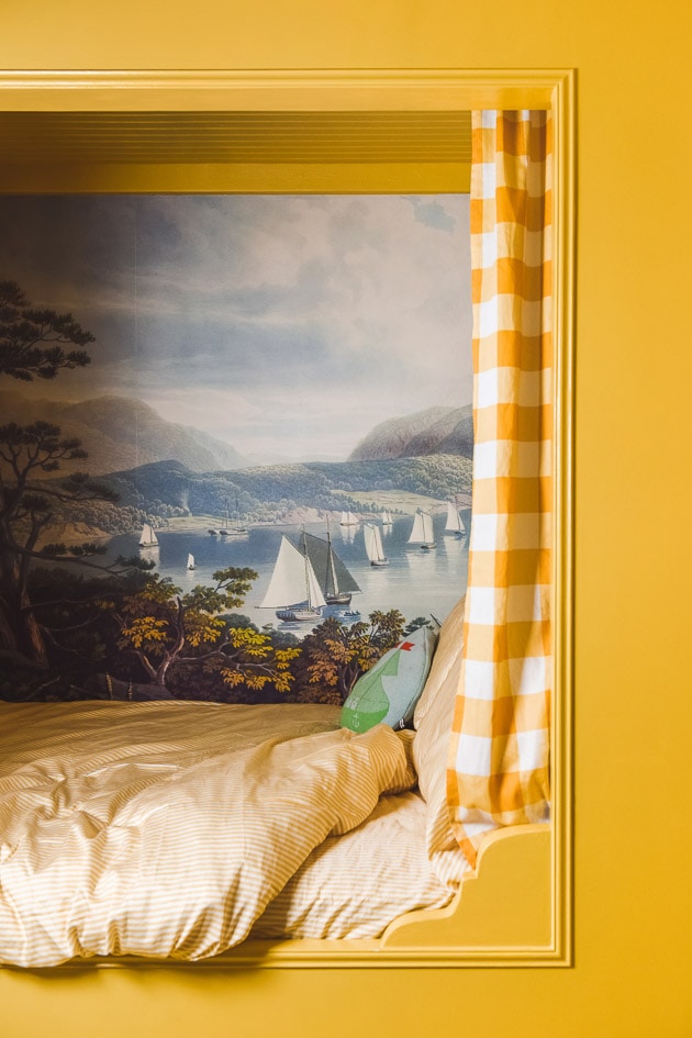
How to make an alcove bed
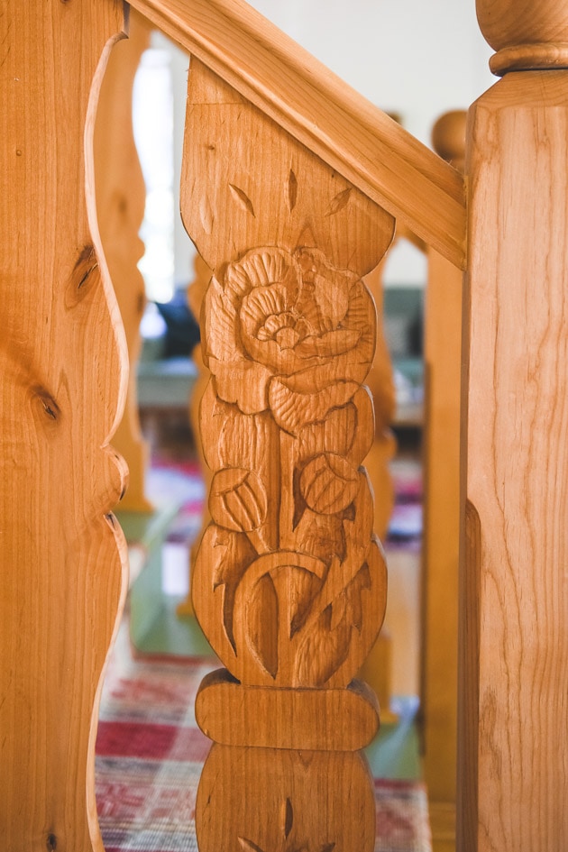
Carved flower balusters
Becoming: Jana and Tanner Roach of Beck and Cap
A Lars Girl’s Back to School Guide
Studio Tour of The House that Lars Built
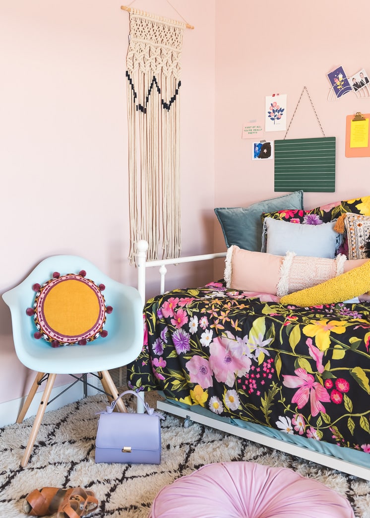
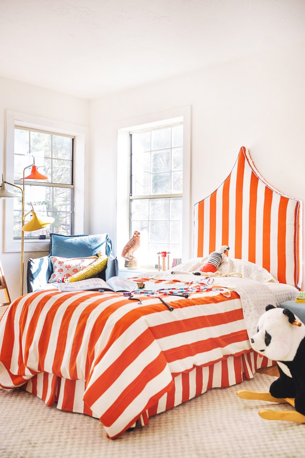
DIY headboard
My Bathroom Remodel Reveal
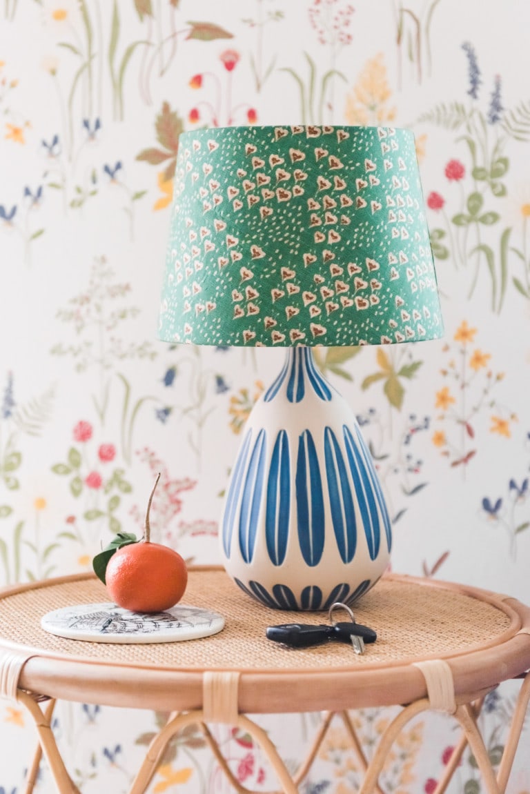
3 DIY lampshades made with unexpected recycled materials
7 Rental-Friendly Interior Design Hacks
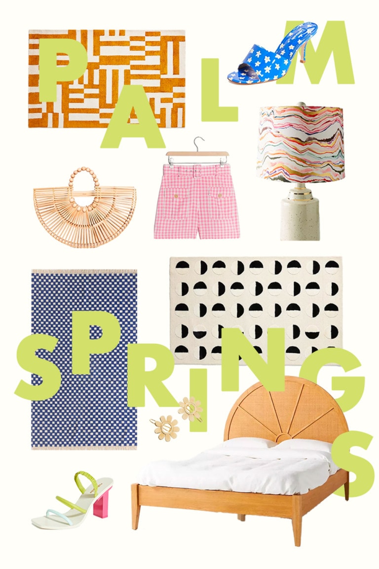
Palm Springs Style You Can’t Miss
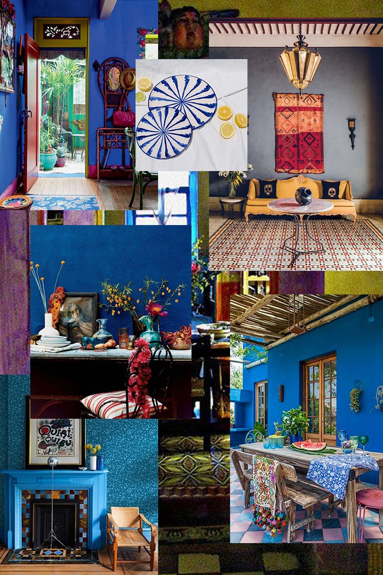
In The Mood For: Frida Kahlo Inspired Interior Design
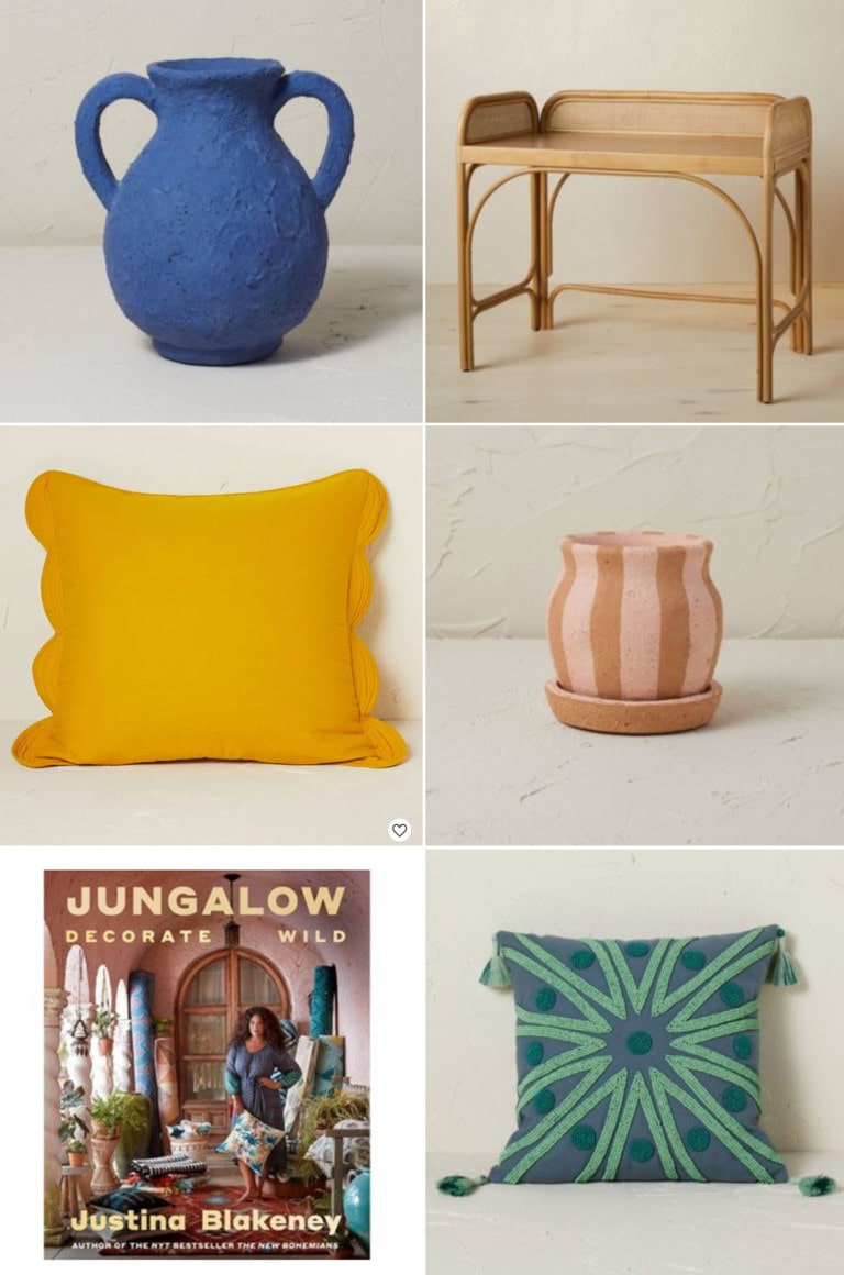
NEW! Jungalow for Opalhouse by Target
Felix’s New Nursery
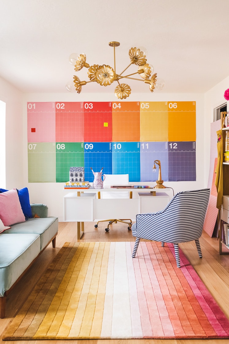
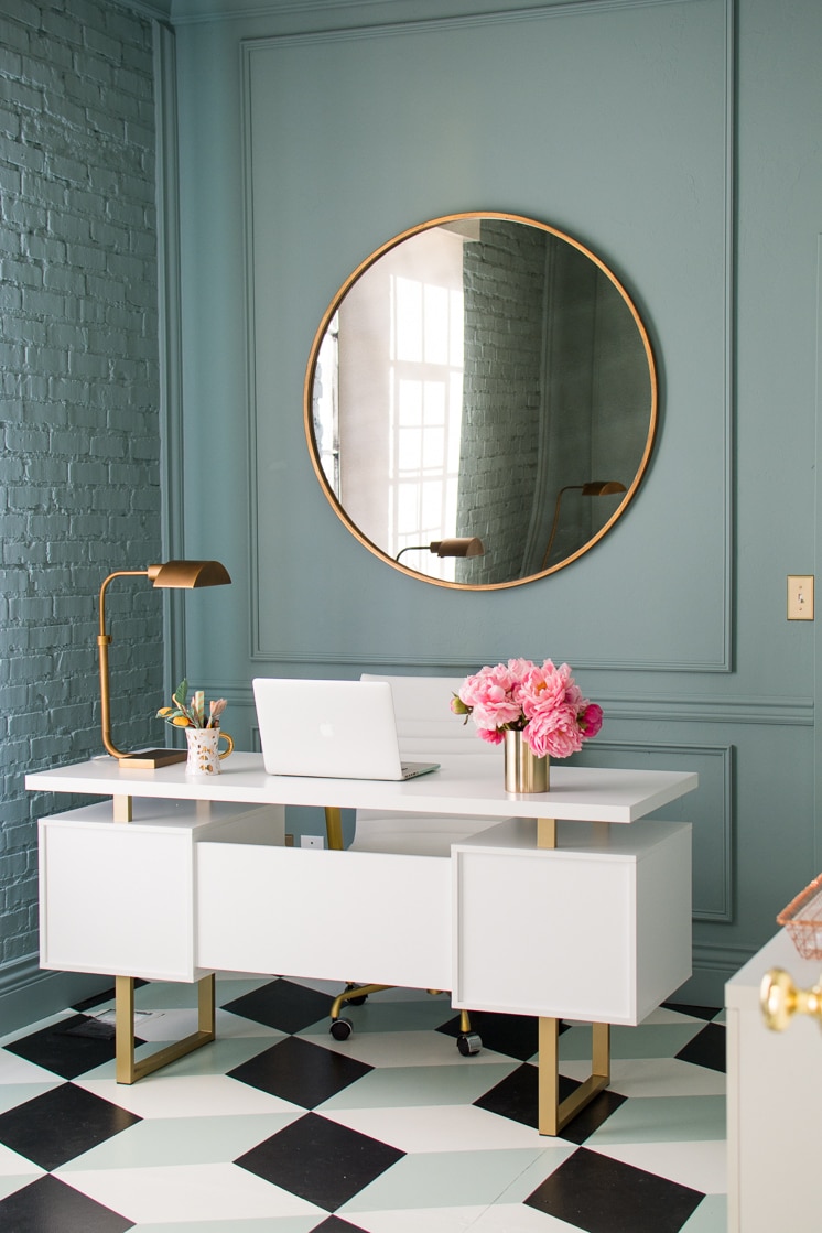
Meet Brittany’s new rainbow office
We’re moving!
In the Mood For: Andy Warhol Inspired Home Decor
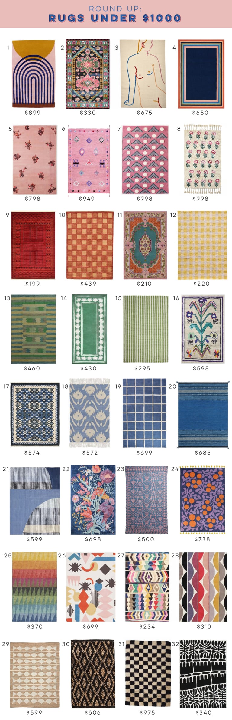
Best Affordable Rugs Under $1000
How to make your own colorful glamping experience
5 reasons mirrors are essential in decor
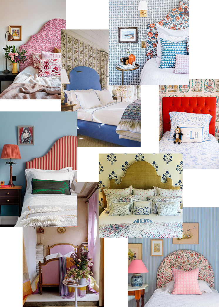
Trend alert! 65 upholstered headboards that make a statement
Scallop Wave DIY Pinboard
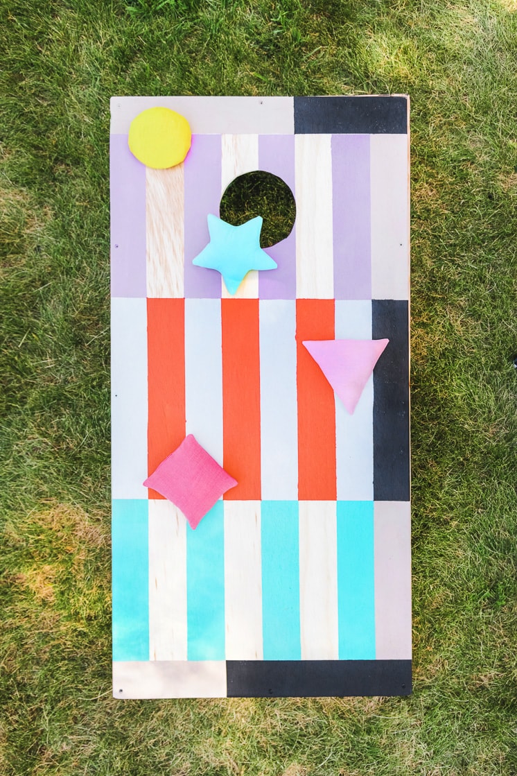
DIY colorful cornhole and bean bag set
1
2
Next Page »
Subscribe
to our newsletter
First Name
(Required)
Email Address
(Required)
Δ