Gah! We’ve been keeping a secret for over a year now–-we filmed a TV show and it’s out NOW! The show is called In With the Old on Magnolia Network and you can see it on Season 3 on Discovery+ or HBO Max. I’m thrilled to share the details with you in the coming weeks starting with this post. This will include all the rooms we worked on along with the before and afters of our home renovation. Consider this the Big Mama post with more in-depth posts to come.
There’s so much to say about the experience of doing a TV show not to mention the experiencing of renovating and the natural conflicts of each. I’ll get to all of that eventually, BUT, we are going to start with the specific rooms we worked on and some basic info about each one along with all the before and afters of our home renovation.
Like I mentioned, I’ll be addressing each room in greater depth in subsequent posts along with our experience of working on the show. I’ll also get into more detail about some of the themes we talk about on the show. If you have anything you’d like me to address, please let me know! I’m doing a Q and A on Instagram tomorrow so if you have specific questions, find me there!
Specs:
- Built in 1992
- 4550 sq foot
- Federalist Revival home
- 8 bedrooms/5 bathrooms
- .25 acres (I think? Ha! Can’t remember)
Details:
- We moved in September of 2020
- We filmed from February 2022 – July 2022
Brittany and Paul’s Checklist:
- Exterior. Improve the exterior with a Scandinavian-inspired plaster-effect to cover the brick and new landscaping
- Kitchen. Take our phase 1 kitchen to the next level by honoring Paul’s Scandinavian background and my family history
- Bedroom. Make a cozy Scandinavian folk-inspired bedroom for Jasper, my 4 year old son
- Staircase. Add a nod to my family history and our Scandinavian roots with a new staircase
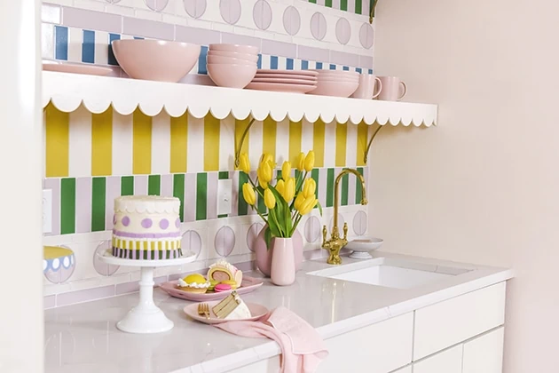
- Kitchenette. Create a whimsical kitchenette to our studio in the basement
- Front Yard. Create a drought tolerant cottage garden.
The exterior
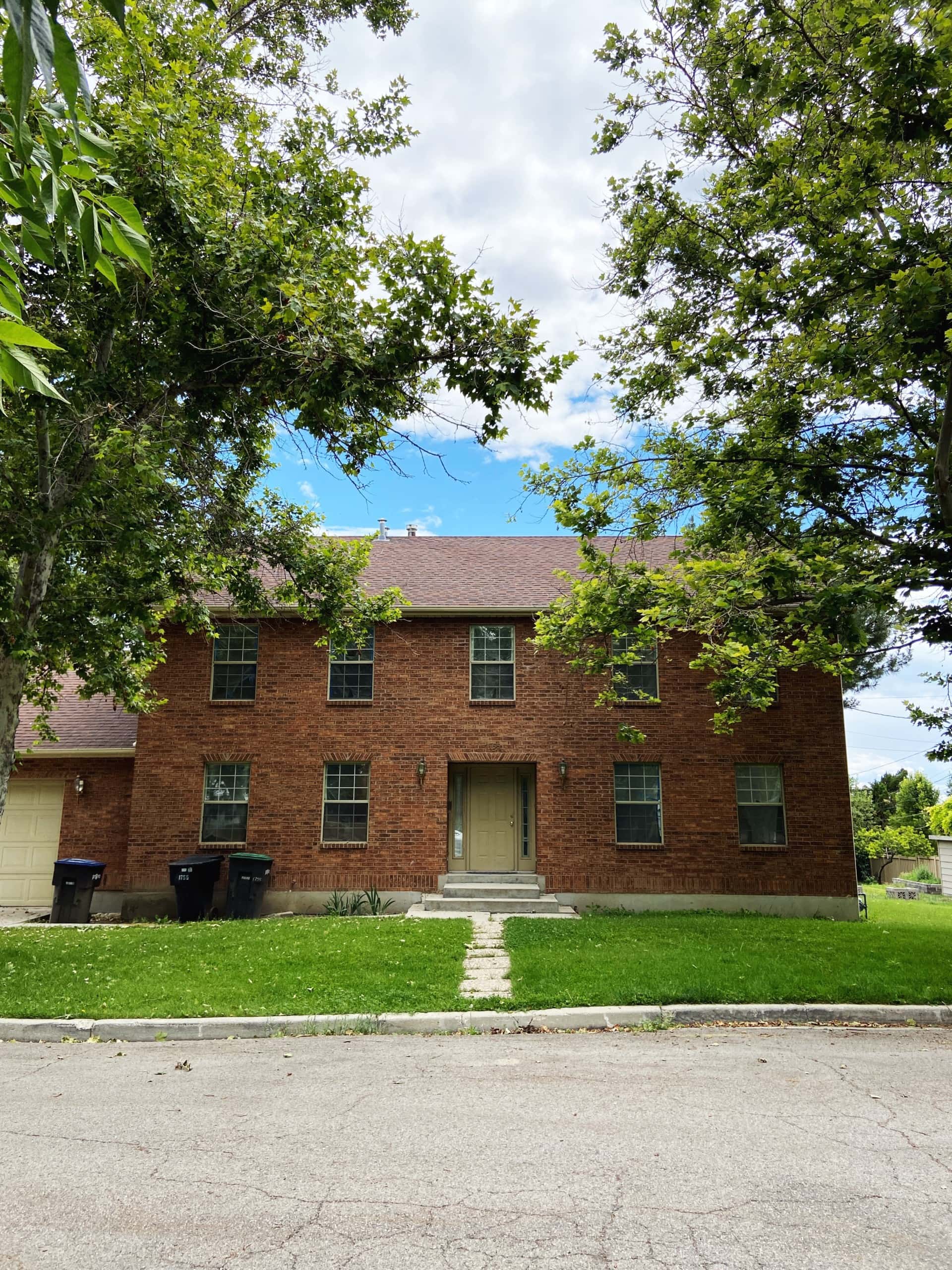
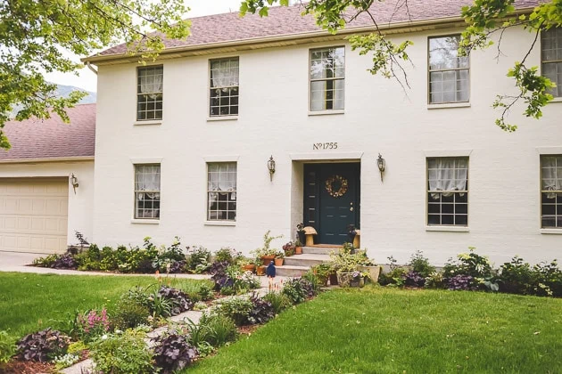
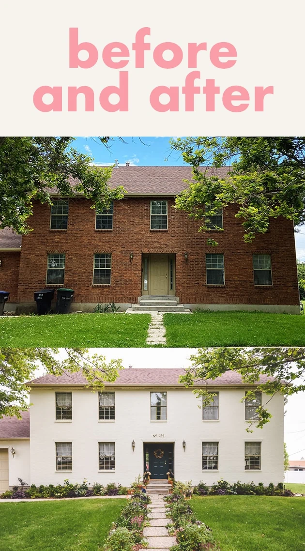
First up, the exterior. It was actually the last thing we worked on and possibly the most intensive, although that is very debatable depending on who you ask. To be honest, I wasn’t sure we were going to do anything at all to it because it was too much for my overwhelmed brain to handle with so many other big things going on (and that’s including running a business and two kids). Here’s what we started with:
Before and afters of the exterior renovation
Door makeover
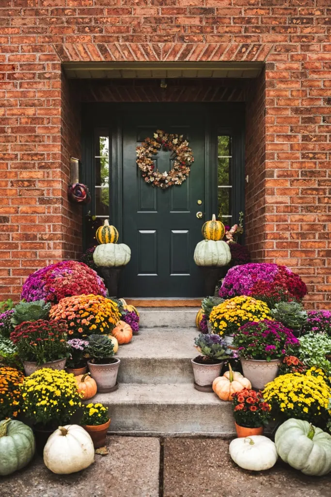
In the fall of 2021 we gave the front door a little makeover (you can see the full post here–it didn’t go according to plan ;/), which you can see here (still my favorite fall display to date!).
The exterior plan
The house is stately but plain and I’d like it to be more true to the historical style of a Federalist Revival home although we are still considering taking it in a more Danish or English direction–still haven’t decided. In my dream world and budget, I would be doing SO much more to the exterior including raising the pitch of the roof along with a new roof, adding dormer windows, replacing the windows, adding in a portico, new lighting, a new garage door, a beautiful garden, but we had to go with what we had time and budget for, which was the following:
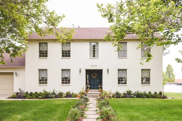
- Paint the facade
- Switch out the address numbers
- Add in some more landscaping to the front and walkway
- Expand the width of the walkway
- New mailbox
After photos of the exterior of our house
Ta da! Of course, these photos represent so much more than a simple ta-da, but a ta-da will have to do for now until I go into more detail about it. You can read more about the transformation from brick to white here.
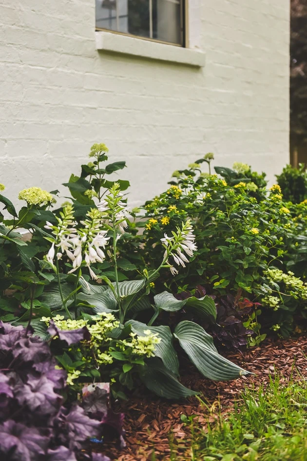
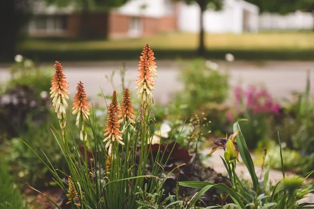
Landscaping for our drought conditions
Utah is a desert climate and we’re in a huge drought so I chose a landscaping plan that was more drought tolerant than what we currently have. The house had existing grass and the existing sycamore trees and some fir and apple trees in the back. While we’d eventually like to move away from grass because it requires so much water (SO MUCH WATER!!!), we had to work with it for now until we can do more with it at some point. We worked with Monrovia on the new plan and they were wonderful! I’ll get to what we did and how we came up with our plan in a follow-up post about our garden (you can read this post for now!) UPDATED: You can read more about our drought tolerant cottage garden here.
Painting our red brick white
I’m going to guess that painting our brick house might be controversial choice. As you might see in your own city, it is super trendy right now to go white because of the Farmhouse trend though it is not why we chose it. I certainly think there can be beauty in red brick, but our red/yellow brick was 90s, not historic, and had funny “worms” in them as –a funny added texture probably made with nails or something. The colors weren’t great (but maybe they photograph ok?). We really wanted to take it in a more old Danish or even old English direction.
We found this great German company that has a US presence called Keim. They make mineral silicate paint that is meant for masonry. We also used their amazing primer that has a rough texture to it that gives a very authentic European feel. I’m in LOVE with it. You can read about the full process here.
The Kitchen
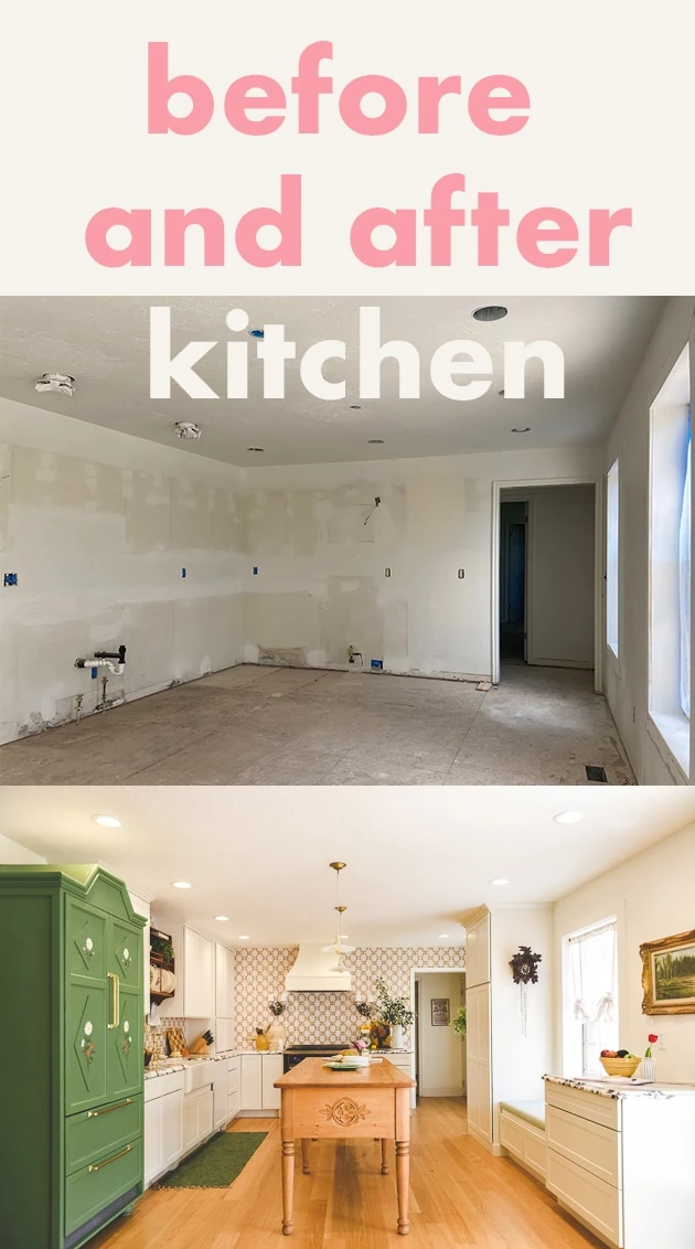
Ok! Onto the kitchen, which you can read about it more detail here. I had already begun a direction on the kitchen before we agreed to do the show so I decided to keep on going with it even though I knew there could be problems with the supply chain (spoiler: there was!).
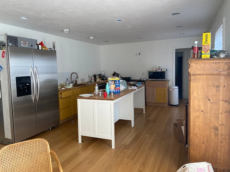
Here’s what the kitchen was like when we first moved into the house. The kitchen is everything past the doors on the left and right side.
Before photos of the kitchen
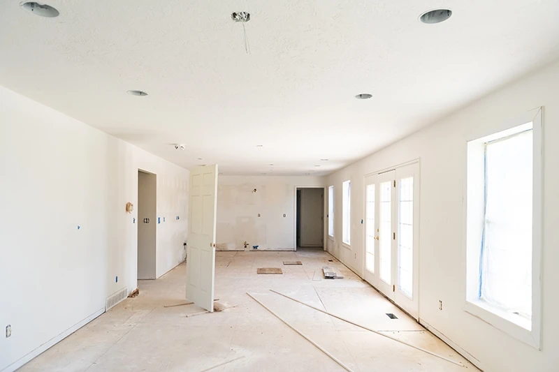
If it wasn’t obvious: there was no kitchen. FUN!!!!!! (sarcasm).
Phase 1 kitchen
We put in a VERY basic kitchen when we moved in so we could take our time on the design afterwards. The previous owners had left a refrigerator and oven range in the garage so we had our basic needs met there. We put in unfinished wood lower cabinets from Home Depot and two Ikea islands together and voila! Ha! You can read more about this phase 1 kitchen here. I didn’t ever bother finishing it up because I was hoping to get to Phase 2 pretty quickly.
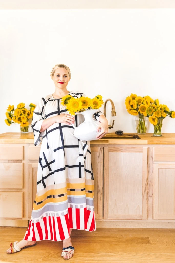
At one point we painted the cabinets to add a little bit more interest.
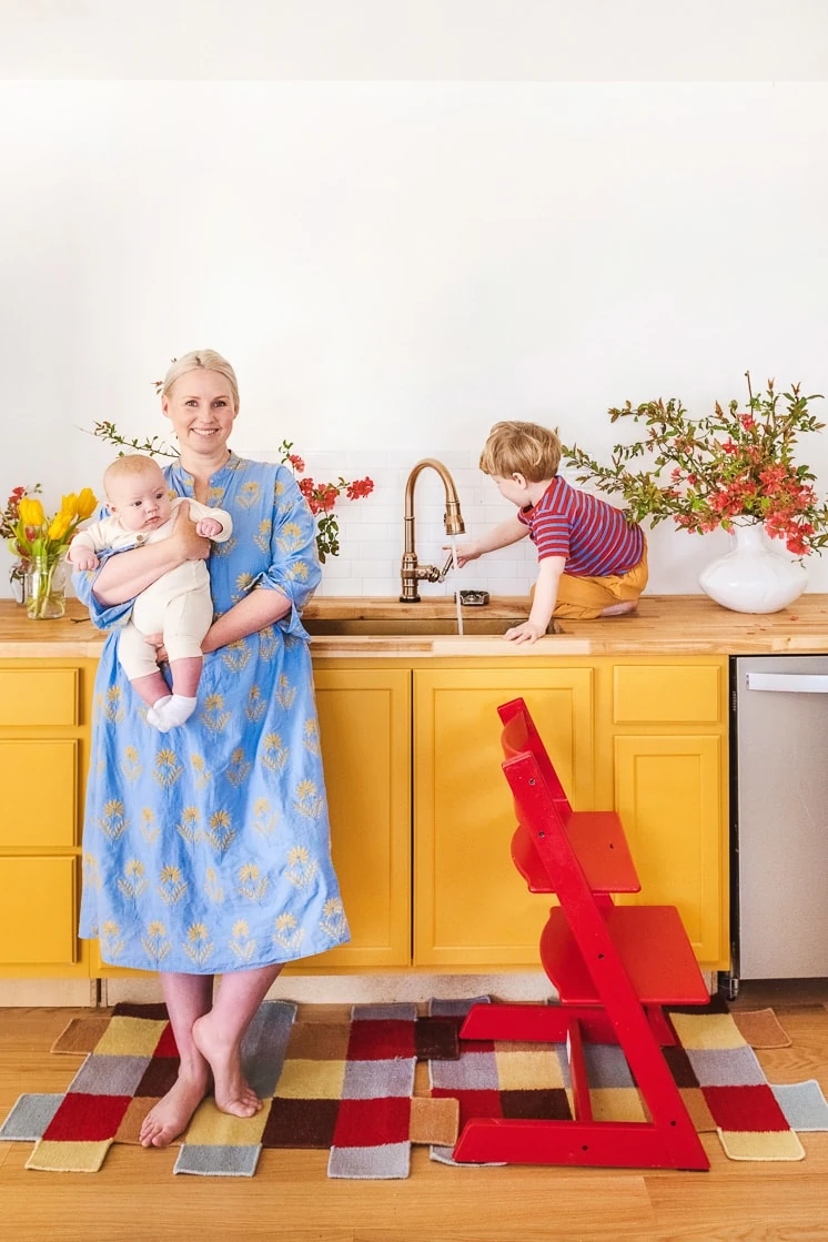
But as you can see, we didn’t even finish!
The Kitchen Plan
I wanted our kitchen to have an old world quality to it–like it was original to an old European kitchen, but also have color and a nod to our Scandinavian heritage. Here’s what we set out to do to achieve that:
- Replace the cabinets
- New appliances
- New lighting
- More storage
- Make it a gathering place
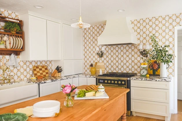
After photos of our Kitchen
We worked with Cliq Studios on the cabinets. I wanted it to feel like a it was working kitchen in a stately manor so we planned on utilizing the whole room by placing cabinets on each wall. We took advantage of the window wall by placing a floor to ceiling pantry, a bench, and some desk top drawers. I love how it feels like it uses the full space completely while also maintaining sufficient room for passing into the next rooms, which are the laundry and pantry and access to the garage.
With another budget and time, I would want to switch the whole kitchen layout around by placing the sink by the window, but I wasn’t ready to spend the additional money so we worked with the existing layout.
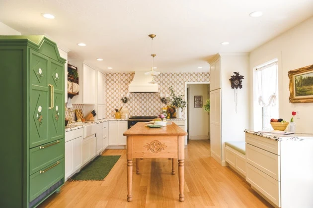
Custom work table by Beck and Cap
Do you see that amazing work table/kitchen island? Oh, it’s a beauty! We worked with Janna and Tanner of Beck and Cap on it and it’s unbelievable. It’s completely custom and they are a dream to work with. They even surprised us with that wood carving on the end as a nod to our Scandinavian heritage! You can read a full interview about them here.
Bringing in antique items
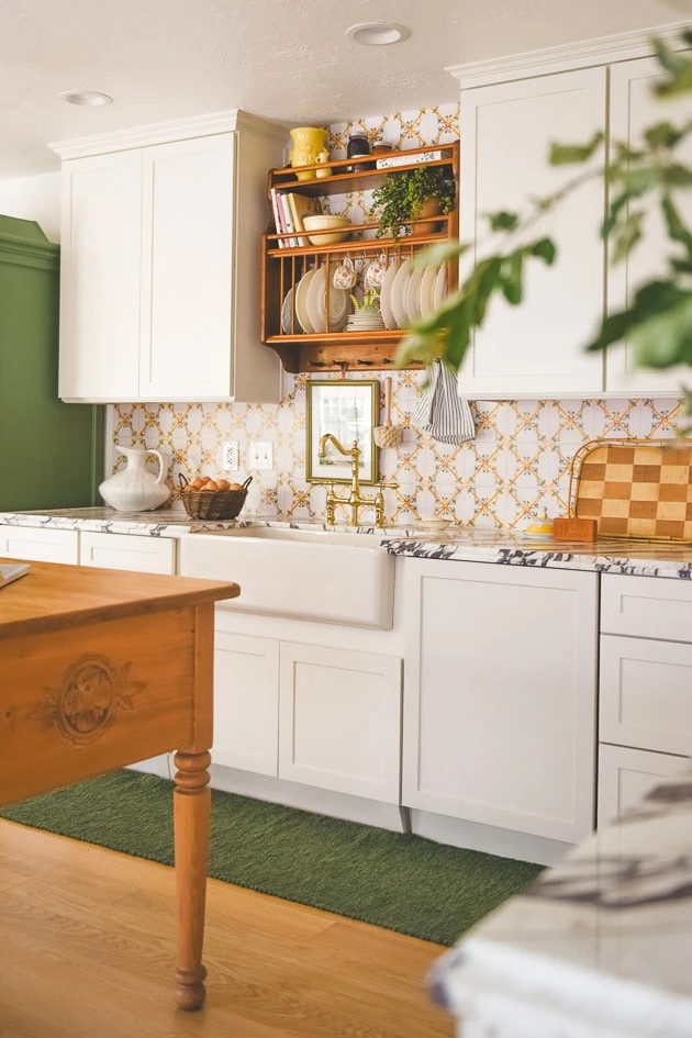
My friend, Meta Coleman is an amazing interior designer and friend (you can read more about her here and here). I consulted with her on our kitchen and she found some old pieces for us to use in our kitchen like this plate rack, which I think ties in that Old World quality we were going for.
We worked with Signature Hardware on the beautiful polished brass faucet, clay farmhouse sink, and hardware and I love them all! I wrote a whole blog post about it here.
We also worked with Forte on a panel-ready dishwasher. I thought the price point is great for panel-ready and it works great!
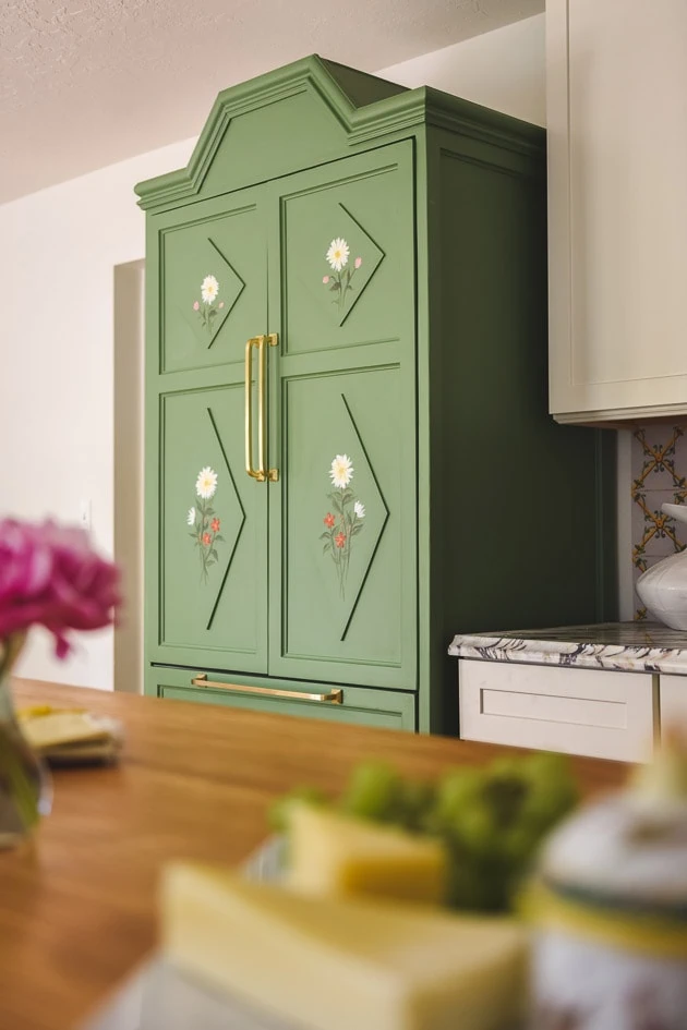
Kitchen refrigerator to look like an old cabinet
Meta also gave me the idea to transform a panel-ready fridge into an old Scandinavian wedding cabinet. And you’ll never guess who built it…OUR NANNY! Pat becomes Handy Nanny on the show and saves the day multiple times. She built this by herself–she’s incredible. I had to do a whole interview on her because she is out of this world fantastic. And you can read more about the fridge here.
Wood kitchen hood
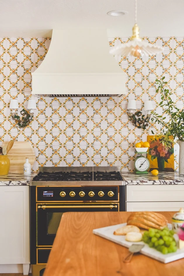
I was looking for a ready made hood and I found a great company that ONLY does hoods called Hoodsly. They just happened to have the perfect size hood for our space in stock, which was so so helpful. I love the sloped shape and how it tones down the wallpaper. I think we might be doing a glow-up to it soon so stay tuned!
Kitchen tile/wallpaper
The kitchen wallpaper/tile situation was a major situation. It went through various plans, but ultimately I had to go with something that I could get done in the short amount of time that we had. I originally wanted a custom tile, but that turned into a lot of money AND time and plus the sample came back not as expected.
I ended up finding an antique tile I loved from Portugal. Jane took a picture of it and Garet turned it into a wallpaper on Spoonflower. It’s got a sheen on it which makes it easy to clean up as a backsplash. I wrote more about the process here.
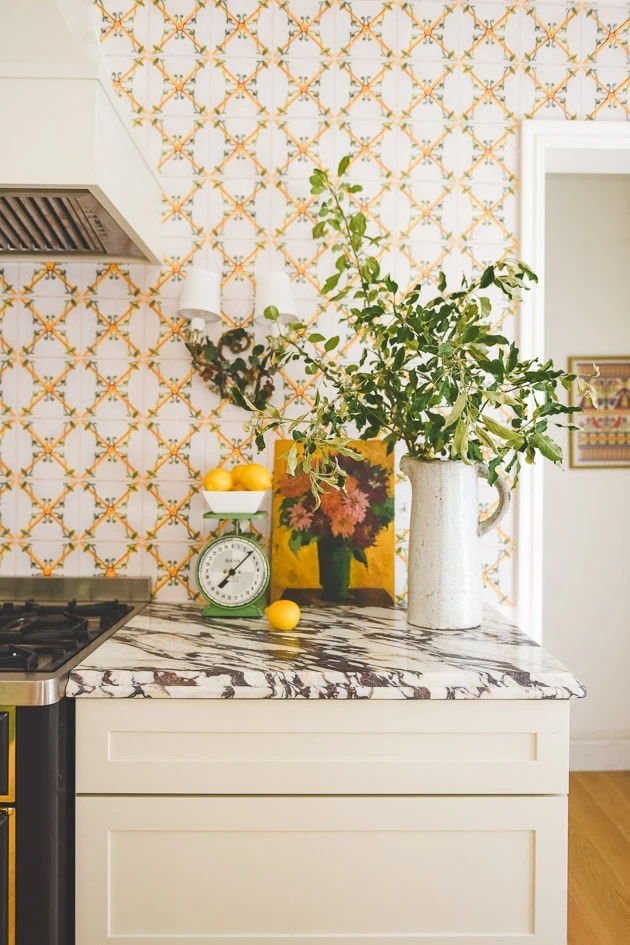
Marble Countertops
However, before the tile/wallpaper was settled on, I had already chosen the veiny marble countertops. I don’t like the way the two work together, but there was no time to change either of them so here they are with plans for a different blacksplash.
Vintage lighting
Meta is a big proponent of vintage lighting for its uniqueness and patina. She directed us to these beautiful French opaline fixtures, which are dainty and gorgeous. I got mine from here, but you have to check back to see what she has in stock.
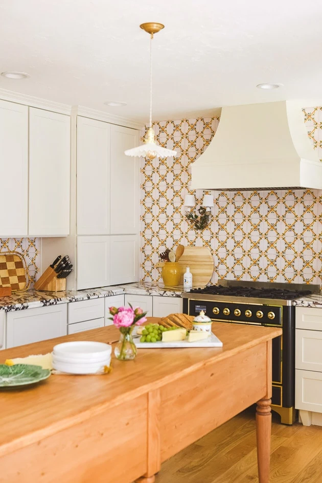
Antique Looking Kitchen Appliances
We had a great 48″ oven range before our renovation, but I knew we didn’t need something so big and commercial. Instead, I wanted something that would feel and look antique. We worked with Ilve on a duel oven range. The Graphite Matte was in stock so that’s the one we went with in order to make sure we got it in time. But even though we did it out of necessity, I still would have chosen it (a la Claude Monet’s oven range!). It’s a beauty with all those brass details and we love how it works. I wrote a review about the Ilve stove here.
Notes:
You will probably notice some things ostensibly missing like hardware on the cabinets and that’s because I’m planning on changing a few things and I didn’t want to drill holes into the cabinets before I knew what handles I was going to use. More soon!
In another budget and time, I would want to switch the whole kitchen around completely by placing the sink by the window, but I wasn’t ready to spend that so we worked with the existing layout.
If you want to read more about the kitchen, you can read about it here.
I LOVE how it turned out but I did have a few regrets and some changes, which I plan on making. You can read about those here.
Jasper’s Bedroom
Moving onto Jasper’s bedroom. It’s so funny because as I type I’m remembering all the drama for each room and it’s giving me a bit of PTSD…Thankfully now I only remember the end results!
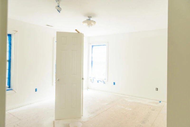
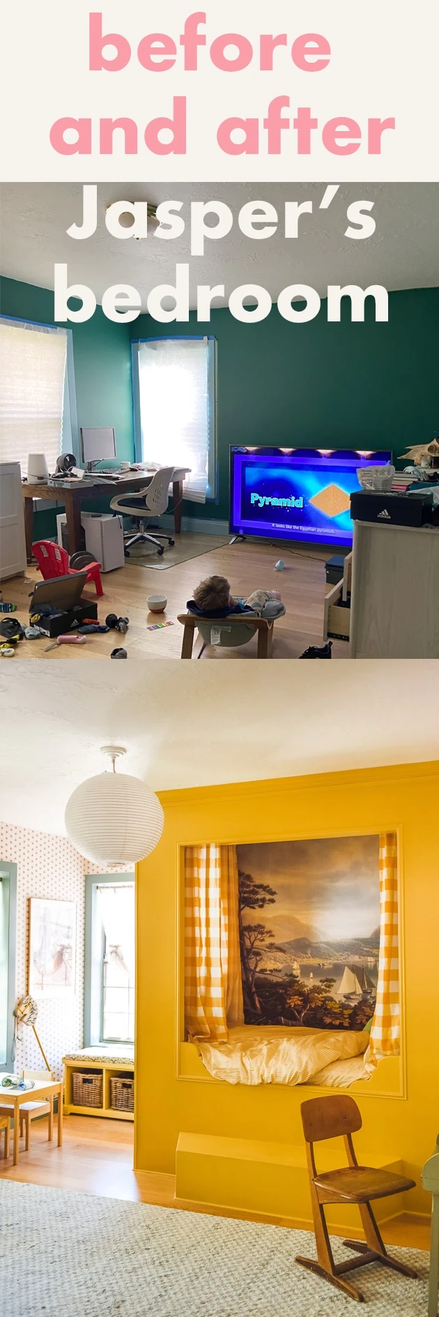
This is what Jasper’s room looked like when we moved in. Much like the rest of the rooms, right? Nothing in it!
Before photos of Jasper’s Bedroom
A game of Musical Chairs
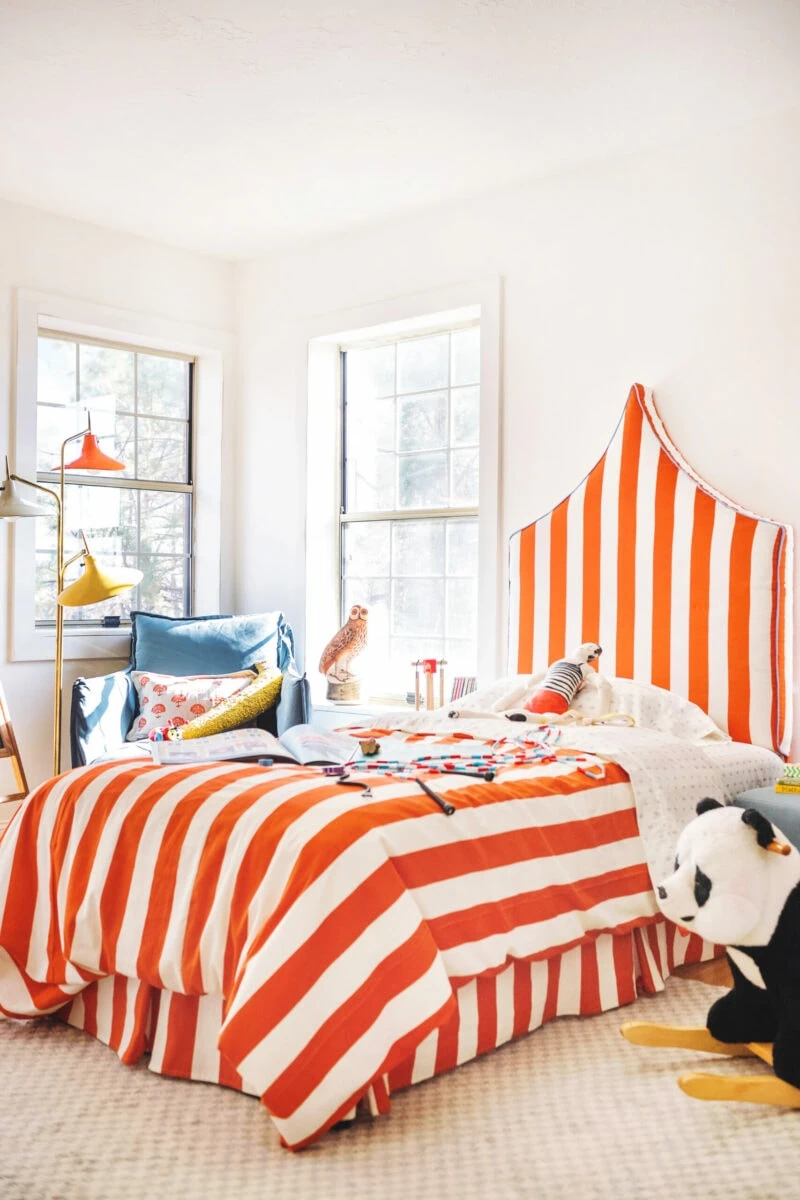
The secret is that Jasper’s room was actually in the room next door but because of where the closet door was situated, the bed we had in mind wouldn’t fit so we had to switch rooms with Paul’s office. A few months prior, we had made him this DIY upholstered circus-inspired bed, which I still love, but you can see it was completely white.
Paul’s office on the other hand, had already acted as Felix’s nursery so it was painted green. This is the room that we were moving Jasper’s bedroom into.
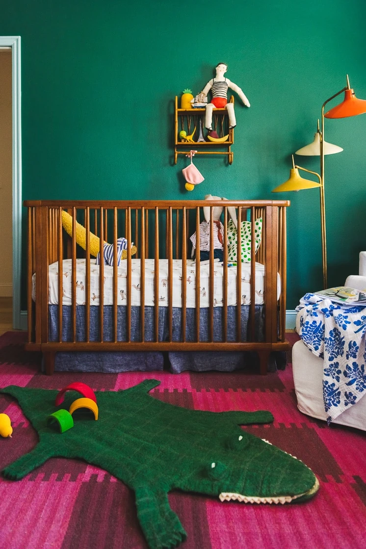
Jasper’s bedroom plan
- Switch Paul’s office and Jasper’s bedroom
- Build a built-in Scandinavian-inspired bed
- Wallpaper the room and paint
- Replace lighting
After photos of Jasper’s Bedroom
Honestly, this is my favorite room in the house right now. I nap in it 100% of the time when I can and will continue to do so. It’s THE coziest place in the whole world. We may start renting it out ;).
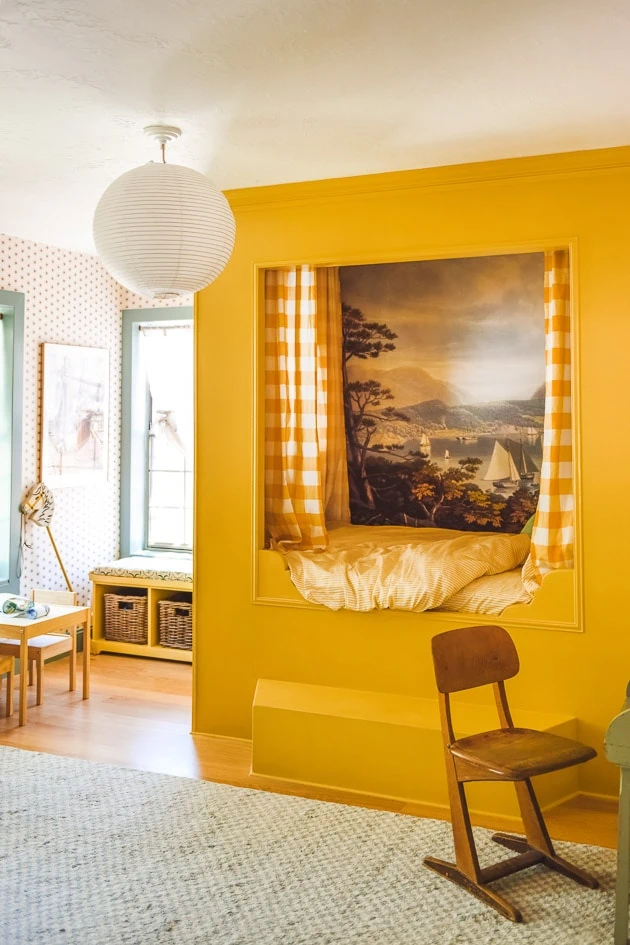
Wanna hear another secret? Handy Nanny Pat strikes again on the bed! Now, mind you, I was actively seeking people out to make these custom projects for me, but there was a labor shortage in construction (not sure if there still is because I have taken a LONG break from all home projects) and I couldn’t find anyone in the time frame that I needed. Pat took a look at it and said “I can do it”. Ha! Honestly, I didn’t even doubt it even though she hadn’t made anything like it before.
Custom built-in niche bed
It turned out to be a more intense project than we were both anticipating (6 weeks!) but she completely NAILED it! She even created that adorable puppet-theater style side window along with the custom details because she is from another planet–unreal. You can read about the process of making the alcove bed here.
Built in bedroom furniture
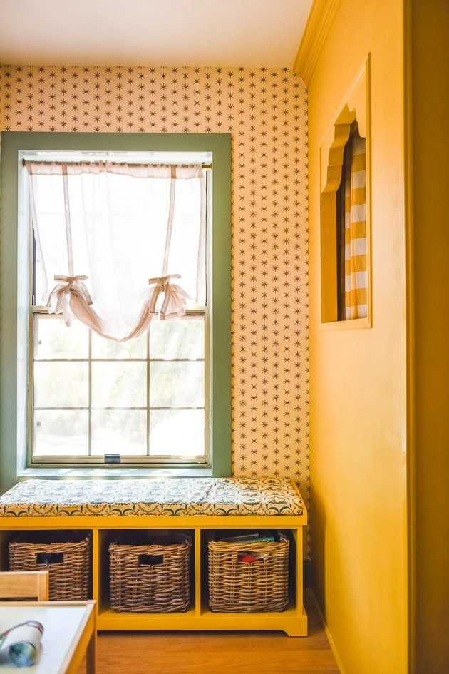
I found a wood bench on Facebook Marketplace that we painted the same color so it felt like it was built-in too. We added on a pad with this fabric from Spoonflower. It was perfect for the maritime theme that we settled on.
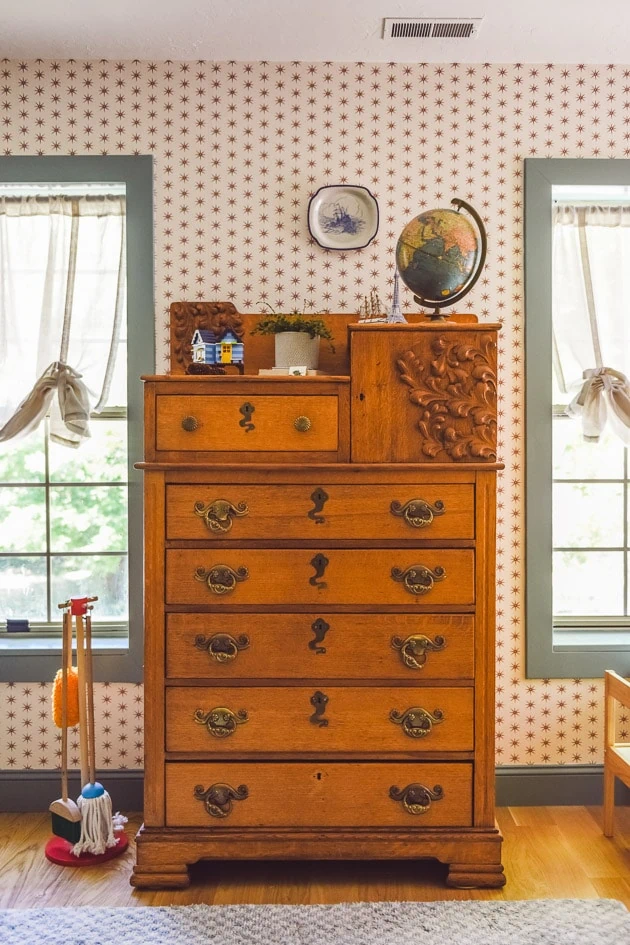
I found this drawer at an antique warehouse in Salt Lake City and I love how beautiful that wood if not a little bit weird with the adornment.
Wallpaper and fabrics
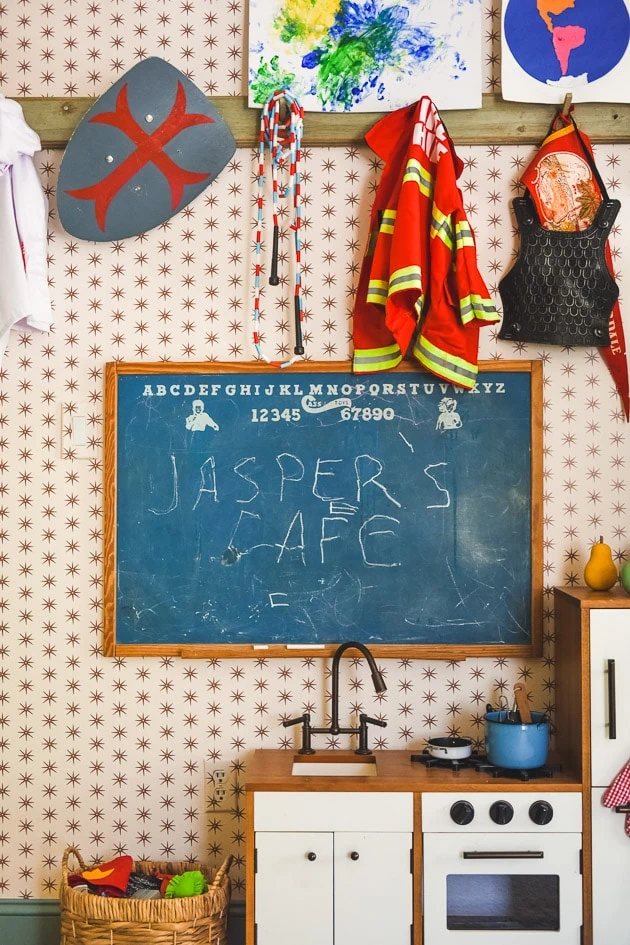
We worked with Spoonflower on ALL the wallpaper and fabrics in Jasper’s room and I’m in love with it all! The wallpaper is by Danika Herrick, who was kind enough to put her star design into a new color for me (that’s one good bonus to Spoonflower–a lot of artists will take on custom work!). I did an interview with Danika, which you can read here because she’s so prolific!
Custom curtains for the bed
I wanted the bed to have a Swedish quality and a big gingham brought some whimsy and fulfilled the job. Meta had introduced me to a similar woven but it was going to cost me thousands of dollars. I ended up finding a very similar color and size on Spoonflower, hallelujah so Carrie on our team DIY’d some curtains.
I also found some sheets and a duvet cover in a similar color in a small stripe on Spoonflower, which I thought was nice, though I’m considering switching everything out for the same large yellow plaid.
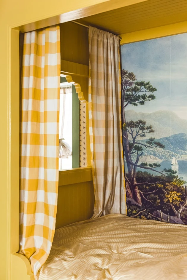
Mural in a built-in Bed
NOW, let’s talk about that mural, huh? This was Paul’s idea! He thought it would be cool to add one in and I’m so glad he thought of it. I knew exactly where to turn to–Rebel Walls. They are a Swedish company that has a ton of kind of wild wallpapers and murals. I found this one called Safe Haven, which was perfect and added in a deepness to it. I love that it took it in a maritime direction. More about that soon!
The staircase
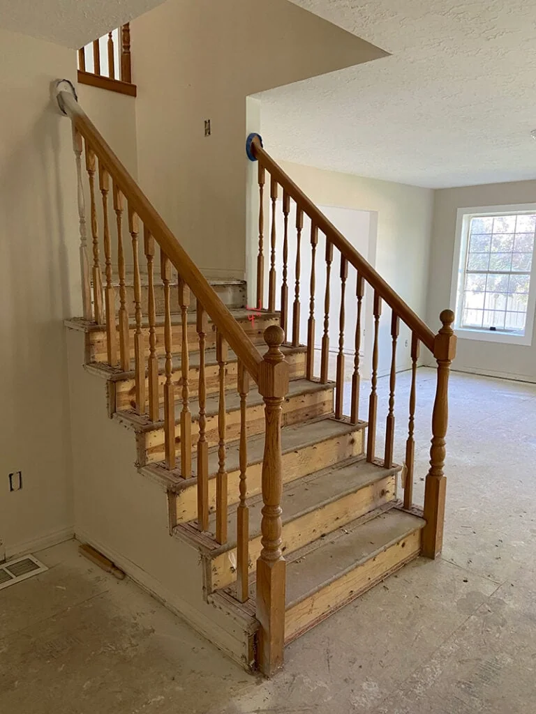
Before we ever bought our house, we dreamed about owning it. We would walk by it on walks and I’d dream about what I’d do to it. After awhile I realized that it was vacant so I snapped some pictures from the window. This is what the staircase looked like before we bought it.
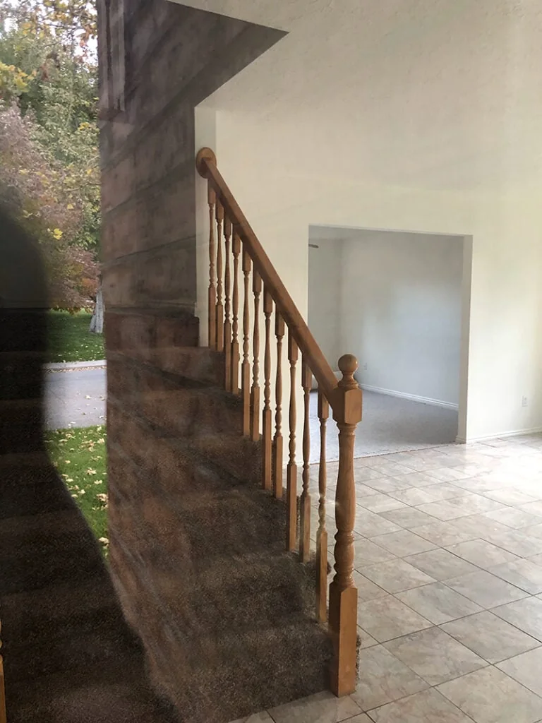
And this is what it looked like once we bought it.
Removing the banister
The banister was removed once we replaced the flooring but I didn’t know what direction I was taking the rest of the house at the time so I didn’t immediately put one in. I knew it was a big hazard for my 2 year old, but somehow, thankfully, we never had a problem with it. Once Felix started crawling we had to act FAST and it coincided with the timing of the show.
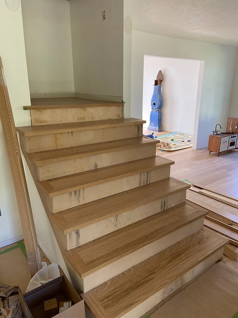
We had worked with Stuga on all the wood floors, which you can read about here. We have loved them!
The Staircase Plan
- Add in a banister
- Add some Scandinavian folk personality!
After photos of the staircase
Add this to my list of projects that I make as complicated as possible. Ha! But I LOVE the heart that went into it. You can see it all on the show, but it really was a labor of love with so many people involved. You can read the full post here.
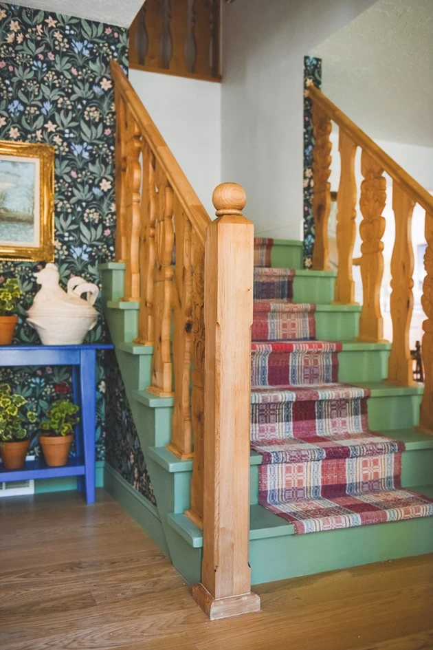
Flat Sawn Balusters
I went with traditional flat sawn balusters. The problem was, to my knowledge, you can’t just buy them anywhere, at least not in the shape I wanted. So, my generous and talented brother-in-law, Tanner Boyes of Specter Design, took on the project. He worked with his good friend Quinn Peterson, who is also very handy and talented. Together they cut out all the shapes and made the newel posts. I talk about the full DIY process in this post.
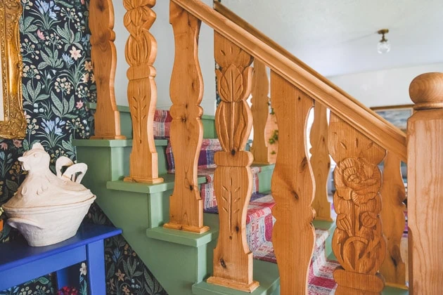
But I wanted something a bit more to go with the shape. Cue Jill DeHaan, an amazing artist and illustrator. I noticed some of the wood carvings she was doing on her Instagram and I knew it was the perfect way to add more meaning and depth into our home. I LOVE how they turned out. Again, more about that soon! There’s a lot to tell!
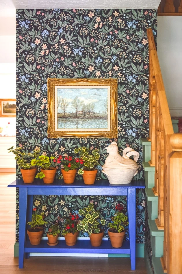
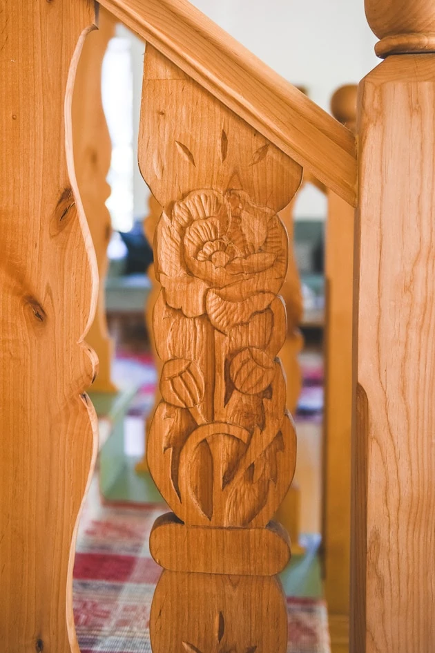

While I love how it turned out, I do have a few regrets along with some changes I’m going to make here.
The office kitchenette
The kitchenette in the basement for my office was one room that didn’t make it into the edit. Actually, we filmed a whole storyline about my team and some projects we were working on that didn’t make it into the edit, which I’m disappointed about, but I’ll tell you anyway!
Besides putting epoxy on the floors and dressing up one room with wallpaper, we hadn’t done too much to the office in the basement. I was getting antsy to make the space totally Lars. I started with the kitchenette because everyone really needed a place to put their food.
Before photos of the kitchenette of our home renovation
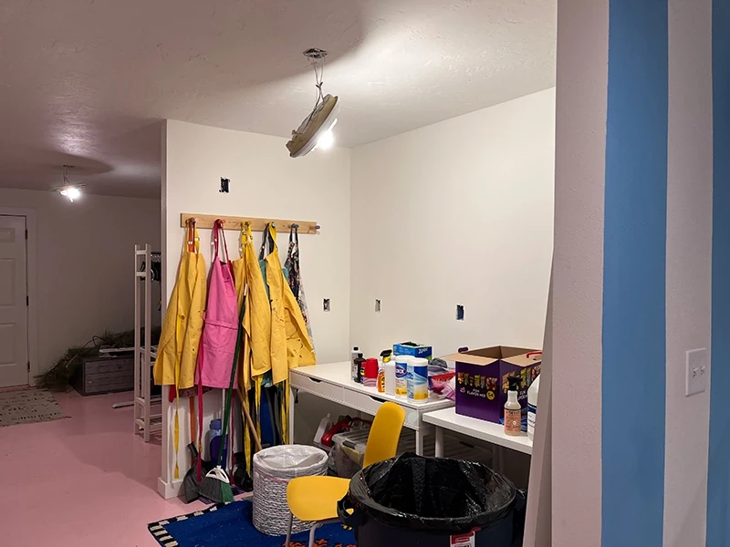
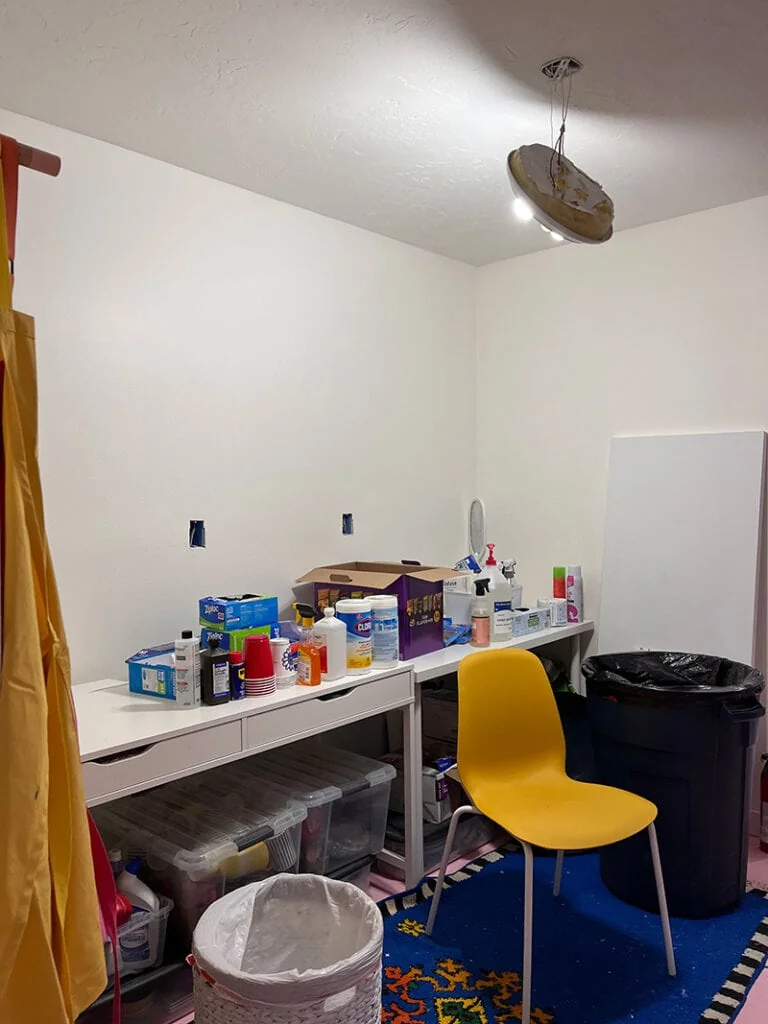
Here are some of the before photos of the kitchenette. It’s a three walled space about 8′ wide that you pass by like a hallway into the main crafting room.
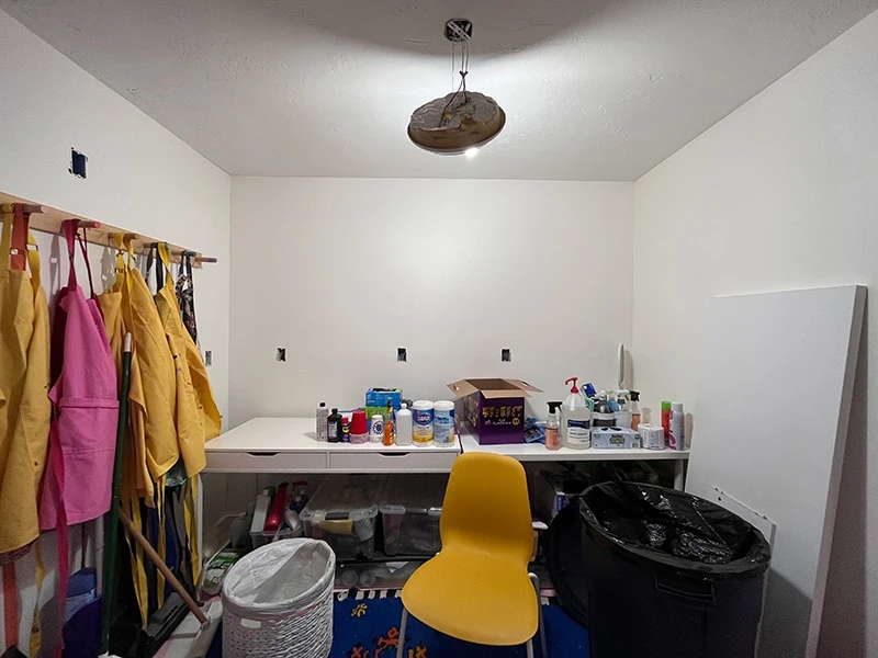
Please notice the lovely lighting 😉
The kitchenette plan
- Add in a kitchenette–sink, fridge, counter, no dishwasher needed
- Add in shelves to store our props
- Add in a backsplash
- Add in seating
- Replace lighting
After photos of the office kitchenette
You can see the full kitchenette reveal here.
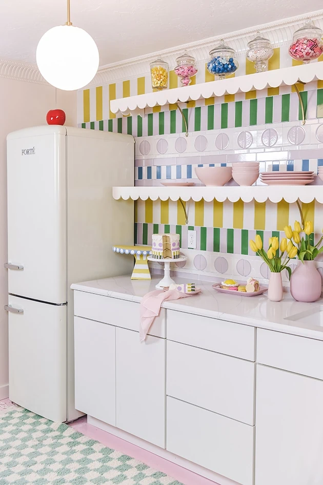
Modern kitchen cabinets
I LOVE how the kitchenette turned out! I was inspired by a retro frosted layered cake with piped icing but in a more modern, playful way. Once again, we worked with Cliq Studios on the cabinets in a more modern silhouette. I didn’t add in hardware because I was hoping to create our own hardware, but I couldn’t get it done in time ;).
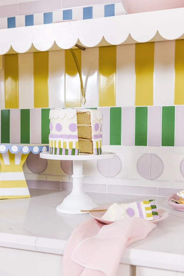
Frosting-inspired tile
We worked with Fireclay Tile to create the frosting-inspired tiled backsplash and added in some frosting/scalloped shelves to complete the look. My friends Julia and Evelyn Bigelow made the matching cake–are you kidding me/! So cute! I wrote a tutorial post on how we achieve this look here.
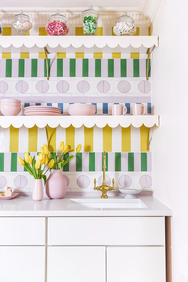
Kitchen accessories
We worked with Signature Hardware on the brass bar faucet, which I adore, along with the sink.
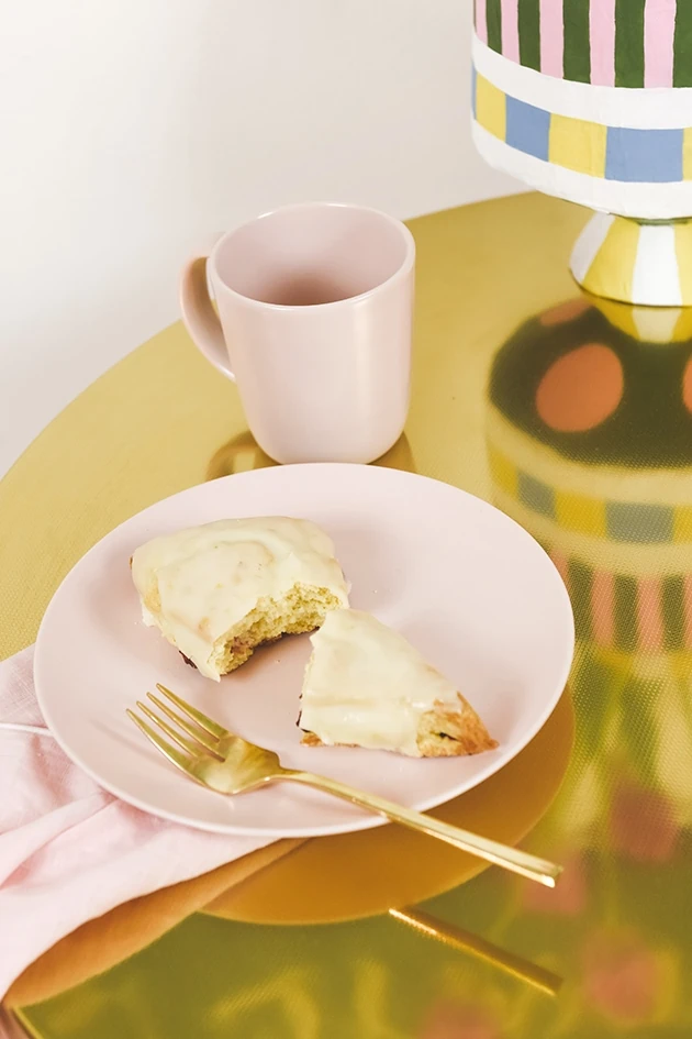
Sitting area
We didn’t get time for the custom bench that I was hoping to put on the opposite wall so we added in some chairs and table for the time being, but I’m hoping to do it soon!

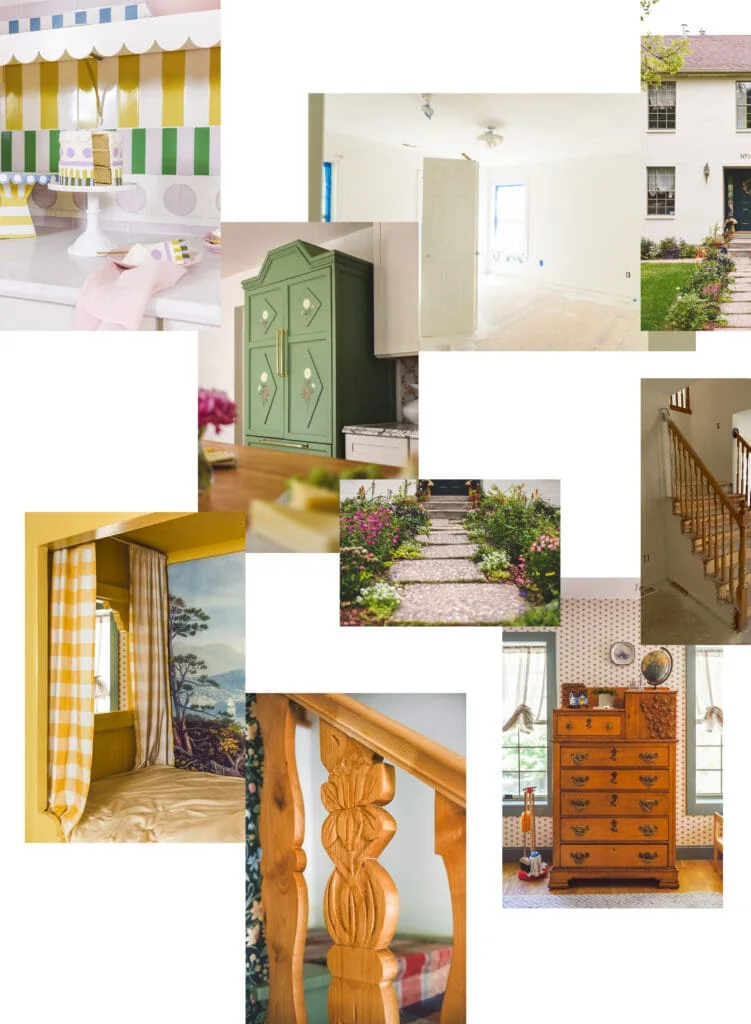
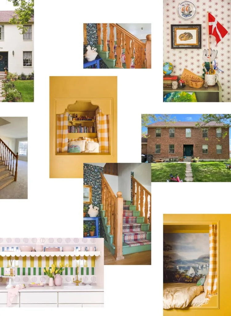
Before and Afters of our home renovation
OK! That’s all the before and afters of our our home renovation. Like I mentioned, I’ll be sharing more detailed posts of each room so hopefully that will answer some questions, but in the meantime, feel free to leave your questions in the comments section. Can’t wait to hear your thoughts!
Sources
Exterior: Masonry Primer and paint from Keim-USA, address numbers from Drop Cap Studio, all landscaping from Monrovia
Kitchen: Cliq Studios for cabinets, Tile wallpaper from our wallpaper shop, Ilve USA oven range in graphite and brass, Hood from Hoodsly, Dishwasher by Forte, Fridge by Fisher Paykel, bench cushion fabric from Spoonflower, calacatta viola countertops, sconces from Shiny Things London, Work table by Beck and Cap, Faucet from Signature Hardware, sink from Signature Hardware, fridge hardware from Signature Hardware
Jasper’s A sunny nautical-inspired children’s bedroomBedroom: Star wallpaper from Spoonflower, Blue Paint, Yellow Paint is Benjamin Moore, bed duvet and sheets from Spoonflower, Yellow check curtains from Spoonflower, Mattress, bench fabric from Spoonflower, Mural wallpaper from Rebel Walls, Citra rug from Dash and Albert
Staircase: Floral wallpaper from Sandberg Wallpaper, staircase runner from Textile Trunk, paint by Benjamin Moore
Kitchenette: Cliq Studios for cabinets, faucet and sink from Signature Hardware, tile from Fireclay Tile, Scallop trim, crown moulding, pink dishes from Year and Day
Other spaces of the other spaces
You can read about the kitchen here
You can read more about our antique-inspired oven range here
Read more about the kitchen hood here
In With the Old is on Magnolia Network available to stream on Discovery+ or HBO Max.


Comments